

In Stephen Hawking’s remarkable book “A Brief History of Time”, he mentions in the introduction that he was advised that each formula he put in the book would halve the sales. Zero formulas, one million sales. One formula, half a million sales. Two formulas, a quarter-million sales. And so on.
By the way, that is exponential growth (well, decay, in that case). Which is what I’m going to talk about, but it’s also why I will try to include as few formulas as possible. Let’s stick to what’s important. Like, driving a car. Gas pedal, go. Brake pedal, stop. Steer where you want to go. That’s basically it, and you don’t need to understand the magic taking place under the hood to make good use of the car.
So, speaking of cars… let’s say you’re in your car, and you want to go from 0 to 100 km/h. My first car did that in about 18 seconds. My current car does it in 2.9. Both of those numbers are insane, but for completely different reasons.
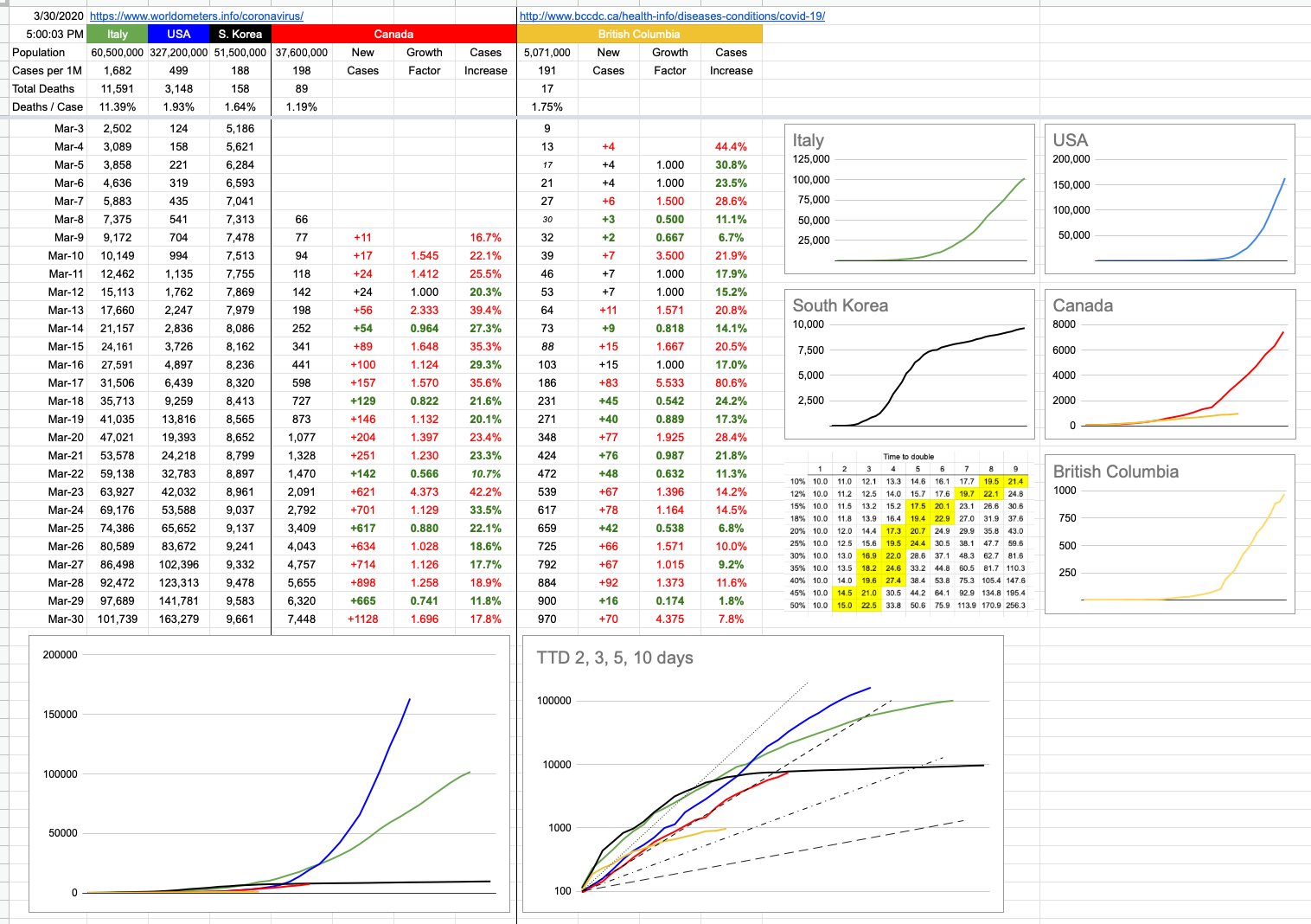
Let’s look at the new chart I’ve added, which is a logarithmic graph of all the same data… and some dotted-dashed lines I’ll explain below.
You car will follow an acceleration curve, which… interestingly, for a supercar like a Ferrari, will look a lot like the Italian line on the logarithmic chart. A more modest car, like a Kia, will look more like the South Korea line.
Ooohhh, wait a minute, we might be onto something here…
All cars eventually hit a top speed where they are no longer accelerating, and when they do, like the Kia/South Korea line almost has, it flattens out to a near-zero slope. That Ferrari/Italy line will flatten out too, eventually, but as we can see, at a much higher level, and it’s not there yet… but trending that way.
The Canada line has been skirting the left side of its attached dotted line, and is now a little on its right. What’s it most looking like? Thankfully, very evidently, not the MegaSupercharged Corvette/US line, whose pedal is still floored and heading to a scary top speed. Whether Canada trends more like South Korea or Italy depends to be seen. Eyeballing it would imply somewhere in between. The math implies something similar. The reality remains to be seen with what happens in the critical next couple of weeks as the incubation window vs. social isolation window overlap winds down.
When I started doing these daily charts, which seems like years ago, but it’s actually only been a couple of weeks, my intention was to provide an apples-to-apples comparison of how we were doing vs. other countries, especially the US. We were roughly 10 days behind them, and they were roughly 10 days behind Italy. And I threw in South Korea so we’d have a good target to aim towards. There were the original little charts showing each country independently, to illustrate what their curves looked like, and the consolidated chart of all of those on top of each other at the same scale. And then I added B.C. because it’s behaving a little differently than the rest of Canada, and most of the people reading this (including me) live there.
I am not going remove any of that, because they’re still interesting to look at, especially if you’ve been following it from the start, but the scale of the numbers and the squashing effect renders the visuals less useful than before. You can zoom in and definitely see the red line detaching from the blue one. You can definitely see the yellow line detaching from the red one. But as time goes on, it’ll just turn into a thick purple line.
Which leads us to the new graph I added today, one you’ve likely seen elsewhere… a logarithmic representation. This one is a little cleaner because it only has my 5 data lines…. and 4 dotted-dash lines, which refer to a topic I brought up yesterday, and have everything to do with the rate of acceleration — the Time To Double. The steepest of those lines, the smallest dots, is a TTD of 2 days. The next one over, that the Canada line is riding and now hopefully falling off of, is a TTD of 3. Below those are TTDs of 5 and 10.
There is no magic number as to what’s good… the bigger the TTD, the better. The more manageable things are. The less the avalanche of cases.
Fun fact… do you remember in school, where some of you hated math, and argued with the teacher that you’d never in a million years need this in the real world… well, haha, guess what, what we’ve been talking about here is differential calculus, and the acceleration we’re looking at is the first-order derivative of these graphs and their data. And the rate of change of that acceleration is the second-order derivative.
Hey, sit down — I promised, no formulas. There’s no test. But… now you have some understanding at what it is the experts are looking at closely, and, in many cases… worryingly… the rate of change of the acceleration. And its implications with respect to time to double, and the planning and contingencies that needs to be in place for those different scenarios. When they talk about flattening the curve, this is the graph to which they’re referring. And in a perfect world, all of those lines start flattening-out to the right. I’d much rather be writing about rates of deceleration.
One day…. hopefully sooner than later.
View Original Post and All Comments on Facebook
Leave A Comment