

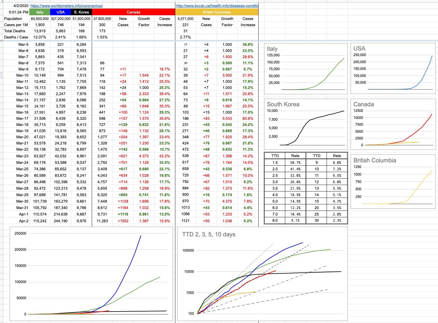
I added a little table (just above the logarithmic chart) to the spreadsheet yesterday, and today I will explain it. It’s a simple “look-up” table for “Time To Double”, useful if you want to know how a certain percentage maps to a TTD. For example, let’s say you have $1,000 to invest, and you want to double it to $2,000 in 7 years. What interest rate would you need? The answer is 10.5%. If you can wait 10 years, you’d only need a rate of 7.2%. How long to double your investment if you’re being offered 20%? The answer is 3.8 years.
These percentages and their related time periods can measure years… or days, which is the relevant discussion.
Let’s begin with a simple example, where we start with the number 100. And we are adding 20 to it every day. After 5 days, it’s doubled to 200. A TTD of 5. Now we keep adding 20 per day… so it’s going to take another 10 days to go from 200 to 400. And to double from 400 to 800, it’ll require a further 20 days. The only thing doubling here is the TTD itself… and this represents linear, not exponential growth. Certainly, it’s growing… and in this example, that 100 will grow indefinitely… but, as it does, its TTD gets bigger and more distant.
Now let’s imagine an example where on day 1, we’re at 100. But by day 4, we’re are 200. And at day 7, we’re at 400…. and we’re at 800 after only 10 days. So this is clearly a TTD of 3, and if you look at the continuing growth… 800, 1600, etc… it’s not hard to imagine what this would look like on a graph… an ever-increasingly steep curve. With a consistent TTD, there is exponential growth. The steepness of that curve has everything to do with the actual TTD, and that’s important because no matter what the finish line, it’s important how quickly we get there. In this case, we want to get there as slowly as possible.
The big graph on the bottom left shows those curves, overlapped on each other, showing how numbers have evolved for different jurisdictions from similar starting points. The logarithmic graph to its right shows the same data, and when you graph exponential data on a logarithmic scale, consistent exponential growth shows up as a straight line. Those 4 TTD lines of 2, 3, 5 & 10 days are the best example. A logarithmic presentation also helps to show the deviation, positive or negative. As that exponential growth increases or decreases… ie, as the TTD increases or decreases, the lines for each country (or province) will move… and obviously, to the left (into the steepness) is bad, and to the right (flattening out) is good.
Logarithmic graphs can be a little misleading in the way they squish data, and can misrepresent reality. But from the point of view of displaying trends, they’re pretty good. We can look at the encouraging B.C. line. We can look at the Canada line, and at least relate to the fact that we’re on a very different trajectory than what the U.S. is following. As much as the numbers back east have jumped, and as exponential as the growth continues to be, it’s less exponential, ie slower, ie the TTD has gone up, ie… from a trending point of view, not worse than what led up to it.
Even without the graphs, the numbers speak for themselves, and the growth percentages are there, day to day, both for Canada and for B.C. You can plug those numbers in to the little table… from today, from a week ago… and see what TTD would correspond.
That being said, what exactly are we measuring? These TTDs are important to chart the rates of growth, but rates of growths of what? Known cases? Presumed cases? Hospitalizations? Patients in critical condition? Deaths?
The only thing I’ve been dealing with are confirmed cases and their growth. My data deals with the confirmed known spread of the virus…. but all of those other numbers are also important, and will be tackled in due course. Topics for another day.
View Original Post and All Comments on Facebook
I found this video on the mathematical modelling of infection quite informative and others might too (from one of my favourite youtube channels).
Also, Horatio, you might be interested in the software used, it’s called GeoGebra and it’s free (links in the video description).
I’m not great at math myself but I’ve always found it interesting.
https://youtu.be/k6nLfCbAzgo
My cousin’s supervisor for her PhD at UVic published a modelling paper based on Chinese numbers. It showed that the R0 wasn’t that high but that on average people were transmitting before showing symptoms. The finding was with a
14 Day quarantine you will still miss 6-7 % of infections but you could drop that to 0.5% with a 22 day quarantine
Horatio Kemeny you are brilliant. Thank you for this amazing contribution of solid data, and powerful context.
I am hearing that China’s reporting was/is iffy. Any truth to that?