

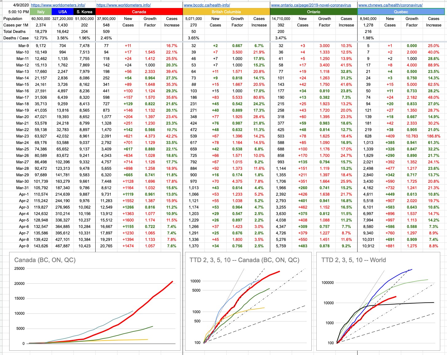
Oh, Canada… our home and native land is a lot more relevant to the majority of people reading this, so I’ve made some changes. You will notice that the original graph that started this little daily update is gone. It’s served its purpose, which originally was to map an apples-to-apples comparison of Italy, the U.S. and Canada — with South Korea thrown in for reference — if you were to superimpose their trajectories from a comparable starting point. When that started, Italy was 10 days ahead of the U.S. and the U.S. was 10 days ahead of Canada. On the graph, all of those lines were on top of each other, and it was going to be interesting to watch what happens as time goes on.
To summarize what has happened since… and you can look at yesterday’s final version of that graph to see what I mean (or go back even further and see when things really started to diverge)… The U.S. was actually doing better than Italy for a while, until all hell broke loose… then they burst through that green line and have never looked back. Italy, while still in the midst of their crisis, has definitely seen its curve flattening. Canada, for a while worryingly tracking the U.S., “fell off the bottom” of that blue curve and has comparatively been doing a lot better. The B.C. line, on this scale, is indistinguishable from the X-axis. Indeed, it’s the scale of this graph (linear Y-axis) that has rendered it useless. The unfortunate blue-line numbers will just keep squashing the other lines down, so we retire this graph with full honours, though I will still track the data and update the TTD logarithmic graph of Canada vs. The World.
But there are two new graphs… one, on the bottom left, is exactly what I described above, but just for Canada… with B.C., Ontario and Quebec. You will notice with some degree of curiosity that the Quebec line is above the Canada line… how can that be? Isn’t Quebec still part of Canada? Let’s not have that particular discussion, right here, right now. Yes, of course they are, so what’s the deal?
Nos amis from la belle province, with their usual panache, were simply late to the party. Given that this graph aims to compare apples to apples, its starting point is the same for everyone. Quebec recorded its 100th case March 18th or 19th. On that day, both B.C.and Ontario were around 250 each. Canada’s total was around 800.
Forgetting when it happened, but rather how it happened, Quebec’s numbers were not great for a while; they quickly accelerated at a frightening rate. They went from 100 to 1,000 cases in 5 days… a pace that exceeds Canada’s overall trajectory. The good news for our frères and sœurs is that things have recently looked a lot better. In fact, while numbers keep growing, they are growing more slowly. The “Cases Increase” percentage columns all tell that same story. Social/physical distancing… you know.
Where are the Prairies, the Maritimes, the Territories in all of this…? Listen, you don’t want to be on my charts… I aim to chart the big, significant numbers. Hope you never get so relevant that you need your own data column and squiggly line… anyway, there are only so many colours.
Special shoutout to Nunavut… with respect to this pandemic, they are having none of it. Ha Ha!! (Sorry). But indeed, they’re the only province or territory with zero cases. How it that possible? It’s very simple… the population density of our northern compatriots is 0.02 people per square km. In other words, everyone up there gets their own 50 sq. kms. In other words, go up there and draw a square that’s 7km per side. It’s all yours. It’s also really cold. All of that combined equals automatically-imposed social/physical distancing. And check it out… zero infections. Case closed.
View Original Post and All Comments on Facebook
Ontario and Quebec hit hard from the Florida effect. The virus spread like crazy down there and the people coming off the cruise ships flying home to Canada. From the website I sent you on cellular mobility we are locking down just the same as BC. BC was lucky to be so far removed from the Florida effect.
Have the US estimates been at all reliable? I mean, they can’t even get an accurate deaths number, let alone an accurate cases number.
Thank you again for doing this.
From what I understand, Quebec is testing more people than the other provinces. It is also using a different method of counting cases– it counts probable/presumptive cases as confirmed, while the other provinces distinguish between those two categories. Of course, Quebec is so far ahead of everyone else that there must be other reasons. The Florida effect is one reason. Another reason is that Spring Break had just started and a lot of the students went home, taking the virus with them
I am following the neighbourhood numbers in Montreal–
CDN/NDG 453
CSL 241
Outremont 131
Plateau 203
Sud-Ouest 171
Westmount 55
Eliza Hunt read these every day
So, like many, I Iook forward to the now famous daily posts from Horatio Kemeny.
This is the best part from today’s informative update:
“Special shoutout to Nunavut… with respect to this pandemic, they are having none of it. Ha Ha!! (Sorry).”
Thank you so much for your brilliance and insight every day. So enjoyed your input about Hastings yesterday and hope it won’t be long before we can all enjoy racing again……