

Purely for the sake of creating examples, I am going to once again virtually kill a lot of people. Please don’t be sad… this is all made up as I go along.
- Older lady, sheltering with family. All of them became a little sick, but not sick enough to get tested. Some fevers and coughs. She dies in her sleep, but doesn’t get tested. A few weeks later, the family is tested and they’ve all had it.
– Young man, smoker, high blood pressure. Has a heart attack and dies. Tested and found to have had the virus.
– Elderly man, tested positive, was doing ok at home, but breathing is becoming difficult. Gets in the car, speeding to the hospital, blows a red light and gets T-boned by a truck. Killed instantly.
– Young man who, as a result of the lockdown, lost his business and is now losing his home, history of depression, commits suicide. Tests negative.
– Same example as above, but tests positive.
– Middle-aged man has a heart attack, rushed to hospital, but massive delay at ER… and dies while waiting for admission. Tests positive. Or negative. Whatever.I can come up with lots of “edge cases”, but perhaps they don’t serve much purpose other than to spark an interesting conversation. Some of these are obvious, some are not, and some, one could argue, should be… but aren’t.
The question you might think I’m about to pose is… what counts as a COVID-19 death… and yes, that’s part of it… but trying to answer just that question… can be quite problematic.
At the moment, there is confusion and disagreement with respect to what counts and what doesn’t. There is a certainly a big difference between dying of COVID-19, and dying with it. And there’s a lot of grey area in-between the obvious cases.
To compound the confusion, different jurisdictions have different ways of counting things… and many of them have changed their method as time has progressed. On April 14th, the state of New York changed what counts as a COVID-19 death, adding 3,700 to their count. More recently, Pennsylvania made adjustments that lowered their number by 200.
My examples above are only a tiny fraction of the sorts of cases one could argue one way or the other, and my examples are pretty superficial. When it comes to categorizing deaths where there were pre-exisitng conditions, it requires real medical knowledge, and even then… one lung is full of fluid but the other is not, patient was positive but that’s an unusual presentation of the virus, plus this, minus that… it’s up for debate among medical professionals, let alone everyone else who may have a vested interest in that number being higher or lower.
It’s complicated. And, obviously, necessary to standardize in the long run so everyone can be talking about the same thing. But in the meantime, there’s another number that’s very telling and, to a great extent, indisputable.
If you want to shut up the “it’s just a seasonal flu” crowd, and the “the death rate is like 0.04% because everyone already has it” crowd… look no further than excess deaths.
Excess deaths is exactly what is sounds like… if in a certain place, on average, N people die in the month of March, and historically that’s held quite accurately as X% of the population, then you have a pretty good argument for COVID-19 deaths when that number is N+2,000. Even if the official tally says only 1,500 virus deaths, you know it’s been understated by up to 500… which would indicate undercounting by 33%
You can then set aside the differences between states and countries as to what counts and what doesn’t, because after you factor out the obvious ones such as accidents, you have a bunch of deaths that are generally unaccounted for, with no category. There’s a good chance that this virus is their category.
This has been going on long enough that we can actually start looking at those numbers, to see if they reveal anything of value.
Note that there are times when averages are worth talking about… and there are times when they are not. Averaging the ages of passengers on a school bus full of kindergarten kids and their grandparents… tells us little. The average of 20 5-year-olds and 20 people aged 68 to 82… is about 40. And nobody on that bus is anywhere near that age. Two averages tell us a lot more… like one average is 5, and the other is 75.
Keeping that in mind… is there any consistency with respect to excess deaths?
Europe is a good place to look, with its diversity of population and experience during this pandemic. The average excess death percentage across 13 countries is 49%… which means for every two documented COVID-19 deaths, there was an additional one that flew under the radar.
As one might expect, the hardest hit places were Italy (90%) and Spain (51%). Those are two places where things got out of control quickly… and also where there is already enough data to make sweeping generalizations. If you look at graphs of what this looks like, The Financial Times, at ft.com, has an article titled “Global coronavirus death toll could be 60% higher than reported” with lots of little graphs, per country, to look at.
Note that this still isn’t apples to apples, because Spain and Italy were first, and are much further along their pandemic trajectory than others. In comparison, you might be tempted to look at other countries and think it doesn’t look so bad, but this is something to revisit in the future, when more than one month of data is available. Those graphs, per country, all show a series of flat, grey lines (previous years) and then the red 2020 line… which goes along quietly on top of the others and then suddenly spikes, sharply and quite alarmingly in most cases. What’s interesting to see is that these spikes are like ocean waves… and there’s no way to tell if that wave is crashing, or whether it’s the first part of the wall of a tsunami. Ideally, it spikes right back down again… and Spain and Italy may well be doing that. The others; the jury is still out. The England/Wales number is “only” 37%, but that graph looks ready to continue to rise, and/or at least continue to fill a long red section. As do many others.
And when you drill down to certain, known areas of concern… New York City — forget the official stats… they have a 300% excess death-rate to look at. London, 96%. Paris, 122%. Stockholm, 75%. And if you look at Northern Italy, specifically the hard-hit Bergamo province… 464%.
He are some raw and indisputable numbers of how it looks when things don’t get clamped down. Lots more people die, directly or indirectly, as a result of this virus.
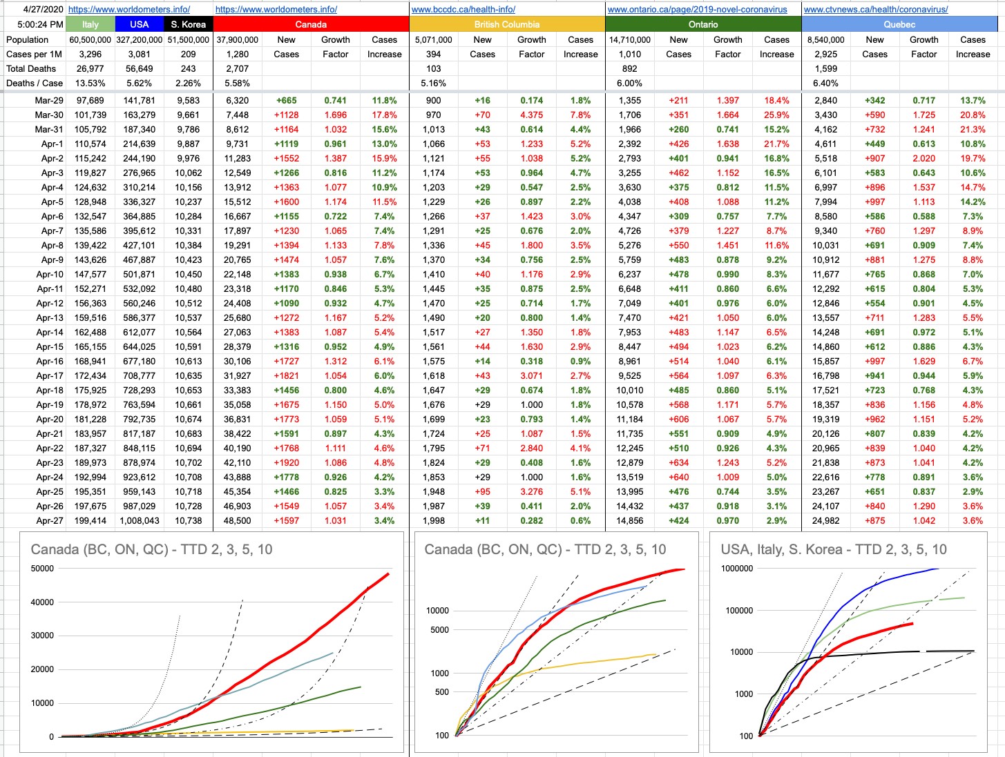
These places seems distant and irrelevant to some of us here, lucky enough to live in a place with 39 new cases yesterday and only 11 today. And that’s a result of doing things right. It’s not just luck.
View Original Post and All Comments on Facebook
Leave A Comment