

Today’s update is a lot less political and a lot more informational; I’ve replaced some graphs and added some new info.
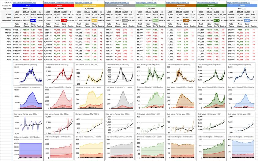
The top two rows of graphs represent the second wave, which I defined as starting Sep 8th. The bottom two rows represent the third wave, which I defined as starting March 10th. How’d I pick those dates? Purely arbitrary, but that’s where it looks to me like when the numbers started to turn the corner.
The top row of each wave is new cases per day, as well as the famous 7-day moving average. That’s the black line, cutting through the more-jagged thinner coloured line of daily new cases. As you can see, everywhere, it’s headed in the wrong direction, more steeply in some places than others.
The second row of graphs now consolidates hospitalizations (provincial colour), ICU cases (red), and deaths (black).
Those bottom two rows are the ones to watch in the coming days and weeks… remember when we were all cheering to flatten the curve? It’s sort of like that. We need all of those lines to be slanted like they are… except downwards, not up.
Hopefully we see it start to turn that corner, but if today’s numbers across the country are any indication, we have a long way to go.
Fuck.
What a crazy race we’re in. C19 (variants) vs vaccinations.
It’s exhausting to listen to the nay sayers, meanwhile the rest of us are holding our breath and just praying we win the race.
Horatio Kemeny, would you be able to share your dataset for the US and BC? I want to play around with it on excel.