

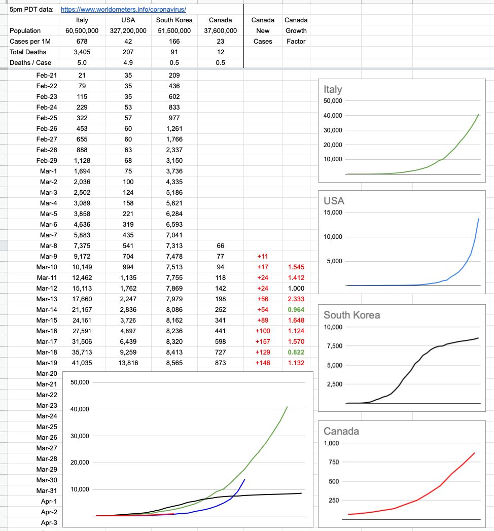
I added a couple of rows and columns of interest. Mark Twain said something like "Lies, Damned Lies, Statistics". Indeed, there are many ways to paint different pictures with the same colours. This simple chart has grown in complexity and I've received a lot of comments and some criticism from people.
To be clear, and I'm not a statistician… I was curious how Canada's response, at this critical time, looks compared to three other cases… Awful, Bad, Bad-then-good. It's still early to tell, and I have my opinion… but pictures are worth more than words, so here you go.
View Original Post and All Comments on Facebook
Leave A Comment