The First 100 Days

Day 10 – March 26, 2020

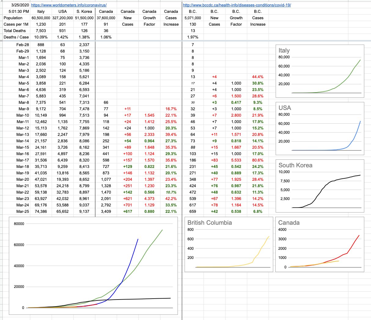
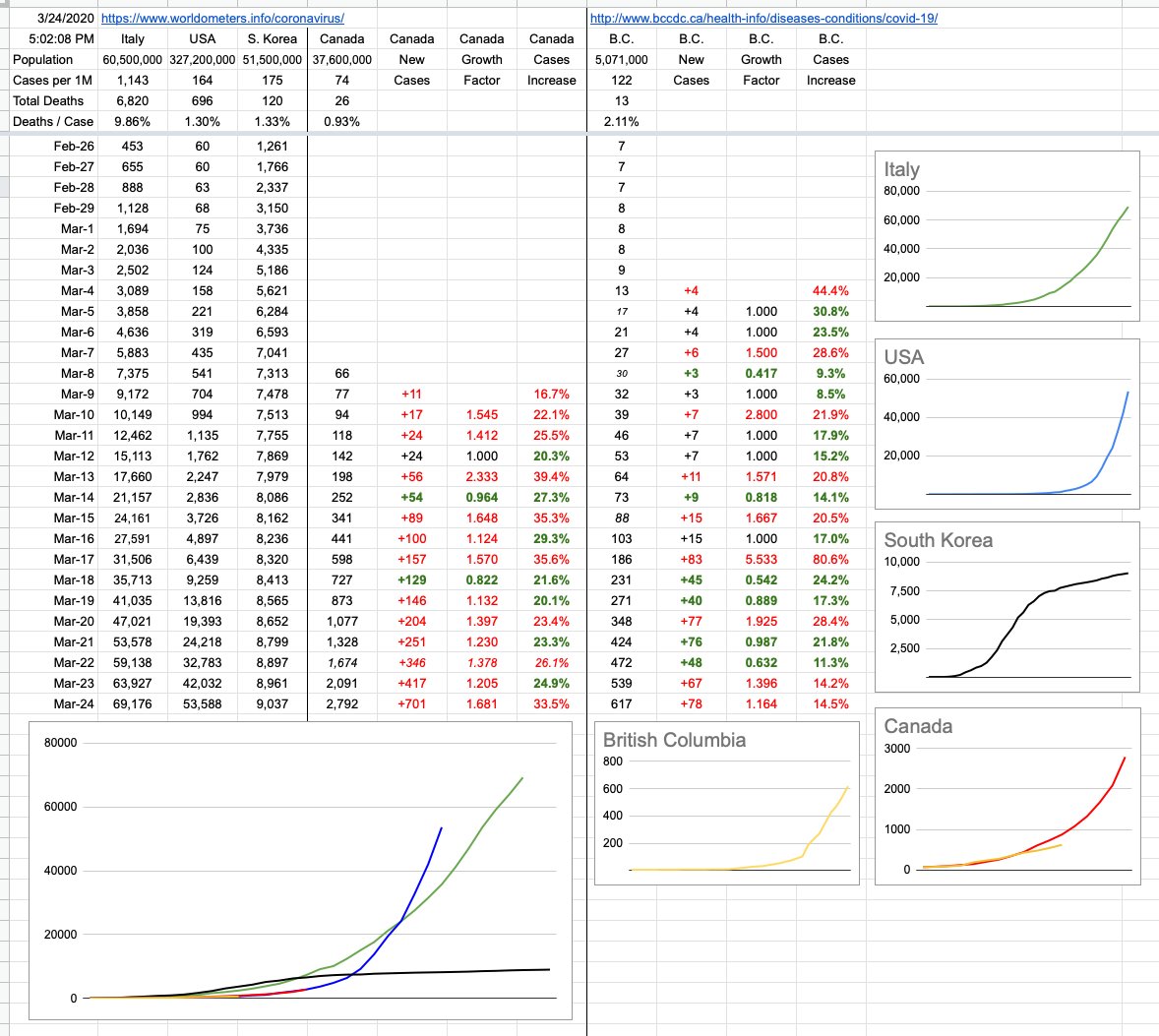
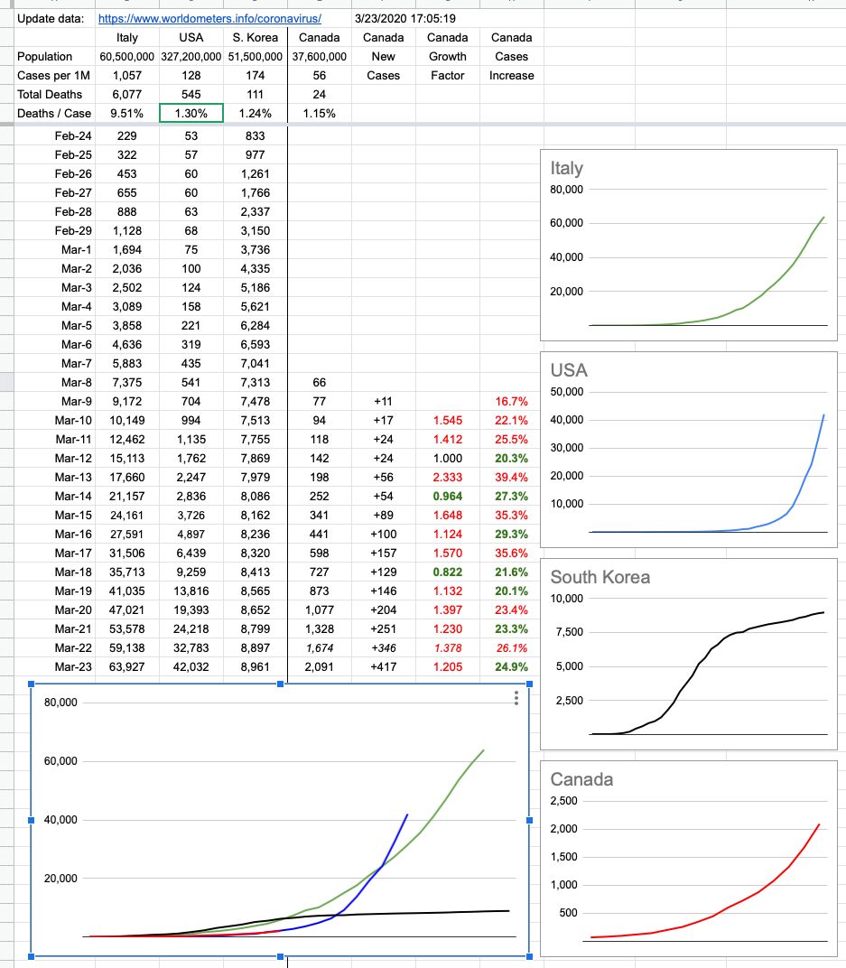
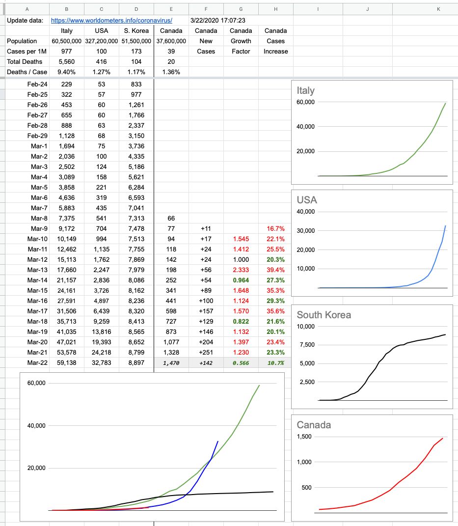
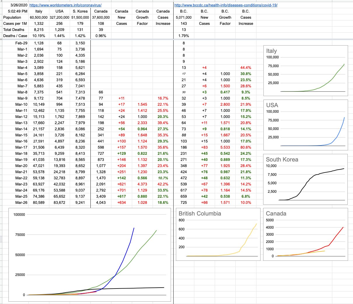
Fun fact: Both South Korea and the U.S. reported their first case of COVID-19 on the same day: January 20. The present-day outcomes are so different that it’s worth understanding what they did (or didn’t), and where our approach, provincial and national, fits in.

The answers are long and complicated and will be discussed and argued for centuries, but it can all be distilled down to one brief and accurate summary: South Korea did a lot; the United States did not.

One thing South Korea did was test the hell out of this thing, as far and wide as they could. They developed and administered thousands of tests almost instantly — like a week — and were quick to isolate those that tested positive. The U.S.… didn’t. They stuck their heads in the sand for a bit, called it no big deal, and did little except stop incoming flights from China… but as far as I know, the COVID-19 virus is not a member of any particular frequent-flyer club. It doesn’t care what airline it flies, nor where the flight originated. Once it’s on the plane and headed somewhere, it’s landing and it’s sticking around.

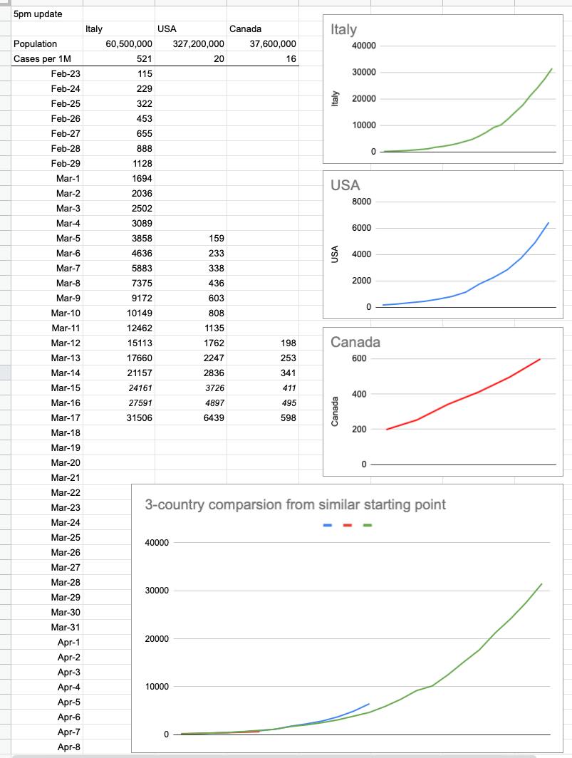
It was initially thought that community transmission wasn’t a concern… the U.S. thought it, we in Canada (and here in B.C) thought the same; we will find cases, we will isolate them, the cases will resolve and it shouldn’t be a big deal. The risk to you and me is low. A month ago, there were only 7 cases in BC, and all of them could be traced to close contact.

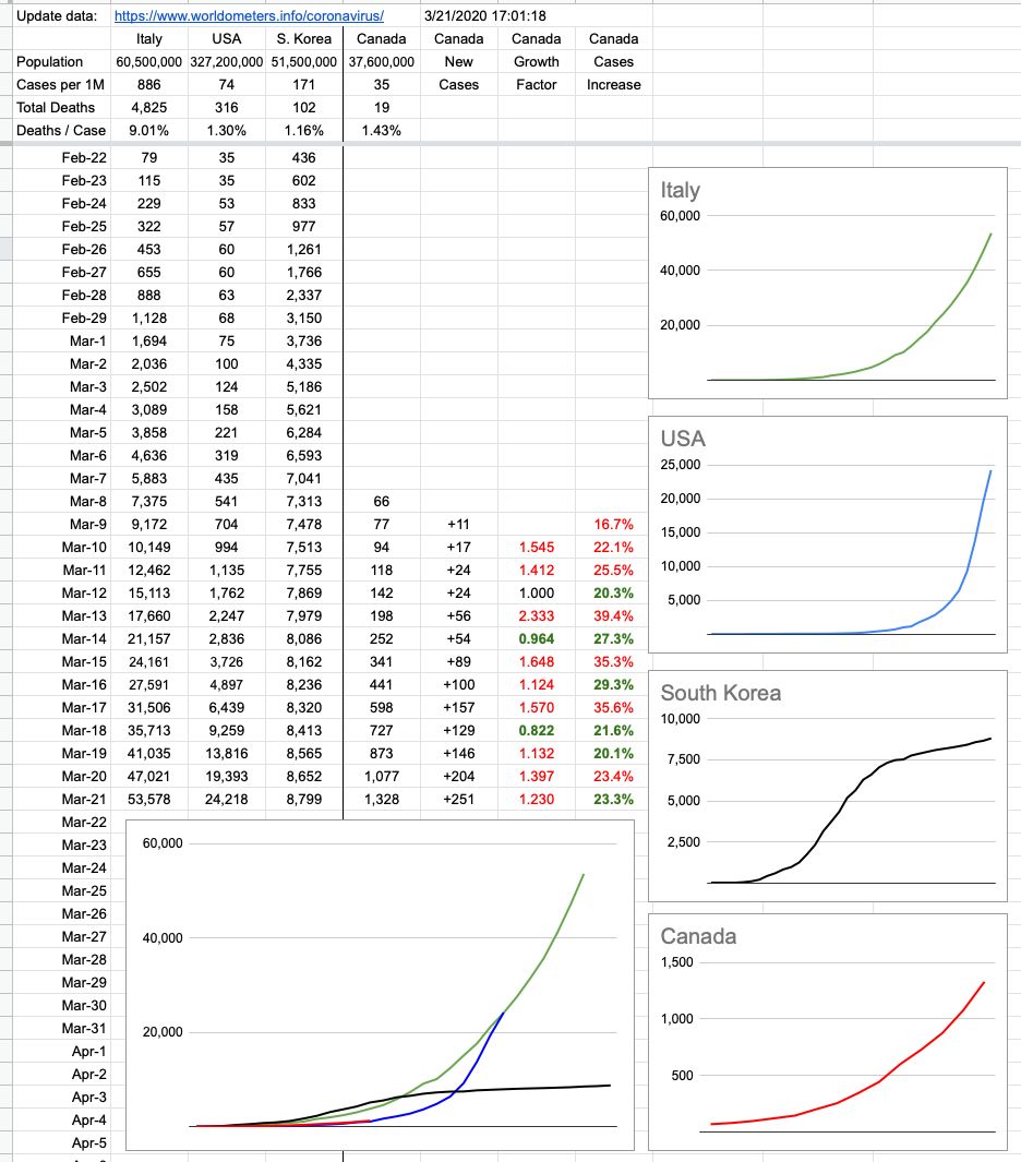
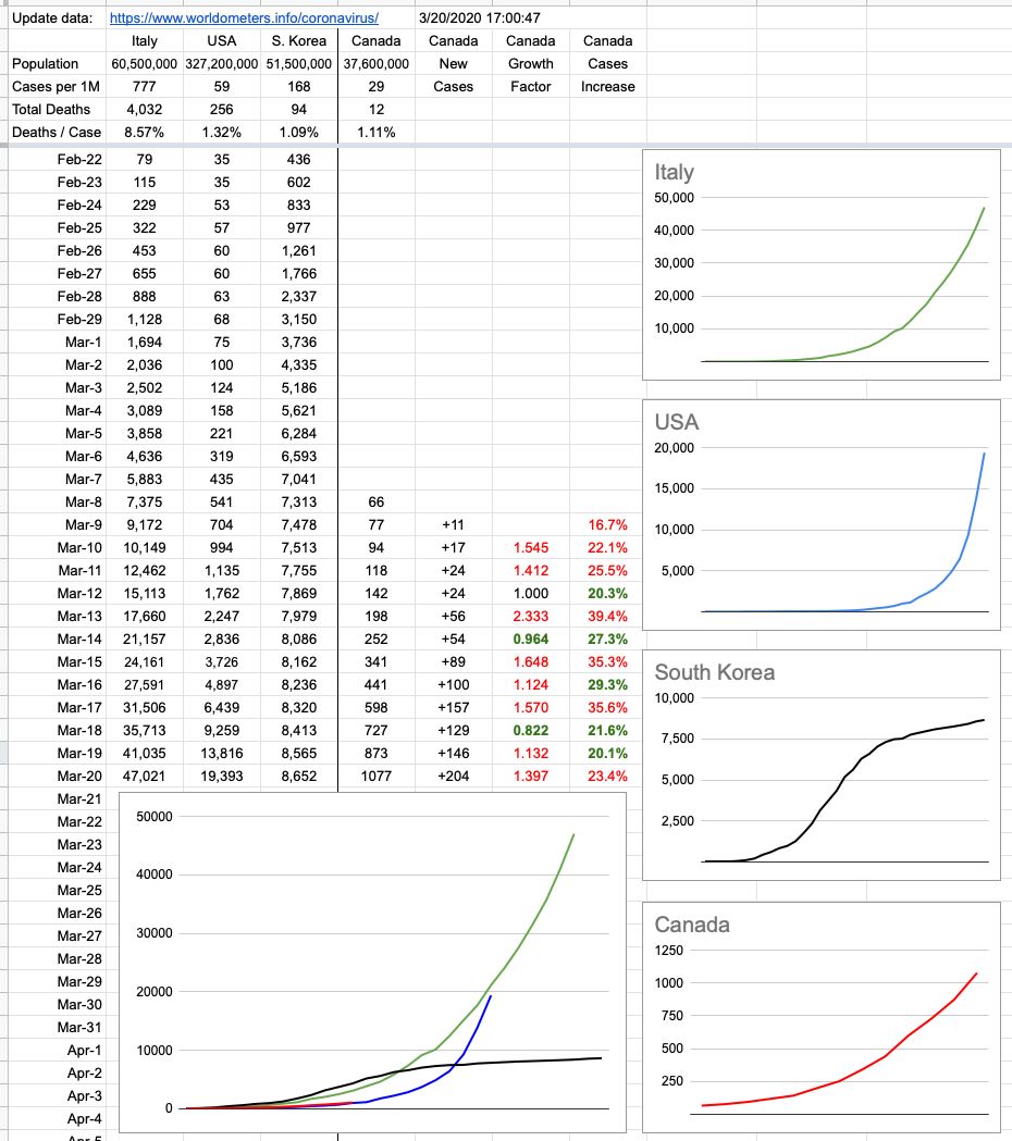
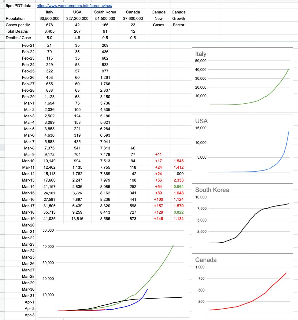
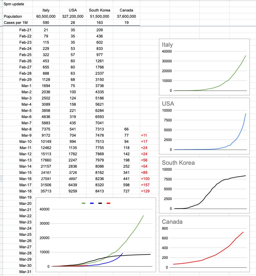
South Korea’s initial jump of cases had a lot to do with their prolific testing, but what comes after is what’s worth noting. Their impressive flattening of their curve has everything to do with their reaction… isolate. And when it became apparent that community transmission was indeed happening, that’s the only reasonable course of action: Social/Physical distancing.

Since our testing hasn’t reached everyone, and since we don’t yet have antibody tests that would tell us who’s already had it, the only reasonable course of action is to pretend everyone has it, and act accordingly. Indeed, the way to think about it isn’t to assume everyone has it… and keep away. It’s to assume you have it, and take every precaution not to pass it along to anyone else.

We are being warned to expect a jump in numbers in the coming days, due to the difference between incubation times and how long it’s been since the directives were brought in. We may see a sharp increase in cases in the coming days… incubation period of 14 days minus 10 days of distancing equals 4 days where we were all potentially wandering around infecting each other. And as those infections kick in, the numbers will rise… possibly quite sharply.

It’s after that period of time that we should start seeing some real effects of what we’ve all collectively been doing. That black South Korea line is what we want. That blue American line, not so much.

On that note, and again, too early to tell… but here in B.C., our growth is, for now, linear. Good news… for now.

View Original Post and All Comments on Facebook

Day 9 – March 25, 2020

At some point, we are all having “one of those moments” these days… it can last a minute… or an hour… sometimes, all day. The first thing I do when I update these charts every day is to enter the date, and today, when I entered Mar-25, I had one of those moments.

Seeing that date reminded me… that in some non-pandemic-infested parallel universe somewhere, the Canucks are playing the Sharks tonight, and I have tickets to the game.

I was really looking forward to it… because it was bound to be an exciting game. This is exactly the time of year when we’re typically fighting for a playoff spot, and usually, it’s a situation like the Canucks have to beat the Sharks, but also, the Ducks have to beat the Flames. And it’d really help if the Avs could beat the Oilers, just in case we lose, because then, next game, yada yada…

All of that occurred to me because… wow, do I miss that. I would so much rather be doing that sort of math… than this.

But here we are, so let’s look at these numbers… and hope that one day soon, all of us can get back to the things that feel so incredibly far away right now.

And, for what it’s worth, today was a good day. BC had a good day, and Canada overall did as well.

That yellow BC line looks good… for now. That will change in the coming days, and Dr. Henry was asked about how many cases she thinks are out there, as opposed to just confirmed cases. She will discuss it Friday morning, with some detail on the modelling they’re using to arrive at these estimates. There is a big difference between confirmed cases and actual cases… how big remains to be seen. But at least today, around here, it was a sunny day in many respects.

View Original Post and All Comments on Facebook

Day 8 – March 24, 2020

As is often the case with us here in BC, the Wild West of Canada, we’re not always in sync with the rest of the country… and since the majority of people reading this are in BC, I’ve added a whole new set of data and graph… which is us… British Columbia.

I haven’t been following closely other province’s responses. Nationally, yes. BC, yes. But I’m not sure when Ontario or Quebec locked things down, nor the manner in which they did it. The reason that’s relevant is that while we’re seeing some not-so-great numbers out of Quebec today, the last few days here in BC paint a better picture.

We’re still over a week away from seeing the direct impact of the social-distancing order, and numbers will indeed increase between now and then… but the manner in which they increase is important, and for the moment, at least around here, it looks pretty good. The growth is linear, not exponential. At least for now. It’s evident in the BC graph, and it’s very evident when compared to the rest of Canada, which overall continues to pretty accurately track where the US was 10 days ago.

View Original Post and All Comments on Facebook

Day 7 – March 23, 2020

The lack of data over the weekend left a bit of a gap… which I filled in with some guesswork. I know where we were on Saturday, and I know where we are now. How we got here looks to be pretty consistent, but the next few days are more important than the last few. We are tracking very closely to the US, trailing by 10 days… just before things started getting really out of hand down there.

It’s important to note that I’m tracking new cases — not active cases. It was good news to hear that 100 cases in BC considered active have been resolved to “cured”. More than 300 in Canada overall.

As time goes on, we can look forward to that number of resolved cases growing, but note that its growth doesn’t affect tracking new cases. Those will always go up. In fact, at some point, it’s (hopefully) likely we will have “negative” days — where there are less new cases than resolved cases… but the idea of these graphs is to simply track the spread (and control) of new cases. What we do with them is a whole other question, and I’ll be happy to offer my opinion on that as time goes on. So far, comparing it to what’s going on elsewhere in the world, it’s pretty good. And will gradually look a lot better if you all just #stayhome!!

View Original Post and All Comments on Facebook

Day 6 – March 22, 2020

I don't like posting incomplete data, so stick a huge asterisk next to this… because there was no BC update today, so the Canada number is incomplete. Nevertheless, the other numbers are accurate, so here it is… and with tomorrow's update I will back-fill what's missing from today's and we'll see where we're at.

Hope you all got out for a bit of outside social distancing! Because most of the rest of the week is miserable rain, and for once — Vancouver rain — if that's going to stop people from clustering outside on the White Rock pier or the basketball courts at Kits beach… good.

View Original Post and All Comments on Facebook

Day 5 – March 21, 2020

To put it in very Canadian terms, what you want to see on the graph is for it to not "hockey stick" up to the right. So far… we're good. I keep saying the same thing, but seeing numbers grow isn't bad; it's expected. And linear growth flattening out is the best-case scenario. Exponential growth is what's bad, and as numbers grow, we'll have a better sense. The next several days will tell a lot.

In the meantime, I hope everyone had a really nice day of social-distancing outside in the sun… which means hang out outside, alone or with the people closest to you, ie the people you live with. And stay away from everybody else!

View Original Post and All Comments on Facebook

By |2020-10-08T01:26:40-07:00March 21st, 2020|Categories: COVID-19 Daily Report, The First 100 Days, Sports & Gaming|Tags: , |15 Comments

Day 4 – March 20, 2020

We’re still at relatively low numbers, tracking pretty closely to where the US was 10 days ago. It’s a continual rolling 10-day window to see how effective our efforts have been. It’d be really nice to see that red line detach from the blue one and continue straight across with no upswing and it’d also be very nice for our neighbours to the South to see their line flattening out.

The colour coding on the rightmost two columns of numbers signifies change from the previous day. The growth factor is a comparison between today’s new cases vs. yesterday’s. The column to its right is the percentage increase of cases nationwide. Green is good, because it implies a smaller increase than the previous day. A streak of green days in a row would be very nice to see.

Needless to say, especially this early in the game, these numbers are very susceptible to how many tests are being administered and who’s being tested. As time goes on and numbers get bigger and the data is more generalized, it’ll all mean more and be clearer. The localized clusters we’ve witnessed (especially in B.C.) are not indicative of the entire country. If we based our assumptions entirely on what’s unfortunately happened at the Lynn Valley Care Center, we’d be appropriately far more worried.

Shoutout out to Dr. Bonnie Henry and Adrian Dix, whose 3pm updates are not just informative but also reassuring. And to the sign-language guy… if we are all as passionate in treating this as seriously as that guy is with the way he conveys the message, there’s no doubt we’ll be ok.

View Original Post and All Comments on Facebook

Day 3 – March 19, 2020

I added a couple of rows and columns of interest. Mark Twain said something like "Lies, Damned Lies, Statistics". Indeed, there are many ways to paint different pictures with the same colours. This simple chart has grown in complexity and I've received a lot of comments and some criticism from people.

To be clear, and I'm not a statistician… I was curious how Canada's response, at this critical time, looks compared to three other cases… Awful, Bad, Bad-then-good. It's still early to tell, and I have my opinion… but pictures are worth more than words, so here you go.

View Original Post and All Comments on Facebook

Day 2 – March 18, 2020

Follow-up to yesterday’s post… and I will try to update this daily, around 5pm. To make it consistent, I’ve normalized the numbers for that. The data comes from https://www.worldometers.info/coronavirus/

The individual Canada chart looks a little curvier than it did yesterday, but that’s only because I added a bit of earlier data and while the trend was indeed increasing, the historical numbers are small. Check the y-axis, not just the pattern.

Also, while yesterday saw an increase of 157 cases nationally, that number was lower (129) today, according to this source of data. And that’s what it’s all about… slowing the growth, because it will grow for the foreseeable future. The question is how fast.

I’ve also added South Korea as an example of how it looks when you do things right; that is the trend everybody wants to see. Still growing, but way slower than before.

View Original Post and All Comments on Facebook

Day 1 – March 17, 2020

There’s a table going around showing what’s happened in Italy and the US so far. Here it is, with Canada added in… and a couple of rows of extrapolated data. I added the graphs, and what they show is simple — it’s up to us, ie Canada, to do everything we can with respect to flattening the curve. It’s not too late, because it’s still a straight line… but there’s zero wiggle room. In a perfect world, that red line stays straight, stays well-below those exponentially-growing green and blue lines, and eventually flattens out and goes down to zero. We, today, are where the US was a week ago and Italy was 2.5 weeks ago. And neither of those are trends we want to follow. Listen and follow what we’re being told. They are strict guidelines for a reason; they work.


View Original Post and All Comments on Facebook

Go to Top