

I’ve written about queueing (Oohh! Five vowels in a row!) theory before, but sometimes you don’t need the fancy theory and rocket-science math that goes with it… sometimes, you just need common sense to understand what’s going on.
Example… I own a retail store. I’m open 10 hours a day, and I typically get around 600 customers a day. Conveniently, the math is easy… on average, that’s 60 customers an hour… one per minute.
What happens if I decide to close 3 hours early? Assuming all those customers want their stuff, and they’re all going to show up… now I’m facing 86 customers per hour… a 43% increase.
On Dec. 24th, around 42,000 people showed up a B.C. Liquor Stores. One might expect around the same number of people might go shopping on New Year’s Eve, and one would be correct… it turned out to be around 41,000.
The big difference, of course, is that the window of time they had to do so got shrunk by 3 hours, thanks to an unexpected announcement that materialized the previous day. All liquor sales to end by 8pm, announced Dr. Henry, much to the surprise of everyone… and the panic of those who worked that day, and had planned to swing by in the evening. Ultimately, I assume everyone got their booze… one way or the other; traffic was up 188% in those last few hours.
That part of it did not catch anyone by surprise; certainly not the people who make the decisions. It’s easy to understand what they were weighing: Upsetting a lot of people and having some crowded liquor stores… or having a repeat of Halloween downtown. They voted for the former, knowing full-well there’d be a rush inside those stores… but also knowing there are safeguards and mask policies and all the rest of it… and that the risk of trouble was higher in uncontrolled crowds.
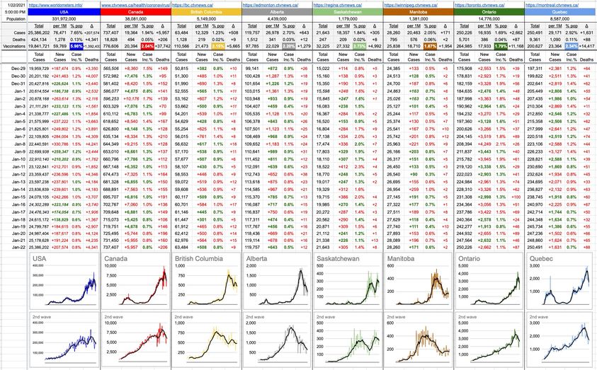
Did that decision cause an appreciable bump in case numbers? See below…
There’s little reason to keep the 2nd-Wave graphs logarithmic, so I’ve now made the Y-axes all linear. It shows a clearer idea of what’s going on. Also, for today, I’ve removed the Deaths and Hospitalizations graphs; it leaves more room for the numbers above… although the graphs below tell the same story.
If you look at the 2nd-Wave graph, there’s the big run up… and then it starts to slide downhill (downhill is good in this context). That downhill started in late November and kept a nice, consistent run down. Then it turned uphill again… about a week after New Year’s, right around the time those effects would be kicking-in. You can see a smaller version of that in Alberta, and a much bigger version in Saskatchewan; the new cases caused by the events of New Year’s.
Was it a catastrophic increase? Certainly not. Was it due to the liquor stores closing early? That’s probably a part of it, but by how much…? Your guess is as good as mine.
But what’s interesting about it is that if you remove the effects of Christmas and New Year’s, you can see where we’d likely be at… just remove the uphill part and slide whatever is to the right of it down. That’s easier to do visually, but the numbers tell the same story, and the implication is that we’d likely be seeing new case counts in the 300s, not 500s… and death counts in the single digits, not double.
These are the sorts of trade-offs we’ll be dealing with until this pandemic is over. Re-openings and softening of restrictions are all based on the risk/reward of doing so. Same with masks in schools and inter-provincial travel. There are strong opinions on both sides of all arguments… and yeah, it’s not rocket science… but they’re not easy decisions either.
18 Likes, 5 Shares
I started to lose faith in Dr Henry with that last-minute move at 3pm on Dec 30. There was no new data, she knew what NYE was going to look like & could’ve made that decision a week earlier. It showed a lack of foresight. It was particularly disrespectful to restaurants who had planned their evenings around her 10 pm liquor cut off and had little time to rejig weeks’ worth of planning.
WTF? Sure….. trash her…. look at the cases/million in Bc compared to the other provinces? She has to agonize knowing the consequences of a poor decision before attempting to put in place measure designed to SAVE LIVES and keep our health care system from becoming overrun? All the arm chair quarterbacks questioning someone of her background? Why dont you go get a degree? She has done a great job! Perfect? For sure not and she will admit it. But we have it great here compared to our cousins back east. Please just follow precautions, stay healthy and safe. This will pass if we all work at it.