Saskatchewan

October 13, 2021

The Great Divide; it keeps getting wider… and every day is happy to provide examples to suit whatever argument you wish to agree with. If we were ever all together in the same boat, drifting in the same direction… well, that’s over. The river forked, and some went this way and others went that way. Depends who you ask. And yes, geologists, sit down… I know, rivers don’t do that… but you know what I’m trying to say… just trying to symbolize the ever-increasing gap in people’s opinions.

Like… It’s almost over! The U.S. border will be open soon! The Canucks are playing their first regular season game in over 18 months in front of a sell-out crowd!

Or… todays Covid deaths… 38 in Alberta and 11 in Saskatchewan… are more than we’ve seen since January. There are so many critically-ill patients in Saskatchewan that they’ll be sending them to Ontario hospitals. Yeah, here we go again.

OK, so what’s the deal? Where the hell exactly are we? Is it heading towards being over? Is it heading for a fifth wave? Will it ever end? We had such High Hopes.

Pink Floyd has a song called High Hopes… from their 1994 album “The Division Bell.”
The song contains lyrics like “The grass was greener” and “The light was brighter” and “The taste was sweeter”. How things were. And where we hope we’re once again headed… soon.

An interesting thing about that song… the eponymous (“relating to the person or thing for which something is named”) Division Bell itself plays a prominent role. You can hear it on every 4th beat of most of the song. One-two-three-DING one-two-three-DING… and I don’t mean some little “next, please” chime or a little sleigh bell… I mean an actual gigantic bell, the sort you see in a belltower of a mediaeval church. The song starts with lots of bells, but then just settles on this one… keeping that 4th beat. Then comes the wall of sound… the drums, the bass, the guitars, the keyboards, David Gilmour’s voice… but, by the end of the song, all of that has faded away and we’re left with nothing but… yes, you guessed it. When I purchased tickets for that concert, I was hoping they’d have an actual bell on stage.

Sidenote… I stood in line all night for tickets to that concert… and bought the maximum 6 tickets when it was finally my turn. I think 4 of the 5 friends who came to that show with me back in 1994 might be reading this.

Anyway, I was not disappointed. Prominently occupying the back of center-stage was a gigantic bell, and it well-served its purpose for the final song of the night; there was a solitary percussionist whose only job was to hammer it every 4 beats.

The persistence of it… they symbolism isn’t difficult to grasp. It’s not subtle… it hits you like… well, like being clanged by a bell-hammer every four beats: It doesn’t matter what’s happening now; it’s temporary. It’ll fade. But what came before and what’ll come again; that’s permanence. You can almost hear the bell ringing from a thousand years ago and ringing a thousand years into the future. But here we are for the moment and, as per above, where are we?

Before we answer that, it’s worth answering “Where should we be?” All things being equal, this pandemic should be over.

Let’s remind ourselves about R-naught (“Rø”)… a number which, at the start of this pandemic meant everything. Rø measures the “spreadability” of a disease by calculating how many people, on average, an infected person is themselves infecting. An Rø of less than one means the disease is on its way out. An Rø of greater than one means it’ll continue spreading.

The original C19 had an Rø of between 1.4 and 3.9. The Alpha variant doubled that. And then the Delta variant came along and doubled it again, to somewhere between 5 and 9. For comparison, a seasonal flu has an Rø of 0.9 to 2.1. Measles has an Rø of 12 to 18. We are closer to measles territory than a conventional flu.

If we had vaccines and treatments and no variants, this might all be over. There is a direct correlation with respect to herd immunity and Rø… and it’s exactly what you’d expect; the more infectious the disease, the more people need to be immune to it to prevent it from spreading. The originally-thought herd immunity level for beating this thing was around 70%, and with an Rø of 3, that’s about right. But now, unfortunately, it’s far from being the case. With the Delta variant, we need to be approaching 90%.

Originally, good hand washing and masks and social distancing and restrictions were thought to be the key… and they were. Without vaccines, all of those things help tremendously in stopping the spread, effectively bashing down the Rø because they prevent the virus from spreading unchecked. The world provided some examples as to what happens when you let that native Rø run its course, and it wasn’t pretty.

So… instead of a quick end, what we got is a far more contagious variant… and far more vaccine hesitancy/denial/insanity than anyone could’ve predicted. Those two things very-effectively have served to extend this… and, in essence, convert it from a pandemic to what’ll ultimately be an endemic disease that’ll be with us forever.

OR…

Well, here’s a funny thing. Much like a broken clock is right twice a day, when the fanatical anti-vaxxers scream that the scientists don’t understand this thing at all, there’s one particular aspect where they’re right… and it has to do with the mysterious 2-month cycle of Covid-19. One example of nailing the broken clock is this:

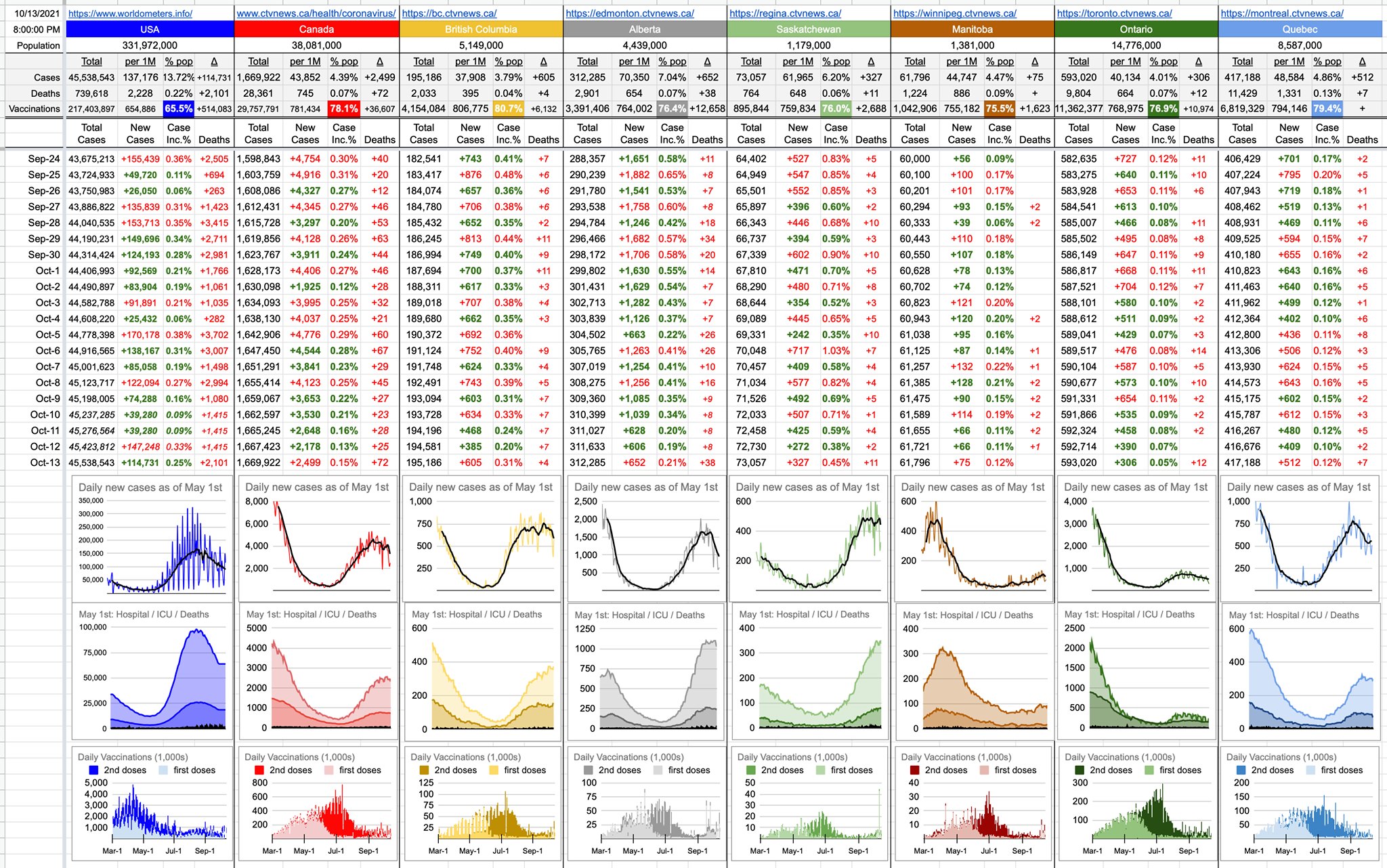
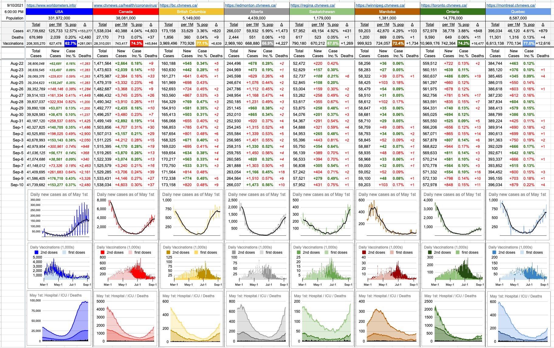
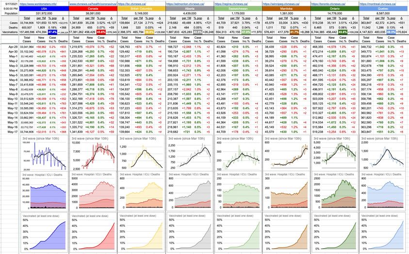
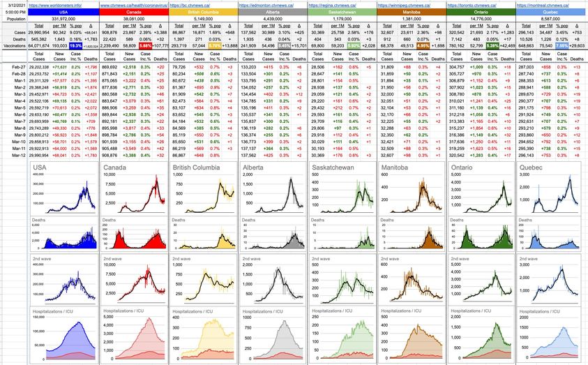
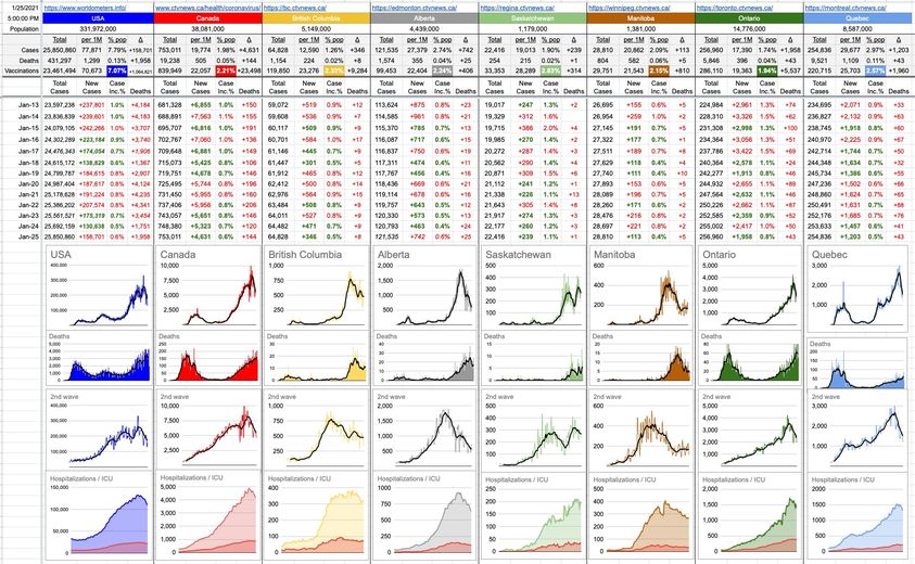
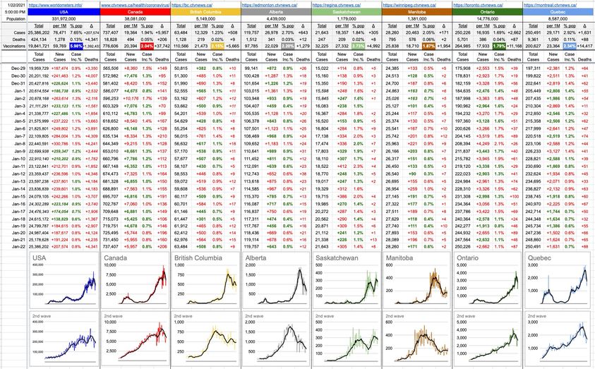
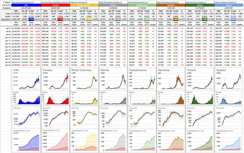
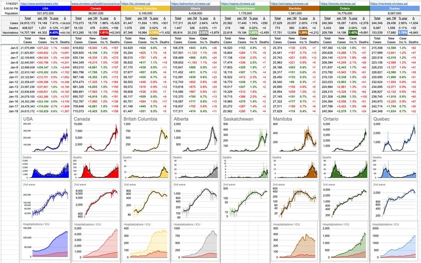
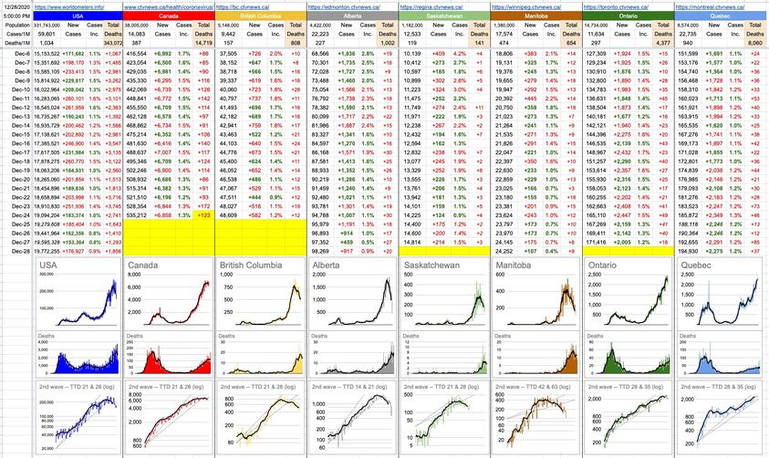
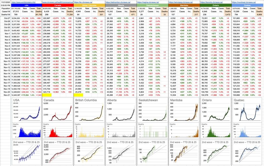
It seems, with some regularity, that when there’s a surge in cases, they seem to plateau after about two months and then drop off. Indeed, look at the numbers and pretty pictures and they all tell the same story. There’s a definite plateau off of the two-month surge, and in the U.S., who started down the path before us, a notable decline in new cases… 35% since September 1st. Indeed, worldwide, cases have dropped 30% since late August and when cases drop, so do hospitalizations and ICU admissions and deaths. The surge in ICU cases and deaths in Alberta and Saskatchewan today are due to the new case surges of two weeks (and longer) ago… but today’s new-case numbers are all, at worst flat, and, at best, a lot lower (more than 50%) from the recent past. Here’s a not-so-bold prediction: in a month, things in those two provinces (and Canada in general) will be looking a lot better.

Why is this happening? Nobody is too sure, because all of the variables have been written out of the equation. It’s warm, it’s cold, masks on, masks off, social distancing, easing of restrictions, vaccines. Whereas all of those things are treated very differently around the world, there’s a very evident pattern: Generally speaking, cases rose from February to late April, fell until late June, rose to highs in late August and have been falling ever since. In Canada, we were a little late to the party, so add a month to all of that. But the pattern is there. And so, Canada numbers will continue to go down, the border will open and Canucks fans will flood to Seattle for games and we will all be back to normal.

No, not quite… but given vaccinations and the pattern above, there’s reason to be optimistic. Those two things imply that the worst is over. And yes, it could change again. Pick an as-of-yet unused Greek letter, attach “variant” to it, and a frightening Rø, and you can throw the optimism out the window. There’s the other broken clock. We simply don’t know what we don’t know… and that’s why the bell keeps ringing, and will do so till the end of time.

Like the song ends, and like we might all be feeling, drifting with the current, destination time and place unknown…

With friends surrounded
The dawn mist glowing
The water flowing
The endless river
Forever and ever

Ding… ding… ding…

October 13, 2021

September 10, 2021

Hey… it’s been a while! So… sit back and relax, because this is going to be a long one. We have plenty to cover.

I’ll start by glossing over a bit of the current situation, because we’re all familiar with it, and although the numbers continue to provide a glaringly obvious message, there are those who refuse to look at them.

Depending where you look, you’ll find variations on the same theme… and they all say things like your chances with vaccines are not 20% or 60% better… it’s more like 2,000%… or 6,000%. Every single person in BC today in the ICU that’s under the age of 50 is unvaccinated. The vast majority of people in hospital are unvaccinated. We can talk about BC, Alberta, Ontario, Canada, California, Nebraska, Florida, whatever… it’s all the same everywhere; just a different multiplier, often based on vaccination rates. The numbers all range from quite significant to truly significant. There are no exceptions anywhere; the vaccinated population is way, way better off.

I’ve included the usual three rows of graphs, though the top one – the graphs of daily new cases – once, the most important graphs imaginable… are becoming somewhat irrelevant. Much more relevant is who got infected (Vaccinated? Unvaccinated?) and how it’s affecting them. The real numbers to look at (and the graphs that go with it) are hospitalizations and ICU admissions; the bottom row of graphs. There’s certainly a kick upwards, especially in Alberta and Saskatchewan, who are seeing levels comparable to back in May… but for the rest of us, it looks pretty reasonable and no reason to panic. Especially if you’re vaccinated.

In the last three days, the average daily number of C19 deaths in Canada is 34. Since the American population is about 9x ours, you might expect a death rate 9 x 34, which is around 300. But instead, it’s close to 2,500. And needless to say, largely due to overwhelmed hospitals way beyond capacity in jurisdictions with low vaccination rates. No matter how you slice the data, it all points to the same thing.

On that note, the daily vaccination rates show a significant slowdown. That’s the middle row of graphs. It hasn’t totally died out, but we’re nowhere near the rates of early July… though it’s picking up a bit again, and I have something to say about that.

There are a lot of people who’ve recently gotten vaccinated because of the “vaccine passport” that’s coming alive in 72 hours.

Side-note with respect to the rollout; I am an IT/tech/computer guy and I can be as critical as they come, especially when talking about deploying systems to massive amounts of people who’ll all use it simultaneously. I have a lot of experience in that, and I know it’s complicated, so I know what you have to plan for, etc… and so I have to say, Kudos to those involved with this thing. It certainly wasn’t without some initial little hiccups, but that’s to be expected when unprecedented numbers of people suddenly flood to it. In fact, if it hadn’t bent a little under the load, I’d be complaining they spent too much on it. It’s like building a 16-lane Lions Gate Bridge, 8 lanes each way… when it’s only needed for New Year’s Eve. Sure, you’ll never have traffic problems on the bridge itself, but just imagine Georgia St. or Taylor Way. What a mess it’d be without addressing them too.

And this thing has to not only be its own infrastructure, it has to communicate with varying other older systems and not flood them with too many connections and requests. The queuing system seems to have worked well; I jumped on it the moment I saw the url and found myself in a 17-minute line-up. That queue grew to over an hour at some point, and indeed, some people got 503 errors and gateway timeouts and whatever else. So what. Moments later, it worked. I have yet to hear about anyone who got past the queue and then had a problem, and that implies excellent design. Everything past the choke-point, that single point of failure… so far has been flawless. And, after all of that… at this moment, the wait time is zero and it’s likely to remain that way, even with the flood of people on Monday rushing to get it.

But let’s talk about those people who, today, would get a “No Record Found” if they tried to fetch their card.

For the last two years, there have been those people… well all know a bunch… masks are useless, vaccines are useless, conspiracies and so on. Now, perhaps having done some actual research and listened to some actual reliable sources, maybe they’ve come to the conclusion that getting vaccinated would be the intelligent thing to do. But how can they, without totally losing face? Admitting they’re wrong now would mean admitting they’ve been wrong all along, and that’s a tough pill to swallow. Some people’s egos just can’t take the hit.

Well… now they have the perfect out. They can proudly and loudly announce how they still feel vaccines are useless… but… they just want to live their life in peace and do things they want… so, they just got vaccinated and there’s their little blue vaccine card, and soon, after their second dose, it’ll be green. Yay!

And if you’re one of those people or know someone… yes, do it. Tell them to do it. Go for it. All of your friends and family who’ve been pleading to you to get vaccinated couldn’t care less about your justification, whether it’s the inward-facing or the outward-facing version, however different they may be. Just go get it done. Go right ahead and blame it on anything and everything else. It doesn’t matter. All of those aforementioned people will welcome your decision with open arms.

Looking back at where a lot of this anti-everything came from, and removing Donald Trump’s catastrophic contribution to the public sentiment, in hindsight, there may have been two things that might have “spun” better. Better “optics”. It’s not like pandemics have a PR department, but if they did…

For one thing, naming this a novel coronavirus initially convinced people that this is something new, unseen and a complete mystery. If instead they’d labelled it originally what it really is… a new version of something old, perhaps there’d have been a lot less hesitancy when the vaccines appeared. Everyone understands sequels. Remember SARS from years ago? Well, here’s “SARS 2: The Killer Returns”. And everything we’ve learned from the original SARS we can now put to use. This is not a new story; it’s a continuation of an old one. So instead of a brand new vaccine technology being quickly developed against a pathogen the likes of like we’ve never seen before, people might understand that it’s just a new version of a virus that’s been around for decades, being fought by R&D technology that’s also been around for decades. In Hollywood terms, that story certainly would’ve “tested better.’

That didn’t happen, and that lesson didn’t get learned, and then that skeptical crowd was met with “Vaccine Passports”. Once again, something new, untested and worthy of rebellion.

Calling it was it is – an immunization record – would also have “tested better”. We all already have an immunization record… with words like smallpox and measles and diphtheria and mumps and whatever else in it. We all have it and many of us have needed it. Some employers demand it. Some schools demand it. Some travel destinations demand it. All doggy daycares demand it too. There’s nothing new with immunization records… but you throw the word “passport” in there, and the implications of not having one, and the “Freedom And Rights!!1!1!!!1!!!” crowd shows up.

And on that note… if you think I’m going to voice my disgust at people who picket and protest outside of hospitals, insulting healthcare workers and blocking access for actual patients… I am, but that’s only part of it.

The other part of it is the symbolism associated with it. I happened to see among the pictures of the protesters a person wearing a little yellow star with “Not Vaccinated” written on it, where conventionally you’d expect to see the word “Jude’”.

Cultures these days are up in arms about appropriation. Here’s a cheap dreamcatcher for $5.99, available in the local tourist shop. It’ll look so cute in the window! Here’s a bundle of sage; take it home and light it and wave it around. That’s called smudging. Isn’t that cute? And Woke? We’re *so* Culturally Lit!!

Yeah, one can see how offensive that would be to people who understand the depth and significance of what those things really are. Their history. What they symbolize. What it meant to the people for whom it was intended.

So, let’s talk about that little yellow star. First of all, and this part of it isn’t so well known, that wasn’t the only Nazi-imposed oppressive symbol of The Holocaust. Red triangle? Communist. Brown triangle? Gypsy. Purple triangle? Jehovah’s Witness. Pink inverted triangle? Homosexual.

And for a brief moment, imagine the outrage from the LGBTQ community if that pink triangle were appropriated for this purpose. Idiots screaming about freedom, comparing it to the struggles of a community that’s been marginalized for centuries.

But they’ve chosen that little yellow star to complain about their lack of freedom, so let’s go with that. That little yellow star is indeed a striking symbol of lack of freedom. For those who had to wear it, it meant a loss of freedom, and depending on what year, it meant something different. From 1933 to 1945, at differing times, it meant the loss of freedom to travel. To go to school. To own a business. To operate a business. To own property. To have your own home. To own anything. And finally, to live… slowly and surely, those rights were eroded until there was nothing left. But really, at no point, did it have anything to do with being able to book a table at that sushi place in Yaletown where they make those awesome cube-like nigiri that they roast with a blowtorch. No… the Jews of the Holocaust weren’t worrying too much about stuff like that and, further, if the solution to their problems could’ve been solved by a disease-preventing inoculation, I can think of at least 6 million people who gladly would’ve taken advantage of it.

If you want to complain about freedoms being ripped away from you, talk to the women of Afghanistan. Hell, you don’t even need to go that far. Talk to the women in Texas… both groups of women who until recently had rights which were ruthlessly and unexpectedly ripped away from them.

So… I look at these despicable people marching with their ignorant, illiterate signs and their tasteless and inappropriate symbols… and here’s what comes to mind: Many years ago, I took a few law courses at VCC… a sort of evening-adult-education thing. It was more about getting familiar with some business law issues, but we covered a bit of criminal law as well. Interesting stuff. One thing I remember is the difference between assault and battery. Those two terms are commonly used somewhat interchangeably, but there is a difference… and the word assault is sometimes used incorrectly. Hitting someone isn’t an assault; that’s the actual battery. There doesn’t need to be any physical contact for there to be an assault… just inducing fear or threats or intimidation; that’s an assault. Of course, it’s hard to hit someone without there having been some element of those three things beforehand, so it’s often assault and battery combined.

Why do I mention this? I mention it only because, in my case, it’ll undoubtedly be both that I’ll be charged with if I see anyone wearing one of these little yellow stars… because I will walk up right up to them and rip the fucking thing right off their shirt or jacket while simultaneously punching them in the face. A very quick one-two.

My thinking is that it’d be so quick that there technically might not be time for it to be an assault. Just battery… for sure. Anyway, nitpicking… but I think everyone who knows me well would be surprised… that the guy who goes out of his way to shoo a fly or bee or even spider out of the house, instead of so-easily squashing them… would be the guy arrested for punching a protester in the face. Truthfully, I haven’t been in an actual fistfight since I was 10 years old. But I’m telling you right now – perhaps somewhat blowing my potential “moment of rage, no pre-meditated intent” defence: If I run into one of these people, they will need to visit the hospital to which moments earlier they’d been blocking access.

Well! You’ll either hear about me in the news… or I’ll be back here in due course with more to say; this has already gotten a bit long. Enough for now. Have a great weekend… till next time!

May 17, 2021

Encouraging local numbers today… and if you don’t like analyzing numbers, just look at the pretty pictures… specifically the B.C. one… which, in a nutshell, shows the rise and fall of the 3rd wave. Our numbers these days are exactly where they were at in early March, when things started to go sideways.

And, actually, not sideways… just up… sharply. But as you can see, as quickly as they went up, they’ve come down. That little plateau was in the second week of April, and it’s been downhill (in the good sense) ever since then. What’s going up sharply these days is the temperature… and vaccinations.

Looking across the country, as it turns out, nobody has managed this third wave as well as B.C. Quebec would be a close second though; their worst is over and they’ve slid down to the bottom of their own hill.

Alberta has turned the corner, but has a ways to go. Saskatchewan as well, though slower… but Manitoba is still arguably headed in the wrong direction; really not sure what happened there, but this week will tell a lot.

And Ontario… certainly headed in the right direction… their daily numbers and their average is lower… but it’s still wildly volatile and it always feels like they’re near a tipping point. Aided by warmer weather and lots of upcoming vaccinations, their worst is also likely over.

I don’t want the maritimes and the northern territories to feel left out… all looking good.

Locally, nothing will change before the May long weekend… but, by then, we may be poised to see some significant relaxations. Don’t hold me to it; I don’t make the rules… but given all of the above, given what we’ve learned in a year, given where we are with vaccinations, given what we now know about the colossal difference in risk between indoor and outdoor gatherings, given that we know it’s a tiny number of people who infect lots of others.. not everyone infecting one or two others… given all that, it wouldn’t be difficult to put some rules in place that really open things up in an effective way.

To be honest, they would’ve done it already if they could count on people sticking to the important parts. Like, golf? Out golfing with friends? Risk of transmission on the golf course… near zero. Risk of transmission on the 19th hole, downing a pitcher of beer? Much higher. Can we count on people to play a round of golf, but then not spend three hours in a crowded, poorly-ventilated pub? This is where the give an inch/take a mile issues come into it, and managing that, going forward, will be the bigger challenge.

March 12, 2021

Our last dose of local numbers until Monday, and, as usual, they tell a mixed message… hospitalizations up by 11, ICU cases down by 1. Case numbers rose by 648, the largest one-day jump since Janurary 7th. But also, nobody died of C19 in the last 24 hours… which hasn’t happened since November 5th. As per yesterday’s post, it depends how you look at it. You’ll find disagreement with respect to what it means.

On the other hand, it’s rare for Republicans, Democrats, Liberals, Conservatives, the NDP… pretty much everyone… to all agree on something… but there’s a topic that keeps coming up twice a year, and I have never heard anyone speak in favour of it. Everyone is opposed to it, yet it’s still around… and all of the aforementioned have the power to once and for all to deal with it, but for some reason simply haven’t.

Wouldn’t we all be a lot better off without the constant, biannual Daylight Savings nonsense? Pick one or the other and just leave it there… and by the way, the right answer is to leave it ON – when we move our clocks forward tomorrow, that is the setting they should stay on… forever.

Are you getting up at 4:30am to spread manure on the fields? Me neither. What a load of crap. But what’s ironic is that, unlike what we’ve all been hearing forever, it was not the farmers that wanted DST… they initially opposed it. Saskatchewan is effectively all farms, and they’ve never been a part of this nonsense.

DST was created during WWI as an effort to conserve fuel. In fact, it was the Germans who came up with it… and much of the world involved in WWI went along with it, the U.S. and Canada included. And although most of North America and Europe still does the clock flipping, the rest of the world has abandoned it… or never did it in the first place.

Studies have repeatedly shown that when you stop screwing around with the clocks twice a year, there are reductions in crime, depression, childhood obesity, energy consumption and car accidents. Economic activity goes up… and, might I suggest, the next 6 months will be wonderful with the extra hour of afternoon sunshine… but, after that, just in time for Winter comes the flip back, and 5pm darkness… wouldn’t every single economy benefit from that one extra hour? No more flipping back. Nobody is getting up early to go have breakfast on a patio somewhere at 6:30am… but all the pubs and restaurants would love an extra hour of “afternoon/evening crowd.”

Like I said, nobody likes DST. The issue seems to be that unless everyone decides this in unison, it’s problematic. I take it for granted that L.A. is the same time as us, and that Toronto and New York are three hours ahead. I don’t ever want to have to devote a single brain cell to that calculation. It’s already annoying enough for places that flip the opposite direction, and now, at different times. Sometimes Chile is 3 hours ahead… sometimes they’re 5 hours ahead. On paper, they’re supposed to be 4 hours ahead but it’s rarely the case because both places are haphazardly moving their clocks back and forth.

Enough already. It’s time for a change. Or not, I guess.

16 Likes, 2 Shares

January 25, 2021

A year ago today, a man who’d recently returned from Wuhan, China, wasn’t feeling well… and wound up at Toronto’s Sunnybrook Hospital, where he became Canada’s first test-positive C19 case.

Hearing that this morning made me think back… what was I doing at the time? Thanks to modern technology, it doesn’t take much to scroll back through recent history.

A year ago last night, I was at the Chan Centre watching my talented nephew, acting in a very engaging and entertaining theatre production. It was excellent, and so, appropriately, the venue was jammed.

A year ago today was a Saturday, and, at 10am, we were back at UBC — at TRIUMF this time — for a couple of lectures. One was about earthquakes – the famous impending “big one” that will hit the south coast, sometime between tonight and 500 years from now. The other was about black holes, cosmic collisions and sensing gravitational waves. Takeaway: If a large earthquake shows up off the south coast, don’t be in Tofino. And, I guess, if a black hole shows up off the south coast, don’t be in Tofino either… but you won’t have much too time to worry about it.

These lectures are super-interesting if you’re into this sort of thing, so, accordingly, it was crowded. Sold out in fact. So sold out we couldn’t get tickets online, and just crashed the venue, hoping we could sneak in. The tickets are free, but seating is limited; fortunately, some people didn’t show up and they let us in.

The kids were there too, and perhaps it took a bit of gentle bartering to get one of them there as well, because we wound up going out for dinner that night, to Kobe. Kobe is excellent, and always crowded as well; you end up sharing a table/cooking surface with complete strangers for a couple of hours.

Talk about taking stuff for granted. Three very different things, but all had one thing in common; hanging out in close proximity with strangers… and thinking nothing of it. That’s how it was.

So, what’s happened in that one year… today also marks another milestone; today, the world went over 100,000,000 known C19 cases. There have been over 2,000,000 deaths. There have also been over 72,000,000 recoveries. In Canada, more than 750,000 cases came after that guy.

My prediction was that here in Canada, we’d be seeing the worst of this pandemic… right about now. Now would be the time when the gradual decline would begin, and while it’d take a long time to snuff it out in due course, it’d never get worse than what we’re experiencing now.

This completely-non-professional opinion was based on the confluence of a few things, but primarily, it’s this: any negative effect that would’ve been caused by the holiday season would now be known and we’d be in the midst of handling. Whether they were supposed to or not, people got together over the holidays. Some of them passed on infections, etc… so how bad was it? Well, it definitely caused a spike, but if you look at the graphs and numbers, things are clearly trending favourably. Couple that with the fact that there are no large family-gathering-type holidays any time soon… and given that vaccines are every day making slow but steady progress into bloodstreams… and that the majority of people and businesses are still towing the party line… put it all together and, optimistically, the worst is behind us. That being said, who could’ve predicted newer mutations that are more virulent, and which could possibly lead to more cases. The answer to that question is epidemiologists… and they did.

We’re far from sounding the all-clear, but the numbers and pictures at the moment tell a cautiously-optimistic story; declines everywhere… ranging from steep (Alberta, Manitoba, Quebec) to moderate (B.C) to mild (Ontario, Saskatchewan)… but the entire country is trending in the right direction. For now.

Today’s versions of cool lectures, theatre productions, and restaurants look nothing like what they did a year ago. There are online and socially-distanced versions of all of that, but they’re nothing like the real thing. A year ago we had the real thing… and every indication is that a year from now, we’ll have it again.

34 Likes, 4 Shares

January 22, 2021

I’ve written about queueing (Oohh! Five vowels in a row!) theory before, but sometimes you don’t need the fancy theory and rocket-science math that goes with it… sometimes, you just need common sense to understand what’s going on.

Example… I own a retail store. I’m open 10 hours a day, and I typically get around 600 customers a day. Conveniently, the math is easy… on average, that’s 60 customers an hour… one per minute.

What happens if I decide to close 3 hours early? Assuming all those customers want their stuff, and they’re all going to show up… now I’m facing 86 customers per hour… a 43% increase.

On Dec. 24th, around 42,000 people showed up a B.C. Liquor Stores. One might expect around the same number of people might go shopping on New Year’s Eve, and one would be correct… it turned out to be around 41,000.

The big difference, of course, is that the window of time they had to do so got shrunk by 3 hours, thanks to an unexpected announcement that materialized the previous day. All liquor sales to end by 8pm, announced Dr. Henry, much to the surprise of everyone… and the panic of those who worked that day, and had planned to swing by in the evening. Ultimately, I assume everyone got their booze… one way or the other; traffic was up 188% in those last few hours.

That part of it did not catch anyone by surprise; certainly not the people who make the decisions. It’s easy to understand what they were weighing: Upsetting a lot of people and having some crowded liquor stores… or having a repeat of Halloween downtown. They voted for the former, knowing full-well there’d be a rush inside those stores… but also knowing there are safeguards and mask policies and all the rest of it… and that the risk of trouble was higher in uncontrolled crowds.

Did that decision cause an appreciable bump in case numbers? See below…

There’s little reason to keep the 2nd-Wave graphs logarithmic, so I’ve now made the Y-axes all linear. It shows a clearer idea of what’s going on. Also, for today, I’ve removed the Deaths and Hospitalizations graphs; it leaves more room for the numbers above… although the graphs below tell the same story.

If you look at the 2nd-Wave graph, there’s the big run up… and then it starts to slide downhill (downhill is good in this context). That downhill started in late November and kept a nice, consistent run down. Then it turned uphill again… about a week after New Year’s, right around the time those effects would be kicking-in. You can see a smaller version of that in Alberta, and a much bigger version in Saskatchewan; the new cases caused by the events of New Year’s.

Was it a catastrophic increase? Certainly not. Was it due to the liquor stores closing early? That’s probably a part of it, but by how much…? Your guess is as good as mine.

But what’s interesting about it is that if you remove the effects of Christmas and New Year’s, you can see where we’d likely be at… just remove the uphill part and slide whatever is to the right of it down. That’s easier to do visually, but the numbers tell the same story, and the implication is that we’d likely be seeing new case counts in the 300s, not 500s… and death counts in the single digits, not double.

These are the sorts of trade-offs we’ll be dealing with until this pandemic is over. Re-openings and softening of restrictions are all based on the risk/reward of doing so. Same with masks in schools and inter-provincial travel. There are strong opinions on both sides of all arguments… and yeah, it’s not rocket science… but they’re not easy decisions either.

18 Likes, 5 Shares

January 19, 2021

OK Saksatchewanites/Saskatchabusihes/Saskatchawenians… you now have your hospitalizations graph… thank you to my friend Richard for providing that data in a usable form. But today, let’s talk about the opposite of that… the opposite of needing to go to the hospital is what’ll prevent the vast majority of us from doing so… and that is… vaccines. And there is news to report.

The headline I read screamed, “Thousands of Israelis Tested Positive for Coronavirus After First Vaccine Shot!!!!!” – the exclamation points are mine, but the rest is verbatim… and while that sounds like a disastrous claim, it’s not. If the headline is meant to grab everyone’s attention, it works… but, as usual, there’s more to the story. Let’s dig into the numbers a bit.

First of all, part of the reason Israel managed to get so much vaccine ahead of everyone else is that they were willing to be, in essence, a test-bed for what it would look like to distribute the vaccine through a first-world technologically-capable infrastructure and collect as much valid real-world data as possible… straight from the source. As previously written, many other places who’ve had vaccines long before Pfizer/Moderna came around (China, Russia) have been putting out numbers… which, for numerous and valid reasons, are met with skepticism. But here we have accurate data, so what does it tell us…

Some 12,400 Israelis tested positive after being vaccinated, and, among them, 69 who’d been vaccinated twice. That first number sounds big, but that’s out of 189,000 people – which amounts to 6.6% — an efficacy of 93.4% — which for any vaccine is off-the-charts successful, and is almost bang-on with the expectations of ~95%

Digging a little deeper into the numbers… 100,000 people were tested a week after getting the vaccine; 5,438 were found to be positive… a 5.4% infection rate. A different set of 67,000 people was tested in the 8-14 days-after period, and 5,585 tested positive… 8.3%.

People were also testing positive more than two weeks after getting the first dose, but in declining numbers as time went on. Immunity is meant to start ramping up in days 15 to 21, and that’s reflected in declining positivity numbers… especially after the second dose.

It should be noted that there are other relevant factors; the majority of those who’ve received vaccinations are over 60, and it’s well-understood that people’s immune systems erode as they get older. Flu shots, for example, are less than 60% effective in those 65 and older… as compared to 80% to 90% for those younger than that.

With the Pfizer vaccine, for what it’s worth, 102 employees at one particular medical center were tested a week after immunization. It was found that 100 of them had antibody levels 6 to 20 times higher than the previous week.

In summary, the vaccine works well. Very well. It’s not perfect, because 95 does not equal 100, and its effectiveness varies on numerous factors; some people are simply far more susceptible to infection, and age is one of those contributing factors. At the end of the day, the idea is to get to herd immunity, and that’s achieved when enough people are immune that they’ll protect those who aren’t – and, possibly, who can’t be. By far, the quickest way to get there is through vaccination.

That’s the plan currently being rolled out across the planet, with varying degrees of success; get the shot into as many people as possible, while carefully following the results to make sure they’re in-line with what’s expected. With Israel leading the charge and making available all the data… from what we can see so far… so far, so good.

40 Likes, 5 Shares

January 18, 2021

You’ll have to pardon me; today was data “catch-up” day, so this is all just fact… and very little “interesting” opinion. And if you won’t pardon me, I’m sure I can convince the soon-to-be-former president… he seems poised to hand them out like candy.

So… I took the opportunity to add a whole new row of graphs (the bottom row); a visual look at hospitalizations and, included within that (overlaid at the bottom, in red), the ICU numbers as well. At a glance, B.C.’s hospitalization numbers are pretty flat over the last little while, hovering in the 350 rage. ICU cases today are at 68, which is down slightly over the recent past… as evidenced by the gradual downslope of the red ICU part of the graph. Alberta’s hospitalizations are down as well, as are their ICU cases.

On the unfortunate flipside, Ontario and Quebec are still seeing slow and steady growth on both fronts.

If you follow these graphs closely, you might notice that the Time To Double (TTD) lines are gone from the 2nd-wave graphs. I’ve been writing and describing and fiddling with TTD numbers and graphs since day 1 of this, but given the numbers, they’re not needed. That’s a good thing, from the point of view that things aren’t growing exponentially. Let’s hope the growth in cases remains, at worst, relatively linear… and then we never have to see those lines again. To be clear, case numbers are still growing in many places, but the rate of growth (at least, for the moment…) is not of the scary exponential sort.

My profuse apologies to the Saskatchewanians (Saskatchewaners?) who are looking at that big space where a graph should be; I couldn’t find the data in a usable form… but will keep looking around.

36 Likes, 4 Shares

By |2021-01-20T10:58:45-08:00January 18th, 2021|Categories: COVID-19 Daily Report|Tags: , , |2 Comments

December 28, 2020

Here’s an interesting fact that means nothing but is an interesting coincidence… the vast majority (ie. 49 out of 50) U.S. states are mostly south of us. South of what? The 49th parallel. Forty-nine states are south of the forty-ninth parallel. Yes, I’d never realized that. Yes, Puerto Rico would like a word with me. Yes, it’s spelled forty, not fourty… even north of the forty-ninth.

Comparisons to our neighbours (not neighbors) to the south get made all the time, and this pandemic is no exception. “At least it’s better here than in the states” is often heard, and it’s true… but that’s not a great comparison, because nobody on the planet is doing worse than the U.S.

But apples-to-apples, exactly how do we compare? Where would we fit in?

If you look at the daily new cases per million (DNCpM) of population for each particular state or province, here’s how it looks…

First of all, similar to how difficult it is for Canadian musicians to establish themselves in the American market, pandemically-speaking, we haven’t cracked the Top-40… not even close. If Quebec, our worst-performing province, were a U.S. state, it’d barely make the Top-50… being out-performed only by Washington, Oregon, Vermont & Hawaii.

The worst three states have DNCpMs that look like this:

California: 985

Tennessee: 927

Arizona: 800

North of the 49th, it’s this:

Quebec: 265

Alberta: 235

Saskatchewan: 152

For comparison, B.C. is 58

So… 50 states plus 10 provinces plus 3 territories… bundle them all together and what do you get? With the exception of a little bit of overlap in the 48 to 52 range, the U.S. occupies the entire top of the chart, and Canada, the bottom. You can literally draw a thick line through spot 49 and it would cleanly separate the two countries. Another interesting yet meaningless coincidence.

Except it’s not so meaningless… especially because while these numbers are an interesting snapshot today, they will soon change, possibly rather drastically as news arrives that the far-more contagious U.K. variant is here. We’re not exactly sure when it flew into town, though likely Dec. 15th… but it’s arrived, and undoubtedly the Boxing Day crowds (including the one-hour-plus lineups to get into the airport’s shopping mall) aren’t going to help things.

The numbers are expected to go up anyway, but this 70%-more-contagious curve-ball will likely affect the models. By how much…? Good question. We’ve talked about how it takes just one person… it was one person who flew in from the U.K. that brought it into B.C. It was one person who flew in from the U.K. and did not follow the quarantine protocol in Ontario and then gave it to a couple there. That’s all it takes, and now it spreads like wildfire.

Everyone is tired of hearing it… but, unfortunately, it’s true. Not following the simple rules has far-reaching consequences. This soon-to-be rapid spread… the one that that will unfortunately push Ontario and B.C. up the charts… is more than just coincidence.

23 Likes, 1 Shares

By |2020-12-28T17:03:34-08:00December 28th, 2020|Categories: COVID-19 Daily Report|Tags: , , , , , , , , , |3 Comments

Day 250 – November 21, 2020

No B.C. numbers today, but here’s a brief look elsewhere…

Parts of Ontario (Toronto and Peel) are in a lockdown of the sort we saw around here at the start of this pandemic. Very tight constraints with respect to with whom you can get together, and strict rules around what that needs to look like. Everything else is pretty-much closed, except the essentials.

Saskatchewan saw a huge increase in numbers today, something they saw coming; measures were put in last week, but they’re now dealing with the effects of what came before. As we know, it can take a couple of weeks to realize the effects of these measures.

Alberta also set its record for new cases in the last 24 hours.

Today’s lesson in exponential growth comes from Nunavut… where, for the longest time (like till November), they’d seen zero cases. They got their first one Nov. 6th… their second one Nov. 7th… and then two more Nov. 8th. Then 8, 18, 26, 60… and they’re now over 100. Their graph is not a gentle slope or a hockey stick… it’s a literal cliff wall which they slammed into, after 7 months of flat road. That’s how this thing can take off.

In the spring, it was all about flattening the curve. For those late to the game, like Nunavut and Saskatchewan, where they never got a first wave, that’s where they’re at.

For places like Ontario and Quebec, it’s not just about flattening the potential frightening growth… it’s that the numbers, as flat as they may be (which they’re not) are already really big.

What’s worse… if you have 100 hospital beds available… to see cases go from 2 to 8 to 20 to 50 in a few days? Or to see them go 98, 99, 103, 98?

The answer is… it depends… on what measures are in place. Drastic measures are needed in example A, but example B is just as frantic, because it’s evidence of a problem that’s stressing the limits and that’s not going away unless something is done about it. Roughly speaking, example A is Nunavut and example B is Ontario.

The rate of growth is interesting to look at, on an apples-to-apples basis. I’ve added Time To Double (TTD) lines to the provincial graphs, and I’ve set them all (for now) to 20 and 25, so you can compare the data against those straight lines… and across provinces. Don’t worry too much about where those lines cross, just look at the slope of the data compared to the TTD lines. B.C. and Alberta are examples of consistent growth… you can see the recent growth is virtually parallel to the TTDs of 25. And at their steepest recent points, both Saskatchewan and Manitoba had recent TTDs approaching 10.

You’ll notice that Quebec and Ontario are a lot flatter. Indeed, their TTDs are 50 and 77 respectively. Their issue isn’t so much exponential growth… it’s just that any growth is already putting pressure on a system that at some point won’t be able to handle it.

Follow & Discuss on Facebook

Go to Top