Data

Day 83 – June 7, 2020

Air travel has obviously been radically affected by this pandemic, but before everything went all to hell, it’s interesting to note that typically, there are so many planes (tens of thousands) flying around at any given moment, that it’d actually be impossible to ground them all; there’d be no room to park them. We caught a glimpse of that post 9/11 when, for a week, all air traffic over North America was stopped. Airports turned into giant parking lots — YVR was one of them, the taxiways and runways littered with an eclectic collection of livery. Another one of them was Gander, Newfoundland… a town with a population of around 10,000 people… and an airport that’s well-suited to emergencies, being the closest point between the U.S. and Europe… so when the call came in to every plane, “Get down now… anywhere… closest airport… NOW.” — every plane over the Atlantic, headed to the U.S… or every plane that had just departed, heading East… all of them set a course for Gander. The population of Gander almost doubled, for a week, when 38 planes carrying 6,700 people suddenly showed up.

And for a week, the air was clear — far clearer than it’d been for many decades, and it was an opportunity for scientists to gather data… to gather data that otherwise would never have been available. That was a very steep price to have paid for that data, one nobody would have wanted to pay. But since the opportunity presented itself, it obviously made sense to take advantage of it.

There’s the old saying… today is the first day of the rest of your life. And these days, until there’s a cure for this virus, today is also always the beginning of these rolling “5 to 14-day windows” where we get to see the after-effects of our activities.

We’ve come to learn a lot about the transmission of this virus, and how enclosed spaces for prolonged periods of time are a much bigger issue than being outdoors, being distant, and picking up the virus off a contaminated surface. Not to say that some of those things don’t pose a risk; they all might, but it differs… and effectively, the more exposed you are to the virus, both in time and volume, the worse it is.

The numerous protests going on around the world are a good example of these rolling windows, and everyone is keeping a close look at the outcome. It’s not an ideal experiment, but there’s plenty of data that’ll be made available; possibly very expensive data, as per the post-9/11 air quality numbers. In this case, the guinea pigs aren’t air particles… they’re human beings who decided to throw caution into the wind. While there are Covid-responsible ways of protesting… masks, outdoors, socially distanced… many people said to hell with it. We’ve of course seen many maskless crowded protests already anyway, so what’s the big deal?

Well — there will eventually be answers to that rhetorical question. George Floyd was murdered on May 25ᵗʰ, coming up now on two weeks. It’s hard to judge what effect the protests around the U.S. (and Canada) have had, especially south of the border where numbers weren’t slowing down to begin with. So, to be sure, they’re still rising… but are they rising faster than they otherwise might have? And to throw more variables into it, openings have been taking place in many different cities and states; how much is that contributing? Washington State was doing pretty well, but they had a significant spike a couple of days ago… a week after many new openings. Coincidence? Just a spike, not a trend? Time will tell.

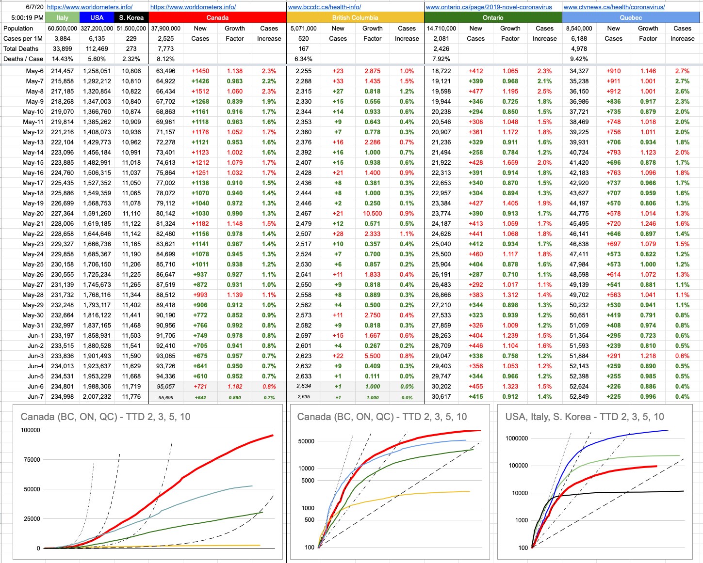
Around here, time will tell as well — for now, it’s two straight days without real data… tomorrow’s update will backfill Saturday and Sunday.

View Original Post and All Comments on Facebook

Day 60 – May 15, 2020

“Collect as much data as you can for now.” — this is a mantra that is common in many different disciplines, especially the ones where you’re not sure what data matters. One day, you’ll have a chance to look back on it and figure out what matters, but for the most part, especially initially, the thing to do gather as much as you can, and eventually learn from it.

“Eventually” could mean decades from now. It could also mean tomorrow. In fact, it could even mean 15 minutes from now. On that note, as you’re reading this, somewhere, on the periphery of your focus, there are ads and sponsored posts and other slight differences that are being thrown at you; an experience that will differ slightly for someone else. Some of it is based on your history, but some of it is just data collecting… like, does it work better to use this ad or that ad? Does it work better in red or green? Does it work better positioned here or there? This data is all being crunched, often in real-time — to deliver to you the most pleasant experience possible. Haha, sorry, not quite — to deliver to you the most profitable experience for someone… is the better answer. Facebook is worth $500 billion, and their revenue stream has to come from somewhere, since 99.999% of the people who use Facebook have never given them a penny… so, rest assured, those who are paying want to make sure they’re getting their maximum bang for the buck.

And, of course, an awful lot of data is being collected about this virus, and there are disagreements about what’s important. As per above, it’s always a good idea to gather it all and then figure out later what matters and what doesn’t. Sophisticated modelling techniques do this all the time. For example, a neural network. That sounds a lot fancier or scarier than it really is. It’s not some sort of artificial brain which can think for itself, become sentient and launch an attack on humanity… rather, it’s just software for taking a ton of data, much of it possibly unrelated, and grinding through it in such a way that it “learns” what inputs are relevant to outcomes, and which are noise. A properly trained neural network can be very useful for predicting outcomes that a person may not as easily see, because it’ll have filtered out the irrelevant aspects and focused only on what makes a difference.

A simple example would be trying to train a neural network to predict the outcome of horse races. This is a project that as been on my “to-do” list for about 30 years, and perhaps if enough horse racing returns soon, and I’m still locked up at home, I’ll finally have a chance to work on it. And I will tell you exactly what I plan to do, and what I hope to find. The first thing is to take tens of thousands of historical races and format the data in a way that it can be fed into a neural net. Then, it will grind away on it, “learning”… and I would assume it’ll find a high correlation for specific horses with respect to things like fractional quarter-mile times, weight carried, relative class of opponents and track-surface-conditions. It’ll find a low correlation with things like the name of the horse, what time the race was run and what day of the week it was. That’s the beauty of the neural network; just throw all of the data at it, and let it figure out what matters. It might figure out correlations for specific horses… that even the most astute handicapper or sharpest bookie might miss.

I know a lot of people reading this are thinking whoa dude, that’s pretty cool. Yes, it is… it would be. I’ll keep you posted.

More relevant to all of us are our local numbers, and there are many to look at. We are on track (haha!!) for opening things up soon, and, at least around here, it makes sense. It’s been a while since I’ve talked about “Time To Double”, so let’s look at that a bit. The graphs below don’t do justice entirely to where we’re at, because TTDs when presented in this fashion becomes a “lagging” indicator. Things are better than what those graphs imply, if you’re looking at the TTD lines.

Recall, back in the day… like back in March, which seems like it was 20 years ago… we were looking at some scary TTD numbers. The new-cases numbers were increasing by about 25% day-over-day, a TTD of about 3. Scary exponential growth.

If we take some averages of the last 5 days of confirmed new cases… the TTDs and percentages look like this:

B.C.: 130 (0.53%)
Ontario: 43 (1.63%)
Quebec: 37 (1.89%)

Canada: 44 (1.62%)

These are obviously very-flattened curves, compared to where we were.

I am well aware of the people standing up screaming that those numbers aren’t real. Have a seat, and let’s discuss the obvious. Of course not. There are more, and have been more, cases than we’ve “known” about. We will in due course know how “off” we were… like is the real number 10x that? 100x? 1,000x? I’d love it, if it were 2,000x because that’d mean we’ve all been exposed to this, and if you believe that gives you immunity (and that seems to be the case with coronaviruses in general), we’d be in great shape. That number is way too big, but while I’m here, in an effort to make numbers and guesses and projections more accurate for all of us, I urge you all to visit the bccdc dot ca site and take the survey. You may even get a serological antibody test out of it.

Inaccuracy of those particular numbers aside, there are some concrete ones which are indisputable… hospitalizations, ICU cases, “pressure on the medical infrastructure” and excess deaths… to name a few of the most critical ones. These numbers vary wildly around the world, but they’re the best indicators, along with new cases, to indicate how close jurisdictions are to phasing-in re-openings. At least around here, those numbers look good… good enough that we’re marching ahead to the next phase.

View Original Post and All Comments on Facebook

Day 48 – May 3, 2020

In 2012, I was in L.A. to visit a movie set. The hotel was in a nice part of town; the set, perhaps not so much. I ordered an Uber, and a black SUV showed up. The destination (call it “Z”) was already entered into the app, so off we went. It was interesting to note that this driver had his car set up with at least four different phones or devices dangling from the windshield and dashboard. Uber, Nav, Music, actual phone… I don’t know.

But at one point, one of them went out of sync… and he asked, “I thought we’re going to Z”
“That’s right”, I replied.
“Well… this says we’re going somewhere else”

Odd.. some glitch… one of his devices was pointing to some location maybe 20 blocks away from Z. Call it X.

“No… not sure why. It’s Z”
“OK, because I can’t take you to X”
“No worries”

Curious though… so I asked…. “Just wondering, why can’t you take me to X?”
“Sir, I can’t take you to X”
“I understand, and we’re not going to X… I am just wondering what’s the big deal with X and if I wanted to, why you wouldn’t you take me there?”
“Sir, I told you, I will not take you to X”
“I don’t want to go to X. I want to go to Z. I am just curious… if I wanted to go to X, why wouldn’t you take me?”

He pulled the car over.
“I can’t take you to X. I can drop you here and you can find another Uber”
“I don’t think you understand. I don’t want go to X. I’ve never heard of X. I don’t know where or what it is. I am simply wondering what’s so bad with X that you wouldn’t drive me there”
“Sir, you’ll have to get another Uber”

We sat there for a moment, me trying to figure this out. This wasn’t a language issue; he spoke English perfectly. This was just a guy that couldn’t wrap his head around a hypothetical situation. Those two words, which are my favourite when put together… the two words that have led to all of the innovation that’s ever happened in history, when posed by somebody…”What if…” — this guy couldn’t process it; there seemed to be no version of “What if” in his world. I sat there imagining what it might be like to be playing chess against this guy. He moves a piece, you take it. “Oh, darn”. He moves another, and you take it too. “Oh, hmm, you’re good at this”. Well, I’m ok, but it sure helps that I can think ahead more than zero moves. Like I can propose a hypothetical situation in my mind, evaluate it, do that several times and come up with something useful.

But this guy… he just didn’t get it. And maybe he couldn’t.

“Yeah, ok, forget X. Let’s just go to Z”.

And off we went. But there was no more conversation after that, and as much as I really wanted to, I didn’t ask him the same question for the 10th time when we finally arrived. What was the point? He wouldn’t get it. And further to that, I guess the conversation bothered him, because my Uber rating dropped from a perfect 5 stars down to 4.92 after that.

I remember another time a friend sent around an email, asking us to answer a few simple math questions, and explain how we did them in our head. His son was having trouble with math at school, and he was looking for different ways of explaining things. Like, what’s 9+9. I was so surprised to see some answers that came back. Like, for me, it’s just 18. I just know that. But some people were saying… add 1 to each 9, that makes 20, then subtract 2. In their head, they were doing (9+1)+(9+1) – 2. Or 15+8, which for me is just 23, was somehow turned into (15+5)+3 for one person, and (15+10)-2 for another.

There’s obviously nothing wrong with thinking differently. Whatever works for you. But what happens when it doesn’t work?

This was brought to light (and it reminded me of these two examples) by a friend who commented on a recent post of mine, the one about Covidiots. That maybe calling them that was a little harsh; that maybe they not only don’t know any better, but perhaps they *can’t” know any better. Like it’s actually beyond them. There’s possibly some truth to that, and since I’m the biggest proponent of letting people live their lives with freedom and their own particular pursuit of happiness, what’s the big deal… the usual golden rule of “do unto others as you would have them do unto you” is actually a bit better if you change it slightly: “don’t do unto others as you wouldn’t have them do unto you.” It’s better because instead of imposing on others what you think is right, this un-imposes anything on anyone, as long as it’s not hurting you.

But that’s the thing. A bunch of people ignoring intelligent, well-thought-out and proven directives… has the potential to affect us all — drastically, and we’re no doubt going to see the results of it in different places.

The state of Oklahoma is opening up; they think they’re in a position to handle things, and reading their planned phase re-opening, I guess it might look good on paper. Oklahoma has a population of 4 million, compared to B.C.’s 5 million. They also have twice as many confirmed cases and twice as many deaths. They’ve already opened up hair salons, barbershops, spas, nail salons. Two days ago… restaurants, movie theatres, entertainment venues, gyms, spotting venues… the list goes on.

In trying to balance out the greater good of business vs. public health, the officials in Oklahoma made it mandatory for clients of the aforementioned businesses to wear masks. As we know, wearing a mask protects others more than it protects you, and it would make sense for the benefit of the workers of all these places that people wear masks. If they’re going to be subjected to hundreds of people, their safety needs to be taken into account.

That mandate lasted about 3 hours before it had to be lifted… as threats, violence and guns all made appearances… as a lot of people who perhaps aren’t quite clear on exactly what the constitution of their country actually says, protested that their rights were being violated. What’s becoming abundantly clear is that there is a group of people incapable of understanding. Their preconceived notions and/or brainwashing seems to preclude any sort of rational thinking. And it’s also clear that there will never be a way to convince them. And that, unfortunately, is putting everyone around them in danger. So let’s leave it at that… you’re free to do whatever you want, but if your ridiculous actions have the possibility of affecting me, then you’re a Covidiot.

A brief note about today’s numbers — there was a huge spike in Quebec’s numbers, apparently due to a computer error that had neglected to count 1,317 cases from the past. Not counting those, their 892 actual new cases for the day looks a lot better… but that jump obviously affects our national numbers as well. And, it’s quiet day in B.C. — I will correct my guess with tomorrow’s real data.

View Original Post and All Comments on Facebook

Day 45 – April 30, 2020

On my list of lifetime achievements, there’s one I’m particularly proud of… because it’s one that many people have attempted, but very few have succeeded… and it’s this: I fought a speeding ticket in court, and won. Not because the cop didn’t show up; he did, and we had a nice chat before we went in to the courtroom. I outlined exactly what I was going to say to the judge, and the cop listened thoughtfully to everything I said… and then unilaterally decided to drop the case. We walked into the court, he announced that that crown had chosen not to proceed on these charges, and aside from a rather curious look from the judge (I guess this doesn’t happen that often), that was it. Case dismissed, and I walked out of there 3 points and $138 wealthier than when I walked in.

I had a lot of arguments that I threw at the cop, but I think the one that resonated most was this… that while I was indeed speeding as measured against the number painted on the sign at the side of the road, so was everyone else. In fact, when he stopped me, I asked him… why me? Everyone is going the same speed here. And he agreed; he even said so… “I could’ve pulled over any one of you”.

If you assume, for the most part, that the majority of people aren’t idiots, then you can rightfully assume that, for the most part, people, when acting in their own self-interest, might be mirroring what’s in the best self-interest of the greater good. Yes, I do understand the other point of view… because I often feel it while driving… that guy who’s driving slower than you: idiot. That guy that speeds past you: maniac. Those are the two types of drivers that exist, besides you, who’s the only one doing it properly. But the reality is that at any given point, we’re someone else’s idiot or maniac… and when you average it all out, most of us are in the same boat.

If the speed limit is 50 — well, actually, forget the posted limit for a moment. Granville St. on a quiet sunny Sunday morning at 7am in the middle of Summer… vs. Granville St. at 6pm on Friday in the Winter when it’s dark, maybe icy and cold and rainy and everyone is trying to rush to get home but traffic is a mess. In the first case, mostly open road, it might not feel out of place to be driving 80. In the second case, it’s hard to be going faster than 30, and possibly not safe to do so. In both cases, the posted limit is still 50, but it’s possible in neither case for that to be the appropriate speed at which to be driving.

Indeed, back to the initial crucial point. At any given point on Granville St, measure the average speed that everyone is going over a period of 10 minutes. That’s probably the safest speed. Set that as the speed limit, for the moment, and ticket everyone exceeding it by 20km/h or more. And also, ticket everyone going more than 20km/h slower than that. In my opinion, someone who’s going 30 on Granville and causing an angry back-up of traffic is far more dangerous than one guy who speeds by. Speed differential is the key thing… not just measuring it against an arbitrary number that someone came up with, and which coincidentally is the same speed limit as a tiny side-street a block away. Yeah, the speed limit one block east or west of Granville is 50km/h. Granville is 6 lanes, but a side-street is two at most, with parked cars and oncoming traffic having to wait for you to go by. Try driving 50 there… see how safe that feels; it doesn’t, so people don’t.

And so it is with 3 territories, 10 provinces, 50 states and 200 countries all giving conflicting directives as to how to behave. Many people in places with questionable directives have taken it upon themselves to govern themselves according to what makes sense to them. The state says it’s ok to go to gyms and bowling alleys and nightclubs? Nice, but I think I’ll stay away. The country says going to pubs and restaurants and church is no big deal? Sure, but maybe we’ll keep a social distance and not take grandma with us.

There’s still a lot of emerging data and opinion as to what’s safe and what isn’t. The “better safe than sorry” playbook, now shifting to “cautious optimism” has been very successful here in B.C., and our reward is an emerging opening-up — one we’ve earned, and will get to enjoy as long as we follow the rules we have in place which, at least around here — fortunately — make a lot of sense.

I’ll drive 30 when it makes sense, and I’ll drive 70 when it makes sense… not because I’m happy to go about breaking laws, but because it’s what reasonably makes sense to me at that time, and I’m happy to explain my reasons, and I’m happy that there are people around here who’ll listen to reason and go along with it. And if all 5 million people in B.C. and 38 million people in Canada think that way, we’ll be ok. And to be clear, I’m not suggesting you go speeding everywhere. But if everyone around you is “speeding” and if everyone is choosing to not gather in large groups or go to gyms — if you’re not sure how it’s supposed to work, look around. Most of us are OK drivers. And most of us understand what we need to do these days. Just go with that.

View Original Post and All Comments on Facebook

Day 42 – April 27, 2020

Purely for the sake of creating examples, I am going to once again virtually kill a lot of people. Please don’t be sad… this is all made up as I go along.

  • Older lady, sheltering with family. All of them became a little sick, but not sick enough to get tested. Some fevers and coughs. She dies in her sleep, but doesn’t get tested. A few weeks later, the family is tested and they’ve all had it.
    – Young man, smoker, high blood pressure. Has a heart attack and dies. Tested and found to have had the virus.
    – Elderly man, tested positive, was doing ok at home, but breathing is becoming difficult. Gets in the car, speeding to the hospital, blows a red light and gets T-boned by a truck. Killed instantly.
    – Young man who, as a result of the lockdown, lost his business and is now losing his home, history of depression, commits suicide. Tests negative.
    – Same example as above, but tests positive.
    – Middle-aged man has a heart attack, rushed to hospital, but massive delay at ER… and dies while waiting for admission. Tests positive. Or negative. Whatever.

    I can come up with lots of “edge cases”, but perhaps they don’t serve much purpose other than to spark an interesting conversation. Some of these are obvious, some are not, and some, one could argue, should be… but aren’t.

    The question you might think I’m about to pose is… what counts as a COVID-19 death… and yes, that’s part of it… but trying to answer just that question… can be quite problematic.

    At the moment, there is confusion and disagreement with respect to what counts and what doesn’t. There is a certainly a big difference between dying of COVID-19, and dying with it. And there’s a lot of grey area in-between the obvious cases.

    To compound the confusion, different jurisdictions have different ways of counting things… and many of them have changed their method as time has progressed. On April 14th, the state of New York changed what counts as a COVID-19 death, adding 3,700 to their count. More recently, Pennsylvania made adjustments that lowered their number by 200.

    My examples above are only a tiny fraction of the sorts of cases one could argue one way or the other, and my examples are pretty superficial. When it comes to categorizing deaths where there were pre-exisitng conditions, it requires real medical knowledge, and even then… one lung is full of fluid but the other is not, patient was positive but that’s an unusual presentation of the virus, plus this, minus that… it’s up for debate among medical professionals, let alone everyone else who may have a vested interest in that number being higher or lower.

    It’s complicated. And, obviously, necessary to standardize in the long run so everyone can be talking about the same thing. But in the meantime, there’s another number that’s very telling and, to a great extent, indisputable.

    If you want to shut up the “it’s just a seasonal flu” crowd, and the “the death rate is like 0.04% because everyone already has it” crowd… look no further than excess deaths.

    Excess deaths is exactly what is sounds like… if in a certain place, on average, N people die in the month of March, and historically that’s held quite accurately as X% of the population, then you have a pretty good argument for COVID-19 deaths when that number is N+2,000. Even if the official tally says only 1,500 virus deaths, you know it’s been understated by up to 500… which would indicate undercounting by 33%

    You can then set aside the differences between states and countries as to what counts and what doesn’t, because after you factor out the obvious ones such as accidents, you have a bunch of deaths that are generally unaccounted for, with no category. There’s a good chance that this virus is their category.

    This has been going on long enough that we can actually start looking at those numbers, to see if they reveal anything of value.

    Note that there are times when averages are worth talking about… and there are times when they are not. Averaging the ages of passengers on a school bus full of kindergarten kids and their grandparents… tells us little. The average of 20 5-year-olds and 20 people aged 68 to 82… is about 40. And nobody on that bus is anywhere near that age. Two averages tell us a lot more… like one average is 5, and the other is 75.

    Keeping that in mind… is there any consistency with respect to excess deaths?

    Europe is a good place to look, with its diversity of population and experience during this pandemic. The average excess death percentage across 13 countries is 49%… which means for every two documented COVID-19 deaths, there was an additional one that flew under the radar.

    As one might expect, the hardest hit places were Italy (90%) and Spain (51%). Those are two places where things got out of control quickly… and also where there is already enough data to make sweeping generalizations. If you look at graphs of what this looks like, The Financial Times, at ft.com, has an article titled “Global coronavirus death toll could be 60% higher than reported” with lots of little graphs, per country, to look at.

    Note that this still isn’t apples to apples, because Spain and Italy were first, and are much further along their pandemic trajectory than others. In comparison, you might be tempted to look at other countries and think it doesn’t look so bad, but this is something to revisit in the future, when more than one month of data is available. Those graphs, per country, all show a series of flat, grey lines (previous years) and then the red 2020 line… which goes along quietly on top of the others and then suddenly spikes, sharply and quite alarmingly in most cases. What’s interesting to see is that these spikes are like ocean waves… and there’s no way to tell if that wave is crashing, or whether it’s the first part of the wall of a tsunami. Ideally, it spikes right back down again… and Spain and Italy may well be doing that. The others; the jury is still out. The England/Wales number is “only” 37%, but that graph looks ready to continue to rise, and/or at least continue to fill a long red section. As do many others.

    And when you drill down to certain, known areas of concern… New York City — forget the official stats… they have a 300% excess death-rate to look at. London, 96%. Paris, 122%. Stockholm, 75%. And if you look at Northern Italy, specifically the hard-hit Bergamo province… 464%.

    He are some raw and indisputable numbers of how it looks when things don’t get clamped down. Lots more people die, directly or indirectly, as a result of this virus.

These places seems distant and irrelevant to some of us here, lucky enough to live in a place with 39 new cases yesterday and only 11 today. And that’s a result of doing things right. It’s not just luck.

View Original Post and All Comments on Facebook

Day 38 – April 23, 2020

When I was a kid, I was taught that the dinosaurs died out sixty-five million years ago. More recently, my kids, when they were in elementary school studying dinosaurs… were taught that they died out sixty-six million years ago. How exactly did a million years elapse in less than 50? Was it at 65,999,980 in the late 70s, and it just recently “rolled” over to 66?

No… but something must have changed, and it did, from various directions. Geophysicists, geologists, palaeontologists and other researchers… all working on completely different things — some drilling for oil in the Gulf of Mexico, some working on hypotheses regarding the mass-extinction event from around 65 million years ago, some researching a very thin but fossil-diverse soil layer in New Jersey from around that time period… at some point, in the early 80s, someone asked the “what if…?” of a meteor/asteroid/comet slamming into earth might hold some explanations… and indeed, the puzzle pieces all fit. And, further to that, if that were the case, we should also be finding other things, specifically… well, this and that, and when “this and that” were searched for, they were found. Including dating that massive crater to just over 66 million years.

That crater (the Chicxulub crater — 100km wide, 30km deep) was caused by a piece of rock somewhere between 11 and 81 km in diameter, slamming into the earth with a force of somewhere around 500 billion Hiroshima A-bombs. That’s a lot of bombs… so let’s do some ridiculous math…

Each bomb is 3 metres long…. so if we line them up, end to end, that’s 1.5 billion km. That’s from earth, to the sun… and back. Five times. Or back and forth to Mars, four times. Or one, nice long line of A-bombs… from here to Saturn.

So imagine all that firepower concentrated in one spot, all blowing up at once. It’s a wonder the earth itself survived. It did, though the massive earthquakes and tsunamis and acid rain and volcanic eruptions and blocked-out sun for years… did not make for great living conditions. All of the terrestrial-based dinosaurs were wiped out, and all that’s left of them are the ones that could literally fly above disaster below. Indeed, from a dinosaur’s point of view, we are all living in a post-apocalyptic world.

And how do we know all this? Science. Knowledge attained through study and practice. Knowledge acquired through the rigours of scientific testing, which itself implies a methodology that includes proving hypotheses though experimentation, data-collection and analysis. It’s not vague hand-waving and guesswork.

Which is why it’s getting a little frustrating listening to some of the nonsense spewing out of the mouths of some politicians and business leaders from around the world. Yeah, we get it — the economy is in shambles. We need to get back to normal. Everybody is suffering. But when the vast majority of scientists agree on something, they’re probably right. And when it’s not what you want to hear, that doesn’t make them the bad guy. Listen to them. Don’t fire them. We are all suffering through this present situation, and the virus doesn’t care who you are, what your political motivations are, how much money you’re losing every day. But the virus does care about surviving…if it could think, that’s the only thing it would care about. In fact, if it could survive without causing you any bad side-effects, it’d probably choose that, because then it could propagate further and guarantee its survival. Either way, it’s not going to go away on its own… and its efforts to survive hurt us… and if we left it to run wild, we would be in a world of hurt.

Many different scientists are working on this. Not geologists nor palaeontologists. More like epidemiologists, microbiologists, immunologists, virologists and biotechnologists. And a whole host of other “…ists”. Today, they say things like “social distance” and “lockdown”, and for that, they’re the bad guys. One day, when the same people are saying, “here’s a vaccine”, they will be heroes.

They’re already heroes, thrown into a spotlight none of them ever wanted. “Leave me alone to do my research for the greater good”, they would tell you… but instead, they seem to face the wrath of those who don’t want to deal with reality because it conflicts with their electorate and/or bottom line.

Once again, and I’ve said this countless times… we’re very lucky around here. We have scientists who know what they’re talking about and we have politicians who listen to them and we have business leaders who understand the big picture. Looking around the world, we seem to be in a fortunate bubble of intelligence, harmony and cooperation… which is why if we do what they say, we will all get out of this sooner. And today is a good example; only 29 new cases here in B.C., including cases in known clusters… which means, at most, only a handful of new community cases. No jumps in hospitalizations or ICU cases. Steady as she goes.

And by the way, scientists… you managed to adjust that dinosaur number by a million years… we’ve been at this for about 4 months now… and back then, we were being told a vaccine in 12 to 18 months away. Can we adjust that a bit…? How about 8 to 14 months?

View Original Post and All Comments on Facebook

Day 34 – April 19, 2020

There’s this old joke where a mathematician, a physicist and a statistician go hunting. They’re crawling around for a while, but suddenly see a deer, way off in the distance. “I got this.”, says the mathematician, and he carefully takes aim and pulls the trigger… but misses about 5 feet to the left. The physicist says, “Not bad… but I got it”. He aims his rifle and fires…and misses, 5 feet to the right. The statistician jumps up excitedly… “We got him!”

This game of analyzing numbers can get very convoluted, because there are always different ways of looking at things, and according to something I briefly mentioned yesterday (confirmation bias), we’re often looking to find and interpret data to fit what we believe… or want to believe.

There’s a big part of me that wants to believe this virus is far more prevalent than has been reported. The implications of that pretty straightforward. At the moment, in Canada, we have around 35,000 confirmed cases. We all know the real number is higher than that, but how much higher, and what does it matter? If the number were 100x, we’d be approaching 10% of the population. If it were 1,000x, we’d be way past the point of herd immunity… the implication would be that we’ve all had it and can pretty much get back to normal, just being extra careful to isolate those who are still at risk, at least until they get it… in whatever form it shows up… knowing full-well the medical system can handle it. We will, in the near future, know exactly what number to attach to that x. Here in B.C., somewhere between 5 and 10 is my guess… which, combined with our effective efforts at flattening the curve, imply we can start along the path of getting back to normal… and the initial easing of restrictions, tentatively scheduled for mid-May, is step one.

There’s a study coming out of Stanford that implies that number may be between 50 and 85. I am suspicious of that number for a few reasons, but we will let the experts sort it out. The sample size and who comprised the test group and a few other things… leads me to think there are a lot of asterisks next to a lot of the findings. I haven’t read the report, but as per above, I hope it’s even a little bit true; the implication that this has been around longer and wider than we think.

That being said, there is no version of reality where this is just like any other seasonal flu. A “bad flu season”, and we’ve had many, does not overrun the medical system like this one has. There is no version of this where “just let it run its course” would make sense. There is a lot of screaming from some people about how we’re destroying our economy and people’s livelihoods for nothing. Well, there will be plenty to learn from all over the world, since there are (unfortunately) jurisdictions that have decided to follow different, less strict routes… some through design (U.K.), some through incompetence (U.S.), and some through sticking their heads in the sand (Sweden). There is a technical/scientific term for when one suddenly realizes the present course of action may not be ideal, and that a drastic course-correction may need to be implanted. It’s called the “Oh… shit” moment.

Two of those jurisdictions have already had their moment. The third is well on its way, and it requires a somewhat different way of thinking about things.

Let’s begin with a bad example of trying to compare apples to apples. What country has the highest confirmed infection rate? Well, it’s the Vatican City… they have a population of 800, and have recorded 8 infections. But 8 out of 800 is the same as 1 out of 100. Which is the same as 10,000 out of a million… which is very, very, high. The U.S. comparative number is 2,300. Canada’s is 922. In fact, given the demographic breakdown of the Vatican population (I’m assuming a disproportionate number of older men)… and the fact that it’s surrounded entirely by Rome, the largest city in Italy (whose comparable number is 3,000), that’s pretty good. To add to the list of interesting but useless numbers, the Vatican has 2.27 Popes per square km.

Part of the challenge of analyzing numbers is being sure you’re comparing apples to apples, and the more I’ve been at this, the more I realize it’s not even apples to oranges… more like apples to bicycles.

Sweden, with a population of 10.2 million, has 14,385 known cases… which equals 879 cases per million… pretty close to Canada. So far so good. Their number of 1,540 confirmed deaths isn’t so great… more than double the U.S, and approaching Italy numbers as a percentage of total population. But not an outlier with respect to other countries. Where things differentiate greatly is the “Resolved” column, and that one is pretty-much apples to apples around the world. No matter how widespread or deficient the testing strategy in any particular jurisdiction, there is a measurable number of test-positive cases, and those cases will resolve: recovered or deceased. This doesn’t have anything to do with assumed cases or Stanford studies. It’s far simpler… at some point, you were tested… and you either recovered or you died. These are the survival rates of identified cases:

Canada: 88.4% (B.C. 92.4%)
United States: 63.6%
South Korea: 97.2%
Spain: 78.4%
Sweden: 26.7%

So what exactly is going on in Sweden? If you look at the distribution of test-positive cases, it’s a pretty standard bell curve. If you look at the distribution of deaths, it’s heavily weighted to older people…. 89% of those deaths are people aged 70 or over. That’s comparable to Canada as well. I think the vast difference may be that a lot of these cases aren’t being identified until they’ve passed away. I’m not sure these cases are entering the system till “after”, and it goes straight into the two stats: positive test plus death. Their medical system is not overwhelmed. It’s a first-world country when it comes to treatment, and they have capacity. So the implication is that the virus is running rampant through the elderly population… and given their strategy, no masks nor gloves nor social distancing (unless you have symptoms) and keeping everything open… this will eventually reach everyone over a certain age. That’s roughly 20% of Sweden’s population, and with a roughly 10% mortality rate for that demographic, that’s more than 200,000 people. That is their trade-off for keeping the economy open.

In Canada, 4 million people are aged 70 or over. So if we did the same here, we’d be looking at roughly 400,000 deaths in that age group alone.

Those are the worst-case scenarios, mitigated by potential treatments, vaccines and changes in policy… but here’s at least one version of an answer to that rhetorical question that’s often getting asked: “What is the trade-off for shutting down our economy?” The answer is… many, many lives.

View Original Post and All Comments on Facebook

Day 33 – April 18, 2020

Did you know that the bubonic plague is still around? That pesky little bug that killed up to 200 million people in the Middle Ages still pops up from time to time. A boy in Idaho got it a couple of years ago, I kid you not.

“Hey Jimmy, what’d you do all Summer?”
“Actually, I was sick for most of it with bubonic plague”

It’s almost worth getting, just so you can bring it up in Show’n’Tell. So much better than “Visited the grandparents in Wichita and miked some cows”.

Jimmy (probably not his real name) is fine… completely cured with a routine course of modern antibiotics. Jimmy is lucky he wasn’t born 500 years ago, because his pocket full of posies would have done nothing for his ring around the rosie.

The bacteria that causes bubonic plague has been quietly around for at least 6,000 years, but every once in a while, it makes a big splash. The Black Death, which peaked in the mid-14th century, was the biggest known pandemic of that particular bug, but there have been many outbreaks over the centuries… and while they’ll never achieve the magnitude of what happened in the Middle Ages, two breakouts is 2014 and 2017 in Madagascar killed around 200 people. And it’ll keep showing up, because it’s bacteria and it’s alive.

Unlike bacteria, viruses aren’t alive in the sense that they can just procreate on their own. They need a host, and in the current case, that host is a human… and in particular, human noses and airways. That’s a relevant point, which differs, for example, from SARS, also a coronavirus… which appeared and died-off in 2003. It incubated deep in people’s lungs. There are many other differences as well. SARS was far deadlier (~10%) but also less contagious. And the biggest difference is that while COVID-19 is still around, SARS-CoV is gone… extinguished from existence, except deeply-buried is research laboratories. Extinguished because of the way it was managed; the same gameplay of testing and isolating until every known host was known, and then kept away from infecting others. No host to jump to means it dies off, and that’s that. As has been widely quoted… if we could 100% isolate everyone on the planet for 14 days (probably a little longer, but not much) and keep completely isolated those who develop symptoms in that time — this thing would be squashed out of existence. That’s impossible to achieve, so the next best thing is a vaccine, which can, in due course, achieve the same thing. Has that ever actually been done?

Yes — and it’s one of the greatest achievements of medicine. Smallpox is gone, entirely, as of 1980, after a concerted effort that took decades. Smallpox was a horrible disease, with awful symptoms and a mortality rate of 30%, and you could catch it from someone coughing or sneezing on you, or touching contaminated surfaces… the usual that we are all familiar with these days.

But back in the day, medieval epidemiologists (heh) did not have a lot at their disposal, and it’s hard to blame them. Germ theory was centuries away from being figured out. Plague doctors wore those famous plague masks with the long noses, full of good-smelling herbs… which, if they didn’t help keep them safe, at least helped mitigate the stench of dying people all around them. In fact, back then, it was thought that illness was transmitted through miasma… bad-smelling air. A kind of chicken-and-egg causality where you assume the bad smell in the air is cause of all this illness… not the result. The name “malaria” literally means “bad air” in latin. But at least to some extent they’d figured out that keeping away from sick people was a good idea; the first versions of social distancing. Those Venetian masks with the long noses? It’s hard to cough/sneeze on someone when you can’t get too close. They understood at least that: stay away. I have this image of a medieval Dr. Henry, standing at the top of the Rialto Bridge, yelling down to the gondoliers on the Grand Canal… “Hey you down there! You shouldn’t be oot and aboot! Go home!” She wouldn’t be yelling, of course… more like softly but strongly suggesting.

Germ theory eventually sorted it out, but there was an interesting little overlap of time where smallpox “vaccines” from the Far East arrived in Europe, and worked… but nobody understood why. That didn’t fit with any known medical knowledge of the time, but it seemed that taking powdered smallpox scabs and inhaling them… would lead you to develop a mild form of the disease, from which you would recover. Well, most of you. There was a 2% mortality rate with that treatment… which is still a lot better than 30% if you get it. Game-theorists of the day could have tried to figure out what gave them better odds… a certain 2% chance of death vs. a N% chance of contracting something with a 30% chance of death. Here, I’ll do the math… if you thought your chances of contracting smallpox were greater than 7% (one in 14), go for the scab inhalation. I’ve bet on enough 14-1 shots in my life to know that I should take my chances with the scabs.

I say all this because the people back then, flying blind as they were, made the best of what they had and what they knew. We are way ahead these days… but as we’re all experiencing, there’s always plenty more to learn… and I think it’s going to really heat up in the next few weeks. We have a perfect storm overlapping of emerging antibody tests, conflicting studies from around the world regarding how widespread this is, data from jurisdictions that are doing things very differently and so on. And much of this is saddled with a conformity bias that makes it very difficult to navigate. When you start with a conclusion you’re hoping to reach, it’s not difficult to find the data to support it. It’s all out there. We will navigate it as best we can.

Speaking of we — we around here, and in Canada in general, saw a good day of numbers… a line of green… everything trending nicely… for now. This week we’ll start seeing the effects, if any (and hopefully, none)… of the long weekend.

View Original Post and All Comments on Facebook

Day 26 – April 11, 2020

For the sake this example, I’m about to virtually kill a lot of people. Please don’t feel bad — they never existed.

Let’s imagine you want to drive from Vancouver to Seattle… and let’s further imagine that there’s a winding road that follows the coastline all the way down. Sidenote — for part of it, there is… there’s a 20-mile winding road from Bellingham to Burlington called Chuckanut Drive that’s well-worth the detour. Spectacular views and much more.

So… there’s the imaginary coastline road, and there’s Highway 99/I-5 which actually exists.

And you’re a new driver, kind of nervous… the thought of the fast-moving traffic on the highway scares you a bit. But you also know the coastline road is very winding, and you’ve heard of cars losing control and going over the cliff. You do your research and quickly find a report that tells you that over the last two years, accidents killed 45 people on the highway and 24 on the coastline road. Again, I’m making this all up. Nobody was hurt in the creation of this posting.

No brainer, you think, the coastline road is twice as safe as the highway… because that’s the ultimate measure of safety, and there can’t be too much more to it…

Well, there can be… and if you keep reading down my imaginary report, you’ll find that the coastline road seems to have about one accident a month. Like clockwork, once a month, a single-occupant vehicle loses control, rolls down the 100-foot cliff and kills the driver. That accounts for the 24 deaths.

On the highway, as it turns out, some idiot last year was celebrating something… and rented out one of those monstrosity stretch Hummer limos, filled it with 43 of his closest buddies… and apparently everybody, including the driver, got drunk… and the limo, with its full tank of gas, crashed into a telephone pole, exploded into flames and killed all 45 occupants.

That changes things a bit, doesn’t it…

Those 24 single-car accidents each have a little circle around them. The HummerLimo has a single, big circle around it. Around here, the Lynn Valley Care Centre has a big circle around it too, as does the administration office of Lions Gate Hospital. The Mission Institution. The Okanagan Correctional Centre in Oliver. The Blueberry River First Nations community near Fort St. John. All of them have their own little circles.

So… let’s talk about clusters.

From an epidemiological point of view, a cluster is defined by infections that are grouped by where and when they happened. If those two things are close to each other, they’re part of the same cluster. Infections can be clustered, deaths can be clustered. Really, any statistic can (and usually should) be associated where it’s relevant.

In B.C., the Lynn Valley Care Center (where the average age of residents is 87) recorded Canada’s first COVID-19 death on March 8th. Since then, it’s accounted for an additional 17. Here in B.C., our mortality rate per resolved case is 6.0% when you count Lynn Valley, and 4.3% when you don’t. This is in no way minimizing the importance of each and every one of those people; rather, it’s just to point out where they should fit in statistically.

Treating those unfortunate 18 deaths the same as any random 18 in the city would skew things significantly; there’s clearly a lot more to learn about those 24 individuals that drove off the cliff than by analyzing the demographics of the 45 people in the limo.

This is all something to keep in mind when reading reports that tend to favour skewing data towards their intended conclusion… something I’m saying for my own benefit as much as yours, because these days I’m being bombarded with articles and reports and opinions, many of which are diametrically opposed to each other. All of them claim credible evidence. I’m trying to keep a level head, and you should too.

As for today’s numbers… well, it’s green all the way across the bottom. From a purely aesthetic point of view, that’s as good as it’ll ever get… and it’s what I consider great evidence that what we’re doing is working. Let’s keep at it, and let’s hope those people that aren’t such good listeners don’t become clusters of their own once this long-weekend is over.

View Original Post and All Comments on Facebook

Day 24 – April 9, 2020

Oh, Canada… our home and native land is a lot more relevant to the majority of people reading this, so I’ve made some changes. You will notice that the original graph that started this little daily update is gone. It’s served its purpose, which originally was to map an apples-to-apples comparison of Italy, the U.S. and Canada — with South Korea thrown in for reference — if you were to superimpose their trajectories from a comparable starting point. When that started, Italy was 10 days ahead of the U.S. and the U.S. was 10 days ahead of Canada. On the graph, all of those lines were on top of each other, and it was going to be interesting to watch what happens as time goes on.

To summarize what has happened since… and you can look at yesterday’s final version of that graph to see what I mean (or go back even further and see when things really started to diverge)… The U.S. was actually doing better than Italy for a while, until all hell broke loose… then they burst through that green line and have never looked back. Italy, while still in the midst of their crisis, has definitely seen its curve flattening. Canada, for a while worryingly tracking the U.S., “fell off the bottom” of that blue curve and has comparatively been doing a lot better. The B.C. line, on this scale, is indistinguishable from the X-axis. Indeed, it’s the scale of this graph (linear Y-axis) that has rendered it useless. The unfortunate blue-line numbers will just keep squashing the other lines down, so we retire this graph with full honours, though I will still track the data and update the TTD logarithmic graph of Canada vs. The World.

But there are two new graphs… one, on the bottom left, is exactly what I described above, but just for Canada… with B.C., Ontario and Quebec. You will notice with some degree of curiosity that the Quebec line is above the Canada line… how can that be? Isn’t Quebec still part of Canada? Let’s not have that particular discussion, right here, right now. Yes, of course they are, so what’s the deal?

Nos amis from la belle province, with their usual panache, were simply late to the party. Given that this graph aims to compare apples to apples, its starting point is the same for everyone. Quebec recorded its 100th case March 18th or 19th. On that day, both B.C.and Ontario were around 250 each. Canada’s total was around 800.

Forgetting when it happened, but rather how it happened, Quebec’s numbers were not great for a while; they quickly accelerated at a frightening rate. They went from 100 to 1,000 cases in 5 days… a pace that exceeds Canada’s overall trajectory. The good news for our frères and sœurs is that things have recently looked a lot better. In fact, while numbers keep growing, they are growing more slowly. The “Cases Increase” percentage columns all tell that same story. Social/physical distancing… you know.

Where are the Prairies, the Maritimes, the Territories in all of this…? Listen, you don’t want to be on my charts… I aim to chart the big, significant numbers. Hope you never get so relevant that you need your own data column and squiggly line… anyway, there are only so many colours.

Special shoutout to Nunavut… with respect to this pandemic, they are having none of it. Ha Ha!! (Sorry). But indeed, they’re the only province or territory with zero cases. How it that possible? It’s very simple… the population density of our northern compatriots is 0.02 people per square km. In other words, everyone up there gets their own 50 sq. kms. In other words, go up there and draw a square that’s 7km per side. It’s all yours. It’s also really cold. All of that combined equals automatically-imposed social/physical distancing. And check it out… zero infections. Case closed.

View Original Post and All Comments on Facebook

Go to Top