Mortality rate

Day 71 – May 26, 2020

There’s an interesting footnote about that Spanish Flu pandemic of 1918… which is the age distribution of deaths. For COVID-19, the median age of mortality is… well, it’s high. Depending where you look, it’s almost always north of 80. The younger you are, the better your chances… all the way down to zero, where except in extremely rare cases, often associated with other contributing factors, pretty-much anyone under the age of 20 looks safe from developing any serious symptoms.

A lesser-discussed pandemic is the Russian flu, which ran over a period of 4 years, peaking around 1890… and ultimately killing more than a million people worldwide. Its mortality profile is similar to COVID-19 in that it was far more dangerous for the elderly. But also, a big difference… is that it also killed a lot of very young people. The mortality rate for ages 0 to 10 was similar to those somewhere in the 40-60 range. The 10-30 age range was the least affected… and those over 70 were more than 20x likelier to die than that 10-30 group.

The 1918 pandemic hit the young people the hardest, a puzzling question that’s still being discussed, and there are very different ways of approaching it. The worst age to be for that pandemic was 28 — that was the highest-mortality age group. One common thought is that those who survived the 1890 pandemic built immunity, and were far less affected in 1918. But another interesting analysis starts with some simple math… 1918-28 = 1890. Indeed, those who survived the 1890 pandemic as infants… whether just born or perhaps still in utero — they were the ones hardest hit 28 years later.

To further confuse the issue, while it’s established that 1918 was without a doubt influenza (H1N1), there are some theories that 1890 wasn’t actually a flu, but a coronavirus… which obviously means that the theory of acquired immunity for older people can’t be correct, and that perhaps some drastic effect on the immune system of infants took place during a critical time of development.

Such are the sorts of things I learn when I fall into the Google spiral of doom… setting out to research something, and winding up very far away… and you all know how that can go… even here on Facebook, you log in to just send a quick message to a friend, and 20 minutes later you’re looking at wedding pictures of people you’ve never heard of.

What I started with today has to do with headlines like this:

“Coronavirus cluster linked to pool party” (Arkansas)
“Several members of a Franklin church test positive for COVID-19” (North Carolina)
“A second hairstylist potentially exposed 56 clients to COVID-19” (Missouri)

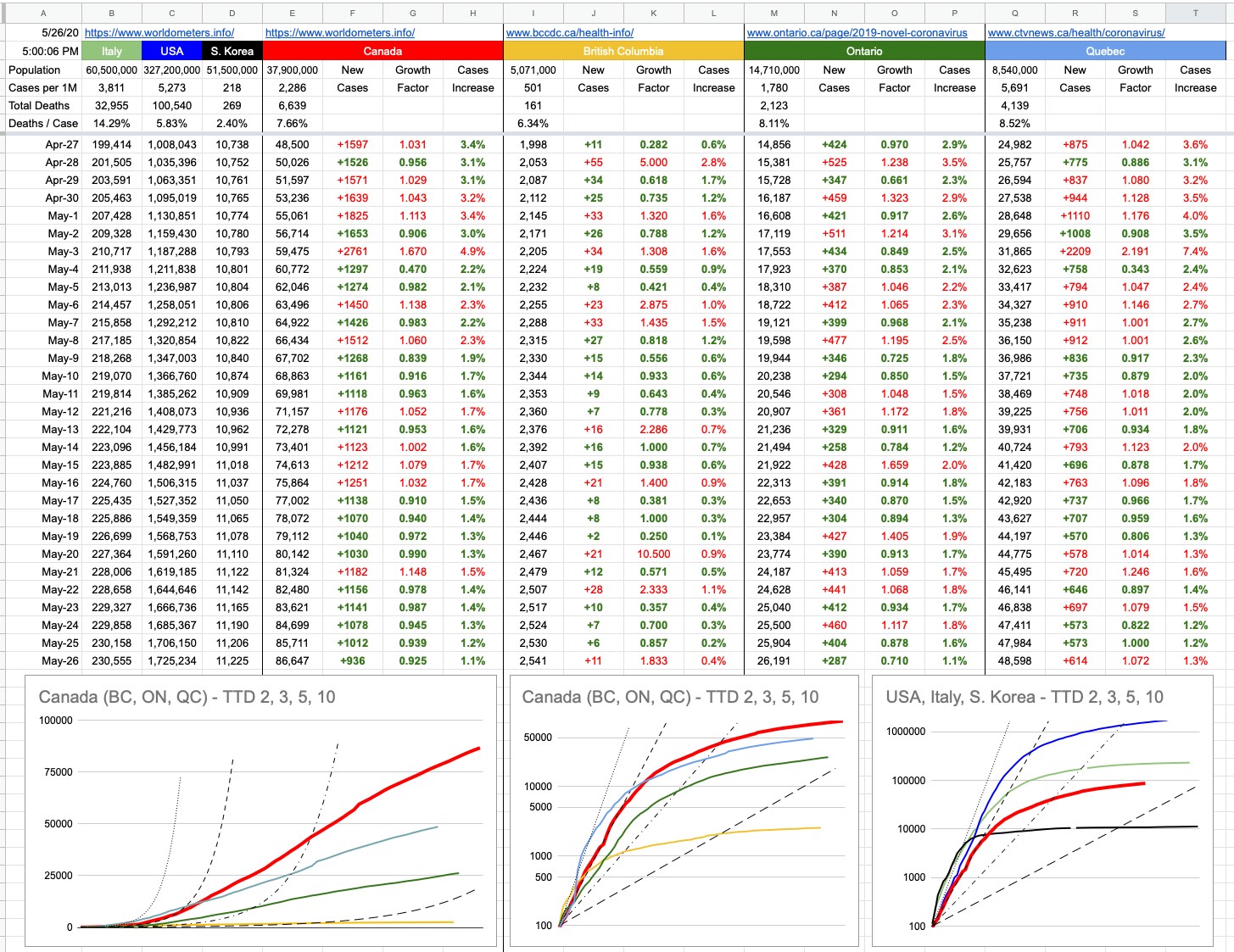
When I started writing this today, the American death count was below 100,000. As I prepare to hit [Post], it’s now over…

Some American states violently threw the doors open at the start of May — so now we’re seeing not just the initial effects, but the secondary ones as well. With an incubation period of 5 to 14 days, we’re perhaps even seeing the beginnings of a third. So how does it look… well, in 17 states, the numbers of new cases are trending upwards… among them Arkansas, North Carolina & Missouri. And Georgia. And Alabama. It’s really not a big surprise to see where things aren’t headed in the right direction. And there’s no reason to single out the U.S. — we’ve all seen those pictures from that park in Toronto a few days ago. I went for a great bike ride today, and my usual ride would have taken me down the Arbutus corridor, down to the water, and around the seawall… with a lap of Stanley Park if time (and regulations) permit. But I avoided all that, because I didn’t want to be anywhere near the sort of crowd I imagined I’d find.

The vast majority of people whose behaviour really makes you wonder… are younger. Because, you know, they’re invincible. And I don’t mean to single out an entire generation or two as irresponsible; it’s just what I happen to observe around me.

And when you think about it, I’m double their age and even I can’t really say I’ve suffered through any global health crisis that’s affected me. I’m old enough that certain vaccines didn’t exist when I was a kid, so I, along with most of my peers, suffered through chicken pox. The MMR vaccine showed up a few years after I was born, which means I missed the ideal window to have gotten vaccinated. I did, of course, as soon as it made sense… but anyone younger than me… they’ve largely been immune from birth… to diseases which, not that long ago, would’ve been affecting — and possibly claiming the lives of — friends all around them.

“The risks are for the history books and life is meant to be lived and we’re not really at risk, etc etc.”

It’s not a great attitude, in general… and it applies to everyone who thinks for some reason we’ve made it free and clear to the other side. We haven’t, yet. Opening up doesn’t mean throwing caution into the wind.

View Original Post and All Comments on Facebook

Day 44 – April 29, 2020

It’s an interesting thing, this North American attitude… often found in sports. The great American pastime, baseball… there are no ties. The game can go into extra innings, which in turn can end up going on longer than the original game itself. In playoff hockey, same thing… full 20-minute periods until someone scores. Recall the famous Canucks/Stars playoff game that went into a 4th overtime — more OT than the 3 periods that preceded it. And hockey is a good example; there used to be ties in the regular season. And then… no, let’s decide this… they added overtime… and for a while, if the game ended in a tie after overtime, it remained a tie. But that wasn’t good enough… so, shootout. There will never be a tie again. There must be a winner. The most American of all games… the NFL actually allows ties, but there’s OT, with rules that make it almost certain one team will win. The only reason it can’t go on forever is that after more than 4 quarters of football, injuries are far more likely. There’s maybe one tie a year in the NFL; It’s rare, and nobody likes it when it happens. And NBA basketball? They will play overtime forever until there’s a winner.

On the flipside, the most popular sport outside of North America — soccer (fútbol!) — allows ties. What’s the difference in attitude?

I used to think it was attention span. Soccer holds your attention, sometimes for several minutes, between whistles. Hockey, same thing, which is perhaps why it’s not as popular as some of the others (especially in the U.S.). But football, baseball and basketball… endless time between action; time to discuss what just happened. Time to analyze it. Time to replay it, in slow motion, from different angles. That’s what I used to think, but no. What it simply is…. is that we just like to have a winner. After the big battle, a tie is just too unsatisfying.

It’s going to turn out that this virus is not as lethal as we initially thought… but, also…. it’s nowhere near as safe as a common cold or flu. The typical flu kills 0.1% of those it infects. COVID-19 seems to be somewhere between 0.4% and 3.4%. Let’s call it 2% for the moment. That makes it 20 times worse than a common flu. But also, nowhere near as bad as SARS (15% mortality) or Ebola (50% mortality).

The end result, somewhere in the middle, is the worst case scenario for the “I told you so!!!” crowds, because it means everyone can think they were right, and everyone else was wrong. It’s a sort of a tie that nobody likes, and both sides have plenty of ammunition to throw at each other.

In places that evidently haven’t been hit hard (B.C., prime example) the screaming about how we’ve wrecked our economy for nothing. Lockdown/shutdown — why? Look…for 100 dead people, most of them old or unhealthy to begin with? All of this suffering? For what?

On the flipside, places like Northern Italy and Spain and New York, who didn’t or couldn’t do enough to prevent the wave of catastrophic exponential growth in serious cases that led to a complete overwhelming of the medical system. And lots of deaths… multiples of excess deaths over the typical expected numbers.

Let’s look at some real numbers, implied by the general assumptions we think we know about this virus. The chart below shows ranges of age, and next to them, the mortality rate associated to that age group. Next to that, last year’s numbers for Canada’s population, followed by extending that mortality rate to our population. Knowing what we know today, if we were all infected and untreated, 750,000 of us would die, most of those being elderly. 750,000 people out of 37,500,000 = … 2%.

Age Mortality Canada Deaths
80+ 14.80% 1,614,000 238,872
70-79 8.00% 2,870,000 229,600
60-69 3.60% 4,607,000 165,852
50-59 1.30% 5,251,000 68,263
40-49 0.40% 4,817,000 19,268
30-39 0.20% 5,183,000 10,366
20-29 0.20% 5,101,000 10,202
10-19 0.18% 4,145,000 7,461
0-9 0.00% 3,982,000 0

TOTAL 2 .00% 37,570,000 749,884

That would never happen here, yells one side. That’s exactly what would’ve happened, yells the other.

On Friday, we will hear two things from Dr. Henry — one, that we have done our part and should continue to do so, and given what we’ve achieved, here are the first steps in the plan of re-opening our lives. And two, keep at it — an integral part of the new normal, at least until a vaccine shows up, will be maintaining the very things that have led to this success in the first place. That’s the side I’m on… and I’d like to think my side has done so well, that, by now, there’s probably enough hospital capacity to house the covidiots marching and protesting on Beach Ave. I’d like to think a small handful of morons isn’t enough to blow this for all of us… but time will tell.

View Original Post and All Comments on Facebook

Day 34 – April 19, 2020

There’s this old joke where a mathematician, a physicist and a statistician go hunting. They’re crawling around for a while, but suddenly see a deer, way off in the distance. “I got this.”, says the mathematician, and he carefully takes aim and pulls the trigger… but misses about 5 feet to the left. The physicist says, “Not bad… but I got it”. He aims his rifle and fires…and misses, 5 feet to the right. The statistician jumps up excitedly… “We got him!”

This game of analyzing numbers can get very convoluted, because there are always different ways of looking at things, and according to something I briefly mentioned yesterday (confirmation bias), we’re often looking to find and interpret data to fit what we believe… or want to believe.

There’s a big part of me that wants to believe this virus is far more prevalent than has been reported. The implications of that pretty straightforward. At the moment, in Canada, we have around 35,000 confirmed cases. We all know the real number is higher than that, but how much higher, and what does it matter? If the number were 100x, we’d be approaching 10% of the population. If it were 1,000x, we’d be way past the point of herd immunity… the implication would be that we’ve all had it and can pretty much get back to normal, just being extra careful to isolate those who are still at risk, at least until they get it… in whatever form it shows up… knowing full-well the medical system can handle it. We will, in the near future, know exactly what number to attach to that x. Here in B.C., somewhere between 5 and 10 is my guess… which, combined with our effective efforts at flattening the curve, imply we can start along the path of getting back to normal… and the initial easing of restrictions, tentatively scheduled for mid-May, is step one.

There’s a study coming out of Stanford that implies that number may be between 50 and 85. I am suspicious of that number for a few reasons, but we will let the experts sort it out. The sample size and who comprised the test group and a few other things… leads me to think there are a lot of asterisks next to a lot of the findings. I haven’t read the report, but as per above, I hope it’s even a little bit true; the implication that this has been around longer and wider than we think.

That being said, there is no version of reality where this is just like any other seasonal flu. A “bad flu season”, and we’ve had many, does not overrun the medical system like this one has. There is no version of this where “just let it run its course” would make sense. There is a lot of screaming from some people about how we’re destroying our economy and people’s livelihoods for nothing. Well, there will be plenty to learn from all over the world, since there are (unfortunately) jurisdictions that have decided to follow different, less strict routes… some through design (U.K.), some through incompetence (U.S.), and some through sticking their heads in the sand (Sweden). There is a technical/scientific term for when one suddenly realizes the present course of action may not be ideal, and that a drastic course-correction may need to be implanted. It’s called the “Oh… shit” moment.

Two of those jurisdictions have already had their moment. The third is well on its way, and it requires a somewhat different way of thinking about things.

Let’s begin with a bad example of trying to compare apples to apples. What country has the highest confirmed infection rate? Well, it’s the Vatican City… they have a population of 800, and have recorded 8 infections. But 8 out of 800 is the same as 1 out of 100. Which is the same as 10,000 out of a million… which is very, very, high. The U.S. comparative number is 2,300. Canada’s is 922. In fact, given the demographic breakdown of the Vatican population (I’m assuming a disproportionate number of older men)… and the fact that it’s surrounded entirely by Rome, the largest city in Italy (whose comparable number is 3,000), that’s pretty good. To add to the list of interesting but useless numbers, the Vatican has 2.27 Popes per square km.

Part of the challenge of analyzing numbers is being sure you’re comparing apples to apples, and the more I’ve been at this, the more I realize it’s not even apples to oranges… more like apples to bicycles.

Sweden, with a population of 10.2 million, has 14,385 known cases… which equals 879 cases per million… pretty close to Canada. So far so good. Their number of 1,540 confirmed deaths isn’t so great… more than double the U.S, and approaching Italy numbers as a percentage of total population. But not an outlier with respect to other countries. Where things differentiate greatly is the “Resolved” column, and that one is pretty-much apples to apples around the world. No matter how widespread or deficient the testing strategy in any particular jurisdiction, there is a measurable number of test-positive cases, and those cases will resolve: recovered or deceased. This doesn’t have anything to do with assumed cases or Stanford studies. It’s far simpler… at some point, you were tested… and you either recovered or you died. These are the survival rates of identified cases:

Canada: 88.4% (B.C. 92.4%)
United States: 63.6%
South Korea: 97.2%
Spain: 78.4%
Sweden: 26.7%

So what exactly is going on in Sweden? If you look at the distribution of test-positive cases, it’s a pretty standard bell curve. If you look at the distribution of deaths, it’s heavily weighted to older people…. 89% of those deaths are people aged 70 or over. That’s comparable to Canada as well. I think the vast difference may be that a lot of these cases aren’t being identified until they’ve passed away. I’m not sure these cases are entering the system till “after”, and it goes straight into the two stats: positive test plus death. Their medical system is not overwhelmed. It’s a first-world country when it comes to treatment, and they have capacity. So the implication is that the virus is running rampant through the elderly population… and given their strategy, no masks nor gloves nor social distancing (unless you have symptoms) and keeping everything open… this will eventually reach everyone over a certain age. That’s roughly 20% of Sweden’s population, and with a roughly 10% mortality rate for that demographic, that’s more than 200,000 people. That is their trade-off for keeping the economy open.

In Canada, 4 million people are aged 70 or over. So if we did the same here, we’d be looking at roughly 400,000 deaths in that age group alone.

Those are the worst-case scenarios, mitigated by potential treatments, vaccines and changes in policy… but here’s at least one version of an answer to that rhetorical question that’s often getting asked: “What is the trade-off for shutting down our economy?” The answer is… many, many lives.

View Original Post and All Comments on Facebook

Day 33 – April 18, 2020

Did you know that the bubonic plague is still around? That pesky little bug that killed up to 200 million people in the Middle Ages still pops up from time to time. A boy in Idaho got it a couple of years ago, I kid you not.

“Hey Jimmy, what’d you do all Summer?”
“Actually, I was sick for most of it with bubonic plague”

It’s almost worth getting, just so you can bring it up in Show’n’Tell. So much better than “Visited the grandparents in Wichita and miked some cows”.

Jimmy (probably not his real name) is fine… completely cured with a routine course of modern antibiotics. Jimmy is lucky he wasn’t born 500 years ago, because his pocket full of posies would have done nothing for his ring around the rosie.

The bacteria that causes bubonic plague has been quietly around for at least 6,000 years, but every once in a while, it makes a big splash. The Black Death, which peaked in the mid-14th century, was the biggest known pandemic of that particular bug, but there have been many outbreaks over the centuries… and while they’ll never achieve the magnitude of what happened in the Middle Ages, two breakouts is 2014 and 2017 in Madagascar killed around 200 people. And it’ll keep showing up, because it’s bacteria and it’s alive.

Unlike bacteria, viruses aren’t alive in the sense that they can just procreate on their own. They need a host, and in the current case, that host is a human… and in particular, human noses and airways. That’s a relevant point, which differs, for example, from SARS, also a coronavirus… which appeared and died-off in 2003. It incubated deep in people’s lungs. There are many other differences as well. SARS was far deadlier (~10%) but also less contagious. And the biggest difference is that while COVID-19 is still around, SARS-CoV is gone… extinguished from existence, except deeply-buried is research laboratories. Extinguished because of the way it was managed; the same gameplay of testing and isolating until every known host was known, and then kept away from infecting others. No host to jump to means it dies off, and that’s that. As has been widely quoted… if we could 100% isolate everyone on the planet for 14 days (probably a little longer, but not much) and keep completely isolated those who develop symptoms in that time — this thing would be squashed out of existence. That’s impossible to achieve, so the next best thing is a vaccine, which can, in due course, achieve the same thing. Has that ever actually been done?

Yes — and it’s one of the greatest achievements of medicine. Smallpox is gone, entirely, as of 1980, after a concerted effort that took decades. Smallpox was a horrible disease, with awful symptoms and a mortality rate of 30%, and you could catch it from someone coughing or sneezing on you, or touching contaminated surfaces… the usual that we are all familiar with these days.

But back in the day, medieval epidemiologists (heh) did not have a lot at their disposal, and it’s hard to blame them. Germ theory was centuries away from being figured out. Plague doctors wore those famous plague masks with the long noses, full of good-smelling herbs… which, if they didn’t help keep them safe, at least helped mitigate the stench of dying people all around them. In fact, back then, it was thought that illness was transmitted through miasma… bad-smelling air. A kind of chicken-and-egg causality where you assume the bad smell in the air is cause of all this illness… not the result. The name “malaria” literally means “bad air” in latin. But at least to some extent they’d figured out that keeping away from sick people was a good idea; the first versions of social distancing. Those Venetian masks with the long noses? It’s hard to cough/sneeze on someone when you can’t get too close. They understood at least that: stay away. I have this image of a medieval Dr. Henry, standing at the top of the Rialto Bridge, yelling down to the gondoliers on the Grand Canal… “Hey you down there! You shouldn’t be oot and aboot! Go home!” She wouldn’t be yelling, of course… more like softly but strongly suggesting.

Germ theory eventually sorted it out, but there was an interesting little overlap of time where smallpox “vaccines” from the Far East arrived in Europe, and worked… but nobody understood why. That didn’t fit with any known medical knowledge of the time, but it seemed that taking powdered smallpox scabs and inhaling them… would lead you to develop a mild form of the disease, from which you would recover. Well, most of you. There was a 2% mortality rate with that treatment… which is still a lot better than 30% if you get it. Game-theorists of the day could have tried to figure out what gave them better odds… a certain 2% chance of death vs. a N% chance of contracting something with a 30% chance of death. Here, I’ll do the math… if you thought your chances of contracting smallpox were greater than 7% (one in 14), go for the scab inhalation. I’ve bet on enough 14-1 shots in my life to know that I should take my chances with the scabs.

I say all this because the people back then, flying blind as they were, made the best of what they had and what they knew. We are way ahead these days… but as we’re all experiencing, there’s always plenty more to learn… and I think it’s going to really heat up in the next few weeks. We have a perfect storm overlapping of emerging antibody tests, conflicting studies from around the world regarding how widespread this is, data from jurisdictions that are doing things very differently and so on. And much of this is saddled with a conformity bias that makes it very difficult to navigate. When you start with a conclusion you’re hoping to reach, it’s not difficult to find the data to support it. It’s all out there. We will navigate it as best we can.

Speaking of we — we around here, and in Canada in general, saw a good day of numbers… a line of green… everything trending nicely… for now. This week we’ll start seeing the effects, if any (and hopefully, none)… of the long weekend.

View Original Post and All Comments on Facebook

Day 26 – April 11, 2020

For the sake this example, I’m about to virtually kill a lot of people. Please don’t feel bad — they never existed.

Let’s imagine you want to drive from Vancouver to Seattle… and let’s further imagine that there’s a winding road that follows the coastline all the way down. Sidenote — for part of it, there is… there’s a 20-mile winding road from Bellingham to Burlington called Chuckanut Drive that’s well-worth the detour. Spectacular views and much more.

So… there’s the imaginary coastline road, and there’s Highway 99/I-5 which actually exists.

And you’re a new driver, kind of nervous… the thought of the fast-moving traffic on the highway scares you a bit. But you also know the coastline road is very winding, and you’ve heard of cars losing control and going over the cliff. You do your research and quickly find a report that tells you that over the last two years, accidents killed 45 people on the highway and 24 on the coastline road. Again, I’m making this all up. Nobody was hurt in the creation of this posting.

No brainer, you think, the coastline road is twice as safe as the highway… because that’s the ultimate measure of safety, and there can’t be too much more to it…

Well, there can be… and if you keep reading down my imaginary report, you’ll find that the coastline road seems to have about one accident a month. Like clockwork, once a month, a single-occupant vehicle loses control, rolls down the 100-foot cliff and kills the driver. That accounts for the 24 deaths.

On the highway, as it turns out, some idiot last year was celebrating something… and rented out one of those monstrosity stretch Hummer limos, filled it with 43 of his closest buddies… and apparently everybody, including the driver, got drunk… and the limo, with its full tank of gas, crashed into a telephone pole, exploded into flames and killed all 45 occupants.

That changes things a bit, doesn’t it…

Those 24 single-car accidents each have a little circle around them. The HummerLimo has a single, big circle around it. Around here, the Lynn Valley Care Centre has a big circle around it too, as does the administration office of Lions Gate Hospital. The Mission Institution. The Okanagan Correctional Centre in Oliver. The Blueberry River First Nations community near Fort St. John. All of them have their own little circles.

So… let’s talk about clusters.

From an epidemiological point of view, a cluster is defined by infections that are grouped by where and when they happened. If those two things are close to each other, they’re part of the same cluster. Infections can be clustered, deaths can be clustered. Really, any statistic can (and usually should) be associated where it’s relevant.

In B.C., the Lynn Valley Care Center (where the average age of residents is 87) recorded Canada’s first COVID-19 death on March 8th. Since then, it’s accounted for an additional 17. Here in B.C., our mortality rate per resolved case is 6.0% when you count Lynn Valley, and 4.3% when you don’t. This is in no way minimizing the importance of each and every one of those people; rather, it’s just to point out where they should fit in statistically.

Treating those unfortunate 18 deaths the same as any random 18 in the city would skew things significantly; there’s clearly a lot more to learn about those 24 individuals that drove off the cliff than by analyzing the demographics of the 45 people in the limo.

This is all something to keep in mind when reading reports that tend to favour skewing data towards their intended conclusion… something I’m saying for my own benefit as much as yours, because these days I’m being bombarded with articles and reports and opinions, many of which are diametrically opposed to each other. All of them claim credible evidence. I’m trying to keep a level head, and you should too.

As for today’s numbers… well, it’s green all the way across the bottom. From a purely aesthetic point of view, that’s as good as it’ll ever get… and it’s what I consider great evidence that what we’re doing is working. Let’s keep at it, and let’s hope those people that aren’t such good listeners don’t become clusters of their own once this long-weekend is over.

View Original Post and All Comments on Facebook

Day 12 – March 28, 2020

There’s that feeling you get when you sit down in a rollercoaster… first of all, what the hell am I doing, do I really need to be doing this… but once the thing starts moving, there’s no way out, so the impending dread as you start going up that first big hill… click-click-click as the chain underneath pulls the train slowly… wow, this thing is going a lot higher than I thought… click-click-click… this was such a stupid idea… click-click-click… ugh, this is a lot steeper than it looked… click- ohh.. no more clicks. We all know that means…

… and as the train gains momentum and sends you flying down that first huge drop, two things will come to mind… one, this part of it will thankfully be over soon and two, now you have a clear idea just how steep it was. Which serves to illustrate where we are today with respect to the numbers coming our way in the next little bit… there is a finish line to them, a week to ten days… and we once we hit that bottom, we will know exactly how steep things were.

Given where we are today and as per what I wrote yesterday, I don’t think we need to close our eyes and scream and hope for the best. It’s looking better than that. At least, on paper and at least, for now.

In B.C., although we had the largest one-day increase in cases yet, it’s perfectly in-line with our linear growth. Dr. Henry, for now, would like to see that number consistent at 12% which is roughly where it’s been. The average of the last 10 days is actually 11.1%. Today’s number was 11.6%. Yesterday was 9.2%. Nice solid straight yellow line, right in the sweet spot. And might I add, I am tracking total cases as they accumulate, not factoring in recoveries and deaths. The outcomes of these cases is a whole separate topic. But on that note, while we saw an increase of 92 new cases, we also saw 121 cases moved to the “recovered” column. As far as these numbers are concerned, today in B.C., there are less active cases than yesterday.

Canada’s number is bigger, but also consistent and also, slowly, hopefully, for now… going down day by day. Yes, of course the number of cases is increasing, but that rate of increase is itself decreasing. See that column… 4 out 5 days of green numbers. The rate of growth is slowing. For now. Are we still following the U.S. trajectory? Visually, and numerically, we’re not. Not so long ago, and you can still see it on the chart, Canada’s data was almost exactly perfectly 8 days behind the U.S: Feb 29, Mar 1, Mar 2… the U.S. had 68, 75 and 100 cases. 8 days later, Mar 8,9,10 — Canada had 66, 77, 94 cases. Perfect lockstep. And if you eyeball those numbers as you slowly go down the two columns, you see them in lockstep… and then they slowly start drifting apart.

The hope is that we wouldn’t follow them down the hellhole-course they’re presently on, and, for now, we’re not. We’re at 5,655 nationwide cases. 8 days ago, the U.S. was at 24,218. Had we “kept up”, today’s number would be 4x what it actually is. We’re now more than 11 days behind them.

So what does it all mean…

I’d like to address some of the comments that question the usefulness of these numbers in general, how the testing is inadequate, this isn’t reality, this is a useless exercise because the numbers are all bullshit. That the real case numbers are anywhere from 10x to 50x and it’s anyone’s guess. And therefore, blahblahbblah.

So, first of all, the way to solve big problems is to break them in half. Solve each half independently, and once you do, the big problem is solved. And if one or both of those halves is too complicated to solve, break it in half again and solve that. Keep breaking it in half until you have manageable pieces to solve.

The enormity of our present situation requires breaking it into hundreds of pieces, but here are some of the big ones, each of which needs to be broken down into many smaller pieces:
– the actual number of cases out there, factoring in recoveries
– the actual number of cases that require hospitalization
– why are some demographics hit so differently than others
– the testing infrastructure, and the strategy and adequacy of it
– the ability of our medical infrastructure to handle the cases
– the actual number of people dying from this
– the economic implications of allowing this to go on too long
– the herd immunity thing
– the treatment options, effectiveness of therapies, and timelines
– when and where is the vaccine

Without tackling all of that, notwithstanding each of those topics is its own book, and that’s only a small snippet of topics that need addressing, where we’re at right now is trying to solve chunks of a problem with incomplete information. One thing we have to our great advantage is learning from what others have or haven’t done ahead of us. Like one big change that was implemented today here is that the number of patients on ventilators doubled. Because suddenly a lot more people got a lot more sick? No. Because we learned from data elsewhere that putting people on ventilators sooner has a huge impact on positive outcomes. We didn’t know that two days ago, and now we do, and now we use it to our advantage.

Just because we don’t know something is no reason to throw our hands in the air — “these numbers are all crap anyway” — but to tackle this particular aspect…

Knowing the actual number of cases out there would have a profound effect on many aspects… first of all, how many actual new cases are there each day… how many of them will the person never even know, how many will they get sick but not too sick, how many will need a hospital, how many will die. If we could snap our fingers and know all that, it’d be great. One school of thinking that might kick in is that if actually the number is not 10x or 50x but actually 500x, and many of us have had it and never even knew it, and now we’re immune and will be for several months and even if we’re not, who cares, clearly I can fight this thing off so let me get a little sick and impose my herd immunity and get back to work since the actual mortality rate is only 0.2% etc.

Don’t think everyone has their heads stuck in the sand thinking the published numbers are the extent of this. One day, in hindsight, we’ll know those numbers. It’s possible that one day, we will have instant, cheap and available tiny-traces antibody testing. You’ll be able to wander into Starbucks, and along with your chai latte, spit into some throw-away little thing that’ll turn red if you’ve had it, stay blue if you haven’t. But until we get to that point, to a great extent, all we’re doing is buying time. Flattening the curve to suppress the load on our medical infrastructure. Isolating ourselves so we don’t infect others, especially those who are much likelier to get lethally ill. Keeping this thing controlled and contained until we’re certain we can manage it. It’ll likely never go away, and the waves of it appearing in the future will hopefully wind up in the “no big deal” pile.

But for now, the published numbers, the important numbers… the ones that are putting load on our medical system… the 884 confirmed, the thousands of others likely presumed but not confirmed… don’t think they don’t know about it. Don’t think when they tell you to stay home for 14 days, pay attention to your symptoms but don’t come in — that they’re not tracking you. You, who may well have it who think you don’t count — trust me, you do. Not in my numbers, not in their published active-cases numbers, but you’re out there somewhere, included in all of the projections of what might happen and how they’re going to take care of you if you get really sick. Some of you think you have it, but don’t. Some of you have it and don’t know it. Neither of you got tested, so hey what the hell they don’t know what they’re doing this is bullshit… yeah, no. Not at all. They’re not going to waste a test to confirm a mild test. There’s an N% chance you have it, depending on your age and other risk factors. Take care of yourself with the provided guidelines, and you’ll most likely be ok. And if you’re not, critical care awaits you with open arms. As opposed to everyone who thinks they might have it coming in and overwhelming a system that, certainly at the moment, is not prepared to test 2 million people overnight. If you’ve had it, one day you’ll know.

The fact that our hospitals are not overrun… the fact that we’re prepared at present to handle anything but the absolutely worst-case scenario… the fact that were are notably flattening our curve, both provincially and nationally… and the fact that we’re doing that with incomplete information, tackling big, multi-faceted problems… don’t worry too much about absolute numbers and how you feel they don’t reflect reality. They’re serving us well.

Speaking of serving us well, please take a moment to step outside at 7pm tonight (and every night) to cheer the heroes of this nightmare — hope you never need their help, but the army of medical workers of this province and this country, and indeed, around the world… deserve to (loudly) hear our gratitude and appreciation.

None of us like this. They don’t. You don’t. I don’t. But let’s remember… as hellish as it may be, the rollercoaster ride eventually ends.

View Original Post and All Comments on Facebook

Go to Top