Relevant

Day 26 – April 11, 2020

For the sake this example, I’m about to virtually kill a lot of people. Please don’t feel bad — they never existed.

Let’s imagine you want to drive from Vancouver to Seattle… and let’s further imagine that there’s a winding road that follows the coastline all the way down. Sidenote — for part of it, there is… there’s a 20-mile winding road from Bellingham to Burlington called Chuckanut Drive that’s well-worth the detour. Spectacular views and much more.

So… there’s the imaginary coastline road, and there’s Highway 99/I-5 which actually exists.

And you’re a new driver, kind of nervous… the thought of the fast-moving traffic on the highway scares you a bit. But you also know the coastline road is very winding, and you’ve heard of cars losing control and going over the cliff. You do your research and quickly find a report that tells you that over the last two years, accidents killed 45 people on the highway and 24 on the coastline road. Again, I’m making this all up. Nobody was hurt in the creation of this posting.

No brainer, you think, the coastline road is twice as safe as the highway… because that’s the ultimate measure of safety, and there can’t be too much more to it…

Well, there can be… and if you keep reading down my imaginary report, you’ll find that the coastline road seems to have about one accident a month. Like clockwork, once a month, a single-occupant vehicle loses control, rolls down the 100-foot cliff and kills the driver. That accounts for the 24 deaths.

On the highway, as it turns out, some idiot last year was celebrating something… and rented out one of those monstrosity stretch Hummer limos, filled it with 43 of his closest buddies… and apparently everybody, including the driver, got drunk… and the limo, with its full tank of gas, crashed into a telephone pole, exploded into flames and killed all 45 occupants.

That changes things a bit, doesn’t it…

Those 24 single-car accidents each have a little circle around them. The HummerLimo has a single, big circle around it. Around here, the Lynn Valley Care Centre has a big circle around it too, as does the administration office of Lions Gate Hospital. The Mission Institution. The Okanagan Correctional Centre in Oliver. The Blueberry River First Nations community near Fort St. John. All of them have their own little circles.

So… let’s talk about clusters.

From an epidemiological point of view, a cluster is defined by infections that are grouped by where and when they happened. If those two things are close to each other, they’re part of the same cluster. Infections can be clustered, deaths can be clustered. Really, any statistic can (and usually should) be associated where it’s relevant.

In B.C., the Lynn Valley Care Center (where the average age of residents is 87) recorded Canada’s first COVID-19 death on March 8th. Since then, it’s accounted for an additional 17. Here in B.C., our mortality rate per resolved case is 6.0% when you count Lynn Valley, and 4.3% when you don’t. This is in no way minimizing the importance of each and every one of those people; rather, it’s just to point out where they should fit in statistically.

Treating those unfortunate 18 deaths the same as any random 18 in the city would skew things significantly; there’s clearly a lot more to learn about those 24 individuals that drove off the cliff than by analyzing the demographics of the 45 people in the limo.

This is all something to keep in mind when reading reports that tend to favour skewing data towards their intended conclusion… something I’m saying for my own benefit as much as yours, because these days I’m being bombarded with articles and reports and opinions, many of which are diametrically opposed to each other. All of them claim credible evidence. I’m trying to keep a level head, and you should too.

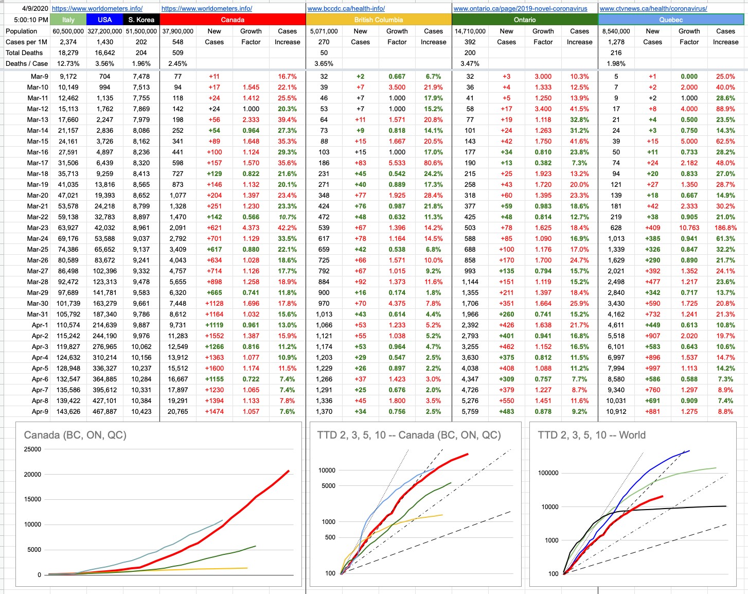
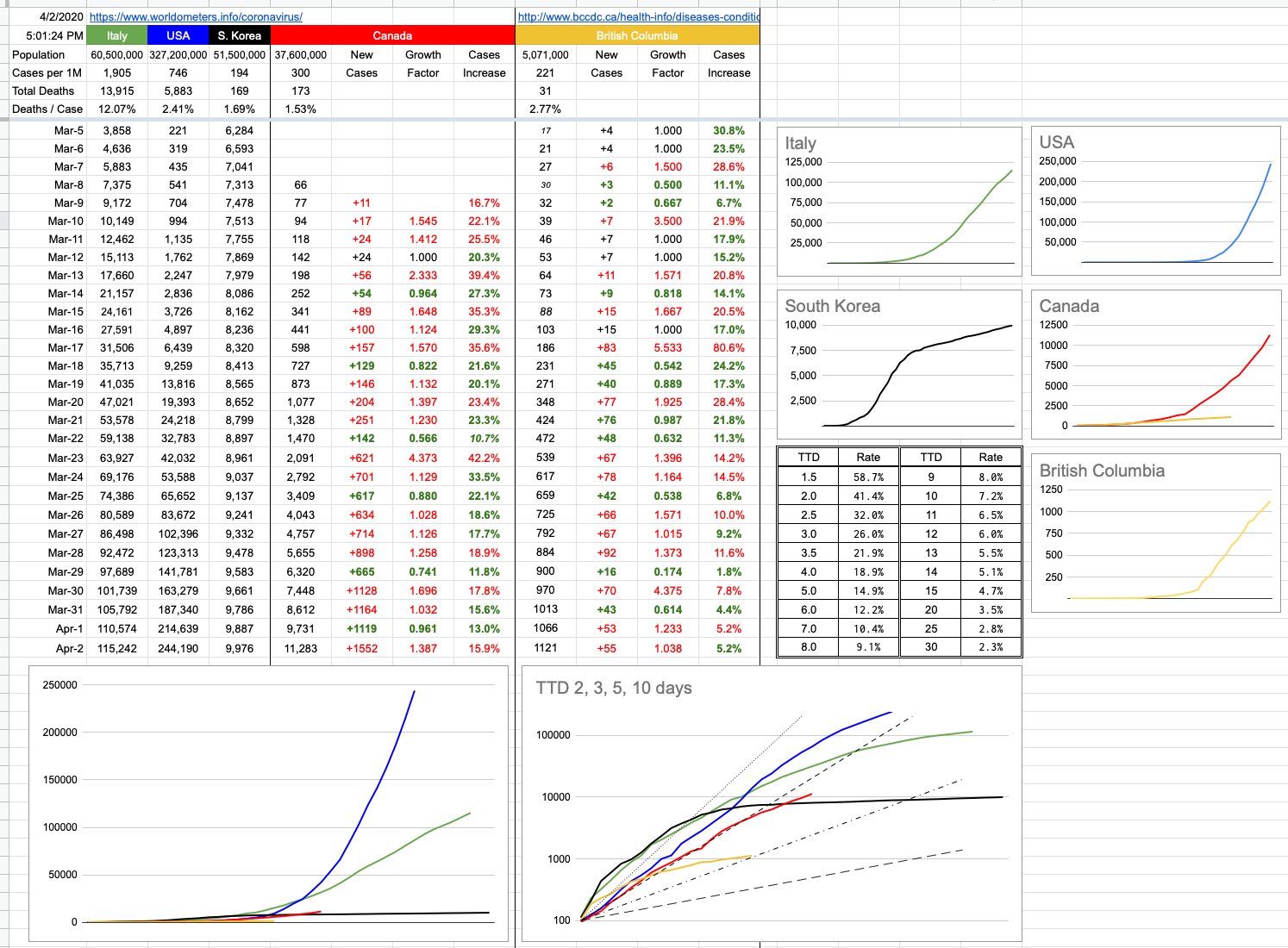
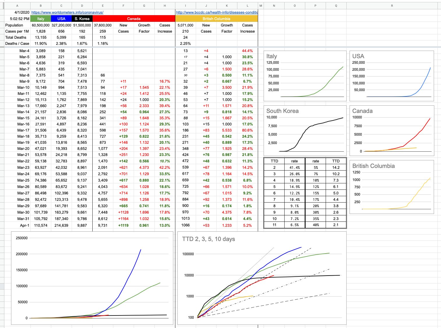
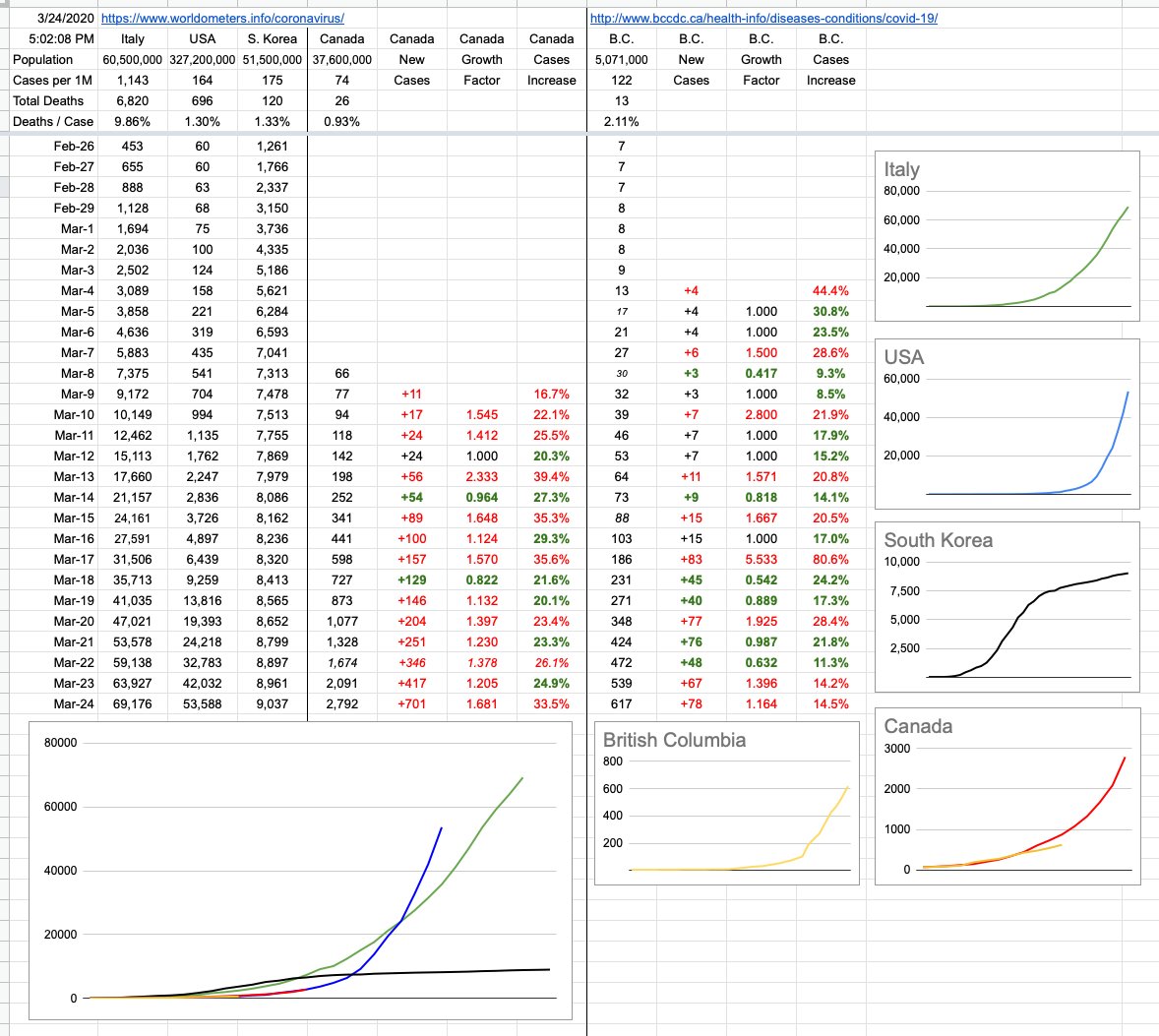
As for today’s numbers… well, it’s green all the way across the bottom. From a purely aesthetic point of view, that’s as good as it’ll ever get… and it’s what I consider great evidence that what we’re doing is working. Let’s keep at it, and let’s hope those people that aren’t such good listeners don’t become clusters of their own once this long-weekend is over.

View Original Post and All Comments on Facebook

Day 24 – April 9, 2020

Oh, Canada… our home and native land is a lot more relevant to the majority of people reading this, so I’ve made some changes. You will notice that the original graph that started this little daily update is gone. It’s served its purpose, which originally was to map an apples-to-apples comparison of Italy, the U.S. and Canada — with South Korea thrown in for reference — if you were to superimpose their trajectories from a comparable starting point. When that started, Italy was 10 days ahead of the U.S. and the U.S. was 10 days ahead of Canada. On the graph, all of those lines were on top of each other, and it was going to be interesting to watch what happens as time goes on.

To summarize what has happened since… and you can look at yesterday’s final version of that graph to see what I mean (or go back even further and see when things really started to diverge)… The U.S. was actually doing better than Italy for a while, until all hell broke loose… then they burst through that green line and have never looked back. Italy, while still in the midst of their crisis, has definitely seen its curve flattening. Canada, for a while worryingly tracking the U.S., “fell off the bottom” of that blue curve and has comparatively been doing a lot better. The B.C. line, on this scale, is indistinguishable from the X-axis. Indeed, it’s the scale of this graph (linear Y-axis) that has rendered it useless. The unfortunate blue-line numbers will just keep squashing the other lines down, so we retire this graph with full honours, though I will still track the data and update the TTD logarithmic graph of Canada vs. The World.

But there are two new graphs… one, on the bottom left, is exactly what I described above, but just for Canada… with B.C., Ontario and Quebec. You will notice with some degree of curiosity that the Quebec line is above the Canada line… how can that be? Isn’t Quebec still part of Canada? Let’s not have that particular discussion, right here, right now. Yes, of course they are, so what’s the deal?

Nos amis from la belle province, with their usual panache, were simply late to the party. Given that this graph aims to compare apples to apples, its starting point is the same for everyone. Quebec recorded its 100th case March 18th or 19th. On that day, both B.C.and Ontario were around 250 each. Canada’s total was around 800.

Forgetting when it happened, but rather how it happened, Quebec’s numbers were not great for a while; they quickly accelerated at a frightening rate. They went from 100 to 1,000 cases in 5 days… a pace that exceeds Canada’s overall trajectory. The good news for our frères and sœurs is that things have recently looked a lot better. In fact, while numbers keep growing, they are growing more slowly. The “Cases Increase” percentage columns all tell that same story. Social/physical distancing… you know.

Where are the Prairies, the Maritimes, the Territories in all of this…? Listen, you don’t want to be on my charts… I aim to chart the big, significant numbers. Hope you never get so relevant that you need your own data column and squiggly line… anyway, there are only so many colours.

Special shoutout to Nunavut… with respect to this pandemic, they are having none of it. Ha Ha!! (Sorry). But indeed, they’re the only province or territory with zero cases. How it that possible? It’s very simple… the population density of our northern compatriots is 0.02 people per square km. In other words, everyone up there gets their own 50 sq. kms. In other words, go up there and draw a square that’s 7km per side. It’s all yours. It’s also really cold. All of that combined equals automatically-imposed social/physical distancing. And check it out… zero infections. Case closed.

View Original Post and All Comments on Facebook

Day 17 – April 2, 2020

I added a little table (just above the logarithmic chart) to the spreadsheet yesterday, and today I will explain it. It’s a simple “look-up” table for “Time To Double”, useful if you want to know how a certain percentage maps to a TTD. For example, let’s say you have $1,000 to invest, and you want to double it to $2,000 in 7 years. What interest rate would you need? The answer is 10.5%. If you can wait 10 years, you’d only need a rate of 7.2%. How long to double your investment if you’re being offered 20%? The answer is 3.8 years.

These percentages and their related time periods can measure years… or days, which is the relevant discussion.

Let’s begin with a simple example, where we start with the number 100. And we are adding 20 to it every day. After 5 days, it’s doubled to 200. A TTD of 5. Now we keep adding 20 per day… so it’s going to take another 10 days to go from 200 to 400. And to double from 400 to 800, it’ll require a further 20 days. The only thing doubling here is the TTD itself… and this represents linear, not exponential growth. Certainly, it’s growing… and in this example, that 100 will grow indefinitely… but, as it does, its TTD gets bigger and more distant.

Now let’s imagine an example where on day 1, we’re at 100. But by day 4, we’re are 200. And at day 7, we’re at 400…. and we’re at 800 after only 10 days. So this is clearly a TTD of 3, and if you look at the continuing growth… 800, 1600, etc… it’s not hard to imagine what this would look like on a graph… an ever-increasingly steep curve. With a consistent TTD, there is exponential growth. The steepness of that curve has everything to do with the actual TTD, and that’s important because no matter what the finish line, it’s important how quickly we get there. In this case, we want to get there as slowly as possible.

The big graph on the bottom left shows those curves, overlapped on each other, showing how numbers have evolved for different jurisdictions from similar starting points. The logarithmic graph to its right shows the same data, and when you graph exponential data on a logarithmic scale, consistent exponential growth shows up as a straight line. Those 4 TTD lines of 2, 3, 5 & 10 days are the best example. A logarithmic presentation also helps to show the deviation, positive or negative. As that exponential growth increases or decreases… ie, as the TTD increases or decreases, the lines for each country (or province) will move… and obviously, to the left (into the steepness) is bad, and to the right (flattening out) is good.

Logarithmic graphs can be a little misleading in the way they squish data, and can misrepresent reality. But from the point of view of displaying trends, they’re pretty good. We can look at the encouraging B.C. line. We can look at the Canada line, and at least relate to the fact that we’re on a very different trajectory than what the U.S. is following. As much as the numbers back east have jumped, and as exponential as the growth continues to be, it’s less exponential, ie slower, ie the TTD has gone up, ie… from a trending point of view, not worse than what led up to it.

Even without the graphs, the numbers speak for themselves, and the growth percentages are there, day to day, both for Canada and for B.C. You can plug those numbers in to the little table… from today, from a week ago… and see what TTD would correspond.

That being said, what exactly are we measuring? These TTDs are important to chart the rates of growth, but rates of growths of what? Known cases? Presumed cases? Hospitalizations? Patients in critical condition? Deaths?

The only thing I’ve been dealing with are confirmed cases and their growth. My data deals with the confirmed known spread of the virus…. but all of those other numbers are also important, and will be tackled in due course. Topics for another day.

View Original Post and All Comments on Facebook

Day 16 – April 1, 2020

I’m going to talk about antibiotics for a moment.

Important point number one: COVID-19 is a virus, not a bacterial infection. Antibiotics won’t work. Secondary complications that can arise, like pneumonia, are… and those would be treated with antibiotics… but if someone has told you that taking some antibiotic may prevent you from getting this virus, or might help treat it, they’re wrong. And if you’re taking some antibiotic for no reason, stop. Which leads me to point number two…

If you’re supposed to be taking antibiotics, there’s exactly one correct way to do it. When the doctor prescribes them, she will look you in the eye and say “Be sure you complete the entire course, till you’ve taken them all, till the container is empty.” That might be 3 or 4 times a day, and it might be a week or two weeks or 3 months. When you pick up the prescription from the pharmacy, the pharmacist will tell you the same thing.

The reason is simple, and we will use a simple example: War. I have an army of 100,000 and you have an army of 100,000, and we battle it out, and since my army is better than yours, I’m down to 20,000 men, but you are down to 50… and we have all you backed into a deserted building and we’re about to surround you and finish you off. But instead, for some silly reason, we decide we’ve already won and we’ll show some mercy, and we let you go. So off go your 50 men, rebuild their army, and in a few months, you come back with a replenished army of 100,000 and destroy me, because chances are that’s a much tougher group than the original 100,000.

Why? Because those last 50 out of 100,000 men were the toughest of the lot. They’re the real survivors, having made it to the very end. They’re the last people you should let go. They’ll go off and recruit and train equally-tough warriors before returning.

So, if you’ve got some bacterial infection, and let’s say you’re supposed to take a course of antibiotics for a week. To begin with, you’re feeling really awful, and you start taking them and guess what, it’s the perfect antibiotic for what you’ve got, and after the third day, you’re feeling fantastic. It’s all cleared up. Awesome. But ugh, taking these pills is so annoying. And you have to stay up so late or get up so early to take one, etc etc. You’ll just go down to two or three a day, what difference can it make. Maybe you’ll just stop.

What you’re basically doing is letting the strongest of the bacteria live on, re-group, and re-attack. Maybe not you, but someone else. And, worse than that, they might mutate a bit, be a bit more resistant to that particular antibiotic… and then, after that cycle has repeated thousands of times, you’re left with our present-day problem of drug-resistant bacteria that require a whole new suite of antibiotics, many of which have yet to be invented.

The relevant connection is to our present-day plight. The COVID-19 is the bacteria, and you and I are the antibiotic.

We’re on “day 3” of that “7-day” antibiotic course. Our social-distancing seems to be making a difference… but we’re not cured yet, and loosening up the treatment can quickly change the outcome. The fact it’s working is all the reason in the world to keep doing it properly.

I actually had another example… it involves the Canucks and the Bluejackets and allowing 4 goals in the 3rd period. But you know what, YouTube is full of videos… cyclists raising their arms in the air in victory as they approach the finish line, only to be passed at the very last minute. Or football players spiking the ball 3 inches before crossing the goal-line, fumbling the ball instead of scoring a touchdown.

The countless examples all point to the same thing, and by now I’m sure you get it: There is no victory until you actually cross the finish line, the game ends, the enemy is extinguished. Etc. Etc. Etc.

Keep taking the medicine… it’s working, but we’re not cured. And abandoning the treatment now could lead to non-victory, whatever that looks like. I don’t know, and nobody wants to find out around here… and for those that are not from around here, look around at the world at places where physical distancing has been implemented correctly, and its effects. And, even more to the point, look at where it hasn’t.

View Original Post and All Comments on Facebook

Day 8 – March 24, 2020

As is often the case with us here in BC, the Wild West of Canada, we’re not always in sync with the rest of the country… and since the majority of people reading this are in BC, I’ve added a whole new set of data and graph… which is us… British Columbia.

I haven’t been following closely other province’s responses. Nationally, yes. BC, yes. But I’m not sure when Ontario or Quebec locked things down, nor the manner in which they did it. The reason that’s relevant is that while we’re seeing some not-so-great numbers out of Quebec today, the last few days here in BC paint a better picture.

We’re still over a week away from seeing the direct impact of the social-distancing order, and numbers will indeed increase between now and then… but the manner in which they increase is important, and for the moment, at least around here, it looks pretty good. The growth is linear, not exponential. At least for now. It’s evident in the BC graph, and it’s very evident when compared to the rest of Canada, which overall continues to pretty accurately track where the US was 10 days ago.

View Original Post and All Comments on Facebook

Go to Top