South

Day 34 – April 19, 2020

There’s this old joke where a mathematician, a physicist and a statistician go hunting. They’re crawling around for a while, but suddenly see a deer, way off in the distance. “I got this.”, says the mathematician, and he carefully takes aim and pulls the trigger… but misses about 5 feet to the left. The physicist says, “Not bad… but I got it”. He aims his rifle and fires…and misses, 5 feet to the right. The statistician jumps up excitedly… “We got him!”

This game of analyzing numbers can get very convoluted, because there are always different ways of looking at things, and according to something I briefly mentioned yesterday (confirmation bias), we’re often looking to find and interpret data to fit what we believe… or want to believe.

There’s a big part of me that wants to believe this virus is far more prevalent than has been reported. The implications of that pretty straightforward. At the moment, in Canada, we have around 35,000 confirmed cases. We all know the real number is higher than that, but how much higher, and what does it matter? If the number were 100x, we’d be approaching 10% of the population. If it were 1,000x, we’d be way past the point of herd immunity… the implication would be that we’ve all had it and can pretty much get back to normal, just being extra careful to isolate those who are still at risk, at least until they get it… in whatever form it shows up… knowing full-well the medical system can handle it. We will, in the near future, know exactly what number to attach to that x. Here in B.C., somewhere between 5 and 10 is my guess… which, combined with our effective efforts at flattening the curve, imply we can start along the path of getting back to normal… and the initial easing of restrictions, tentatively scheduled for mid-May, is step one.

There’s a study coming out of Stanford that implies that number may be between 50 and 85. I am suspicious of that number for a few reasons, but we will let the experts sort it out. The sample size and who comprised the test group and a few other things… leads me to think there are a lot of asterisks next to a lot of the findings. I haven’t read the report, but as per above, I hope it’s even a little bit true; the implication that this has been around longer and wider than we think.

That being said, there is no version of reality where this is just like any other seasonal flu. A “bad flu season”, and we’ve had many, does not overrun the medical system like this one has. There is no version of this where “just let it run its course” would make sense. There is a lot of screaming from some people about how we’re destroying our economy and people’s livelihoods for nothing. Well, there will be plenty to learn from all over the world, since there are (unfortunately) jurisdictions that have decided to follow different, less strict routes… some through design (U.K.), some through incompetence (U.S.), and some through sticking their heads in the sand (Sweden). There is a technical/scientific term for when one suddenly realizes the present course of action may not be ideal, and that a drastic course-correction may need to be implanted. It’s called the “Oh… shit” moment.

Two of those jurisdictions have already had their moment. The third is well on its way, and it requires a somewhat different way of thinking about things.

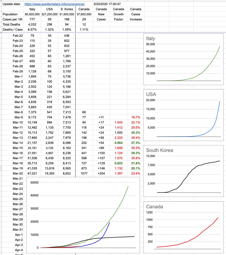
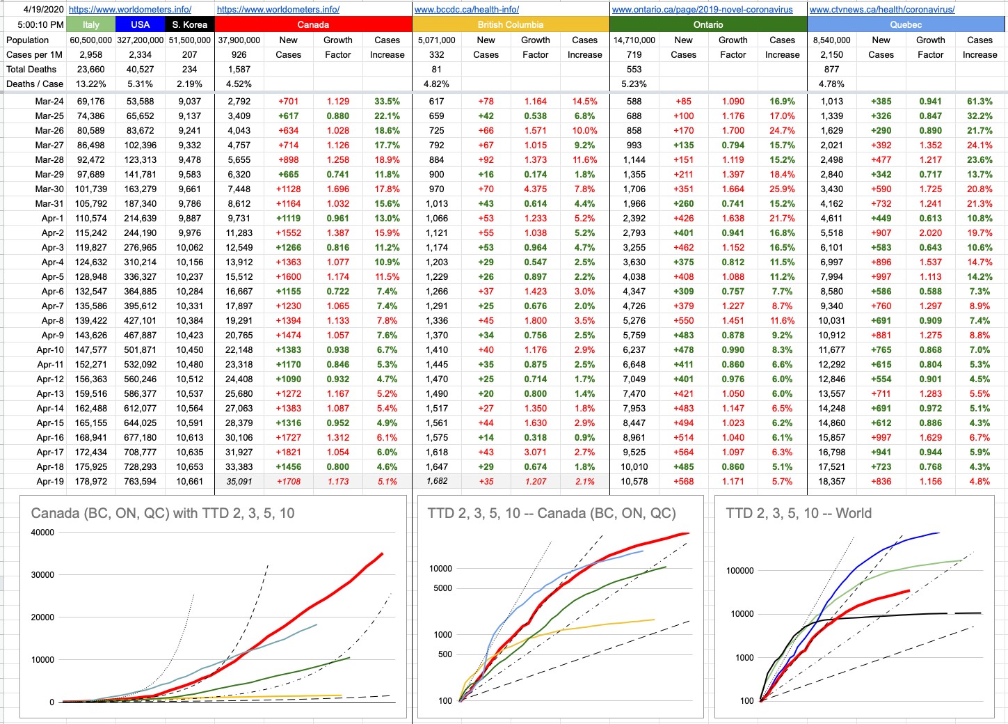
Let’s begin with a bad example of trying to compare apples to apples. What country has the highest confirmed infection rate? Well, it’s the Vatican City… they have a population of 800, and have recorded 8 infections. But 8 out of 800 is the same as 1 out of 100. Which is the same as 10,000 out of a million… which is very, very, high. The U.S. comparative number is 2,300. Canada’s is 922. In fact, given the demographic breakdown of the Vatican population (I’m assuming a disproportionate number of older men)… and the fact that it’s surrounded entirely by Rome, the largest city in Italy (whose comparable number is 3,000), that’s pretty good. To add to the list of interesting but useless numbers, the Vatican has 2.27 Popes per square km.

Part of the challenge of analyzing numbers is being sure you’re comparing apples to apples, and the more I’ve been at this, the more I realize it’s not even apples to oranges… more like apples to bicycles.

Sweden, with a population of 10.2 million, has 14,385 known cases… which equals 879 cases per million… pretty close to Canada. So far so good. Their number of 1,540 confirmed deaths isn’t so great… more than double the U.S, and approaching Italy numbers as a percentage of total population. But not an outlier with respect to other countries. Where things differentiate greatly is the “Resolved” column, and that one is pretty-much apples to apples around the world. No matter how widespread or deficient the testing strategy in any particular jurisdiction, there is a measurable number of test-positive cases, and those cases will resolve: recovered or deceased. This doesn’t have anything to do with assumed cases or Stanford studies. It’s far simpler… at some point, you were tested… and you either recovered or you died. These are the survival rates of identified cases:

Canada: 88.4% (B.C. 92.4%)
United States: 63.6%
South Korea: 97.2%
Spain: 78.4%
Sweden: 26.7%

So what exactly is going on in Sweden? If you look at the distribution of test-positive cases, it’s a pretty standard bell curve. If you look at the distribution of deaths, it’s heavily weighted to older people…. 89% of those deaths are people aged 70 or over. That’s comparable to Canada as well. I think the vast difference may be that a lot of these cases aren’t being identified until they’ve passed away. I’m not sure these cases are entering the system till “after”, and it goes straight into the two stats: positive test plus death. Their medical system is not overwhelmed. It’s a first-world country when it comes to treatment, and they have capacity. So the implication is that the virus is running rampant through the elderly population… and given their strategy, no masks nor gloves nor social distancing (unless you have symptoms) and keeping everything open… this will eventually reach everyone over a certain age. That’s roughly 20% of Sweden’s population, and with a roughly 10% mortality rate for that demographic, that’s more than 200,000 people. That is their trade-off for keeping the economy open.

In Canada, 4 million people are aged 70 or over. So if we did the same here, we’d be looking at roughly 400,000 deaths in that age group alone.

Those are the worst-case scenarios, mitigated by potential treatments, vaccines and changes in policy… but here’s at least one version of an answer to that rhetorical question that’s often getting asked: “What is the trade-off for shutting down our economy?” The answer is… many, many lives.

View Original Post and All Comments on Facebook

Day 32 – April 17, 2020

Today marks one month since I posted my first little chart, with an accompanying short little paragraph explaining it. What’s the date today? March 58th? Seems that way.

Since then, everything has grown… the numbers have grown, the lines on the graphs have grown, and the volume of my little paragraph has as well. It seems to be dealing with a lot more than just numbers, doesn’t it… so… on that note…

Today’s update at 11am from Dr. Henry and Mr. Dix was a thorough presentation explaining where we’re at and where we’re going. The slides of that presentation are available on the BCCDC website, but I’ll give you the summary — we’re doing really well around here, well enough that we can stop comparing the Italy track… we’re not following it… and, looking at the numbers and charts below, haven’t been for a while. And recognizing that we may be seeing a plateau, on its way to a decline — cautious optimism — of many key numbers. New infections, hospitalizations, ICU cases… everything trending in the right direction. We are seeing lower numbers for new infections, even with enhanced testing. For now. We will see next week if the long weekend changed anything.

And it’s key to note that this success has largely been a result of the measures put in place, the timing of those measures, and our compliance with them. And now is not the time to stop. “It’s working” is a lot different than “It worked”. We are still a work in process, and those social/physical-distancing ways-of-life will be around for a while.

Capacity to handle patients is below 50%, and it’d be ideal to keep it there. The absolute certain end to this is a vaccine, and things will be different until then, but it doesn’t mean we’re stuck in our homes forever. The plan for opening things up with a methodical, well-thought-out strategy is in the works, but the last thing we want to do is open things up too quickly. That can drastically change things, and it can happen quickly. One interesting slide, #34, showed the results of dynamic modelling, testing different outcomes given the degree of compliance of social/physical distancing. Short answer — if we keep doing what we’re doing, very good. If we don’t, there are varying degrees of what would happen. Worst case scenario: we all take to the streets today…. In about 10 days, the near vertical growth in cases would quickly overrun our medical infrastructure. That model also implies that a little loosening wouldn’t have a drastically bad effect… but to what extent and how… again, as you can see on that slide, if you hit a tipping point, it’s hard to come back from it. And speaking of that scenario…

There was a story on CNN yesterday with a headline that read “The social-distancing deniers have arrived”. Before clicking on the story, I imagined the picture that’d accompany it… it would be a group of people protesting. I imagined bushy beards, hunting caps, guns, American flags, Trump signs and no masks. I was a little wrong about the masks… a couple of guys had them; the rest, bang on. Oh, and not just guns… assault rifles.

I have a great idea. Get Barack Obama, Joe Biden and Nancy Pelosi to hold a press conference. Throw Bernie in there too. And there, they announce in angry, loud, unified voices… that social distancing is a terrible idea. That this lockdown is ridiculous. “President Trump!”, they should demand, while dramatically ripping their masks off their faces, “End this nonsense! Open every business! Get everyone out on the streets! Now! We demand you open this country, fully… RIGHT NOW!”

It might actually work.

Democrats say Zig, Republicans say Zag. Republicans say Ding, Democrats say Dong. It doesn’t even matter what Zig/Zag or Ding/Dong mean… nobody knows. Nobody cares. We are right, they are wrong. You are with us or you are against us.

Around here, we’ve pretty-much forgotten who’s in power. Premier John Horgan (NDP, if you need reminding) is not around much. I may not agree with everything he has to say, but he and I have something in common; an understanding of what leads to success… a concept that has served me tremendously well all of my life: Surround yourself with excellent people, keep them around, and let them do their thing. Two of those people these days are, of course, Adrian Dix (NDP) and Dr. Bonnie Henry (who knows and who cares). Political affiliations are pretty irrelevant at the moment.

Actually, John Horgan hasn’t been completely M.I.A… he holds a press conference once a week or so and answers questions. There are other issues facing the province, and while I’m unclear what he does all day, some of it has to do with dealing with other provincial issues, and of course, there are many. They haven’t gone away. And some of it is planning how to open up this province (beyond private liquor store hours), hopefully sooner than later, in a way that works and isn’t at odds with the big picture being laid out by Adrian Dix and Dr. Henry. Indeed, he’s letting them run the most important issue of the day, and he’s staying out of the way. It’s working really well, something even the most ardent NDP bashers would grudgingly have to admit. There will be a time and place for partisan politics, and I look forward to it because it’ll mean that things are back to normal.

In fact, the closest thing to partisan politics we’ve had recently was about all of this… Liberal leader Andrew Wilkinson serving up a little softball… “Hey, John Horgan, where are you?” The premier probably could’ve swung at that and hit it over the fence, but he let it go by and watched it dribble to the backstop. Andrew Wilkinson’s question was actually a little more pointed… like, shouldn’t the premier of the province be out in front of the cameras, telling us what’s going on, giving us updates and hope and encouragement, like a real leader… etc. And the answer is simply… no… he shouldn’t. The British Columbian leadership and response to this pandemic has a face (two of them), and it doesn’t need a third.

But behind closed doors, I have no doubt that if one of those two gentlemen needed something from the other — personally, publicly, privately, politically… they’d be listening to each other and talking and working together. If there was ever a time for political partisanship to take a back seat, it’s now. Everyone… from the top on down, needs to be pulling in the same direction. We, around here, are very fortunate.

But just a little south of here… well, that pulling looks like this: it’s a tug-of-war… one side of the rope is 500 trillion little virus balls, all pulling together. The other side is a mixed bag of people… men, women… some are wearing red shirts, some are wearing blue shirts. Some are pulling in the right direction. Some are pretending to pull but are barely holding the rope. Some are pulling sideways. Others are pushing the rope into the ground. One guy is twisting the rope… clockwise… while someone else is twisting it the other way. A couple of people have little hacksaws and are quietly trying to cut the rope without anyone noticing.

It is so incredibly sad and frustrating to watch this slow but inevitable trainwreck. You can’t look away, and wish you could do something… because solutions to the dysfunction exist… but they seem to be well-beyond the reach of the very people tasked to manage it. It shouldn’t be this convoluted. The reasonable voices do exist, of course, but they are drowned out in a sea of irrational, national insanity.

View Original Post and All Comments on Facebook

Day 31 – April 16, 2020

The B.C. number was published minutes after I posted this at 5pm, so I’ve just updated it… and it’s a good one, only 14 new cases. Great to see after yesterday’s spike… and although one day doesn’t make or break anything, that’s the direction we love to see.

Ontario’s growth continues to remain consistent, around 6% — which is a TTD of 12 days. Quebec is probably in a similar range, maybe less (ie better) — but is more volatile. They had a bit of a jump in today’s new cases, but that could be for many reasons. I’ll have a lot more to say about B.C. tomorrow after the modelling presentation… which you should watch, if you can… at 11am.

A couple of shoutouts while I’m here — to the staff and residents at the South Granville Park Lodge… my grandfather, who passed away many years ago… lived his last few years at that residence, and it was a peaceful and happy time, after a 94-year life full of extreme highs and lows. The staff was exemplary, and they unfortunately now find themselves a cluster of COVID-19 cases. I wish them all well.

And… a family friend in Montreal — who I’ve known my entire life… in fact, our families go back close to 80 years of knowing each other… 4 generations now… had been struggling in the ICU with COVID-19, on a ventilator for two weeks with a high fever that would come and go but never go away… well, as of this morning, I’m incredibly happy to report… no more fever and no more ventilator. He’s going to be ok, after a hellish 2-week nightmare. He is my age, my demographic, and at least as healthy as me. That struck very close to home… this thing is serious and this thing can hit anyone. But in this particular case, I probably can’t find the right words to express my relief. Whatever else, it’s been a great day.

And to radically shift gears, the rest of this post will serve as a bit of a public service announcement… these days, scammers, who may also be locked up in isolation, also need to make a living and are trying all sorts of new things, one of which is scary enough that a few people have reached out to me to ask if it’s for real.

You may have received an email where the subject line contains your password… and when I say your password, I mean some password you used somewhere, at some point in the past. And if it happens to be your current online banking password, that can indeed be really scary. I really hope that it’s not a password you use everywhere, because while things aren’t as scary as you think, you do have a bit of a hassle on your hands. But let’s break this down into little bits, and solve each piece of it.

  • how did they get my password and/or name and/or email address?
    – what else do they have?
    – how real is the threat?
    – what do I do?
    – what do I not do?First thing, relax. No matter how bad you think it is, it’s not.

    The email has your actual password, which is certainly enough to get your attention… and it then goes on to say that they’ve seized control of your computer and camera, have a complete log of you sitting in front of your computer doing whatever you do there, and a list of all the sites you’ve visited and all of your contacts. And unless you send them some amount of Bitcoin, they will send that video and list of websites to all of your contacts.

    Rest assured, nobody has taken control of your computer or your camera or your contacts or anything else. There is no video. It’s all complete bullshit. The scary aspect of your password sitting on the subject line means that somewhere, some site where you used that password got compromised… and if you use that password anywhere else, you really should change it… though I will point out that if it’s your “junk” password, it barely matters. I can assure you, some Bulgarian hacker has no interest in fiddling with your subscription preferences to “Turnip Harvester Weekly”. That being said, it’s always suggested you have unique passwords for everything, specifically for this reason — if some database gets hacked (which unfortunately happens more often than it should), that’s the only site and password-reset you have to worry about.

    Huge lists (with millions of names) exist for purchase on the DarkWeb where your name, email address and that associated hacked password are available. These lists sell for cheap, and anyone with some time and a bit of knowledge on how to merge a database with an email template can put together an email like the one you got, and send it to a million people. It is like casting a million little fishing lines into the ocean, and seeing what bites. Usually the email address it came from isn’t even valid, and the email will say — don’t bother trying to contact me. Or reply for proof that I have your contact lists. On that note, if it is valid, do not reply… because that might actually get you onto a list of “live ones”, which only means you’ll now be getting 10x the number of those scam emails in the future. And if you replied and if they did have a list of your contacts, again… relax… it didn’t come from your computer. At the end of all that, the scammer wants you to send some Bitcoin, and if you do, he’ll delete the video and leave you alone forever.

    So… they got your password from a hacked site. If you use that password anywhere important, go change it now. If they sent you a list of contacts to prove they know who you know… they probably got it from Facebook, which has an option that lets people find you via your email address. This is a security hole that everyone should adjust, because if they can find you on Facebook with your email address, and you have your friends list open to the world… then that’s how they know all these people you know. Fix that now… go to Facebook, under Settings, under Privacy… there is a section called “How People Find and Contact You” — settings for who can find you via your email and who can see your friends list and who can look you up via phone number. None of those should be set to “Everyone”. At worst, “Friends of Friends”. Just “Friends” is better. “Only me” might be best. That’s up to you, but lock it up so that random strangers can’t find you or your friends.

    The scammer wants you to send Bitcoin because it’s anonymous. Incidentally, if you need any further proof that this is all nonsense, consider that he’s sending the same Bitcoin wallet address to everyone. If you send him money, he actually has no way of knowing the money came from you. He’s hoping some of those one million little fishing lines will bite, and the Bitcoin wallet will just magically fill up from victims around the world.

    It’s always occurred to me that anyone who’s intelligent enough to be able to figure out how to purchase Bitcoin and then send it — probably wouldn’t fall for this in the first place. But that password thing is a little scary… so maybe it got you thinking in that direction. No worries.

    Summary of action items:
    – if you use that password anywhere, change it
    – review your Facebook settings as per above and adjust as needed
    – google your email address and see if that pops up any information you wouldn’t want out there
    – delete the email

… and stop worrying.


View Original Post and All Comments on Facebook

Day 29 – April 14, 2020

In simple terms, there are three initial conditions to consider if you’re going to fire a cannon: the weight of the cannonball, how much gunpowder you load into the cannon, and the angle of the cannon when you fire it.

If you’re trying to figure out what effect changing those variables can have, the right way to do it is to fix two of them and then see what happens as you vary the third.

For example, set the cannon at a 30-degree angle, and use the same weight of cannonball for 5 shots. Pack each of those 5 shots with increasing amounts of gunpowder… like 10, 20, 30 pounds and so on.

After you’ve fired those five cannonballs, measure the different distances and graph them. And draw a line through those 5 points… and extend it, beyond the last one, following the shape of that line. It might be perfectly straight. It might curve a bit. This is called extrapolation, and lets you make a pretty good guess as to what would happen if you had kept adding more gunpowder.

Now, do the same… this time, use the same amount of gunpowder, but use different weights of cannonballs. Graph and extrapolate that too.

Finally, pick one of those cannonball weights and a fixed amount of gunpowder, and fire them all, changing the cannon’s angle by 5 degrees each time. Graph and extrapolate.

Given those three graphs and their extrapolated lines, you now have a pretty good idea of how to fire this cannon, depending on what you desire. There may be many ways of hitting a target 500 yards away, but one uses more gunpowder. Or maybe you want to hit it with a bigger cannonball. Maybe there are trees in the way, so you’ll need a steeper angle.

One thing that’s certain; the only control you have with this cannonball is what you set with these initial conditions. Once you light that fuse and the cannoball blasts its way out of there, there is nothing you can do about its trajectory. Hopefully you got it right.

It occurs to me that a more modern and relevant example would be golf. When you’re trying to hit a golfball into a hole 150 yards away, there are many variables to consider, and usually, too many for most people, all at once. Pick the right club, but after that… the wind, your tight grip (but not too tight), feet shoulder-width apart, bend your knees, lean forward, keep your waist straight, look at the ball… etc etc. There are many more, and very few people are able to maintain all of those, all at once. And one initial condition out of place affects the whole thing. And again, like the cannonball, once you hit the ball, all you can do is watch.

When you look at the graphs in this picture, it’s not hard to visualize where these lines might be going, given the trajectories shown. If you look at the TTD chart for the world, the one on the far right, you can see the red Canada line in between the black South Korea line and the green Italy line. For a long time, we were hearing thing about which trajectory Canada might be following, using those two countries as examples… ideally, South Korea… but, worryingly, looking like Italy.

Ideally, our red line would’ve bent harder and right, sooner. It didn’t, but it also didn’t follow Italy, though the shape is the same, and using extrapolation, all things being equal, we can tell where we might wind up with respect to cases, if nothing changes.

Except all things are not equal. Unlike cannonballs and golfballs, the big difference here is that we can course-correct, and we have. Our red line and the American blue line were on top of each other for a while… until around March 26th, where things diverged rapidly. Implementing changes makes a difference, and the timing of it is key. A few days sooner or later makes a big difference.

It’s important to note that there were many initial conditions, both here and around the world, that affected things greatly. A big crowd at a soccer game. A large church gathering. Staggered Spring Break dates. The Canucks were away for almost two weeks after Feb 22nd. An endless list of endless jurisdictions where at the right place/right time, some situation that may have brought together a lot of people from lots of different places — did or didn’t happen, for whatever reason.

We will be shown some modelling later this week, and some “what if” scenarios. The biggest “what if” around has to do with properly implementing the measures that have been imposed in many places (including here), and the effects they’ve had. There is some guesswork and some assumptions, but they’re intelligent guesses based on what’s been experienced elsewhere. Extrapolated graphs are part of it. And every indication is that what we’re doing has made — and continues to make — a big difference.

View Original Post and All Comments on Facebook

Day 25 – April 10, 2020

There’s an interesting experiment going on, on the other side of the planet. Our furniture-making, meatball-eating, hockey-dazzling friends in Sweden’s approach to managing this crisis is a lot different than what’s going on around here. We’ve seen a few examples around the world how not to do things. How a few days here and there can have a drastic effect. How not taking it seriously can have big implications. The Globe & Mail wrote about Sweden last week. CNN picked up on it yesterday. Sweden, not a culture that I would associate with recklessness, is taking a huge gamble. If I were a betting man (and I assure you, by any definition of that expression, I am), even I wouldn’t rolling the dice the way they’re doing it.

I will summarize the articles, add a few comments… and something they left out.

To summarize, their schools are open, their pubs are open and there’s no lockdown. Gatherings of more than 50 people are banned, but everything else is left up to the honour system. Trust that others will do the right thing. Recommendations, not orders. Their PM calls it a “common sense” approach. Their chief epidemiologist is saying that it’s working “reasonably well” so far, and that they’ve had “not very much” spread into elderly homes and “almost no” spread into hospitals. In other words, it is, at best, working ok, but it’s in the elderly homes and it’s in hospitals. So basically, it’s everywhere.

Not everyone has bought into the plan… a letter from 2,000 doctors and public-health experts went out, urging the government to get a reality check. But for now… many Swedes get it, and are isolating and maintaining social/physical distancing. But also, many are hosting big family Easter celebrations this weekend. How will it all play out? The articles suggest we’ll know “next month”. I think we’ll know a lot sooner.

A quick look at numbers shows a sharp increase yesterday… like, double the number of new cases from the previous day… a 12% increase, implying a TTD of 6 days… so if that rate remains constant, their 9,000 cases will be 18,000 next week and 36,000 the following week. I will say that the growth rates before that were lower, and as I said yesterday, one day doesn’t make a trend. But the whole thing makes me very uneasy.

Some other numbers that are troubling and not mentioned… once you become infected and are verified by a test, you become a statistic. Your statistic will get modified as time goes on… symptoms or no symptoms, hospitalization or not, ICU or not and so on. The final statistic you will have attached to you is in the “Resolved” category, and it can go one of two ways: Recovered or Deceased. To be clear, this doesn’t include anyone who may presently have it, symptoms or no symptoms… this is exclusively those who definitely had it, and now definitely don’t. At last tally, Sweden had 1,251 resolved cases.

Here are the numbers, for comparison… for all known resolved cases, these are the percentages of those who fully recovered:

South Korea: 97.2%
Canada: 91.3%
Italy: 61.8%
USA: 59.5%

And while we’re here… BC: 94.1% — and that number would be higher were it not for the type of clusters (like long-term care homes) that we’ve experienced here.

And Sweden…? 30.5%.

Out of 10 people in Sweden who’ve had this thing and it’s run it course, 7 have died. Which seriously brings to question how deeply they have their heads buried in the sand. That is a staggering number for a first-world country that claims to have things under control. I hope they come to their senses soon.

Closer to home…

There seems to be some confusion when it comes to physical distancing. Stay home or go out in the sun but don’t get together with others and jog, but away from other people and bike, but not where others do, so bike lanes are sort of not ok, so what’s the deal…

Here’s the deal. You can go out if you pretend the following… pretend that you’re carrying this virus… you’re very fortunate that you have no symptoms, but you’re very infectious… and, if you give this to someone else, the moment you do, a lightning bolt will shoot out of the sky and strike you dead, instantly. Just like that.

So… what do you need do to avoid that? A mask or mouth covering helps… a lot. It doesn’t help you as much as it helps others, but like that parable where everyone’s arms are frozen straight out and everyone fears they’ll starve to death because they can’t feed themselves… well, duh, just feed each other. Everyone wins when you do your part.

When you cough or sneeze, you eject particles into the air…. little droplets within which the virus is carried… and those droplets can hang around, suspended in the air. Not for hours, but for several seconds. While the virus itself is small enough to penetrate most fabrics, water droplets are comparatively much bigger… so wearing a mask is like coughing or sneezing into your elbow or a handkerchief.

Assuming no masks, if you’re walking single file outside with other people (Arbutus corridor, seawall, sidewalks…), maintain a distance of 4 to 5 meters. If the guy in front of you coughs or sneezes, it’s unlikely to reach you. If you’re jogging or slow biking, 10 meters. And normal biking, 20 meters. And if you’re heading towards each other — well, you’re in the wrong place. As much as I enjoy cycling, not there, not now. Someone else just breathing hard, let alone coughing/sneezing — within 20 meters of us approaching each other — I would be breathing his exhaust. I don’t want to do that.

The numbers across the country look good. Flat, or lower… let’s keep at it… and hope that the people who decided to ignore what Dr. Henry and Mr. Dix said about 100 times this week…. “This is not the time to…”, and jammed up the ferry line-ups this morning, and swarmed Victoria and the Gulf Islands — don’t wreck things for all of us.


View Original Post and All Comments on Facebook

Day 24 – April 9, 2020

Oh, Canada… our home and native land is a lot more relevant to the majority of people reading this, so I’ve made some changes. You will notice that the original graph that started this little daily update is gone. It’s served its purpose, which originally was to map an apples-to-apples comparison of Italy, the U.S. and Canada — with South Korea thrown in for reference — if you were to superimpose their trajectories from a comparable starting point. When that started, Italy was 10 days ahead of the U.S. and the U.S. was 10 days ahead of Canada. On the graph, all of those lines were on top of each other, and it was going to be interesting to watch what happens as time goes on.

To summarize what has happened since… and you can look at yesterday’s final version of that graph to see what I mean (or go back even further and see when things really started to diverge)… The U.S. was actually doing better than Italy for a while, until all hell broke loose… then they burst through that green line and have never looked back. Italy, while still in the midst of their crisis, has definitely seen its curve flattening. Canada, for a while worryingly tracking the U.S., “fell off the bottom” of that blue curve and has comparatively been doing a lot better. The B.C. line, on this scale, is indistinguishable from the X-axis. Indeed, it’s the scale of this graph (linear Y-axis) that has rendered it useless. The unfortunate blue-line numbers will just keep squashing the other lines down, so we retire this graph with full honours, though I will still track the data and update the TTD logarithmic graph of Canada vs. The World.

But there are two new graphs… one, on the bottom left, is exactly what I described above, but just for Canada… with B.C., Ontario and Quebec. You will notice with some degree of curiosity that the Quebec line is above the Canada line… how can that be? Isn’t Quebec still part of Canada? Let’s not have that particular discussion, right here, right now. Yes, of course they are, so what’s the deal?

Nos amis from la belle province, with their usual panache, were simply late to the party. Given that this graph aims to compare apples to apples, its starting point is the same for everyone. Quebec recorded its 100th case March 18th or 19th. On that day, both B.C.and Ontario were around 250 each. Canada’s total was around 800.

Forgetting when it happened, but rather how it happened, Quebec’s numbers were not great for a while; they quickly accelerated at a frightening rate. They went from 100 to 1,000 cases in 5 days… a pace that exceeds Canada’s overall trajectory. The good news for our frères and sœurs is that things have recently looked a lot better. In fact, while numbers keep growing, they are growing more slowly. The “Cases Increase” percentage columns all tell that same story. Social/physical distancing… you know.

Where are the Prairies, the Maritimes, the Territories in all of this…? Listen, you don’t want to be on my charts… I aim to chart the big, significant numbers. Hope you never get so relevant that you need your own data column and squiggly line… anyway, there are only so many colours.

Special shoutout to Nunavut… with respect to this pandemic, they are having none of it. Ha Ha!! (Sorry). But indeed, they’re the only province or territory with zero cases. How it that possible? It’s very simple… the population density of our northern compatriots is 0.02 people per square km. In other words, everyone up there gets their own 50 sq. kms. In other words, go up there and draw a square that’s 7km per side. It’s all yours. It’s also really cold. All of that combined equals automatically-imposed social/physical distancing. And check it out… zero infections. Case closed.

View Original Post and All Comments on Facebook

Day 14 – March 30, 2020

In Stephen Hawking’s remarkable book “A Brief History of Time”, he mentions in the introduction that he was advised that each formula he put in the book would halve the sales. Zero formulas, one million sales. One formula, half a million sales. Two formulas, a quarter-million sales. And so on.

By the way, that is exponential growth (well, decay, in that case). Which is what I’m going to talk about, but it’s also why I will try to include as few formulas as possible. Let’s stick to what’s important. Like, driving a car. Gas pedal, go. Brake pedal, stop. Steer where you want to go. That’s basically it, and you don’t need to understand the magic taking place under the hood to make good use of the car.

So, speaking of cars… let’s say you’re in your car, and you want to go from 0 to 100 km/h. My first car did that in about 18 seconds. My current car does it in 2.9. Both of those numbers are insane, but for completely different reasons.

Let’s look at the new chart I’ve added, which is a logarithmic graph of all the same data… and some dotted-dashed lines I’ll explain below.

You car will follow an acceleration curve, which… interestingly, for a supercar like a Ferrari, will look a lot like the Italian line on the logarithmic chart. A more modest car, like a Kia, will look more like the South Korea line.

Ooohhh, wait a minute, we might be onto something here…

All cars eventually hit a top speed where they are no longer accelerating, and when they do, like the Kia/South Korea line almost has, it flattens out to a near-zero slope. That Ferrari/Italy line will flatten out too, eventually, but as we can see, at a much higher level, and it’s not there yet… but trending that way.

The Canada line has been skirting the left side of its attached dotted line, and is now a little on its right. What’s it most looking like? Thankfully, very evidently, not the MegaSupercharged Corvette/US line, whose pedal is still floored and heading to a scary top speed. Whether Canada trends more like South Korea or Italy depends to be seen. Eyeballing it would imply somewhere in between. The math implies something similar. The reality remains to be seen with what happens in the critical next couple of weeks as the incubation window vs. social isolation window overlap winds down.

When I started doing these daily charts, which seems like years ago, but it’s actually only been a couple of weeks, my intention was to provide an apples-to-apples comparison of how we were doing vs. other countries, especially the US. We were roughly 10 days behind them, and they were roughly 10 days behind Italy. And I threw in South Korea so we’d have a good target to aim towards. There were the original little charts showing each country independently, to illustrate what their curves looked like, and the consolidated chart of all of those on top of each other at the same scale. And then I added B.C. because it’s behaving a little differently than the rest of Canada, and most of the people reading this (including me) live there.

I am not going remove any of that, because they’re still interesting to look at, especially if you’ve been following it from the start, but the scale of the numbers and the squashing effect renders the visuals less useful than before. You can zoom in and definitely see the red line detaching from the blue one. You can definitely see the yellow line detaching from the red one. But as time goes on, it’ll just turn into a thick purple line.

Which leads us to the new graph I added today, one you’ve likely seen elsewhere… a logarithmic representation. This one is a little cleaner because it only has my 5 data lines…. and 4 dotted-dash lines, which refer to a topic I brought up yesterday, and have everything to do with the rate of acceleration — the Time To Double. The steepest of those lines, the smallest dots, is a TTD of 2 days. The next one over, that the Canada line is riding and now hopefully falling off of, is a TTD of 3. Below those are TTDs of 5 and 10.

There is no magic number as to what’s good… the bigger the TTD, the better. The more manageable things are. The less the avalanche of cases.

Fun fact… do you remember in school, where some of you hated math, and argued with the teacher that you’d never in a million years need this in the real world… well, haha, guess what, what we’ve been talking about here is differential calculus, and the acceleration we’re looking at is the first-order derivative of these graphs and their data. And the rate of change of that acceleration is the second-order derivative.

Hey, sit down — I promised, no formulas. There’s no test. But… now you have some understanding at what it is the experts are looking at closely, and, in many cases… worryingly… the rate of change of the acceleration. And its implications with respect to time to double, and the planning and contingencies that needs to be in place for those different scenarios. When they talk about flattening the curve, this is the graph to which they’re referring. And in a perfect world, all of those lines start flattening-out to the right. I’d much rather be writing about rates of deceleration.

One day…. hopefully sooner than later.

View Original Post and All Comments on Facebook

Day 11 – March 27, 2020

To circle back a bit on something I said yesterday… with a bit more detail…

The incubation period of a virus (which is up to 14 days in this case) indicates the period of time where someone might be infected, but not show any symptoms. Some viruses can be contagious during that time… as is this one.

In B.C., we were told to go home (and stay home) sometime around March 16th — 11 days ago. It was a bit of a loosey-goosey following to begin with… but it tightened up a few days later… 19th or 20th. Let’s call it 8 days ago.

With an incubation period of max 14 days… and without a serious lockdown until 8 days ago, we have a trailing 6 days where we were all going about our daily business, feeling fine and possibly not too concerned about the possibility of either passing this off or getting this from — someone else. Unfortunately, during that time, both of those things could have happened.

Which means, at this moment, we have this big unknown for the next 6 days… where we might see a spike in cases. The degree of that spike remains to be seen. That’s the potentially bad news.

The potentially good news, however… is that not all cases take to the last minute to show up, so we can learn a bit about what’s happened so far. During these 8 to 11 days of isolation, cases have certainly shown up… and our (for the moment, and hopefully forever) very capable medical infrastructure has been dealing with them.

Also, every single case that developed during that time in (proper) isolation, infected, at most, the people isolated around them. Let’s say that person is isolated in a home with 2 others. The N went to, at most, 3N.

What would have happened if that person were wandering around, not isolated?

R0 (“R nought”) is the number assigned to describe on average how many people someone who’s infected is likely to themselves infect. COVID-19 seems to have a R0 of around 2.2.

So… that one person, instead of infecting just those closely around them, might be outside somewhere infecting 2 or 3 random people. And those people might each infect more people. And if that’s happening every few days, after 3 weeks, that’s repeated 7 times… and now there are 250 cases. All from that one person, if they, and everyone else below them, infected an average of 2.2 others.

That is exponential growth. That is that scary growing curve we’re seeing in many places, like the U.S. That is why you always try to pay-off your entire credit card. That is why you try to keep your money where it’s earning interest that’s compounding. That’s why you’d better know what you’re doing if you’re breeding rabbits. And that is why physical isolation is so ridiculously important… and, when done correctly, effective. One person can make a colossal difference.

Guess what — that one person may have been you, and you didn’t even know it because you never developed symptoms. But by being responsible and staying isolated and not passing it along to someone else… well, one or more of those 250 could have developed serious (even fatal) symptoms. But they didn’t, because you’re doing the right thing. You may actually have saved a life.

And a bit of further potentially good news… at least here in B.C., there is most definitely a flattening of that curve. The numbers are certainly growing, but the growth is linear, not exponential. Like that N that turned into 3N instead of 250N. It’s growing, but not as steeply as the scary scenarios. Including a spike of 83 new cases 11 days ago, the average increase in cases in B.C. during that time has been 63 daily. Today was 67. Yesterday was 66. That yellow line is so linear you can put a ruler to it. For now.

As for all of Canada… well, there’s a definite separation between us and the U.S. We have had 4 straight days of decreasing growth, on a percentage basis. For now, that national curve is also flattening, and gapping notably with the emerging disaster south of the border.

I find myself saying “for now” a lot, and it’s because we’re dealing with a lot of unknowns. Like what the next week may bring. But if you want to be cautiously optimistic, it would appear that just one week of physical isolation is having a very measurable, positive effect.

And if that is the case, now is the perfect time to not go out rejoicing in the streets. The thing to do is what you’re doing. Stay home. What else are you going to do, anyway… it’s rain for the next several days. Yay Vancouver weather!!

That’s it. It’s not too much to ask. You’re not being called to charge Vimy Ridge. You’re not being called to storm the beach at Normandy. You’re being called to sit on the couch and watch Netflix. I have all the faith in the world you’re up to the task.


View Original Post and All Comments on Facebook

Day 10 – March 26, 2020

Fun fact: Both South Korea and the U.S. reported their first case of COVID-19 on the same day: January 20. The present-day outcomes are so different that it’s worth understanding what they did (or didn’t), and where our approach, provincial and national, fits in.

The answers are long and complicated and will be discussed and argued for centuries, but it can all be distilled down to one brief and accurate summary: South Korea did a lot; the United States did not.

One thing South Korea did was test the hell out of this thing, as far and wide as they could. They developed and administered thousands of tests almost instantly — like a week — and were quick to isolate those that tested positive. The U.S.… didn’t. They stuck their heads in the sand for a bit, called it no big deal, and did little except stop incoming flights from China… but as far as I know, the COVID-19 virus is not a member of any particular frequent-flyer club. It doesn’t care what airline it flies, nor where the flight originated. Once it’s on the plane and headed somewhere, it’s landing and it’s sticking around.

It was initially thought that community transmission wasn’t a concern… the U.S. thought it, we in Canada (and here in B.C) thought the same; we will find cases, we will isolate them, the cases will resolve and it shouldn’t be a big deal. The risk to you and me is low. A month ago, there were only 7 cases in BC, and all of them could be traced to close contact.

South Korea’s initial jump of cases had a lot to do with their prolific testing, but what comes after is what’s worth noting. Their impressive flattening of their curve has everything to do with their reaction… isolate. And when it became apparent that community transmission was indeed happening, that’s the only reasonable course of action: Social/Physical distancing.

Since our testing hasn’t reached everyone, and since we don’t yet have antibody tests that would tell us who’s already had it, the only reasonable course of action is to pretend everyone has it, and act accordingly. Indeed, the way to think about it isn’t to assume everyone has it… and keep away. It’s to assume you have it, and take every precaution not to pass it along to anyone else.

We are being warned to expect a jump in numbers in the coming days, due to the difference between incubation times and how long it’s been since the directives were brought in. We may see a sharp increase in cases in the coming days… incubation period of 14 days minus 10 days of distancing equals 4 days where we were all potentially wandering around infecting each other. And as those infections kick in, the numbers will rise… possibly quite sharply.

It’s after that period of time that we should start seeing some real effects of what we’ve all collectively been doing. That black South Korea line is what we want. That blue American line, not so much.

On that note, and again, too early to tell… but here in B.C., our growth is, for now, linear. Good news… for now.

View Original Post and All Comments on Facebook

Day 4 – March 20, 2020

We’re still at relatively low numbers, tracking pretty closely to where the US was 10 days ago. It’s a continual rolling 10-day window to see how effective our efforts have been. It’d be really nice to see that red line detach from the blue one and continue straight across with no upswing and it’d also be very nice for our neighbours to the South to see their line flattening out.

The colour coding on the rightmost two columns of numbers signifies change from the previous day. The growth factor is a comparison between today’s new cases vs. yesterday’s. The column to its right is the percentage increase of cases nationwide. Green is good, because it implies a smaller increase than the previous day. A streak of green days in a row would be very nice to see.

Needless to say, especially this early in the game, these numbers are very susceptible to how many tests are being administered and who’s being tested. As time goes on and numbers get bigger and the data is more generalized, it’ll all mean more and be clearer. The localized clusters we’ve witnessed (especially in B.C.) are not indicative of the entire country. If we based our assumptions entirely on what’s unfortunately happened at the Lynn Valley Care Center, we’d be appropriately far more worried.

Shoutout out to Dr. Bonnie Henry and Adrian Dix, whose 3pm updates are not just informative but also reassuring. And to the sign-language guy… if we are all as passionate in treating this as seriously as that guy is with the way he conveys the message, there’s no doubt we’ll be ok.

View Original Post and All Comments on Facebook

Go to Top