Math Explained

March 15, 2021

Beware the Ides of March… happy March 15th. Indeed, one day after Pi Day comes Die Day… at least, that was the case for Julius Caesar who, on this day 2,064 years ago, quickly realized that unfortunately, sometimes even your best and loyal friends can literally stab you in the back.

It’s good that politics, at least around here, have evolved beyond that. The House of Commons would be quite a different place if that were still an accepted method of resolving disputes.

One dispute that continues to make some waves has to do with the AstraZeneca vaccine… the opinion of which seems to widen with each passing hour. More people vehemently say there’s absolutely nothing wrong with it, yet more and more countries continue to “cancel” it.

I wrote about it yesterday, so let’s update this evolving story. In Europe, 17 million people have received the AZ vaccine. 37 of them developed blood clots. That is 0.00022% of the population. One in 460,000 people. The typical European rate is actually significantly higher than that. I wonder if this story can turn a 180, where suddenly people realize that the AZ vaccine significantly lowers the risk of blood clots. I’m not a doctor, of course… just looking at the numbers. But that’s what they imply.

This is a great example of politics versus medicine. The science, the data, the everything battle tested says it’s safe; more than safe. The politicians who need to cover their asses always like to play it safe, so once those dominoes start falling, “the optics” dictate you need to follow suit. If eleven countries have decided to suspend it “out of an abundance of caution” (and to hell with the data, such as that analyzed and reported by the World Health Organization), and you’re the leader of the 12th nation, what are you going to do? Even as the scientists tell you… it’s fine, it’s ok, here’s the data… yeah, you’re going to cave. This is high-school peer pressure on a global level. Look around; everyone is putting up their hand. What was the question? Who cares, follow along, don’t look like the idiot.

Unfortunately, as I wrote about and am now believing more strongly by the hour, this might have a profound effect on what C19 looks like in the coming weeks in Europe.

Around here, as much as there are people who’d like to jab a dagger in Trudeau’s back, I applaud his resoundingly unambiguous statement endorsing the AZ vaccine, and I applaud the reliance on the suggestions coming from Health Canada – not the obscure political PR analyst firms in Ottawa.

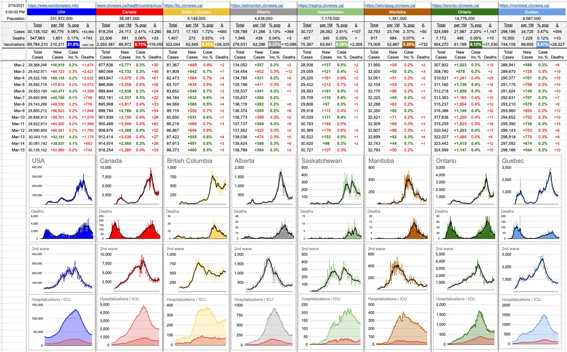
Sunny day here in B.C…. and we get an extra hour of it… and, nicely trending numbers over the weekend. All of that pointing in the right direction.

March 15, 2021 Graph

February 23, 2021

Imagine a big map of North America… now, take 100 pins and stick then on the 100 biggest cities. Now imagine trying to find the shortest path that visits every city exactly once. Imagining the problem isn’t difficult. Solving it is a different story.

To solve it, you’d create a table of all the distances from once city to another. Each city would have a list off 99 entries below it… Vancouver to Seattle, Vancouver to Portland, Vancouver to Miami… etc. The total number of distances to consider would be 100 x 99… and yes, even though Vancouver to Seattle is the same as Seattle to Vancouver, you need the entry twice in the table because, in the solution, you’re not sure from which direction you’d be approaching.

Setting up a computer to solve this is simple: Generate every version of path through all cities, add up the little distances, and keep track of the best one so far. Once you’ve cycled through all the combinations, you’ll have the answer. This is easy, in theory.

It gets a bit more complicated in practice.

How many combinations of paths are there? Starting in any city, there are 99 options for the next one. Once you get there, there are 98 choices for the next one. After that, 97. Therefore, the number of combinations is 100 x 99 x 98 x… all the way down to x 1. That’s 100 factorial (100!) which equals… a really big number. How big? It’s a number with 157 zeroes after it. The number of particles in the universe is a number with 80 zeroes after it. How long would it take to analyze every combination? A few zillion years. Not too practical. That’s how long it’d take to find the perfect solution… but how about a “good enough” solution? Not 100%, but how about 95%?

Back in 1993, when I wrote a program like this, it took about 20 minutes. With today’s horsepower, any home computer could do it in less than a minute.

That’s quite a difference, and for all practical purposes, good enough. The traveling salesman can spend a few extra days on the road and burn a bit more gas… not a big deal. Good enough.

One strategy to solve big problems down to a “not perfect but good enough” level is what’s called a “Genetic Algorithm”… it’s what I used, and it’s pretty cool, so now you get to hear about how it works.

Out of the zillions of possible 100-city-tours, imagine you generate a bunch of random ones… say 10,000 of them. Just create 10,000 unique paths through those 100 cities, totally randomly. Some, like the ones that begin Vancouver-Miami-LA-Toronto… will be awful. Ones that start Vancouver-Seattle-Portland are likely to look better. But… whatever they look like, out of the 10,000… take the best 100.

Now… here comes the cool part… you take those 100 – call them the “first” generation, and figuratively “breed them” to each other. You pretend they’re like parents having offspring… you splice half of one, splice half of another, join them together… and now you have a whole new potential solution. It might be better than one or both parents… it might be worse. Doesn’t matter… breed all the combinations… now you have a whole new generation of 10,000 possible solutions, and they’re almost all certain to be better than their respective “parents”. And now you take the best 100 of those and do it again, and create a third generation. This is like instant evolution… but it doesn’t take 9 months and lots of diapers. It takes a few milliseconds… and that’s the beauty of it… after less than 1,000 generations, which doesn’t take long at all, you have a surprisingly good solution. Already north of 90%.

Modelling 100 cities with nothing but the distances between them is very simple. Modeling the infrastructure within which a virus may live and thrive and propagate is a lot more complicated, but once it’s in place, searching for a solution might look similar. Here’s a random formula for a mRNA vaccine… was it effective? Try 10,000 random formulas, pick the best 100… splice them, mix them, test them… and do it again. And again and again. Pretty quickly, you will have honed-in on realistic possibilities.

This isn’t quite how it came about… but when people wonder how it’s possible to come up with an answer to a supremely complicated and unknown problem, it’s strategies like this… which have the capability of very-quickly zeroing in on viable solutions drawn from an unfathomably huge search-space of potential solutions.

Finding the perfect vaccine might take decades… if not centuries. But a vaccine doesn’t have to be perfect.

How long would it take to find one that’s good enough… say, 95% effective…?

That question has been answered.

14 Likes, 3 Shares

November 22, 2020

We’ll have to wait till tomorrow to see some B.C. numbers, so until then, let’s shift our attention eastward by one province and look at Alberta, who unfortunately is giving us a textbook example of what exponential growth looks like.

For today, I’ve added a third row of graphs. The top row of the three is each province’s journey through this pandemic, from day one. The bottom two rows represent only the 2nd wave; first, logarithmically… and, the bottom one, normally.

They say a picture is worth a thousand words, but sometimes, it’s not because the picture is so indescribably beautiful… but because the picture is difficult to describe. If math isn’t your thing, hearing a sentence like “the plot an exponential curve on a logarithmic scale will be a perfectly straight line.”… might sound confusing. But when you look at the pictures, it makes perfect sense.

Have a look at Alberta, and have a look at the bottom two graphs. They are displaying the same dataset, but on the bottom one, the Y-axis is linear, ie normal, ie… perfectly spaced out. The one above it is logarithmic, which “squashes” the Y-axis the bigger it gets.

The way a logarithmic scale works is that it perfectly compensates for that exponential growth… which is why those smooth, increasing curves of the bottom graph (TTDs of 20 and 25) show up as perfectly straight lines on the graph above it.

Accordingly, the seven-day moving average of daily case-counts of Alberta, the thicker black line, follows the curve on the bottom graph and follows the straight line on the upper graph. While the logarithmic graphs tend to minimize the growth as things get worse (the steepness gets squashed), the real-data graphs tell the truth. It’s clear from looking at these graphs exactly where Alberta is heading, if things don’t change. It’s clear as well that Saskatchewan’s recent increases are far worse than TTDs of 20 or 25; closer to 15 over the last few days.

Exactly 8 months ago, we were heading into the last week of March wondering the same thing we are today… I wonder what the week ahead will look like. It feels like a lifetime ago, March 22nd… that was the 6th day of me writing about all of this (here it is if you’re interested: https://kemeny.ca/2020/03/22/march-22-2020/). The U.S. had 32,000 cases. Canada had less than 1,500. B.C. had less than 500.

Here we are today (Day 251) – and the sentiment hasn’t changed. Just the numbers, which are all a lot bigger.

Follow & Discuss on Facebook

Day 250 – November 21, 2020

No B.C. numbers today, but here’s a brief look elsewhere…

Parts of Ontario (Toronto and Peel) are in a lockdown of the sort we saw around here at the start of this pandemic. Very tight constraints with respect to with whom you can get together, and strict rules around what that needs to look like. Everything else is pretty-much closed, except the essentials.

Saskatchewan saw a huge increase in numbers today, something they saw coming; measures were put in last week, but they’re now dealing with the effects of what came before. As we know, it can take a couple of weeks to realize the effects of these measures.

Alberta also set its record for new cases in the last 24 hours.

Today’s lesson in exponential growth comes from Nunavut… where, for the longest time (like till November), they’d seen zero cases. They got their first one Nov. 6th… their second one Nov. 7th… and then two more Nov. 8th. Then 8, 18, 26, 60… and they’re now over 100. Their graph is not a gentle slope or a hockey stick… it’s a literal cliff wall which they slammed into, after 7 months of flat road. That’s how this thing can take off.

In the spring, it was all about flattening the curve. For those late to the game, like Nunavut and Saskatchewan, where they never got a first wave, that’s where they’re at.

For places like Ontario and Quebec, it’s not just about flattening the potential frightening growth… it’s that the numbers, as flat as they may be (which they’re not) are already really big.

What’s worse… if you have 100 hospital beds available… to see cases go from 2 to 8 to 20 to 50 in a few days? Or to see them go 98, 99, 103, 98?

The answer is… it depends… on what measures are in place. Drastic measures are needed in example A, but example B is just as frantic, because it’s evidence of a problem that’s stressing the limits and that’s not going away unless something is done about it. Roughly speaking, example A is Nunavut and example B is Ontario.

The rate of growth is interesting to look at, on an apples-to-apples basis. I’ve added Time To Double (TTD) lines to the provincial graphs, and I’ve set them all (for now) to 20 and 25, so you can compare the data against those straight lines… and across provinces. Don’t worry too much about where those lines cross, just look at the slope of the data compared to the TTD lines. B.C. and Alberta are examples of consistent growth… you can see the recent growth is virtually parallel to the TTDs of 25. And at their steepest recent points, both Saskatchewan and Manitoba had recent TTDs approaching 10.

You’ll notice that Quebec and Ontario are a lot flatter. Indeed, their TTDs are 50 and 77 respectively. Their issue isn’t so much exponential growth… it’s just that any growth is already putting pressure on a system that at some point won’t be able to handle it.

Follow & Discuss on Facebook

November 12, 2020

Today’s update is about numbers, because I’m looking at them… and they’re not great. At all. Dr. Bonnie is not pleased. B.C. has just gone over 20,000 cases. By tomorrow, Manitoba will have gone over 10,000… and Ontario over 90,000… and Quebec over 120,000.

And the U.S… wow. They blew through 10 million cases recently, but every day their growth is increasing sharply. Today’s new-case number of +164,878 is by far their biggest ever.

The pictures reflect all of this better than the words. Those are steep ramps everywhere, and even the logarithmic graphs are slanted upward… the U.S., Canada, everywhere. Around the word, daily, 10,000 people are dying.

Here are two little examples of exponential growth:

Imagine a chessboard… put a grain of salt on the first square. Put 2 on the 2nd square. Put 4 on the 3rd square… and so on. By the end, you’ll probably have a pretty big pile of salt, right? Enough to fill the room? Enough to salt the road from here to Whistler?

Well… after a couple of rows of the chessboard, it’d be about 3lbs of salt. Not a big deal.

At the end of the next row, you’d have enough to coat the floor of a big room. Hmm… perhaps more than you thought. I’ll cut to the chase… by the end, you’d have 18 trillion dollars worth of salt, and you’d need a box a mile long, wide and high to store it all.

Here’s a better one, and a chance to make some money! Imagine a piece of paper… you fold it in half. Fold it in half again… no big deal. How thick would it be if you could fold it 20 times? The answer is… 1km. Crazy, eh? You can’t come even close. Not even halfway close. So here’s a challenge… send me a video of you folding a piece of paper successfully in half 8 times… that’s it, just 8 simple little folds… any piece of paper you want. But it has to be in half every time, because that’s true exponential growth. Do it successfully and I will send you $1,000. Go for it.

That’s the thing with exponential growth… it’s simple and dismissable to begin with, and suddenly, it hits a tipping point, and it’s drastic. The latter half of the chess board is hugely problematic. The last 4 folds you’re about to attempt are a lot more difficult than the first 4. Like, incomparably more difficult.

And that’s exactly where we are now. I’m not sure where we are on the chessboard, nor on which paper-fold we’re at. But it feels like we’re pretty close to jumping from “this isn’t so bad” to… “Oh oh.”

Follow & Discuss on Facebook

Go to Top