

We’ll have to wait till tomorrow to see some B.C. numbers, so until then, let’s shift our attention eastward by one province and look at Alberta, who unfortunately is giving us a textbook example of what exponential growth looks like.
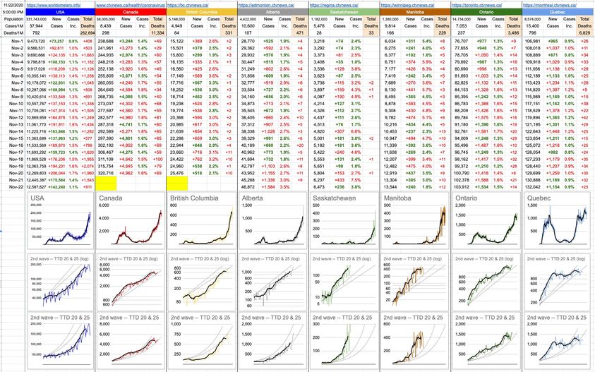
For today, I’ve added a third row of graphs. The top row of the three is each province’s journey through this pandemic, from day one. The bottom two rows represent only the 2nd wave; first, logarithmically… and, the bottom one, normally.
They say a picture is worth a thousand words, but sometimes, it’s not because the picture is so indescribably beautiful… but because the picture is difficult to describe. If math isn’t your thing, hearing a sentence like “the plot an exponential curve on a logarithmic scale will be a perfectly straight line.”… might sound confusing. But when you look at the pictures, it makes perfect sense.
Have a look at Alberta, and have a look at the bottom two graphs. They are displaying the same dataset, but on the bottom one, the Y-axis is linear, ie normal, ie… perfectly spaced out. The one above it is logarithmic, which “squashes” the Y-axis the bigger it gets.
The way a logarithmic scale works is that it perfectly compensates for that exponential growth… which is why those smooth, increasing curves of the bottom graph (TTDs of 20 and 25) show up as perfectly straight lines on the graph above it.
Accordingly, the seven-day moving average of daily case-counts of Alberta, the thicker black line, follows the curve on the bottom graph and follows the straight line on the upper graph. While the logarithmic graphs tend to minimize the growth as things get worse (the steepness gets squashed), the real-data graphs tell the truth. It’s clear from looking at these graphs exactly where Alberta is heading, if things don’t change. It’s clear as well that Saskatchewan’s recent increases are far worse than TTDs of 20 or 25; closer to 15 over the last few days.
Exactly 8 months ago, we were heading into the last week of March wondering the same thing we are today… I wonder what the week ahead will look like. It feels like a lifetime ago, March 22nd… that was the 6th day of me writing about all of this (here it is if you’re interested: https://kemeny.ca/2020/03/22/march-22-2020/). The U.S. had 32,000 cases. Canada had less than 1,500. B.C. had less than 500.
Here we are today (Day 251) – and the sentiment hasn’t changed. Just the numbers, which are all a lot bigger.
Val McDougall
My goodness, Quebec is having a tough time. Why are so many more people dying? It cant just be demographics – age? ethnicity? health care system? lack of mask wearing? religious gatherings? I am sending positive thoughts their way
Okay, I’m genuinely on the fence but this is a question for the peanut gallery: I played a little hockey Sept-Oct and there are precautions in place at rinks, but it’s plainly obvious that if someone has the virus and it spreads as experts say, there’s not much to be done about it on the ice or in the locker room.
That being said, I’m a lot healthier when playing hockey regularly and am still recovering somewhat from heart failure.
Hockey took a break for a few weeks with the emergency order from Dr. Bonnie but is resuming this week.
The question: Do I return to play? Or wait this out? Horatio Kemeny what do you think?!
This is all so disheartening.