

You’ll have to pardon me; today was data “catch-up” day, so this is all just fact… and very little “interesting” opinion. And if you won’t pardon me, I’m sure I can convince the soon-to-be-former president… he seems poised to hand them out like candy.
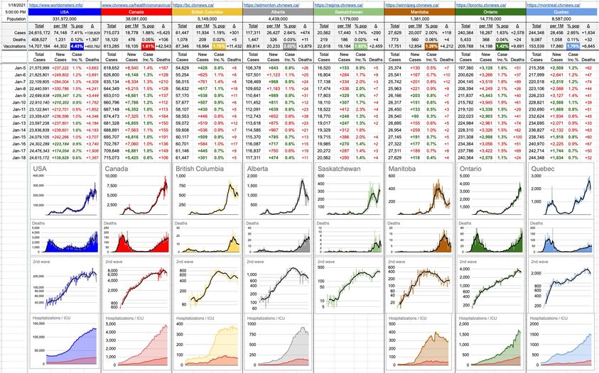
So… I took the opportunity to add a whole new row of graphs (the bottom row); a visual look at hospitalizations and, included within that (overlaid at the bottom, in red), the ICU numbers as well. At a glance, B.C.’s hospitalization numbers are pretty flat over the last little while, hovering in the 350 rage. ICU cases today are at 68, which is down slightly over the recent past… as evidenced by the gradual downslope of the red ICU part of the graph. Alberta’s hospitalizations are down as well, as are their ICU cases.
On the unfortunate flipside, Ontario and Quebec are still seeing slow and steady growth on both fronts.
If you follow these graphs closely, you might notice that the Time To Double (TTD) lines are gone from the 2nd-wave graphs. I’ve been writing and describing and fiddling with TTD numbers and graphs since day 1 of this, but given the numbers, they’re not needed. That’s a good thing, from the point of view that things aren’t growing exponentially. Let’s hope the growth in cases remains, at worst, relatively linear… and then we never have to see those lines again. To be clear, case numbers are still growing in many places, but the rate of growth (at least, for the moment…) is not of the scary exponential sort.
My profuse apologies to the Saskatchewanians (Saskatchewaners?) who are looking at that big space where a graph should be; I couldn’t find the data in a usable form… but will keep looking around.
36 Likes, 4 Shares
Saskatchewanites. Mainly because the other two annoyed me. ????
I would also use Saskatchabushies.
They don’t have data in Saskatchewan.