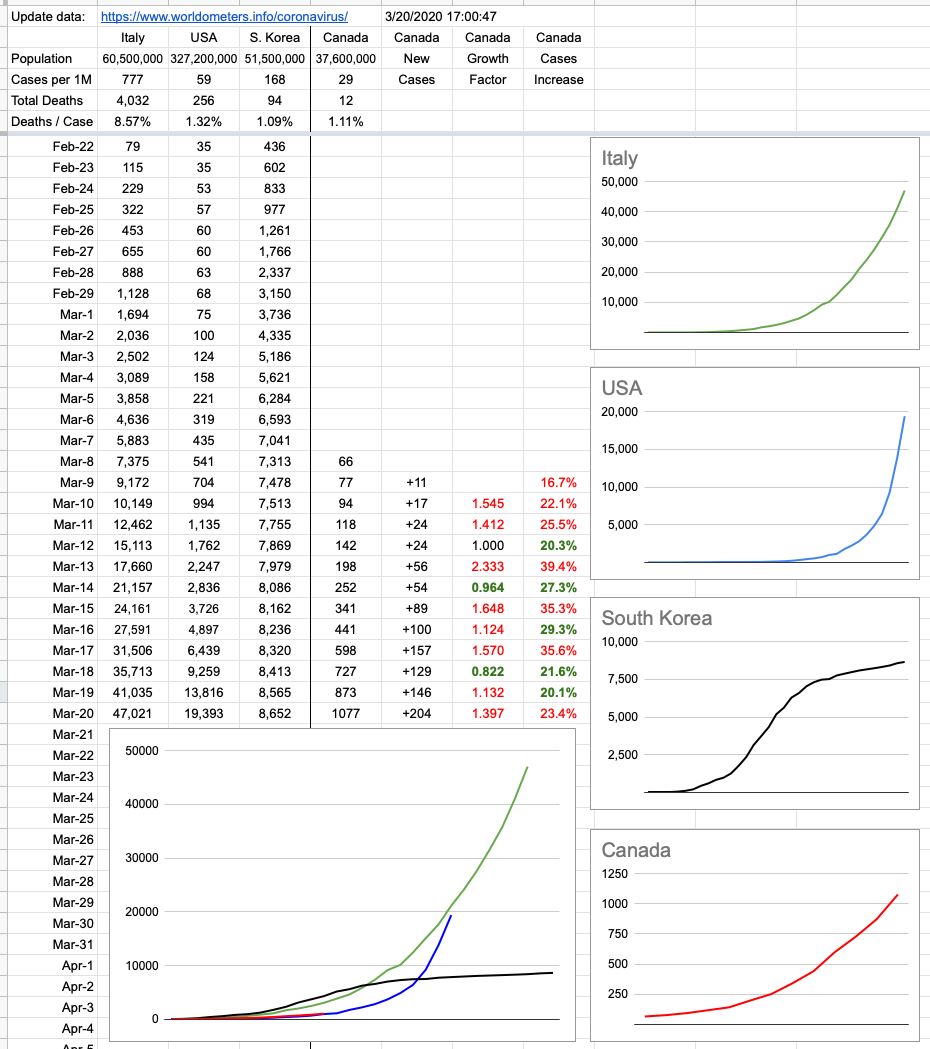
We’re still at relatively low numbers, tracking pretty closely to where the US was 10 days ago. It’s a continual rolling 10-day window to see how effective our efforts have been. It’d be really nice to see that red line detach from the blue one and continue straight across with no upswing and it’d also be very nice for our neighbours to the South to see their line flattening out.
The colour coding on the rightmost two columns of numbers signifies change from the previous day. The growth factor is a comparison between today’s new cases vs. yesterday’s. The column to its right is the percentage increase of cases nationwide. Green is good, because it implies a smaller increase than the previous day. A streak of green days in a row would be very nice to see.
Needless to say, especially this early in the game, these numbers are very susceptible to how many tests are being administered and who’s being tested. As time goes on and numbers get bigger and the data is more generalized, it’ll all mean more and be clearer. The localized clusters we’ve witnessed (especially in B.C.) are not indicative of the entire country. If we based our assumptions entirely on what’s unfortunately happened at the Lynn Valley Care Center, we’d be appropriately far more worried.
Shoutout out to Dr. Bonnie Henry and Adrian Dix, whose 3pm updates are not just informative but also reassuring. And to the sign-language guy… if we are all as passionate in treating this as seriously as that guy is with the way he conveys the message, there’s no doubt we’ll be ok.
View Original Post and All Comments on Facebook


Leave A Comment