

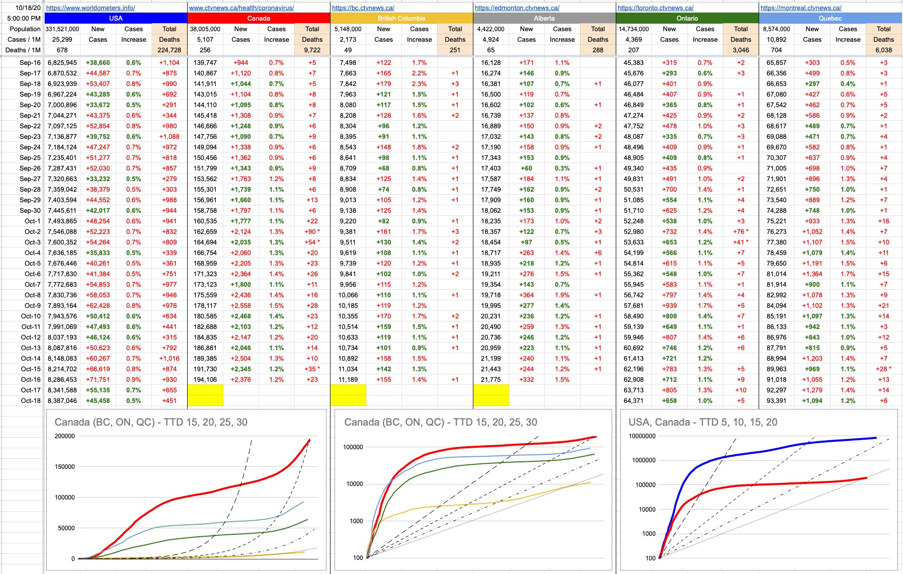
No new numbers till tomorrow, but here’s something older that you may remember, especially if you’ve been reading these updates since the beginning. Today’s graphs aren’t the usual up-to-date provincial and national tallies. Rather, these are what those original Time-To-Double (TTD) graphs look like today.
Early in the pandemic, when things were spiraling out of control, the TTDs were being measured in handfuls of days… 2, 3, 5… that’s what we were witnessing in places like Italy and Spain and, for a little while, severely-affected pockets of the U.S. That’s what we were hoping Canada would avoid.
While things are still growing exponentially, the TTDs are way down. The recent second wave is certainly visible, especially in the left-most (non-logarithmic) graph, but the TTD line on which Canada sits is 20.
The middle graph is the same as the one on the left, except represented with a logarithmic Y-axis… which straightens out the curves of those dotted exponential TTD lines, and serves to represent the rate of exponential growth (or lack thereof) compared to the beginning.
The graph on the right is what Canada looks like compared to the U.S… and since the Y-axis is “compressed”, it makes things look a lot closer than they actually are. Rather than scaling up evenly, every Y-axis grid line on those two right-most graphs represents 10-times the growth. The red line is just below 200,000. The blue line is above 8,000,000.
All that being said, the Canadian graphs’ hockey-sticking up-to-the-right is quite evident, both nationally and provincially. What we’d obviously like to see is for them all to flatten out again… which one day they will.. but, hopefully, sooner than later. We know what we need to do to make that happen…
Leave A Comment