

You’ve heard me say, “Start at the finish line and work backwards from there.” It’s a strategy that’s served me well in life, and looking at today’s B.C. graph reminded me of something.
Back in high school, grade 12 — our science teacher wanted us to figure out absolute zero experimentally. This isn’t a complicated experiment; it’s simply based on the assumption that the volume of a gas changes with temperature. The hotter the gas, the more space it wants to occupy… so if you’ve got the gas locked into a fixed-volume chamber, by measuring the pressure at different temperatures, you can learn a lot.
Side-note… I got into an argument once with someone who insisted that it’s possible to have a temperature colder than absolute zero. Given that temperature is really just measuring the speed of molecules, and that absolute zero is the speed at which they stop, I think it’s impossible for anything to be colder that that… in much the same way it’s impossible for your car to be going any slower than “stopped”. If any experts want to tell me how it might be possible, I’m listening. In fact, like the speed of light, I believe you can’t even get to it… you can just get really close… but if you reach it, all sorts of universal rules break down.
Anyway, with this experiment, you measure the pressure of the gas at different temperatures… and then you graph it. You plot the points on a graph; pressure vs. temperature. And since this is a linear relationship, you should be able to find the temperature by finding the line that cuts through all the data points and then eventually hits the graph at zero. This process is called extrapolation… where you take certain data, figure out the rules that apply to it, and make intelligent guesses with data points you haven’t actually measured experimentally. If your car passes a fence post every 10 seconds at 50km/h, can you figure out how fast you’d need to be going if you wanted to pass a fence post every one second? You can measure and graph it at 50, 100 and maybe even 150km/h… and if you plot that, there’s a perfect straight line to show you you’d need to be going 500km/h. Much easier than trying to do it experimentally.
Of course, if you’re relying on the graph to give you the answer, it’s important the measurements be accurate because a couple of dots just a bit off will move the line significantly. An extrapolation of absolute zero that’s +/- 3 degrees of the real answer is a good result.
But I chose to start at the finish line… and found exactly where, on the graph, absolute zero would be (-273.15 C.)… and drew my line from there to my first data point. And then, magically, all of my results landed perfectly onto the line.
When the teacher was handing back the lab books next class, he stopped at my desk.
“Congratulations on your excellent result, Mr. Kemeny.”
“Thank you, sir.”
“Don’t you find it extraordinary that, armed with just some rudimentary equipment, you managed to find a result accurate to within a 10th of a degree?”
“It’s quite remarkable, sir.”
“How do you explain it?”
“It must be due to the excellent science instruction I’ve been receiving in this course, sir.”
“Thank you, but I’m not that good. Please keep in mind, Mr. Kemeny, that life rarely offers you shortcuts.”
“I suppose that means that when it does, we should take them?”
He just handed me back the lab book. I got 8/10. Everyone else got 10. I didn’t argue.
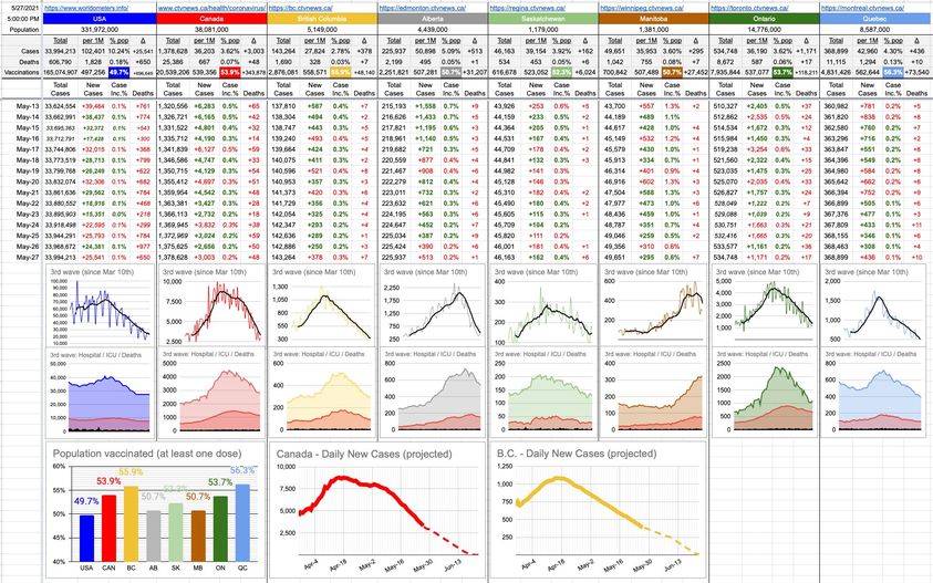
Looking at today’s B.C. graph, it’s a linear descent towards zero new cases a day. Like bad data, a couple of bad days can significantly affect the landing point, but until it does, let’s have a bit of fun with the numbers.
You’ll see below three new graphs. The first one is a consolidation of all of the vaccination rate graphs. Yes, we get it, they’re all going up, nobody is getting un-vaccinated, and those graphs are small enough that the nuanced differences between provinces are indistinguishable. So now, they’re all on one graph… if you want to compare apples to apples.
The other two graphs, as per above, are extrapolations… one is Canada and the other is B.C. The thick line is the real data up to today. The dotted line is where we’re headed if nothing changes. This is still very much a work in progress… so, we shall see. I’m no expert… just some guy plotting points and drawing lines.
It’d be nice to be able to work backwards; certainly, it’s what our provincial health ministry has tried to do with our 4-step re-opening plan… but here we’re stuck doing the actual experiment… and, it should be noted… if these numbers and graphs are anywhere close to reality, we will easily achieve the targets of out provincial 4-set plan. I’d certainly give that a well-deserved 10/10.
Ffs please tell me that wasn’t me too re: absolute zero.
Was that Mr Bacon physics? I’m sure there is a good reason why you remember so much of those days that I have seem to have forgotten.
Reminds me of one of my favourite stories about experimental results: that of Millikan’s measurement of the charge on the electron and how subsequent experimenters got better, more accurate results, but were always suspiciously biased toward the “known” answer that Millikan had got in his seminal experiment.
Physics is pretty clear that you cannot get materials to absolute zero, either. They get mighty close, though.
The current record is 100 picoKelvins achieved at the Low-Temperature Laboratory in the Aalto University of Finland (because why wouldn’t the Finns study extreme cold?)
In doing so, they beat the previous world record that they held of 280 pK.
They did it using a three-stage process, starting with a liquid-helium-cooled cryostat that reduced the temperature of a sample of rhodium down to 3 milliKelvin.
Then using adiabatic nuclear demagnetization to align the magnetic dipoles of the rhodium in two steps, moving the temperature to 50 nanoKelvins, and the second stage at lower power reaches into the picoKelvins.
And they didn’t do it just to make something really, really cold – they were studying magnetic dipole behaviour in nuclei, specifically the rhodium nuclei. The expected a “freeze point” in the magnetic dipoles, which never occurred.
Their findings added to knowledge around creating superconductors