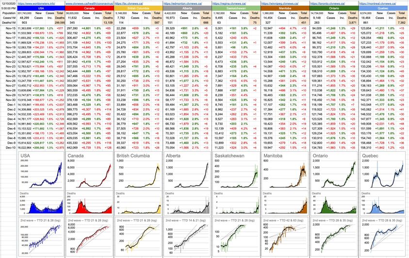
Today’s update is just about numbers. Every day I plug in today’s numbers and, magically, almost everything updates automatically. The only things that don’t, and it’s by design, are the Y-axes of all of the graphs below. I keep them on “manual”, because when the data bumps up against the limits, I want to be able to see it. Then I adjust it.
Good examples are both Ontario and Quebec, which have been bumping-up against 2,000 cases per day. Quebec actually exceeded it by a bit last week, but for now, I’ve left it… though it’s almost certainly just a matter of time. It’s depressing to have to change those numbers, because they tell a story… and if you were to go back to graphs of yesterday or last week or last month and beyond, you’ll see how they’ve all changed over the course of time… slowly but consistently creeping upwards.
I’m hoping to never have to adjust Alberta over 2,000. I’m hoping to never have to adjust B.C. over 1,000. The numbers were headed in those directions quite recently, but perhaps they’re tailing off. For now.
For those that look at the pictures, a couple of things to note… one is that I’ve added a 7-day moving average to the graphs indicating deaths. It makes it easier to see the trend… and, might I add, it’s not a great trend. The 35 deaths in Ontario is a record. The 28 deaths in B.C. is a record. Indeed, the national total of 126 is a record.
Number two is that I adjusted the Time To Double lines on all of the 2nd-wave graphs (bottom row). It’s really just me playing with the slopes of those TTD lines, trying to make them relevant with respect to how the data looks, especially recently. It makes it easier to see things like Manitoba, which has really managed to slam on the brakes; it was scary until recently, but perhaps their Premier’s impassioned plea really hit home… at least with enough people to have made a difference. Maybe we need more Premiers with tears in their eyes, telling us how it is.
As we’ve learned, the progression from infection to illness to hospitalization to death is around a month, if it gets that far. With vaccines starting in earnest by spring, and with the effects of the holiday season peaking around the end of January, mid-February may end up being the peak of this whole thing. That would be my guess. How high that peak goes remains to be seen… I just hope it’s not too many more keystrokes from today… to the ultimate highs of those Y-axes.
22 Likes, 2 Shares


The HK Daily Report (1.44 min read)