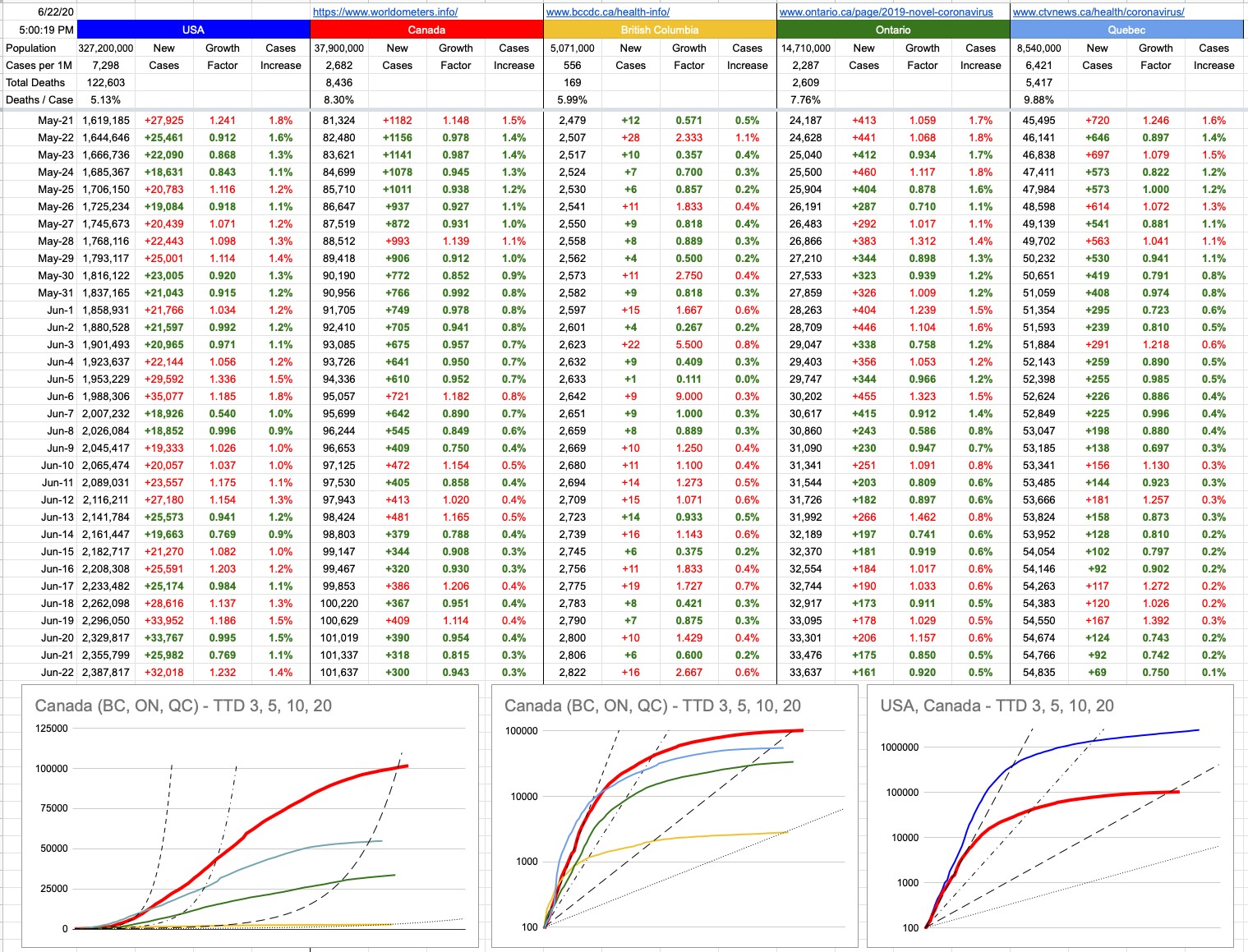
The numbers don’t lie. They can be twisted into statistics, which certainly can… depending how you paint them. But the raw numbers don’t lie.
Cases per million
Tests per million
Deaths per million
Deaths per case
Deaths per test
This list of malleable statistics is informative, but at the end of the day, there are some hard numbers that make up what feeds all these different angles of looking at the same thing. In my opinion, when all is said and done, excess deaths will have to be the numbers that get broken down. Those are not difficult numbers to pin down. Every jurisdiction knows, or should know, how many people die every day, week or month. That’s easily compared to the same period last year, whether as raw numbers or as a percentage of the population. These little graphs are showing up all over the place, and, as expected, show bumps starting in March.
The retro-analysis of these numbers will yield results that will get argued about, but those arguments will start falling flat the year after a vaccine shows up and things are fully back to normal. Certainly, they’re not all COVID deaths… but once you weed through cases of people who avoided the hospital out of fear and things like that, there won’t be another explanation.
In the meantime, we can only gauge where we’re at with numbers we can try to make as current as possible. Test positive cases is one. Virus-attributable deaths is another. Yes, we’re not testing enough. Or, as The President might suggest, we’re testing too much. Yes, some old people would’ve died anyway. Or, believe it or not, some old people can survive common colds or flus. Arguments on both sides, for now… but it’ll be hard to dispute ultimate deaths.
One number that we’ve all gotten used to is now changing… which is the average age of test-positive cases. How serious that turns out to be remains to be seen, but a lot more younger people are getting this. It’s no real surprise the Florida is turning into its own micro-disaster zone. Their governor (falsely) announced the curve was flattened, and things should head back to normal. Now we’re seeing the effects of what happens when you do that. The message that hasn’t been hammered home enough seems to be that until this thing is gone, it’s here. It ain’t over till it’s over. And I suppose the one thing about the presentation of this virus that makes it so difficult is how it skirts the line of “very serious” and “no big deal” so effectively, catering to both sides who’ve chosen what to believe. It’s at least 40x more lethal than a common flu, but it’s not 1,000x worse.
You may have noticed that my graphs and data have changed. I’ve removed Italy and South Korea. Both have been there from the start, because the entire reason I started writing was to track the path we (Canada) were on, as compared to others. There’s no longer much to learn from those two, because in three months, we’ve clearly defined our own track, both nationally and provincially. Thank you Italy and South Korea for providing us with data with which to compare, and congratulations on flattening your curves effectively.
What’s left now is the U.S to compare against. There was a time we were following them lockstep; fortunately for us, that deviated a while back. But what’s going on south of the border is still very important to us, so I’ve not only kept the U.S., but I’ve also added in the same level of detail as the Canadian national and provincial data. I’ve also removed the Time To Double (TTD) of 2 and added a TTD of 20. Indeed, things have flattened beyond the initial crisis. But as we’re learning, things can change. Numbers don’t lie.
View Original Post and All Comments on Facebook


Very informative – numbers don’t lie!
Oh yeah! There’s graphs! Hahaha. I mainly come here for the text ????