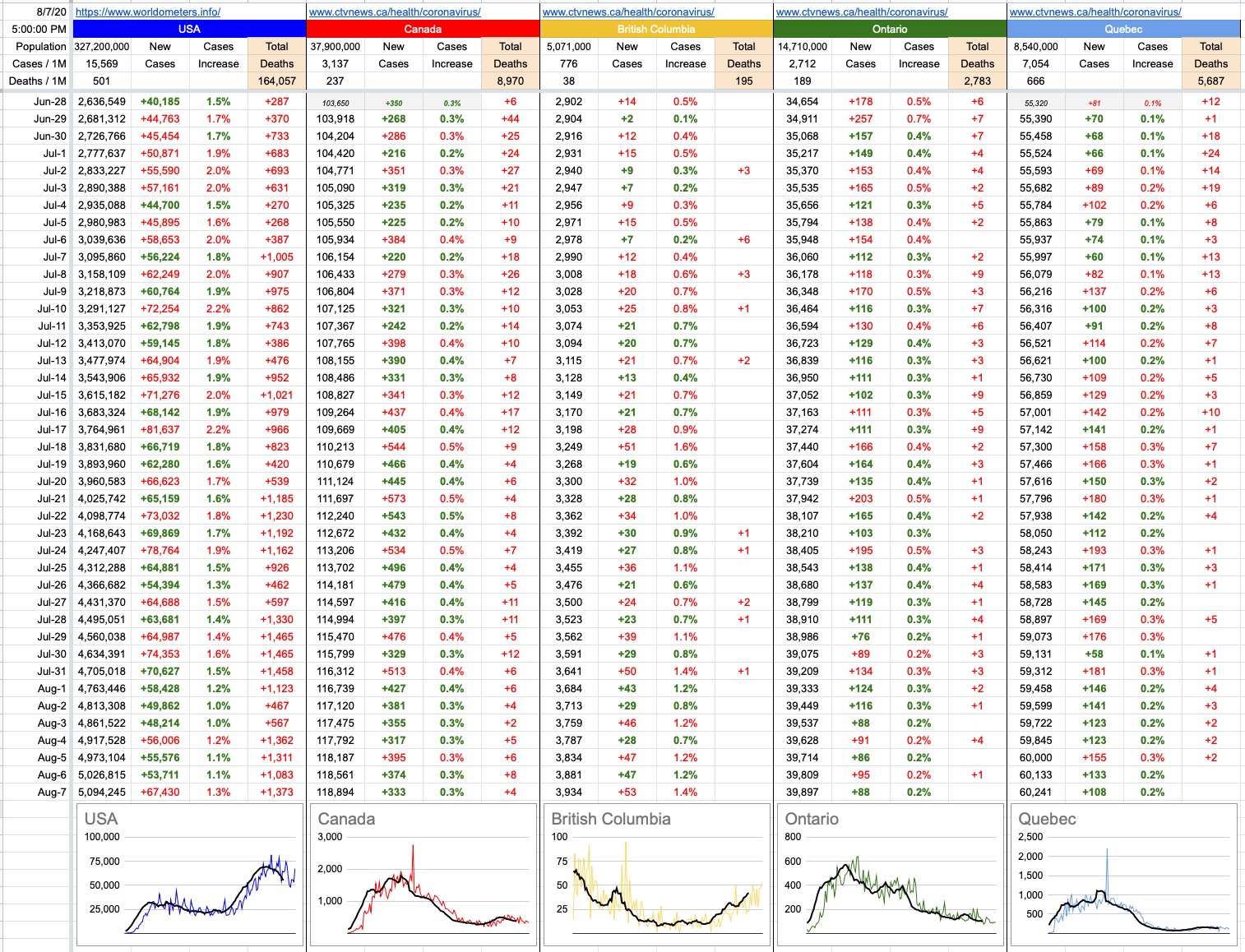
I’ve changed some of the data and graphs, to more accurately reflect where we’re at, and to track information that’s now more meaningful. Doesn’t it look good? Tremendous. World leaders are calling me, telling me they’ve never seen anything like it. The colours, the numbers. It’s a beautiful thing.
I’ve removed the growth factor column, because it’s become less relevant as the meteoric exponential growth has tailed off. I’ve left the cases-increase column, because it encapsulates that growth, as well as being directly relatable to what came before it.
I’ve added a “Deaths” column, which is particularly notable in comparison to our neighbours to the south. There is a “Total Deaths” at the very top, and there is a daily number of new deaths reported in the column below it. A blank means zero deaths, and looking at today’s numbers, those at least look really good. Zero in B.C., Ontario and Quebec combined. There were 3 deaths in Alberta and 1 in Saskatchewan today, and that was it, across Canada.
I’ve also changed Deaths / Case to Deaths per 1 million of population… 497 in the U.S., 237 in Canada, 38 in B.C., etc. This more accurately reflects the proliferation of the virus, more apples-to-apples instead of being more about number of tests given. It’s 15,363 in the U.S., 3,137 in Canada, 776 in B.C. and so on. More on that below.
From a Canadian point of view, these are all pretty good. The continuing upward trend here in B.C. is worrying, but we’re being told it was to be expected. I’m not so convinced, and hope the actions we take today will be reflected in those numbers in due course.
Also worth noting… ever since the White House took the number-gathering away from the CDC and decided to do it on their own, the divergence between cases and deaths has grown. I’m not going to accuse the American Government of lying, but I find it suspicious that the numbers of daily new cases (which they control) have shrunk, while the numbers of deaths (which they don’t control) have remained largely unchanged. Like, average deaths over the last week were 1,041 daily… and 1,100 the week before; pretty similar. The number of new daily cases this last week were 55,604, while the week before that, they were 65,373 Ten thousand less daily cases, yet the same number of deaths.
Recall Donald Trump’s musings that maybe too much testing isn’t a good thing, because when you do that, you find too many cases. Whether he’s hiding numbers or testing less, I don’t know. I’m pretty sure though… a few extra coats of paint on the deck of the Titanic probably looked pretty good. Hey, guys, what about this big hole on the side of the ship? Yeah, yeah, but look at the deck! Look at the shiny gloss! Doesn’t it look tremendous? It’s a beautiful thing.
View Original Post and All Comments on Facebook


Good ….but sad analogy…….
I have to laugh at the ending; such a clever but sad analogy! Well done!
I like the analysis adjustment. Thank you for all this effort.
Thanks Horacio, you have really zeroed in on relevant stats.