Canada

Day 7 – March 23, 2020

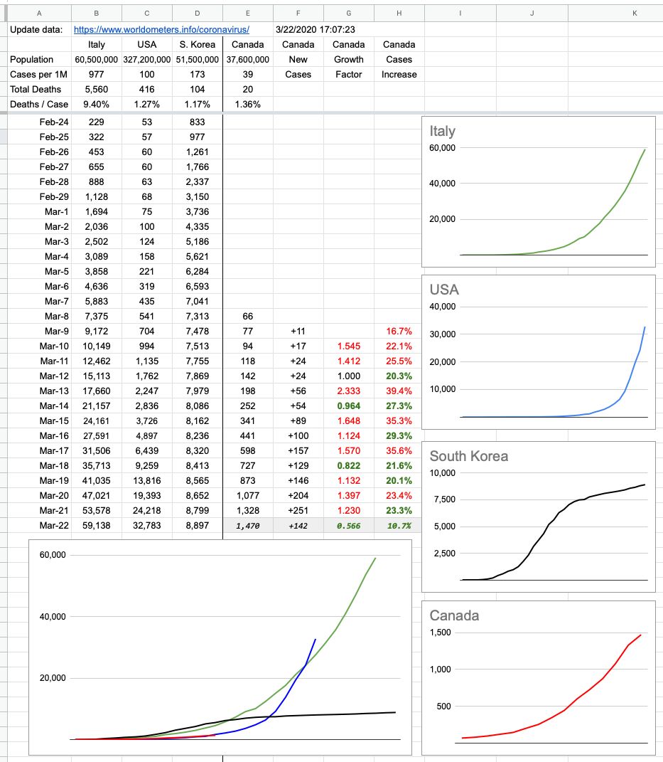
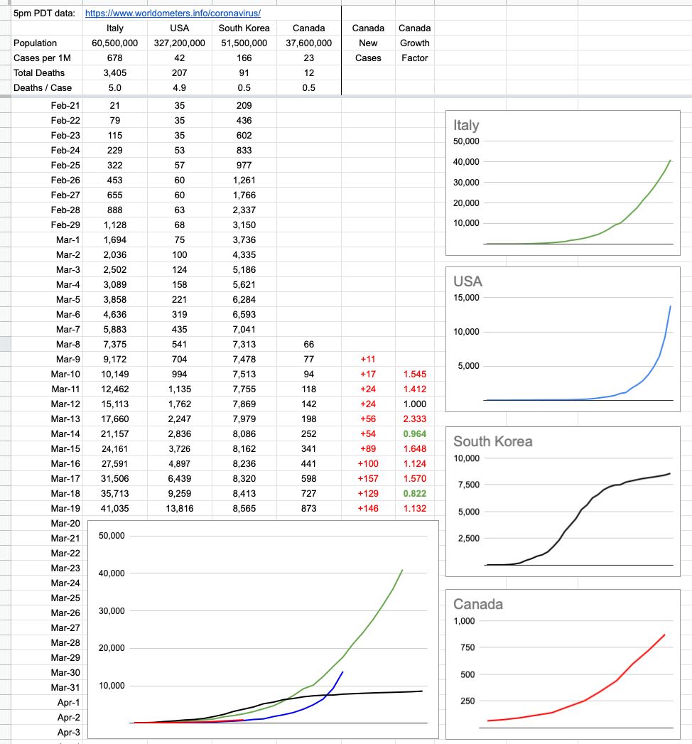
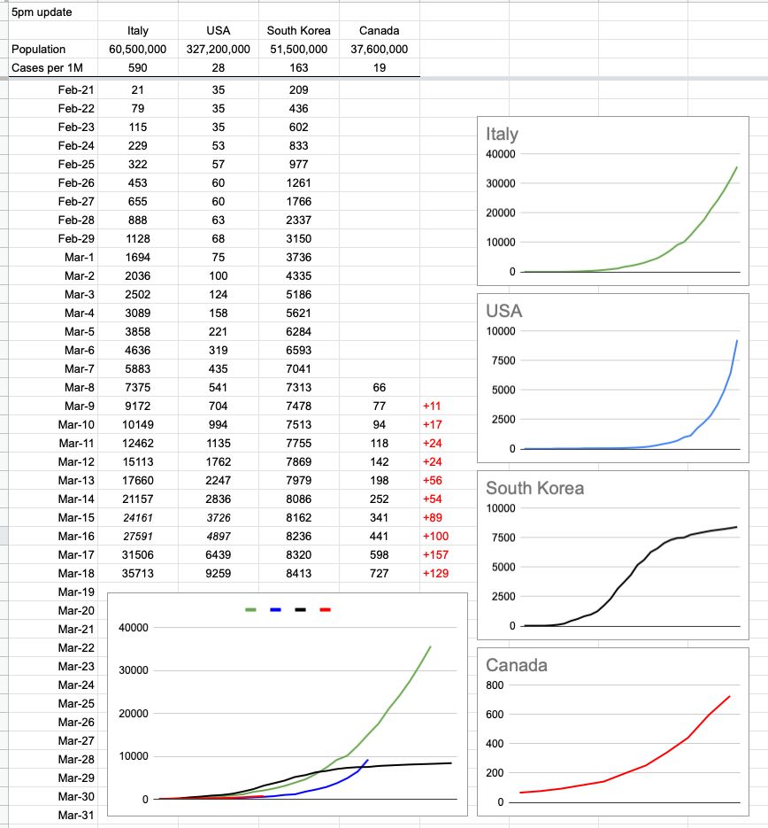
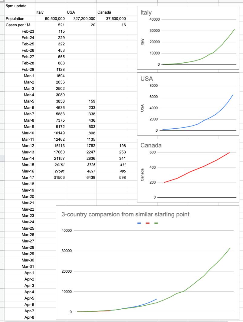
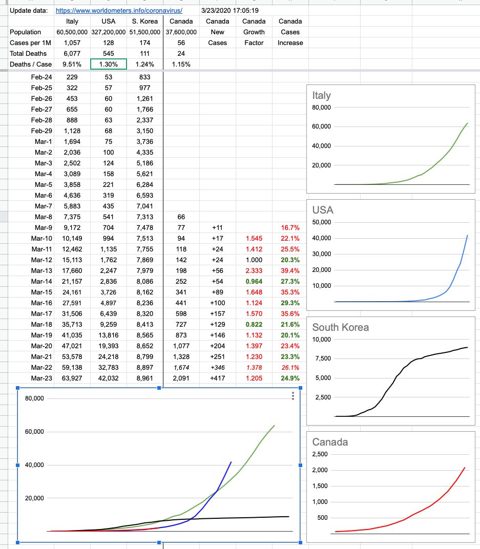
The lack of data over the weekend left a bit of a gap… which I filled in with some guesswork. I know where we were on Saturday, and I know where we are now. How we got here looks to be pretty consistent, but the next few days are more important than the last few. We are tracking very closely to the US, trailing by 10 days… just before things started getting really out of hand down there.

It’s important to note that I’m tracking new cases — not active cases. It was good news to hear that 100 cases in BC considered active have been resolved to “cured”. More than 300 in Canada overall.

As time goes on, we can look forward to that number of resolved cases growing, but note that its growth doesn’t affect tracking new cases. Those will always go up. In fact, at some point, it’s (hopefully) likely we will have “negative” days — where there are less new cases than resolved cases… but the idea of these graphs is to simply track the spread (and control) of new cases. What we do with them is a whole other question, and I’ll be happy to offer my opinion on that as time goes on. So far, comparing it to what’s going on elsewhere in the world, it’s pretty good. And will gradually look a lot better if you all just #stayhome!!

View Original Post and All Comments on Facebook

Day 6 – March 22, 2020

I don't like posting incomplete data, so stick a huge asterisk next to this… because there was no BC update today, so the Canada number is incomplete. Nevertheless, the other numbers are accurate, so here it is… and with tomorrow's update I will back-fill what's missing from today's and we'll see where we're at.

Hope you all got out for a bit of outside social distancing! Because most of the rest of the week is miserable rain, and for once — Vancouver rain — if that's going to stop people from clustering outside on the White Rock pier or the basketball courts at Kits beach… good.

View Original Post and All Comments on Facebook

Day 3 – March 19, 2020

I added a couple of rows and columns of interest. Mark Twain said something like "Lies, Damned Lies, Statistics". Indeed, there are many ways to paint different pictures with the same colours. This simple chart has grown in complexity and I've received a lot of comments and some criticism from people.

To be clear, and I'm not a statistician… I was curious how Canada's response, at this critical time, looks compared to three other cases… Awful, Bad, Bad-then-good. It's still early to tell, and I have my opinion… but pictures are worth more than words, so here you go.

View Original Post and All Comments on Facebook

Day 2 – March 18, 2020

Follow-up to yesterday’s post… and I will try to update this daily, around 5pm. To make it consistent, I’ve normalized the numbers for that. The data comes from https://www.worldometers.info/coronavirus/

The individual Canada chart looks a little curvier than it did yesterday, but that’s only because I added a bit of earlier data and while the trend was indeed increasing, the historical numbers are small. Check the y-axis, not just the pattern.

Also, while yesterday saw an increase of 157 cases nationally, that number was lower (129) today, according to this source of data. And that’s what it’s all about… slowing the growth, because it will grow for the foreseeable future. The question is how fast.

I’ve also added South Korea as an example of how it looks when you do things right; that is the trend everybody wants to see. Still growing, but way slower than before.

View Original Post and All Comments on Facebook

Day 1 – March 17, 2020

There’s a table going around showing what’s happened in Italy and the US so far. Here it is, with Canada added in… and a couple of rows of extrapolated data. I added the graphs, and what they show is simple — it’s up to us, ie Canada, to do everything we can with respect to flattening the curve. It’s not too late, because it’s still a straight line… but there’s zero wiggle room. In a perfect world, that red line stays straight, stays well-below those exponentially-growing green and blue lines, and eventually flattens out and goes down to zero. We, today, are where the US was a week ago and Italy was 2.5 weeks ago. And neither of those are trends we want to follow. Listen and follow what we’re being told. They are strict guidelines for a reason; they work.


View Original Post and All Comments on Facebook

Go to Top