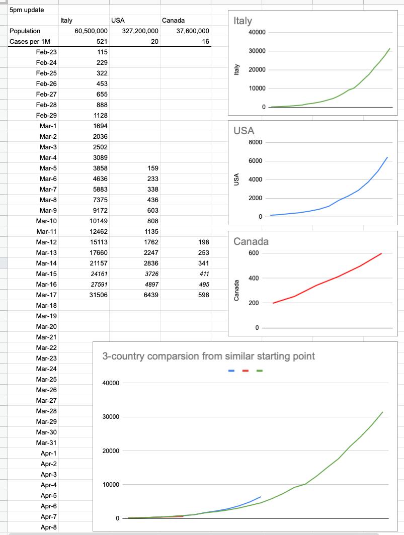
Day 1 – March 17, 2020
There’s a table going around showing what’s happened in Italy and the US so far. Here it is, with Canada added in… and a couple of rows of extrapolated data. I added the graphs, and what they show is simple — it’s up to us, ie Canada, to do everything we can with respect to flattening the curve. It’s not too late, because it’s still a straight line… but there’s zero wiggle room. In a perfect world, that red line stays straight, stays well-below those exponentially-growing green and blue lines, and eventually flattens out and goes down to zero. We, today, are where the US was a week ago and Italy was 2.5 weeks ago. And neither of those are trends we want to follow. Listen and follow what we’re being told. They are strict guidelines for a reason; they work.


