There’s that feeling you get when you sit down in a rollercoaster… first of all, what the hell am I doing, do I really need to be doing this… but once the thing starts moving, there’s no way out, so the impending dread as you start going up that first big hill… click-click-click as the chain underneath pulls the train slowly… wow, this thing is going a lot higher than I thought… click-click-click… this was such a stupid idea… click-click-click… ugh, this is a lot steeper than it looked… click- ohh.. no more clicks. We all know that means…
… and as the train gains momentum and sends you flying down that first huge drop, two things will come to mind… one, this part of it will thankfully be over soon and two, now you have a clear idea just how steep it was. Which serves to illustrate where we are today with respect to the numbers coming our way in the next little bit… there is a finish line to them, a week to ten days… and we once we hit that bottom, we will know exactly how steep things were.
Given where we are today and as per what I wrote yesterday, I don’t think we need to close our eyes and scream and hope for the best. It’s looking better than that. At least, on paper and at least, for now.
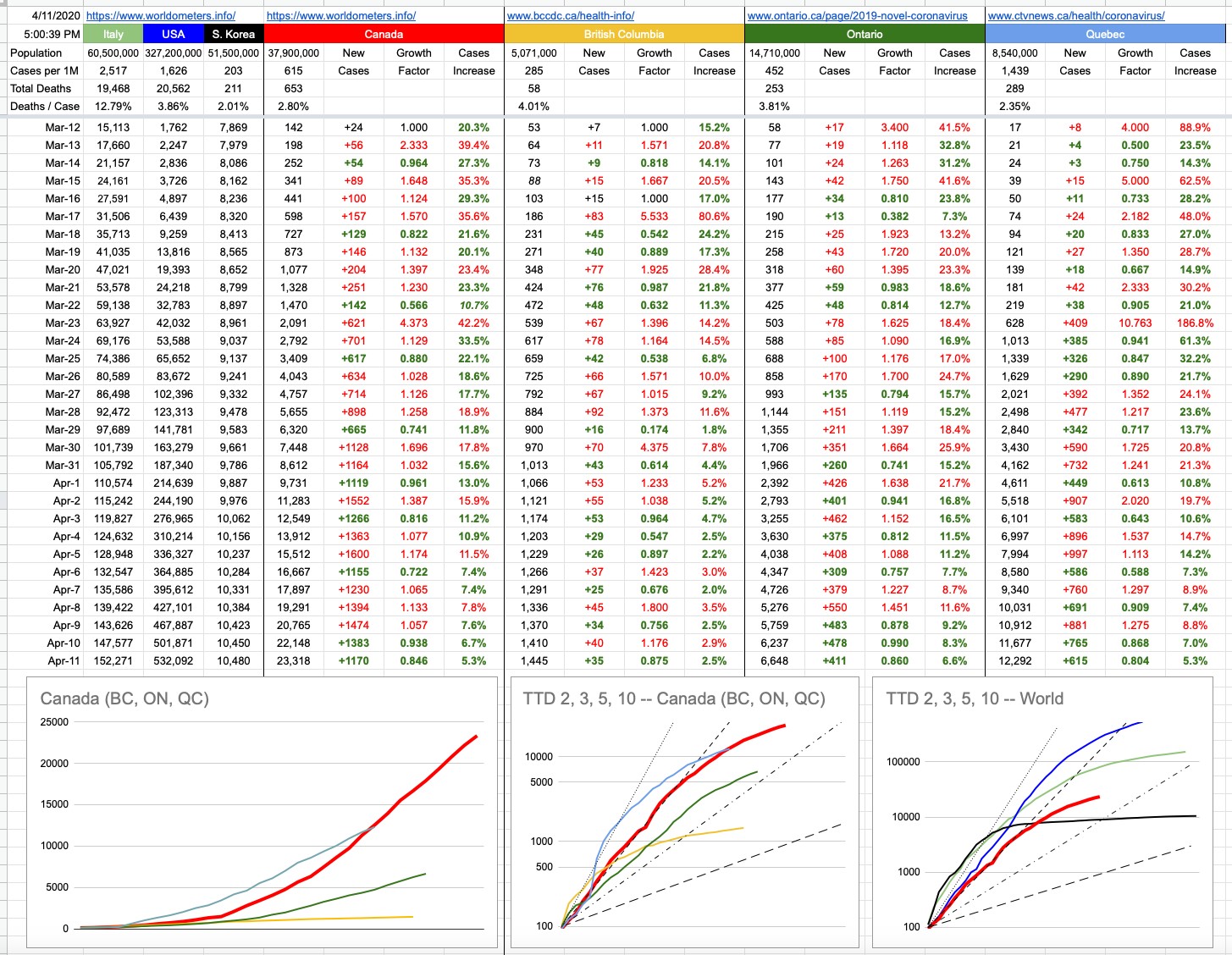
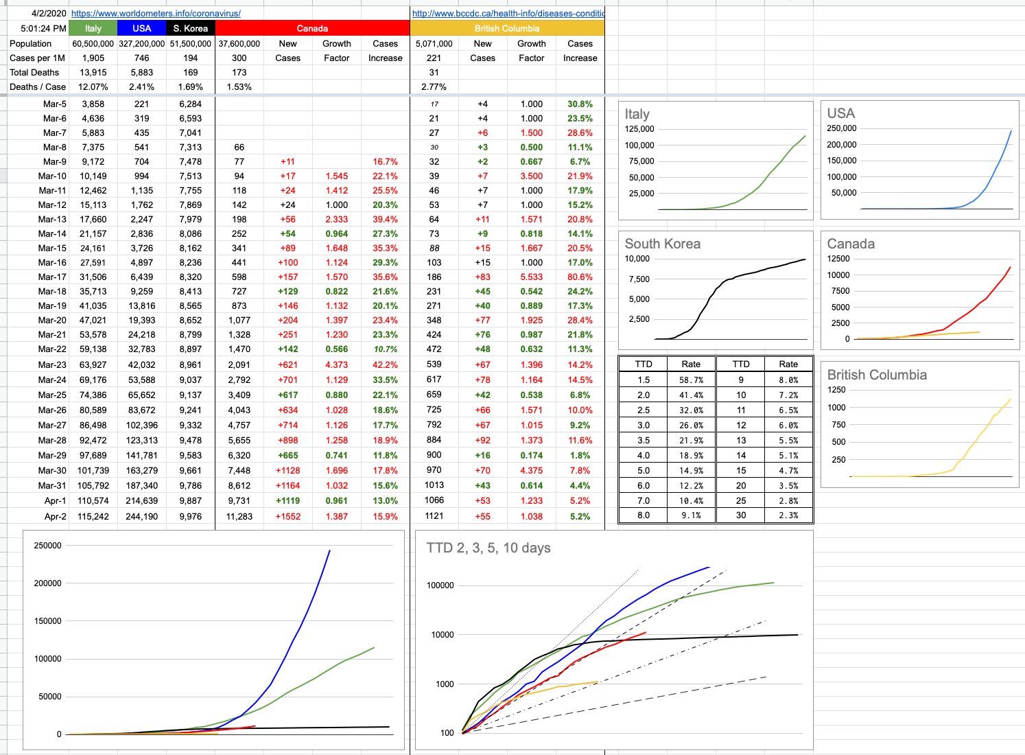
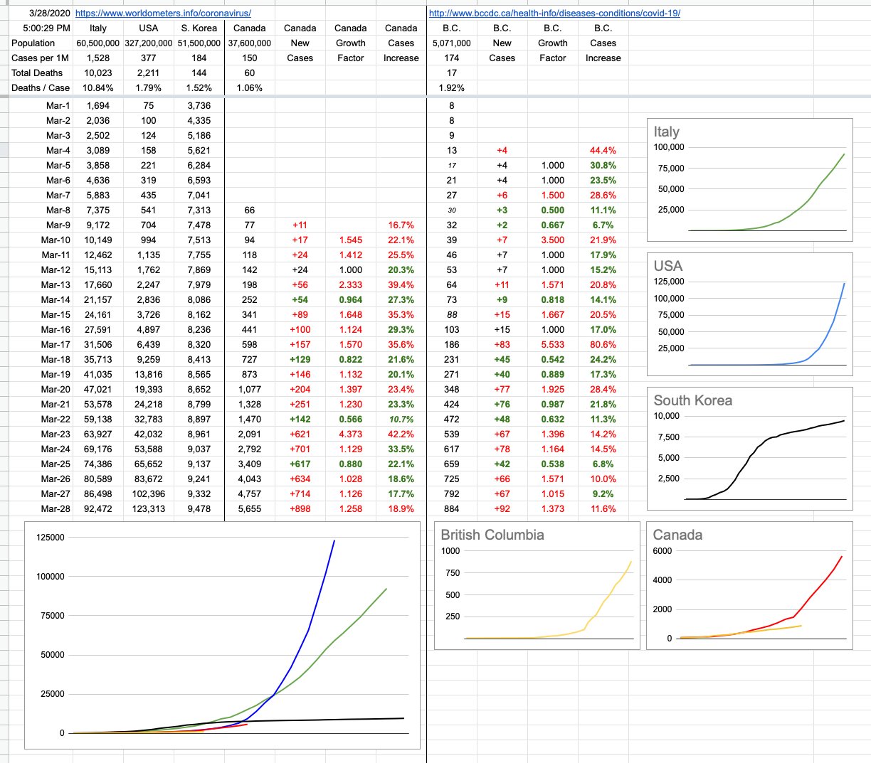
In B.C., although we had the largest one-day increase in cases yet, it’s perfectly in-line with our linear growth. Dr. Henry, for now, would like to see that number consistent at 12% which is roughly where it’s been. The average of the last 10 days is actually 11.1%. Today’s number was 11.6%. Yesterday was 9.2%. Nice solid straight yellow line, right in the sweet spot. And might I add, I am tracking total cases as they accumulate, not factoring in recoveries and deaths. The outcomes of these cases is a whole separate topic. But on that note, while we saw an increase of 92 new cases, we also saw 121 cases moved to the “recovered” column. As far as these numbers are concerned, today in B.C., there are less active cases than yesterday.
Canada’s number is bigger, but also consistent and also, slowly, hopefully, for now… going down day by day. Yes, of course the number of cases is increasing, but that rate of increase is itself decreasing. See that column… 4 out 5 days of green numbers. The rate of growth is slowing. For now. Are we still following the U.S. trajectory? Visually, and numerically, we’re not. Not so long ago, and you can still see it on the chart, Canada’s data was almost exactly perfectly 8 days behind the U.S: Feb 29, Mar 1, Mar 2… the U.S. had 68, 75 and 100 cases. 8 days later, Mar 8,9,10 — Canada had 66, 77, 94 cases. Perfect lockstep. And if you eyeball those numbers as you slowly go down the two columns, you see them in lockstep… and then they slowly start drifting apart.
The hope is that we wouldn’t follow them down the hellhole-course they’re presently on, and, for now, we’re not. We’re at 5,655 nationwide cases. 8 days ago, the U.S. was at 24,218. Had we “kept up”, today’s number would be 4x what it actually is. We’re now more than 11 days behind them.
So what does it all mean…
I’d like to address some of the comments that question the usefulness of these numbers in general, how the testing is inadequate, this isn’t reality, this is a useless exercise because the numbers are all bullshit. That the real case numbers are anywhere from 10x to 50x and it’s anyone’s guess. And therefore, blahblahbblah.
So, first of all, the way to solve big problems is to break them in half. Solve each half independently, and once you do, the big problem is solved. And if one or both of those halves is too complicated to solve, break it in half again and solve that. Keep breaking it in half until you have manageable pieces to solve.
The enormity of our present situation requires breaking it into hundreds of pieces, but here are some of the big ones, each of which needs to be broken down into many smaller pieces:
– the actual number of cases out there, factoring in recoveries
– the actual number of cases that require hospitalization
– why are some demographics hit so differently than others
– the testing infrastructure, and the strategy and adequacy of it
– the ability of our medical infrastructure to handle the cases
– the actual number of people dying from this
– the economic implications of allowing this to go on too long
– the herd immunity thing
– the treatment options, effectiveness of therapies, and timelines
– when and where is the vaccine
Without tackling all of that, notwithstanding each of those topics is its own book, and that’s only a small snippet of topics that need addressing, where we’re at right now is trying to solve chunks of a problem with incomplete information. One thing we have to our great advantage is learning from what others have or haven’t done ahead of us. Like one big change that was implemented today here is that the number of patients on ventilators doubled. Because suddenly a lot more people got a lot more sick? No. Because we learned from data elsewhere that putting people on ventilators sooner has a huge impact on positive outcomes. We didn’t know that two days ago, and now we do, and now we use it to our advantage.
Just because we don’t know something is no reason to throw our hands in the air — “these numbers are all crap anyway” — but to tackle this particular aspect…
Knowing the actual number of cases out there would have a profound effect on many aspects… first of all, how many actual new cases are there each day… how many of them will the person never even know, how many will they get sick but not too sick, how many will need a hospital, how many will die. If we could snap our fingers and know all that, it’d be great. One school of thinking that might kick in is that if actually the number is not 10x or 50x but actually 500x, and many of us have had it and never even knew it, and now we’re immune and will be for several months and even if we’re not, who cares, clearly I can fight this thing off so let me get a little sick and impose my herd immunity and get back to work since the actual mortality rate is only 0.2% etc.
Don’t think everyone has their heads stuck in the sand thinking the published numbers are the extent of this. One day, in hindsight, we’ll know those numbers. It’s possible that one day, we will have instant, cheap and available tiny-traces antibody testing. You’ll be able to wander into Starbucks, and along with your chai latte, spit into some throw-away little thing that’ll turn red if you’ve had it, stay blue if you haven’t. But until we get to that point, to a great extent, all we’re doing is buying time. Flattening the curve to suppress the load on our medical infrastructure. Isolating ourselves so we don’t infect others, especially those who are much likelier to get lethally ill. Keeping this thing controlled and contained until we’re certain we can manage it. It’ll likely never go away, and the waves of it appearing in the future will hopefully wind up in the “no big deal” pile.
But for now, the published numbers, the important numbers… the ones that are putting load on our medical system… the 884 confirmed, the thousands of others likely presumed but not confirmed… don’t think they don’t know about it. Don’t think when they tell you to stay home for 14 days, pay attention to your symptoms but don’t come in — that they’re not tracking you. You, who may well have it who think you don’t count — trust me, you do. Not in my numbers, not in their published active-cases numbers, but you’re out there somewhere, included in all of the projections of what might happen and how they’re going to take care of you if you get really sick. Some of you think you have it, but don’t. Some of you have it and don’t know it. Neither of you got tested, so hey what the hell they don’t know what they’re doing this is bullshit… yeah, no. Not at all. They’re not going to waste a test to confirm a mild test. There’s an N% chance you have it, depending on your age and other risk factors. Take care of yourself with the provided guidelines, and you’ll most likely be ok. And if you’re not, critical care awaits you with open arms. As opposed to everyone who thinks they might have it coming in and overwhelming a system that, certainly at the moment, is not prepared to test 2 million people overnight. If you’ve had it, one day you’ll know.
The fact that our hospitals are not overrun… the fact that we’re prepared at present to handle anything but the absolutely worst-case scenario… the fact that were are notably flattening our curve, both provincially and nationally… and the fact that we’re doing that with incomplete information, tackling big, multi-faceted problems… don’t worry too much about absolute numbers and how you feel they don’t reflect reality. They’re serving us well.
Speaking of serving us well, please take a moment to step outside at 7pm tonight (and every night) to cheer the heroes of this nightmare — hope you never need their help, but the army of medical workers of this province and this country, and indeed, around the world… deserve to (loudly) hear our gratitude and appreciation.
None of us like this. They don’t. You don’t. I don’t. But let’s remember… as hellish as it may be, the rollercoaster ride eventually ends.