Fact

Day 27 – April 12, 2020

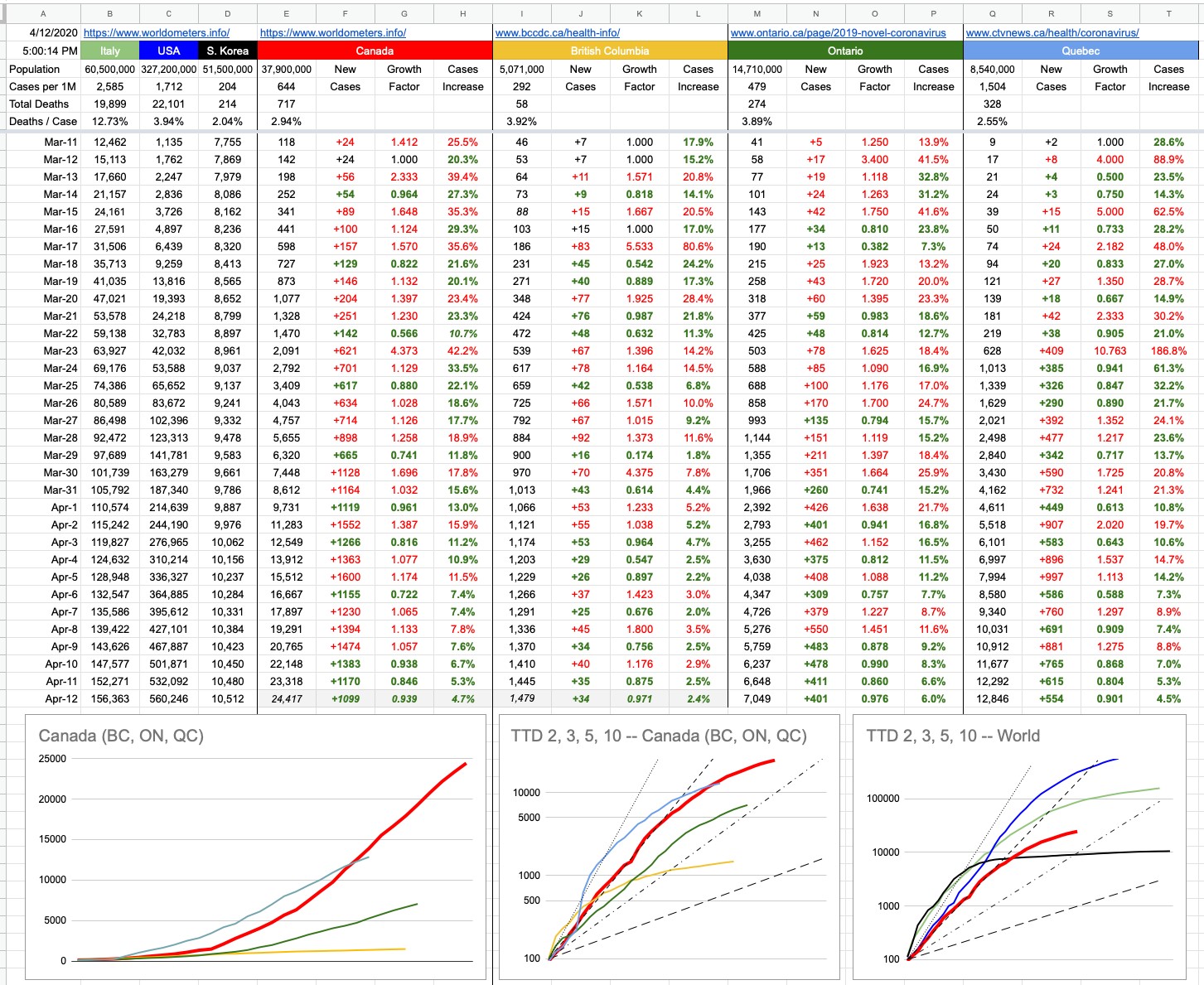
Today is the day we don’t get numbers in B.C. — Dr. Henry and Mr. Dix are taking a well-deserved break, so accurate numbers will have to wait till tomorrow. For now, as usual, I’ve plugged in my B.C. guess for the day — I’ll fix it tomorrow. But assuming a good day locally, it’d make it a good day nationally. Growth rate was down in Ontario for a 4th straight day, and 3 straight days in Quebec.

But while they’re resting, and the numbers people are resting… as many of you are as well… let’s look at things from a much bigger-picture point of view. Like, these days, the earth is also resting.

If you were to believe that the earth is in some way alive and/or conscious, you’d be making the interesting parallel these days that, as a living being, Gaia finally got sick and tired of the virus infesting Her and decided to vaccinate Herself. For the most part, the young people who had nothing to do with wrecking the place would be spared… but the older you are, the more responsible you are for the disregard and destruction and pollution and reckless abandon that have finally made Mother Earth say “Enough”.

Gaia doesn’t have to wipe us all out to heal Herself. She just needs to give us a bit of a wake-up-call, and not much of one as it turns out.

In the grand scheme of things, it’s interesting to note just how irrelevant humanity is to this planet. In a matter of mere weeks, there are changes occurring. The sky is more blue. The water is cleaner. The air is undoubtedly less polluted. People in Punjab can see the Himalayas. People in L.A. can see the Hollywood sign. If there was ever a sign that a little change can make a big difference, there you go. And for all of us thinking we’re wrecking the planet, we are… without a doubt. But if you think this planet can’t fix itself once humanity is gone, that’d be wrong. It can and it will, very easily. Our time on this earth is so irrelevant in Her own grand scheme of things, that… well, let’s explore it. Let’s start by talking about big numbers.

Let’s say you walk out of the bank with $1,000 in cash. It’s a collection of different bills… you’re not sure exactly how many hundreds or fifties or twenties, but it adds up. The teller counted it out in front of you. There’s a Starbucks next to the bank, so you pop in there and get that Pumpkin Spice Latte you’ve been craving. Yes, certainly by October, you’ll be doing this.

The PSL costs… whatever, you’re not paying attention. You give the barista a ten dollar bill and get back a handful of change… some Toonies and Loonies and whatever else, which you jam into your pocket. If someone at that point had asked you how much money you have on you, your answer would be “Around $1,000”. On your way out of Starbucks, there’s a homeless guy there. You fish into your pocket and give him a Toonie. How much do you have on you now? “Around $1,000” is still accurate.

You walk a block and there’s a shiny Loonie sitting on the sidewalk. Quick Karma repayment! You pick it up and put it in your pocket. How much do you have now? Yes, around $1,000… and if you hadn’t picked up that Loonie, the answer would still be the same… around $1,000. That Loonie is little more than a round-off error in your present grand scheme of things of how much you have on you. And that $1,000 is similarly related to a million dollars. If you have around a million dollars, adding or subtracting a thousand doesn’t change anything. It’s still around a million dollars.

I mention all that to create some context and scale between a number we’re all familiar with… a thousand is relatable in many ways. A million less so… we know it’s a lot bigger, but sometimes we don’t realize just how much bigger. And to keep going, when we hear about a billion, we maybe don’t quite realize how big that is. A million is pretty irrelevant when you’re taking about a billion. A million seconds is less than 12 days. A billion seconds is close to 32 years. Indeed, 3 million heartbeats is a few days. 3 billion is your entire life.

Let’s pretend we map out the age of the earth (4.5 billion years) as a long road — the Trans-Canada highway. And let’s walk it. We’ll start at Mile 0 in Victoria — a charming little park at the foot of Douglas St. There are some stairs down to the beach… those would’ve been Terry Fox’s last steps before dipping his artificial leg into the Pacific Ocean, had he completed his Marathon of Hope. Today is the 40th anniversary of the start of his heroic effort, so we’ll begin our walk down there, one foot in the water on our long journey to St. John’s. Each step to the east is one step back in time.

At this scale, each step is 5,800 years. One step out of the water and that’s pretty much all of recorded human history. In fact, by the time you hit the monument at the top of the stairs, that’s about 600,000 years. Humans haven’t been around that long. And we’re still really at Mile 0. The era of humanity is barely a rounding error, as far as the age of the earth is concerned.

Keep walking east, going back in time as you do… dinosaurs died out somewhere near Abbotsford… and only appeared somewhere near Kamloops. Mammals appeared somewhere around Cache Creek. And right around Golden, before you even set foot in Alberta, now we’re at 540 million years ago… that was the emergence of anything more complicated than single-celled life forms. And beyond that, there is a lot more time and distance. It’s all single-celled organisms until somewhere in central Quebec, and then, there ceases to be any life at all. Quite a journey. Canada is a big place. 4.5 billion years is a long time.

The point of all this… as much of a blip in the radar as humanity might be, and as much as the thought of Gaia being this living/breathing thing that Herself is sick… we fight off sickness by being healthier; by allowing our bodies to heal. By giving them the opportunity to do so. A vaccine doesn’t cure you; it allows your body to cure itself. A ventilator allows you to breathe, and it’s the processes beneath that, carrying oxygen-rich blood to your cells… which heal you. Anything that stirs your immune system into action, whether physical or just mental (placebos work for good reason).

So while the earth has temporarily kicked us all into a state of self-reflection and healing, we can see that it doesn’t take much to heal the bigger picture… and it also gives us an opportunity to find some sliver linings to this big cloud, because there are many. I’m as anxious to get back to the real world as you are, but already I can see some changes I’ll make going forward, and I’m sure many of you have as well. We’ve all been learning a lot about ourselves and our habits and what’s important and what isn’t.

I leave you with this… written by Kitty O’Meara, which will read like a prayer for those who are religious, and a like a poem for those who are not. Either way, beautiful words that make you think as you stare out at the sky on this beautiful day… whether out the window or from your balcony or porch or back yard… and yeah, the sky does look more blue, doesn’t it?

And the people stayed home.
And read books, and listened, and rested,
and exercised, and made art, and played games,
and learned new ways of being, and were still.
And listened more deeply.
Some meditated, some prayed, some danced. Some met their shadows.
And the people began to think differently.
And the people healed.
And, in the absence of people living in ignorant, dangerous, mindless, and heartless ways, the earth began to heal.
And when the danger passed, and the people joined together again, they grieved their losses, and made new choices, and dreamed new images, and created new ways to live and heal the earth fully, as they had been healed.

View Original Post and All Comments on Facebook

Day 24 – April 9, 2020

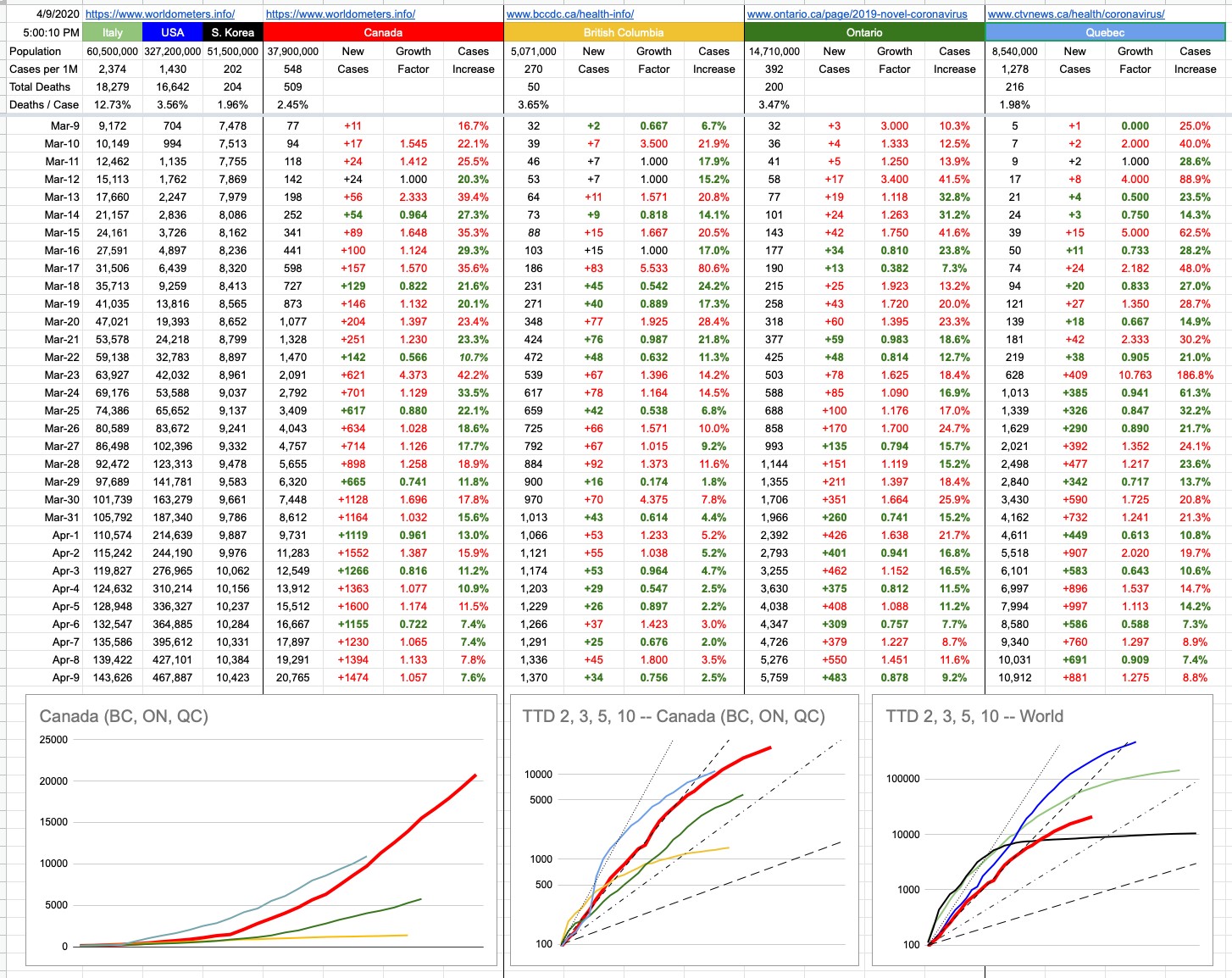
Oh, Canada… our home and native land is a lot more relevant to the majority of people reading this, so I’ve made some changes. You will notice that the original graph that started this little daily update is gone. It’s served its purpose, which originally was to map an apples-to-apples comparison of Italy, the U.S. and Canada — with South Korea thrown in for reference — if you were to superimpose their trajectories from a comparable starting point. When that started, Italy was 10 days ahead of the U.S. and the U.S. was 10 days ahead of Canada. On the graph, all of those lines were on top of each other, and it was going to be interesting to watch what happens as time goes on.

To summarize what has happened since… and you can look at yesterday’s final version of that graph to see what I mean (or go back even further and see when things really started to diverge)… The U.S. was actually doing better than Italy for a while, until all hell broke loose… then they burst through that green line and have never looked back. Italy, while still in the midst of their crisis, has definitely seen its curve flattening. Canada, for a while worryingly tracking the U.S., “fell off the bottom” of that blue curve and has comparatively been doing a lot better. The B.C. line, on this scale, is indistinguishable from the X-axis. Indeed, it’s the scale of this graph (linear Y-axis) that has rendered it useless. The unfortunate blue-line numbers will just keep squashing the other lines down, so we retire this graph with full honours, though I will still track the data and update the TTD logarithmic graph of Canada vs. The World.

But there are two new graphs… one, on the bottom left, is exactly what I described above, but just for Canada… with B.C., Ontario and Quebec. You will notice with some degree of curiosity that the Quebec line is above the Canada line… how can that be? Isn’t Quebec still part of Canada? Let’s not have that particular discussion, right here, right now. Yes, of course they are, so what’s the deal?

Nos amis from la belle province, with their usual panache, were simply late to the party. Given that this graph aims to compare apples to apples, its starting point is the same for everyone. Quebec recorded its 100th case March 18th or 19th. On that day, both B.C.and Ontario were around 250 each. Canada’s total was around 800.

Forgetting when it happened, but rather how it happened, Quebec’s numbers were not great for a while; they quickly accelerated at a frightening rate. They went from 100 to 1,000 cases in 5 days… a pace that exceeds Canada’s overall trajectory. The good news for our frères and sœurs is that things have recently looked a lot better. In fact, while numbers keep growing, they are growing more slowly. The “Cases Increase” percentage columns all tell that same story. Social/physical distancing… you know.

Where are the Prairies, the Maritimes, the Territories in all of this…? Listen, you don’t want to be on my charts… I aim to chart the big, significant numbers. Hope you never get so relevant that you need your own data column and squiggly line… anyway, there are only so many colours.

Special shoutout to Nunavut… with respect to this pandemic, they are having none of it. Ha Ha!! (Sorry). But indeed, they’re the only province or territory with zero cases. How it that possible? It’s very simple… the population density of our northern compatriots is 0.02 people per square km. In other words, everyone up there gets their own 50 sq. kms. In other words, go up there and draw a square that’s 7km per side. It’s all yours. It’s also really cold. All of that combined equals automatically-imposed social/physical distancing. And check it out… zero infections. Case closed.

View Original Post and All Comments on Facebook

Day 17 – April 2, 2020

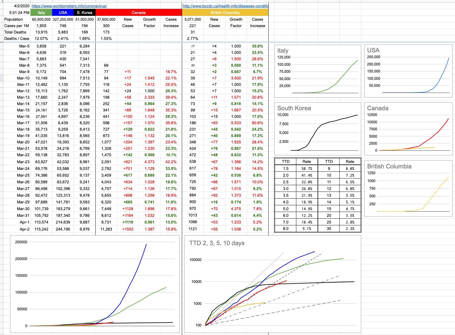
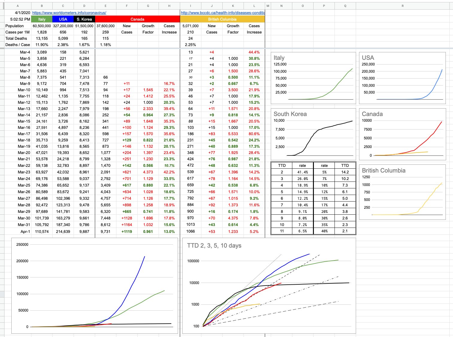
I added a little table (just above the logarithmic chart) to the spreadsheet yesterday, and today I will explain it. It’s a simple “look-up” table for “Time To Double”, useful if you want to know how a certain percentage maps to a TTD. For example, let’s say you have $1,000 to invest, and you want to double it to $2,000 in 7 years. What interest rate would you need? The answer is 10.5%. If you can wait 10 years, you’d only need a rate of 7.2%. How long to double your investment if you’re being offered 20%? The answer is 3.8 years.

These percentages and their related time periods can measure years… or days, which is the relevant discussion.

Let’s begin with a simple example, where we start with the number 100. And we are adding 20 to it every day. After 5 days, it’s doubled to 200. A TTD of 5. Now we keep adding 20 per day… so it’s going to take another 10 days to go from 200 to 400. And to double from 400 to 800, it’ll require a further 20 days. The only thing doubling here is the TTD itself… and this represents linear, not exponential growth. Certainly, it’s growing… and in this example, that 100 will grow indefinitely… but, as it does, its TTD gets bigger and more distant.

Now let’s imagine an example where on day 1, we’re at 100. But by day 4, we’re are 200. And at day 7, we’re at 400…. and we’re at 800 after only 10 days. So this is clearly a TTD of 3, and if you look at the continuing growth… 800, 1600, etc… it’s not hard to imagine what this would look like on a graph… an ever-increasingly steep curve. With a consistent TTD, there is exponential growth. The steepness of that curve has everything to do with the actual TTD, and that’s important because no matter what the finish line, it’s important how quickly we get there. In this case, we want to get there as slowly as possible.

The big graph on the bottom left shows those curves, overlapped on each other, showing how numbers have evolved for different jurisdictions from similar starting points. The logarithmic graph to its right shows the same data, and when you graph exponential data on a logarithmic scale, consistent exponential growth shows up as a straight line. Those 4 TTD lines of 2, 3, 5 & 10 days are the best example. A logarithmic presentation also helps to show the deviation, positive or negative. As that exponential growth increases or decreases… ie, as the TTD increases or decreases, the lines for each country (or province) will move… and obviously, to the left (into the steepness) is bad, and to the right (flattening out) is good.

Logarithmic graphs can be a little misleading in the way they squish data, and can misrepresent reality. But from the point of view of displaying trends, they’re pretty good. We can look at the encouraging B.C. line. We can look at the Canada line, and at least relate to the fact that we’re on a very different trajectory than what the U.S. is following. As much as the numbers back east have jumped, and as exponential as the growth continues to be, it’s less exponential, ie slower, ie the TTD has gone up, ie… from a trending point of view, not worse than what led up to it.

Even without the graphs, the numbers speak for themselves, and the growth percentages are there, day to day, both for Canada and for B.C. You can plug those numbers in to the little table… from today, from a week ago… and see what TTD would correspond.

That being said, what exactly are we measuring? These TTDs are important to chart the rates of growth, but rates of growths of what? Known cases? Presumed cases? Hospitalizations? Patients in critical condition? Deaths?

The only thing I’ve been dealing with are confirmed cases and their growth. My data deals with the confirmed known spread of the virus…. but all of those other numbers are also important, and will be tackled in due course. Topics for another day.

View Original Post and All Comments on Facebook
Day 16 – April 1, 2020

I’m going to talk about antibiotics for a moment.

Important point number one: COVID-19 is a virus, not a bacterial infection. Antibiotics won’t work. Secondary complications that can arise, like pneumonia, are… and those would be treated with antibiotics… but if someone has told you that taking some antibiotic may prevent you from getting this virus, or might help treat it, they’re wrong. And if you’re taking some antibiotic for no reason, stop. Which leads me to point number two…

If you’re supposed to be taking antibiotics, there’s exactly one correct way to do it. When the doctor prescribes them, she will look you in the eye and say “Be sure you complete the entire course, till you’ve taken them all, till the container is empty.” That might be 3 or 4 times a day, and it might be a week or two weeks or 3 months. When you pick up the prescription from the pharmacy, the pharmacist will tell you the same thing.

The reason is simple, and we will use a simple example: War. I have an army of 100,000 and you have an army of 100,000, and we battle it out, and since my army is better than yours, I’m down to 20,000 men, but you are down to 50… and we have all you backed into a deserted building and we’re about to surround you and finish you off. But instead, for some silly reason, we decide we’ve already won and we’ll show some mercy, and we let you go. So off go your 50 men, rebuild their army, and in a few months, you come back with a replenished army of 100,000 and destroy me, because chances are that’s a much tougher group than the original 100,000.

Why? Because those last 50 out of 100,000 men were the toughest of the lot. They’re the real survivors, having made it to the very end. They’re the last people you should let go. They’ll go off and recruit and train equally-tough warriors before returning.

So, if you’ve got some bacterial infection, and let’s say you’re supposed to take a course of antibiotics for a week. To begin with, you’re feeling really awful, and you start taking them and guess what, it’s the perfect antibiotic for what you’ve got, and after the third day, you’re feeling fantastic. It’s all cleared up. Awesome. But ugh, taking these pills is so annoying. And you have to stay up so late or get up so early to take one, etc etc. You’ll just go down to two or three a day, what difference can it make. Maybe you’ll just stop.

What you’re basically doing is letting the strongest of the bacteria live on, re-group, and re-attack. Maybe not you, but someone else. And, worse than that, they might mutate a bit, be a bit more resistant to that particular antibiotic… and then, after that cycle has repeated thousands of times, you’re left with our present-day problem of drug-resistant bacteria that require a whole new suite of antibiotics, many of which have yet to be invented.

The relevant connection is to our present-day plight. The COVID-19 is the bacteria, and you and I are the antibiotic.

We’re on “day 3” of that “7-day” antibiotic course. Our social-distancing seems to be making a difference… but we’re not cured yet, and loosening up the treatment can quickly change the outcome. The fact it’s working is all the reason in the world to keep doing it properly.

I actually had another example… it involves the Canucks and the Bluejackets and allowing 4 goals in the 3rd period. But you know what, YouTube is full of videos… cyclists raising their arms in the air in victory as they approach the finish line, only to be passed at the very last minute. Or football players spiking the ball 3 inches before crossing the goal-line, fumbling the ball instead of scoring a touchdown.

The countless examples all point to the same thing, and by now I’m sure you get it: There is no victory until you actually cross the finish line, the game ends, the enemy is extinguished. Etc. Etc. Etc.

Keep taking the medicine… it’s working, but we’re not cured. And abandoning the treatment now could lead to non-victory, whatever that looks like. I don’t know, and nobody wants to find out around here… and for those that are not from around here, look around at the world at places where physical distancing has been implemented correctly, and its effects. And, even more to the point, look at where it hasn’t.

View Original Post and All Comments on Facebook
Day 12 – March 28, 2020

There’s that feeling you get when you sit down in a rollercoaster… first of all, what the hell am I doing, do I really need to be doing this… but once the thing starts moving, there’s no way out, so the impending dread as you start going up that first big hill… click-click-click as the chain underneath pulls the train slowly… wow, this thing is going a lot higher than I thought… click-click-click… this was such a stupid idea… click-click-click… ugh, this is a lot steeper than it looked… click- ohh.. no more clicks. We all know that means…

… and as the train gains momentum and sends you flying down that first huge drop, two things will come to mind… one, this part of it will thankfully be over soon and two, now you have a clear idea just how steep it was. Which serves to illustrate where we are today with respect to the numbers coming our way in the next little bit… there is a finish line to them, a week to ten days… and we once we hit that bottom, we will know exactly how steep things were.

Given where we are today and as per what I wrote yesterday, I don’t think we need to close our eyes and scream and hope for the best. It’s looking better than that. At least, on paper and at least, for now.

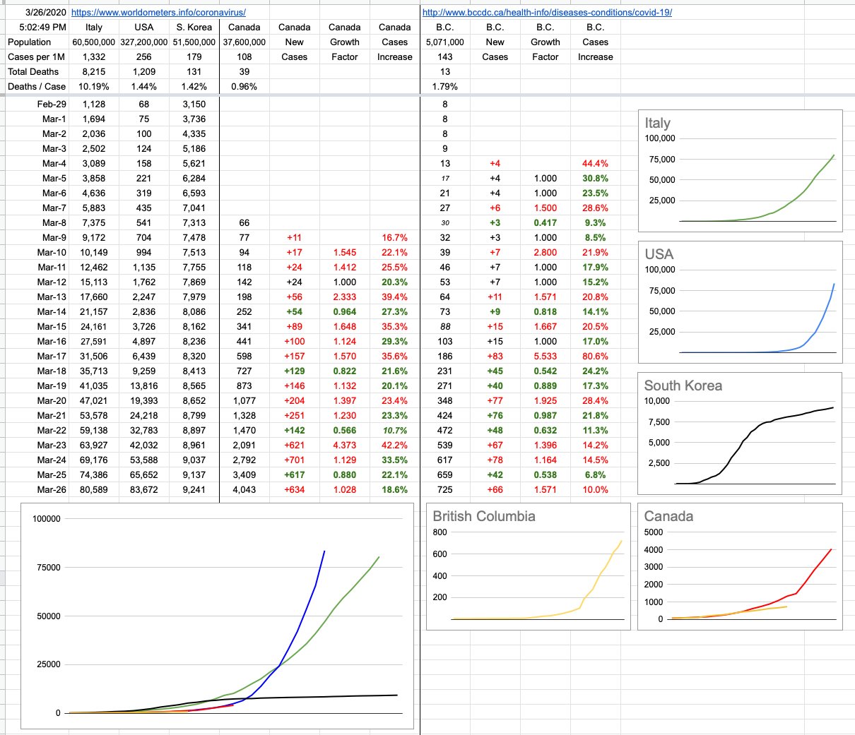
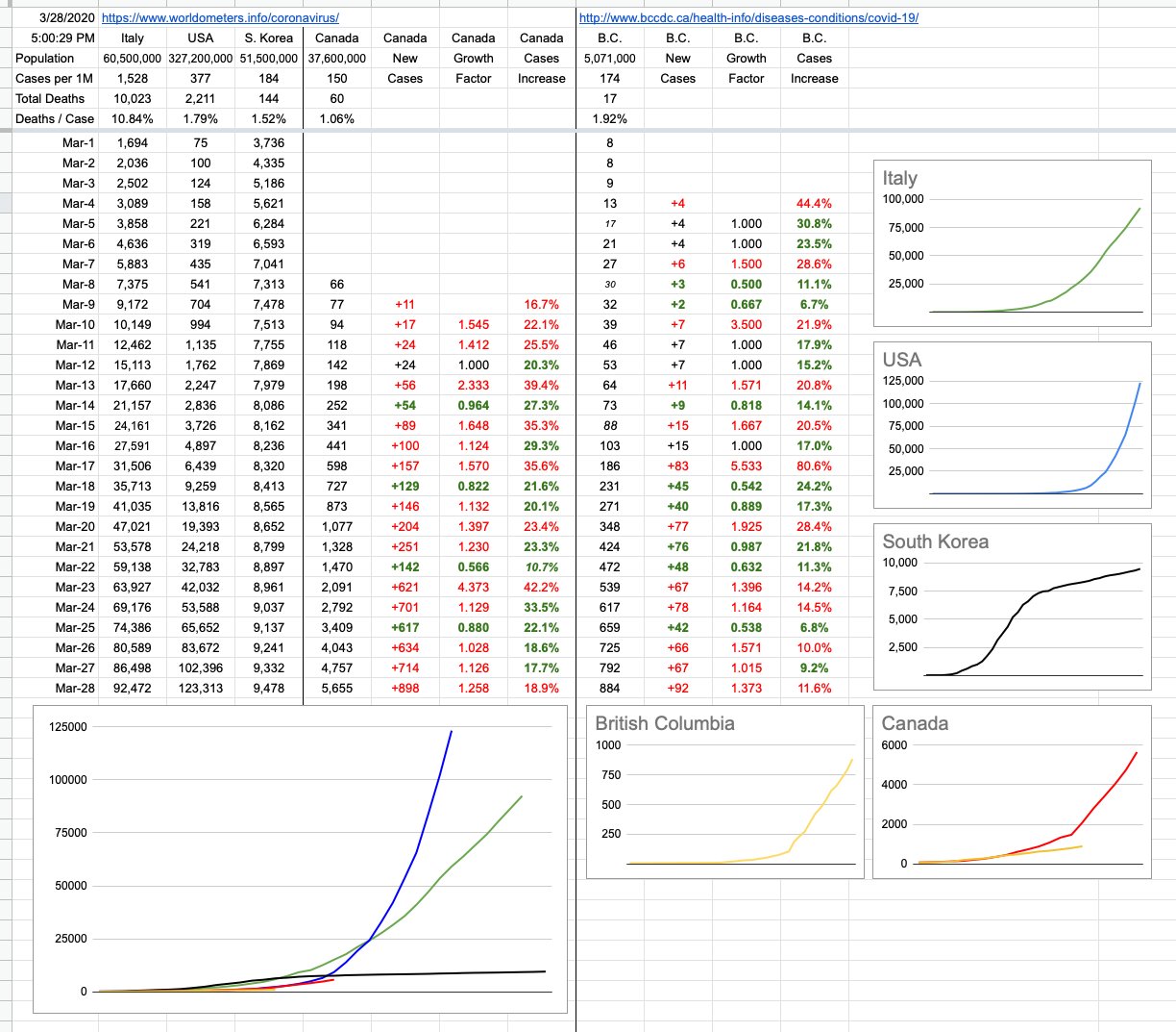
In B.C., although we had the largest one-day increase in cases yet, it’s perfectly in-line with our linear growth. Dr. Henry, for now, would like to see that number consistent at 12% which is roughly where it’s been. The average of the last 10 days is actually 11.1%. Today’s number was 11.6%. Yesterday was 9.2%. Nice solid straight yellow line, right in the sweet spot. And might I add, I am tracking total cases as they accumulate, not factoring in recoveries and deaths. The outcomes of these cases is a whole separate topic. But on that note, while we saw an increase of 92 new cases, we also saw 121 cases moved to the “recovered” column. As far as these numbers are concerned, today in B.C., there are less active cases than yesterday.

Canada’s number is bigger, but also consistent and also, slowly, hopefully, for now… going down day by day. Yes, of course the number of cases is increasing, but that rate of increase is itself decreasing. See that column… 4 out 5 days of green numbers. The rate of growth is slowing. For now. Are we still following the U.S. trajectory? Visually, and numerically, we’re not. Not so long ago, and you can still see it on the chart, Canada’s data was almost exactly perfectly 8 days behind the U.S: Feb 29, Mar 1, Mar 2… the U.S. had 68, 75 and 100 cases. 8 days later, Mar 8,9,10 — Canada had 66, 77, 94 cases. Perfect lockstep. And if you eyeball those numbers as you slowly go down the two columns, you see them in lockstep… and then they slowly start drifting apart.

The hope is that we wouldn’t follow them down the hellhole-course they’re presently on, and, for now, we’re not. We’re at 5,655 nationwide cases. 8 days ago, the U.S. was at 24,218. Had we “kept up”, today’s number would be 4x what it actually is. We’re now more than 11 days behind them.

So what does it all mean…

I’d like to address some of the comments that question the usefulness of these numbers in general, how the testing is inadequate, this isn’t reality, this is a useless exercise because the numbers are all bullshit. That the real case numbers are anywhere from 10x to 50x and it’s anyone’s guess. And therefore, blahblahbblah.

So, first of all, the way to solve big problems is to break them in half. Solve each half independently, and once you do, the big problem is solved. And if one or both of those halves is too complicated to solve, break it in half again and solve that. Keep breaking it in half until you have manageable pieces to solve.

The enormity of our present situation requires breaking it into hundreds of pieces, but here are some of the big ones, each of which needs to be broken down into many smaller pieces:
– the actual number of cases out there, factoring in recoveries
– the actual number of cases that require hospitalization
– why are some demographics hit so differently than others
– the testing infrastructure, and the strategy and adequacy of it
– the ability of our medical infrastructure to handle the cases
– the actual number of people dying from this
– the economic implications of allowing this to go on too long
– the herd immunity thing
– the treatment options, effectiveness of therapies, and timelines
– when and where is the vaccine

Without tackling all of that, notwithstanding each of those topics is its own book, and that’s only a small snippet of topics that need addressing, where we’re at right now is trying to solve chunks of a problem with incomplete information. One thing we have to our great advantage is learning from what others have or haven’t done ahead of us. Like one big change that was implemented today here is that the number of patients on ventilators doubled. Because suddenly a lot more people got a lot more sick? No. Because we learned from data elsewhere that putting people on ventilators sooner has a huge impact on positive outcomes. We didn’t know that two days ago, and now we do, and now we use it to our advantage.

Just because we don’t know something is no reason to throw our hands in the air — “these numbers are all crap anyway” — but to tackle this particular aspect…

Knowing the actual number of cases out there would have a profound effect on many aspects… first of all, how many actual new cases are there each day… how many of them will the person never even know, how many will they get sick but not too sick, how many will need a hospital, how many will die. If we could snap our fingers and know all that, it’d be great. One school of thinking that might kick in is that if actually the number is not 10x or 50x but actually 500x, and many of us have had it and never even knew it, and now we’re immune and will be for several months and even if we’re not, who cares, clearly I can fight this thing off so let me get a little sick and impose my herd immunity and get back to work since the actual mortality rate is only 0.2% etc.

Don’t think everyone has their heads stuck in the sand thinking the published numbers are the extent of this. One day, in hindsight, we’ll know those numbers. It’s possible that one day, we will have instant, cheap and available tiny-traces antibody testing. You’ll be able to wander into Starbucks, and along with your chai latte, spit into some throw-away little thing that’ll turn red if you’ve had it, stay blue if you haven’t. But until we get to that point, to a great extent, all we’re doing is buying time. Flattening the curve to suppress the load on our medical infrastructure. Isolating ourselves so we don’t infect others, especially those who are much likelier to get lethally ill. Keeping this thing controlled and contained until we’re certain we can manage it. It’ll likely never go away, and the waves of it appearing in the future will hopefully wind up in the “no big deal” pile.

But for now, the published numbers, the important numbers… the ones that are putting load on our medical system… the 884 confirmed, the thousands of others likely presumed but not confirmed… don’t think they don’t know about it. Don’t think when they tell you to stay home for 14 days, pay attention to your symptoms but don’t come in — that they’re not tracking you. You, who may well have it who think you don’t count — trust me, you do. Not in my numbers, not in their published active-cases numbers, but you’re out there somewhere, included in all of the projections of what might happen and how they’re going to take care of you if you get really sick. Some of you think you have it, but don’t. Some of you have it and don’t know it. Neither of you got tested, so hey what the hell they don’t know what they’re doing this is bullshit… yeah, no. Not at all. They’re not going to waste a test to confirm a mild test. There’s an N% chance you have it, depending on your age and other risk factors. Take care of yourself with the provided guidelines, and you’ll most likely be ok. And if you’re not, critical care awaits you with open arms. As opposed to everyone who thinks they might have it coming in and overwhelming a system that, certainly at the moment, is not prepared to test 2 million people overnight. If you’ve had it, one day you’ll know.

The fact that our hospitals are not overrun… the fact that we’re prepared at present to handle anything but the absolutely worst-case scenario… the fact that were are notably flattening our curve, both provincially and nationally… and the fact that we’re doing that with incomplete information, tackling big, multi-faceted problems… don’t worry too much about absolute numbers and how you feel they don’t reflect reality. They’re serving us well.

Speaking of serving us well, please take a moment to step outside at 7pm tonight (and every night) to cheer the heroes of this nightmare — hope you never need their help, but the army of medical workers of this province and this country, and indeed, around the world… deserve to (loudly) hear our gratitude and appreciation.

None of us like this. They don’t. You don’t. I don’t. But let’s remember… as hellish as it may be, the rollercoaster ride eventually ends.

View Original Post and All Comments on Facebook
Day 10 – March 26, 2020

Fun fact: Both South Korea and the U.S. reported their first case of COVID-19 on the same day: January 20. The present-day outcomes are so different that it’s worth understanding what they did (or didn’t), and where our approach, provincial and national, fits in.

The answers are long and complicated and will be discussed and argued for centuries, but it can all be distilled down to one brief and accurate summary: South Korea did a lot; the United States did not.

One thing South Korea did was test the hell out of this thing, as far and wide as they could. They developed and administered thousands of tests almost instantly — like a week — and were quick to isolate those that tested positive. The U.S.… didn’t. They stuck their heads in the sand for a bit, called it no big deal, and did little except stop incoming flights from China… but as far as I know, the COVID-19 virus is not a member of any particular frequent-flyer club. It doesn’t care what airline it flies, nor where the flight originated. Once it’s on the plane and headed somewhere, it’s landing and it’s sticking around.

It was initially thought that community transmission wasn’t a concern… the U.S. thought it, we in Canada (and here in B.C) thought the same; we will find cases, we will isolate them, the cases will resolve and it shouldn’t be a big deal. The risk to you and me is low. A month ago, there were only 7 cases in BC, and all of them could be traced to close contact.

South Korea’s initial jump of cases had a lot to do with their prolific testing, but what comes after is what’s worth noting. Their impressive flattening of their curve has everything to do with their reaction… isolate. And when it became apparent that community transmission was indeed happening, that’s the only reasonable course of action: Social/Physical distancing.

Since our testing hasn’t reached everyone, and since we don’t yet have antibody tests that would tell us who’s already had it, the only reasonable course of action is to pretend everyone has it, and act accordingly. Indeed, the way to think about it isn’t to assume everyone has it… and keep away. It’s to assume you have it, and take every precaution not to pass it along to anyone else.

We are being warned to expect a jump in numbers in the coming days, due to the difference between incubation times and how long it’s been since the directives were brought in. We may see a sharp increase in cases in the coming days… incubation period of 14 days minus 10 days of distancing equals 4 days where we were all potentially wandering around infecting each other. And as those infections kick in, the numbers will rise… possibly quite sharply.

It’s after that period of time that we should start seeing some real effects of what we’ve all collectively been doing. That black South Korea line is what we want. That blue American line, not so much.

On that note, and again, too early to tell… but here in B.C., our growth is, for now, linear. Good news… for now.

View Original Post and All Comments on Facebook
Day 7 – March 23, 2020

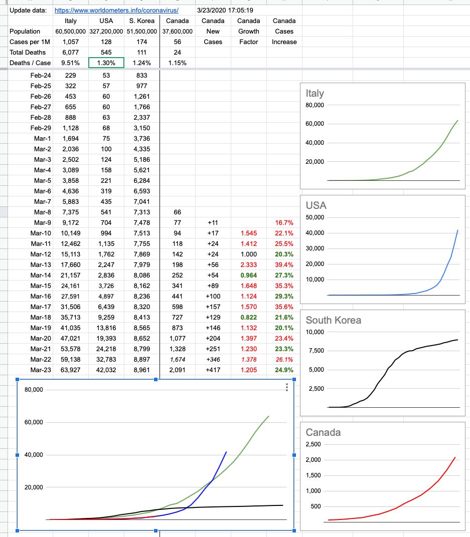
The lack of data over the weekend left a bit of a gap… which I filled in with some guesswork. I know where we were on Saturday, and I know where we are now. How we got here looks to be pretty consistent, but the next few days are more important than the last few. We are tracking very closely to the US, trailing by 10 days… just before things started getting really out of hand down there.

It’s important to note that I’m tracking new cases — not active cases. It was good news to hear that 100 cases in BC considered active have been resolved to “cured”. More than 300 in Canada overall.

As time goes on, we can look forward to that number of resolved cases growing, but note that its growth doesn’t affect tracking new cases. Those will always go up. In fact, at some point, it’s (hopefully) likely we will have “negative” days — where there are less new cases than resolved cases… but the idea of these graphs is to simply track the spread (and control) of new cases. What we do with them is a whole other question, and I’ll be happy to offer my opinion on that as time goes on. So far, comparing it to what’s going on elsewhere in the world, it’s pretty good. And will gradually look a lot better if you all just #stayhome!!

View Original Post and All Comments on Facebook
Go to Top