News

Day 43 – April 28, 2020

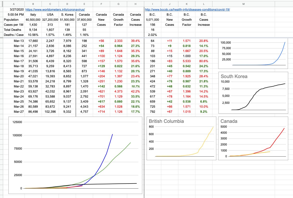
Our local numbers shot up a bit today, but it’s a lot less concerning that in might have been a month ago, because we know exactly where and why this is happening… almost entirely due to known clusters playing themselves out — and play themselves out they do… some clusters have vanished, some care homes are down to zero and, for the most part, we have a really good handle on things. Things are on their way to re-opening.

Let’s also talk about some different numbers today, and what they imply.

In general, people talk about the stock market being up or down. Also, in general, it’s well understood that it’s good when the market is up, and and bad when it’s down. How does that apply to what’s going on these days?

First of all, let’s quickly define what we mean by “the market”. Everyone has heard of “The Dow”, and how it goes up and down.

The Dow (which refers to the Dow Jones Industrial Average — which is important to note, because there are other “less famous” Dow Jones averages) is an index that tracks, in real-time, the stock prices of a variety of big American companies, including Apple, McDonald's, Exxon, Boeing, Pfizer, Nike, Visa,, Walmart and Coca-Cola. That’s a little cross-section of the bigger mix… a variety of big industry. There are 30 companies that comprise the index, and you have heard of all of them. They are industry leaders, and how they’re doing is a reflection on the economy as a whole, at any given moment. On some days, when things are good and everything is way up, and the Dow will reflect that. Or the opposite, of course.

Today is a good day to use as an example, because it’s a mixed bag. Technology stocks (Microsoft, Apple, Google, Facebook) are all down. Financials (JP Morgan, Bank of America, Morgan Stanley, American Express) are all up. Consumer retail shares are a mix (Walmart, Proctor & Gamble are up, Amazon is down). Telecomm is also mixed bag (AT&T is up, T-Mobile is down, Verizon is flat).

Average it all out today, and the Dow is up… a little bit. There are other indexes to look at; the S&P 500 is the next most-commonly known, and it has a broader inclusion of the top 500 listed companies. It’s perhaps the best representation of the market as a whole. It’s also up a little today. Its little cousin, the S&P 100, which lists an arbitrary sample of those 500, is slightly down today.

At any given moment, what defines the price of an individual stock? It’s the equilibrium point where at that exact point in time, someone thinks buying those shares at that price is a good idea… while someone else thinks it’s the right time and price to sell. And these days, that someone is just as likely to be a big, intelligent computer.

Tens of thousands of shares are being traded every second, so when things get quiet (from a broad market price point-of-view), it’s an interesting oasis of calm before the next storm. Like, briefly, for a moment, everyone knows where things are at. Or, think they do…

Imagine you’ve been sitting on a little seesaw in the park, quietly enjoying smooth ups and downs with your friend. Suddenly, instantly, the seesaw grows to 20 metres long… and your friend is replaced by some gigantic bully that seizes his end of the seesaw and starts slamming it up and down, as hard as he can. You hold on for dear life, understanding that jumping off may hurt you more than just hanging on… and you just hope this giant jerk will eventually tire and go away, hopefully leaving you gently on the ground. This is what it’s felt like to be an investor these days.

The all-time high for the Dow was recent… before things came crashing down. On Feb 12th, the Dow closed at 29,551. From there began a bumpy ride that saw it lose 5,000 points over the next couple of weeks, before bouncing back up a bit. Then, in early March, all hell broke loose, and the wild swings of thousand-point gains and losses began, bottoming out at the lowest of lows, hitting 18,214 on March 23rd. And from there, it shot-up to 22,500. It’s presently sitting at 24,100… still well-off the high, but also significantly higher than that bottom. A 20% “off the high” is still alarmingly awful in such a short time, but it’s twice as good as the 40% bottom from a month ago.

Many people are saying it shouldn’t have dropped that far. Many are saying it should have dropped a lot further, and still could. Many are saying there’s no reason it should have recovered this much already. As per above, for everyone who thinks it should be higher, someone else thinks it should be lower. Those two people are presently buying/selling to/from each other, and that’s why it’s exactly where it’s at.

What caused these drastic moves? Unexpected news, rumours, fear… and, of course, real-world disclosures regarding the long-term effects of shutting down significant parts of the economy. And everyone absorbing that information, independently interpreting it and acting accordingly.

When things move that quickly, it rarely has anything to do with fundamentals. Nobody is looking at price:earnings ratios or dividend streams… more like trying to figure out market sentiment and just riding it out till things settle down.

At some point, when it’s fallen that far, a bounce is not just expected, but possibly predicted. The technical traders — those who care nothing about underlying companies but just analyze the numbers themselves… they love to pick resistance points… and identify trends in the market by when prices bounce off a price, or power through it. One of the most famous ones is based on the Golden Ratio — a relationship found all over nature. Flowers, pine cones, sea shells, dolphins, penguins… all have proportions and other fundamental constructs based on it. The magic numbers there are 61.8% and its converse, 38.2%… and whenever a market tanks, the first thing to look for is a “bounce off the 618” — which is exactly what happened to the Dow in my example above. Which further leads me to accurately assume that really, nobody knows what’s going on fundamentally, so when trying to figure out when to buy back in, “let’s just go with that”. When the Dow hit that 618 retracement, a lot of buying stepping in.

There is another index… it’s called the VIX… and if you Google VIX, you can instantly pull up a chart of it and how it looks. The VIX measures volatility, ie just how wildly things are swinging. The bigger the number, the wilder the ride.

The VIX never broke 20 in all of 2019… like you and your friend on the seesaw, quiet ups and downs. When the insanity began last month, that VIX shot up and broke 80 at one point, and has consistently been over 50 most of March. It’s recently started coming down, which is optimistically implying that things will settle down, at least to the point where maybe there’s some idea of what’s really going on. Call it cautious optimism as places start opening up and life shows some promise of taking its first steps towards normality.

And that’s market sentiment in a nutshell — nobody knows. Especially these days. Even in the best of the quietest times, there are always people on both sides of the seesaw. But the level of “unknown” these days is unprecedented… but I will tell you this, with certainty. The market will be hitting new highs… when? I don’t know. I will say September of 2022. But it could also be a lot sooner than that. Or, it could be a lot later. See what I mean?

View Original Post and All Comments on Facebook

Day 39 – April 24, 2020

Yesterday, I talked about the dinosaur apocalypse… how they were all wiped out. But, to reiterate, the only ones that were fully wiped out were the ones on the ground. As hard as it is to believe, and I know some will take exception to this… but… birds… are not descendants of dinosaurs. They are dinosaurs… the ones that survived that cataclysmic event 65… sorry, 66 million years go.

That cataclysmic event was so… umm, cataclysmic… that it wiped out 75% of all species on earth. That was fortunate for those who survived, because it gave them the evolutionary advantage to thrive, among them… mammals.

It’s a long line of evolution between those mammals and the first hominoids… but it does beg an interesting question; has the human race ever been close to extinction? Terrestrial dinosaurs were around for close to 200 million years. Humans have only been around… well, depends how you look at it. With broad brush strokes, the human animal… maybe 300,000 years… but we only began to exhibit what you might call “modern behaviour” around 100,000 years ago.

What would’ve happened if a pandemic-capable virus had shown up? Not much, because there was next to no overlap of communities distanced by geography. It makes one wonder, how often have there been these sorts of viruses over the centuries? Probably lots. But it was localized, there was no treatment, there was no social distancing… all that happened was a big wave of very sick people dying, and eventually through herd immunity and/or lots of death, the virus made its way through everyone it could, and then disappeared from existence.

But the human race actually did come close to extinction, and it wasn’t that long ago, geologically speaking. Well, this is one theory. It’s interesting, as usual, to research things on the Internet because you can always tell where the conformation bias lies. You can tell what people want to believe, and how they conform their evidence to support their side.

Around 75.000 years ago, there was a massive volcanic eruption — one of the biggest ever. The Toba Supereruption (Lake Toba, Sumatra, Indonesia) erupted and ejected some 2,800 cubic kilometres of magma. That is a staggeringly huge cube of hot, melted rock… and it left behind something the same size as the crater that took out the dinosaurs… an enormous 100 x 30 km caldera complex. Once again, it messed with the environment very significantly… the six billion tons of sulphur dioxide that were ejected into the atmosphere caused a global cooling of up to 15 degrees all around the planet for at least a few years, and it was many decades before things returned to normal. This lowered the tree line and snow line by about 10,000 feet… and for humans who were used to a dry, temperate climate, years of perpetual snow did not sit well.

There is a genetic bottleneck at the time when looking back at humans, meaning it seems we can all trace our DNA back to a small group (like a few thousand humans) who made it through that. The rest were wiped out. And to some extent, if that’s what happened, you have to assume we’ve all evolved from a pretty tough group of humans. This was survival of the fittest imposed in the harshest of ways.

This is one theory, and it’s very interesting. There is another group of scientists who claim that’s hogwash, and that the evidence doesn’t necessarily imply any of that.

Whatever the case, all of that I learned yesterday while digging into dinosaurs… you know how the internet can be… one moment you’re reading about what you were researching, like dinosaurs and their extinction… and 40 minutes later you’re reading about mentally ill monarchs throughout human history.

That’s a good little segue onto a topic I really don’t want to touch here. I had a whole thing written out, and indeed, I could write a book on my thoughts with respect to American politics of the day, but this is a scientific and statistical endeavour, ostensibly aimed at keeping track where we are with respect to this pandemic. On that note, it’s not irrelevant to point out, as I have earlier, the shortcomings I see when it comes to leadership pulling in different directions, etc etc. But I just deleted many paragraphs that delve into far more detail, and will leave it at that.

OK, one paragraph. I worry greatly for the great country of the United States of America. Every single day, thanks to the actions or words of just one man, the chasm that separates two groups (big broad brushstrokes here: Republicans and Democrats) — gets a little bigger. It started on day 1, lying about the inauguration crowd size. “Who really cares” is really what should have been the answer, but he chose to lie about it, then double down on his lies, then make others lie for him… it was bewildering, to be honest. What the hell is going on? There was incontrovertible evidence… pictures and witnesses and everyone who was there… but no. It ended up with “alternative facts” trying to be jammed down our throats. All of this on day 1 of his presidency. And since that day, whenever he says or does something that is completely unpresidential, both sides rise to the challenge. And while the argument rages on about who’s right and who’s wrong, the country slides a little bit more downhill. This is not to bash on Republicans and Democrats… there was a time when both those parties worked in harmony for the greater good of the country, especially in times of crisis. I really wonder how repairable this is now. Long after Trump is gone, the degree of bipartisanship needed to successfully guide a country — may not be achieved for many, many years. And I’m not interested in the bullshit arguments of what a great job he’s presently doing. He’s not. I don’t use vague handwaving and gut feel to come to my conclusions, I use hard facts. As you may recall, this entire project of charts and graphs and light commentary started with a simple exercise of trying to track Canada’s response to this crisis as measured by comparing the U.S. and how they were doing. And comparing them to Italy, who was ahead of them. The short answer now is: Awful. Brutal. Look at the numbers, look at the graphs. This isn’t fake news, this isn’t opinion. These are their numbers. These are confused people. These are hospitals that can’t keep up. These are states and leaders with mixed messages. These are deaths. These are the preventable disastrous blue line and its associated numbers, towering over the green, red and black ones below it. This is failed leadership, from the very top.

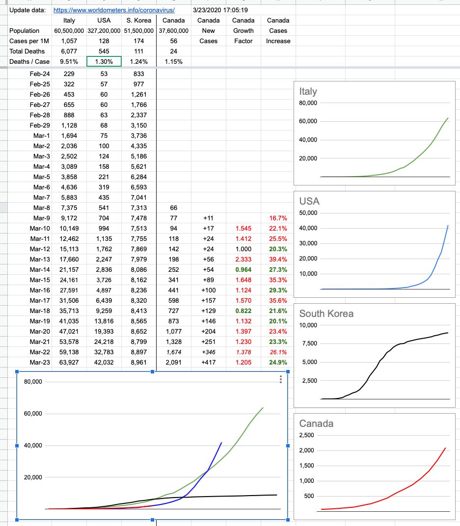
Sorry for the long paragraph… but I did say, just one paragraph. But, some numbers… Canada, today, flat or better growth all across the country. U.S…. more deaths today than the number of new cases in Canada. Also U.S., more deaths today than the entire number of known cases seen in B.C., active or resolved, since the beginning of this pandemic. And finally, U.S., more new cases today than all of what Canada has seen, combined, since day one. By the end of the weekend, the U.S. will have seen its one millionth case. Canada will be below 50,000. That same proportion maps to deaths. And some quick math for you… no, the population of the U.S. is not 20 times that of Canada. Not even 10. As President Trump likes to sign at the end of many of his Tweets: Sad.

View Original Post and All Comments on Facebook

Day 24 – April 9, 2020

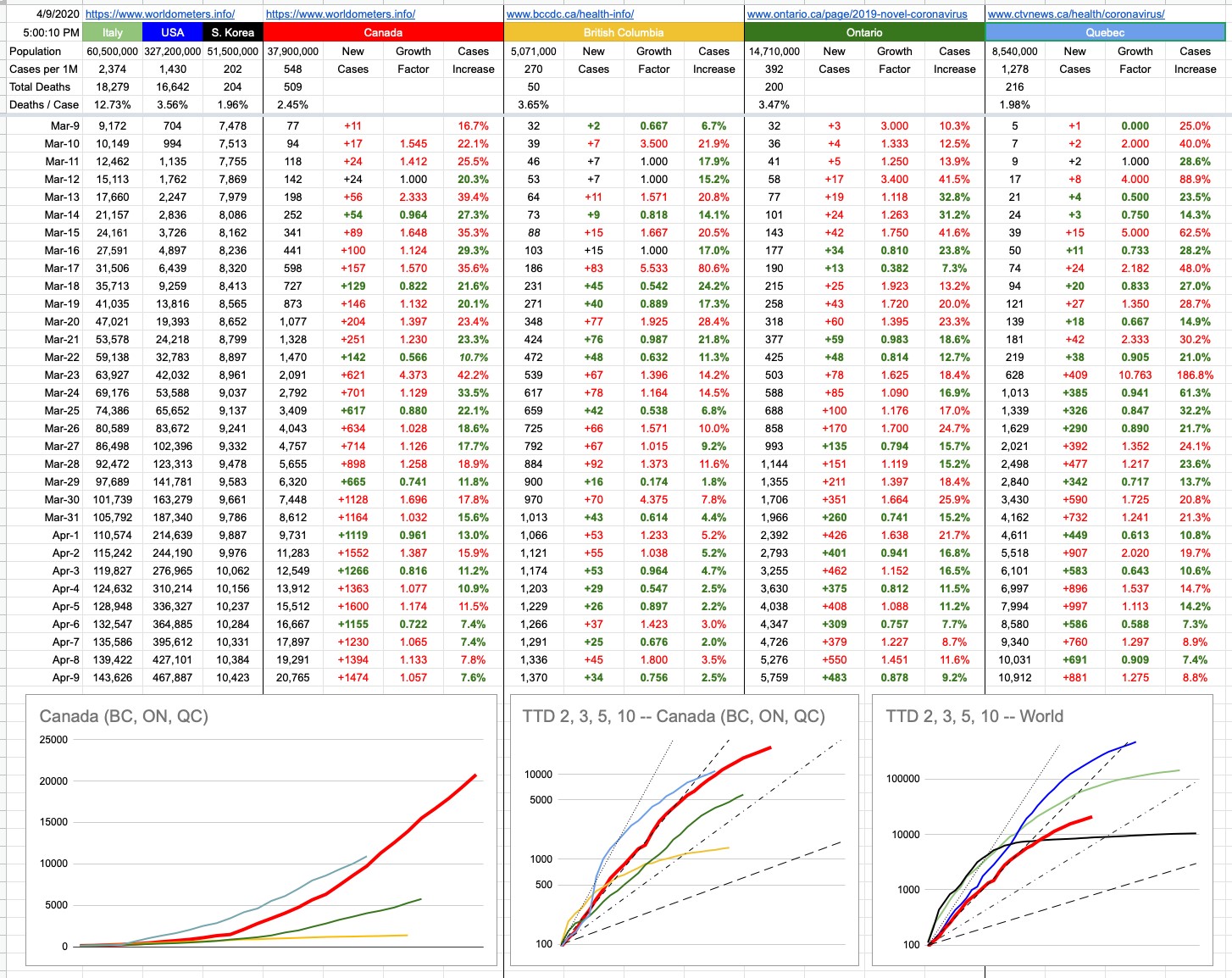
Oh, Canada… our home and native land is a lot more relevant to the majority of people reading this, so I’ve made some changes. You will notice that the original graph that started this little daily update is gone. It’s served its purpose, which originally was to map an apples-to-apples comparison of Italy, the U.S. and Canada — with South Korea thrown in for reference — if you were to superimpose their trajectories from a comparable starting point. When that started, Italy was 10 days ahead of the U.S. and the U.S. was 10 days ahead of Canada. On the graph, all of those lines were on top of each other, and it was going to be interesting to watch what happens as time goes on.

To summarize what has happened since… and you can look at yesterday’s final version of that graph to see what I mean (or go back even further and see when things really started to diverge)… The U.S. was actually doing better than Italy for a while, until all hell broke loose… then they burst through that green line and have never looked back. Italy, while still in the midst of their crisis, has definitely seen its curve flattening. Canada, for a while worryingly tracking the U.S., “fell off the bottom” of that blue curve and has comparatively been doing a lot better. The B.C. line, on this scale, is indistinguishable from the X-axis. Indeed, it’s the scale of this graph (linear Y-axis) that has rendered it useless. The unfortunate blue-line numbers will just keep squashing the other lines down, so we retire this graph with full honours, though I will still track the data and update the TTD logarithmic graph of Canada vs. The World.

But there are two new graphs… one, on the bottom left, is exactly what I described above, but just for Canada… with B.C., Ontario and Quebec. You will notice with some degree of curiosity that the Quebec line is above the Canada line… how can that be? Isn’t Quebec still part of Canada? Let’s not have that particular discussion, right here, right now. Yes, of course they are, so what’s the deal?

Nos amis from la belle province, with their usual panache, were simply late to the party. Given that this graph aims to compare apples to apples, its starting point is the same for everyone. Quebec recorded its 100th case March 18th or 19th. On that day, both B.C.and Ontario were around 250 each. Canada’s total was around 800.

Forgetting when it happened, but rather how it happened, Quebec’s numbers were not great for a while; they quickly accelerated at a frightening rate. They went from 100 to 1,000 cases in 5 days… a pace that exceeds Canada’s overall trajectory. The good news for our frères and sœurs is that things have recently looked a lot better. In fact, while numbers keep growing, they are growing more slowly. The “Cases Increase” percentage columns all tell that same story. Social/physical distancing… you know.

Where are the Prairies, the Maritimes, the Territories in all of this…? Listen, you don’t want to be on my charts… I aim to chart the big, significant numbers. Hope you never get so relevant that you need your own data column and squiggly line… anyway, there are only so many colours.

Special shoutout to Nunavut… with respect to this pandemic, they are having none of it. Ha Ha!! (Sorry). But indeed, they’re the only province or territory with zero cases. How it that possible? It’s very simple… the population density of our northern compatriots is 0.02 people per square km. In other words, everyone up there gets their own 50 sq. kms. In other words, go up there and draw a square that’s 7km per side. It’s all yours. It’s also really cold. All of that combined equals automatically-imposed social/physical distancing. And check it out… zero infections. Case closed.

View Original Post and All Comments on Facebook
Day 11 – March 27, 2020

To circle back a bit on something I said yesterday… with a bit more detail…

The incubation period of a virus (which is up to 14 days in this case) indicates the period of time where someone might be infected, but not show any symptoms. Some viruses can be contagious during that time… as is this one.

In B.C., we were told to go home (and stay home) sometime around March 16th — 11 days ago. It was a bit of a loosey-goosey following to begin with… but it tightened up a few days later… 19th or 20th. Let’s call it 8 days ago.

With an incubation period of max 14 days… and without a serious lockdown until 8 days ago, we have a trailing 6 days where we were all going about our daily business, feeling fine and possibly not too concerned about the possibility of either passing this off or getting this from — someone else. Unfortunately, during that time, both of those things could have happened.

Which means, at this moment, we have this big unknown for the next 6 days… where we might see a spike in cases. The degree of that spike remains to be seen. That’s the potentially bad news.

The potentially good news, however… is that not all cases take to the last minute to show up, so we can learn a bit about what’s happened so far. During these 8 to 11 days of isolation, cases have certainly shown up… and our (for the moment, and hopefully forever) very capable medical infrastructure has been dealing with them.

Also, every single case that developed during that time in (proper) isolation, infected, at most, the people isolated around them. Let’s say that person is isolated in a home with 2 others. The N went to, at most, 3N.

What would have happened if that person were wandering around, not isolated?

R0 (“R nought”) is the number assigned to describe on average how many people someone who’s infected is likely to themselves infect. COVID-19 seems to have a R0 of around 2.2.

So… that one person, instead of infecting just those closely around them, might be outside somewhere infecting 2 or 3 random people. And those people might each infect more people. And if that’s happening every few days, after 3 weeks, that’s repeated 7 times… and now there are 250 cases. All from that one person, if they, and everyone else below them, infected an average of 2.2 others.

That is exponential growth. That is that scary growing curve we’re seeing in many places, like the U.S. That is why you always try to pay-off your entire credit card. That is why you try to keep your money where it’s earning interest that’s compounding. That’s why you’d better know what you’re doing if you’re breeding rabbits. And that is why physical isolation is so ridiculously important… and, when done correctly, effective. One person can make a colossal difference.

Guess what — that one person may have been you, and you didn’t even know it because you never developed symptoms. But by being responsible and staying isolated and not passing it along to someone else… well, one or more of those 250 could have developed serious (even fatal) symptoms. But they didn’t, because you’re doing the right thing. You may actually have saved a life.

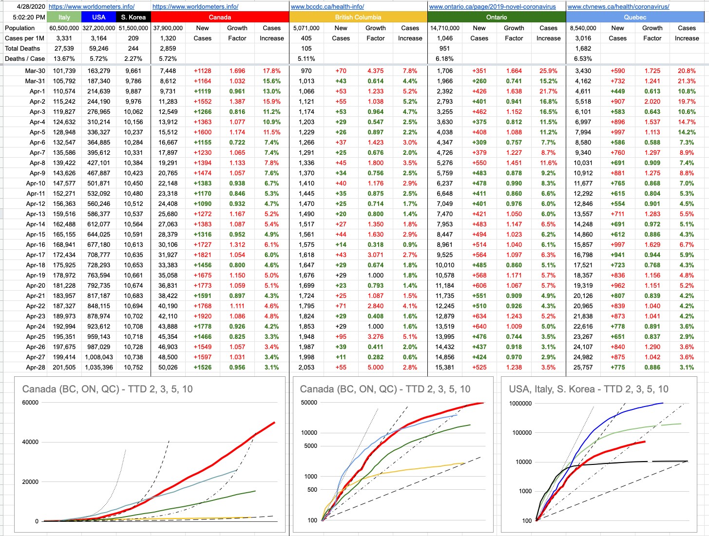
And a bit of further potentially good news… at least here in B.C., there is most definitely a flattening of that curve. The numbers are certainly growing, but the growth is linear, not exponential. Like that N that turned into 3N instead of 250N. It’s growing, but not as steeply as the scary scenarios. Including a spike of 83 new cases 11 days ago, the average increase in cases in B.C. during that time has been 63 daily. Today was 67. Yesterday was 66. That yellow line is so linear you can put a ruler to it. For now.

As for all of Canada… well, there’s a definite separation between us and the U.S. We have had 4 straight days of decreasing growth, on a percentage basis. For now, that national curve is also flattening, and gapping notably with the emerging disaster south of the border.

I find myself saying “for now” a lot, and it’s because we’re dealing with a lot of unknowns. Like what the next week may bring. But if you want to be cautiously optimistic, it would appear that just one week of physical isolation is having a very measurable, positive effect.

And if that is the case, now is the perfect time to not go out rejoicing in the streets. The thing to do is what you’re doing. Stay home. What else are you going to do, anyway… it’s rain for the next several days. Yay Vancouver weather!!

That’s it. It’s not too much to ask. You’re not being called to charge Vimy Ridge. You’re not being called to storm the beach at Normandy. You’re being called to sit on the couch and watch Netflix. I have all the faith in the world you’re up to the task.


View Original Post and All Comments on Facebook
Day 7 – March 23, 2020

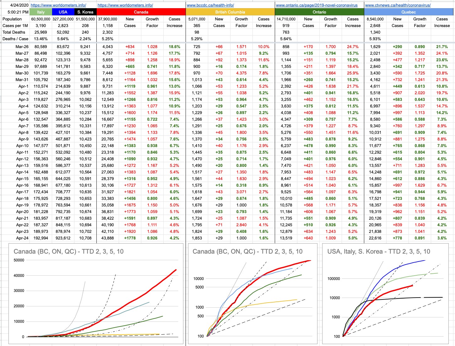
The lack of data over the weekend left a bit of a gap… which I filled in with some guesswork. I know where we were on Saturday, and I know where we are now. How we got here looks to be pretty consistent, but the next few days are more important than the last few. We are tracking very closely to the US, trailing by 10 days… just before things started getting really out of hand down there.

It’s important to note that I’m tracking new cases — not active cases. It was good news to hear that 100 cases in BC considered active have been resolved to “cured”. More than 300 in Canada overall.

As time goes on, we can look forward to that number of resolved cases growing, but note that its growth doesn’t affect tracking new cases. Those will always go up. In fact, at some point, it’s (hopefully) likely we will have “negative” days — where there are less new cases than resolved cases… but the idea of these graphs is to simply track the spread (and control) of new cases. What we do with them is a whole other question, and I’ll be happy to offer my opinion on that as time goes on. So far, comparing it to what’s going on elsewhere in the world, it’s pretty good. And will gradually look a lot better if you all just #stayhome!!

View Original Post and All Comments on Facebook
Go to Top