Respect

Day 60 – May 15, 2020

“Collect as much data as you can for now.” — this is a mantra that is common in many different disciplines, especially the ones where you’re not sure what data matters. One day, you’ll have a chance to look back on it and figure out what matters, but for the most part, especially initially, the thing to do gather as much as you can, and eventually learn from it.

“Eventually” could mean decades from now. It could also mean tomorrow. In fact, it could even mean 15 minutes from now. On that note, as you’re reading this, somewhere, on the periphery of your focus, there are ads and sponsored posts and other slight differences that are being thrown at you; an experience that will differ slightly for someone else. Some of it is based on your history, but some of it is just data collecting… like, does it work better to use this ad or that ad? Does it work better in red or green? Does it work better positioned here or there? This data is all being crunched, often in real-time — to deliver to you the most pleasant experience possible. Haha, sorry, not quite — to deliver to you the most profitable experience for someone… is the better answer. Facebook is worth $500 billion, and their revenue stream has to come from somewhere, since 99.999% of the people who use Facebook have never given them a penny… so, rest assured, those who are paying want to make sure they’re getting their maximum bang for the buck.

And, of course, an awful lot of data is being collected about this virus, and there are disagreements about what’s important. As per above, it’s always a good idea to gather it all and then figure out later what matters and what doesn’t. Sophisticated modelling techniques do this all the time. For example, a neural network. That sounds a lot fancier or scarier than it really is. It’s not some sort of artificial brain which can think for itself, become sentient and launch an attack on humanity… rather, it’s just software for taking a ton of data, much of it possibly unrelated, and grinding through it in such a way that it “learns” what inputs are relevant to outcomes, and which are noise. A properly trained neural network can be very useful for predicting outcomes that a person may not as easily see, because it’ll have filtered out the irrelevant aspects and focused only on what makes a difference.

A simple example would be trying to train a neural network to predict the outcome of horse races. This is a project that as been on my “to-do” list for about 30 years, and perhaps if enough horse racing returns soon, and I’m still locked up at home, I’ll finally have a chance to work on it. And I will tell you exactly what I plan to do, and what I hope to find. The first thing is to take tens of thousands of historical races and format the data in a way that it can be fed into a neural net. Then, it will grind away on it, “learning”… and I would assume it’ll find a high correlation for specific horses with respect to things like fractional quarter-mile times, weight carried, relative class of opponents and track-surface-conditions. It’ll find a low correlation with things like the name of the horse, what time the race was run and what day of the week it was. That’s the beauty of the neural network; just throw all of the data at it, and let it figure out what matters. It might figure out correlations for specific horses… that even the most astute handicapper or sharpest bookie might miss.

I know a lot of people reading this are thinking whoa dude, that’s pretty cool. Yes, it is… it would be. I’ll keep you posted.

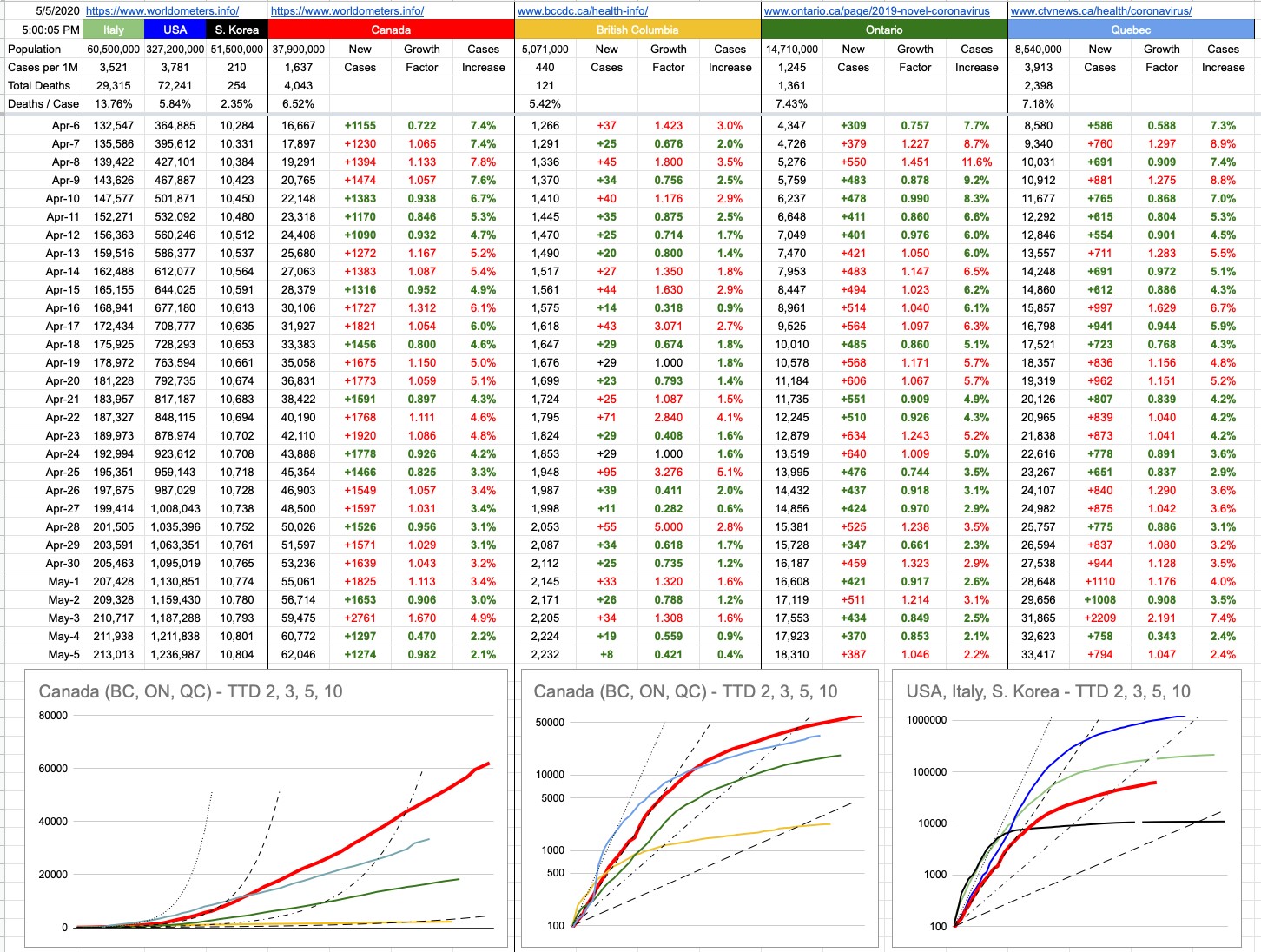
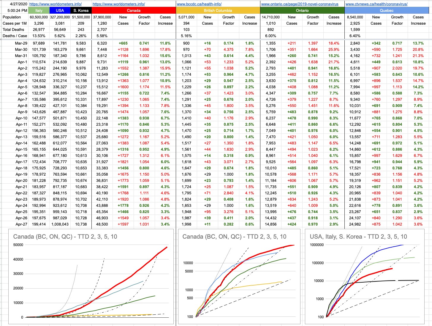
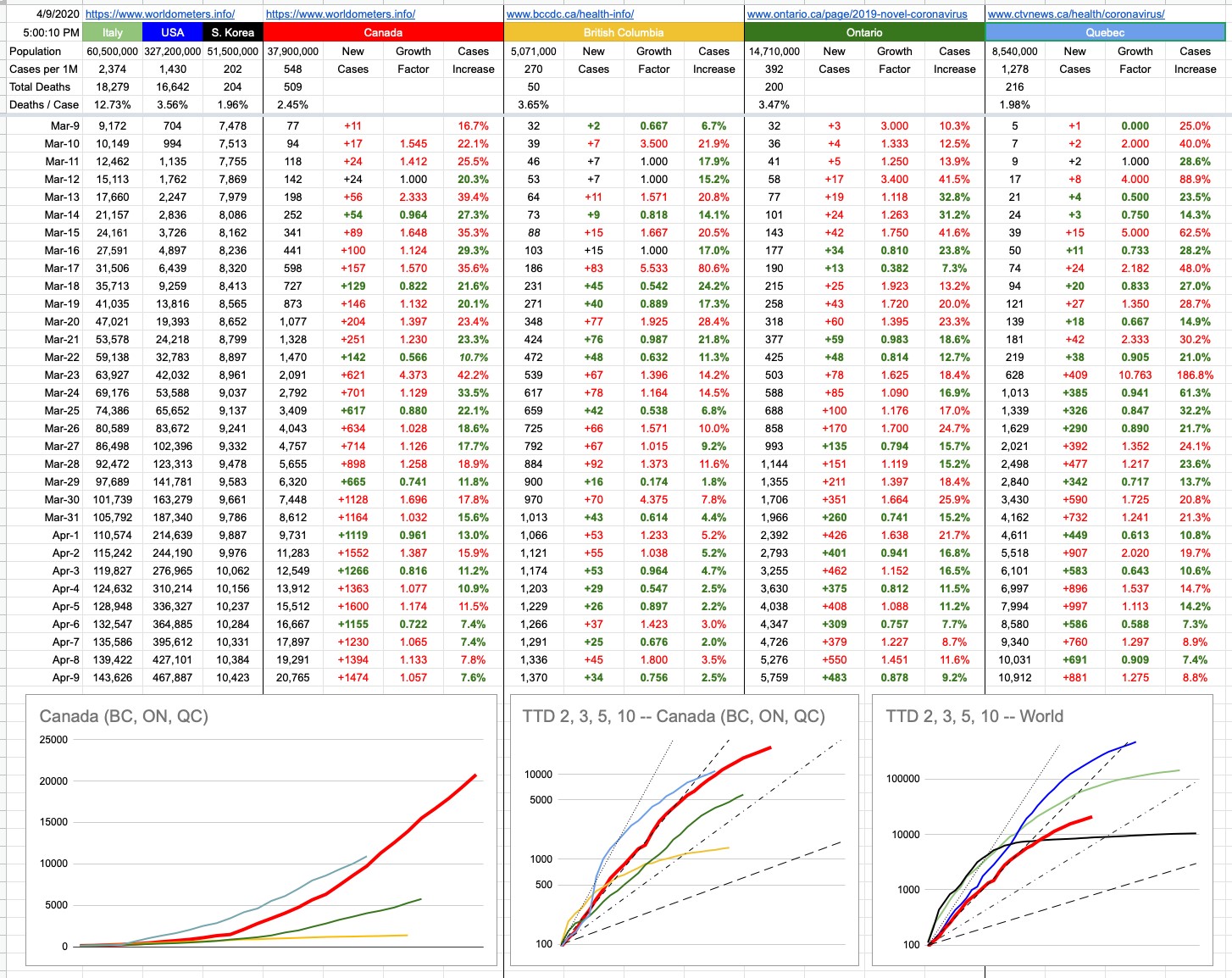
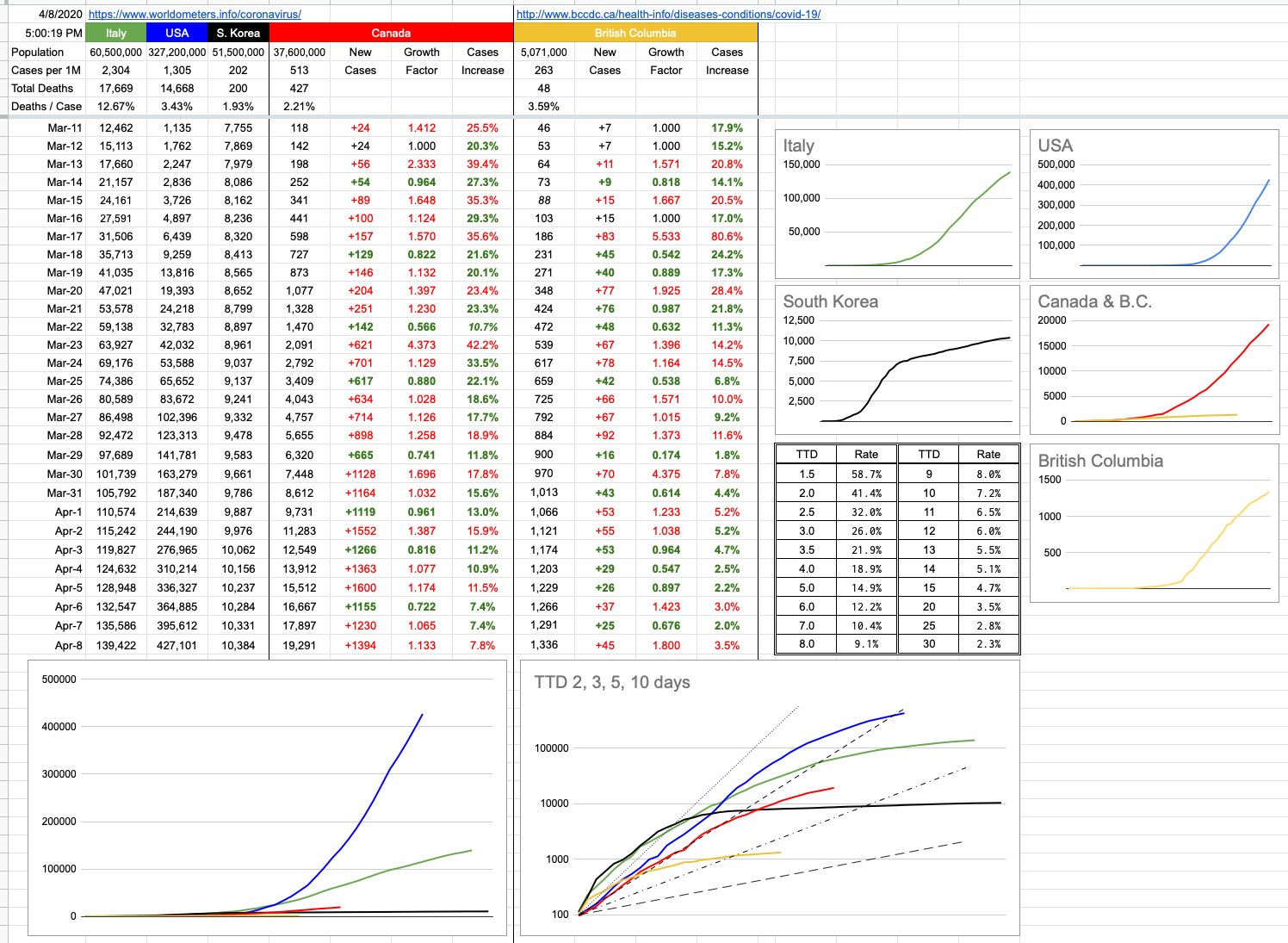
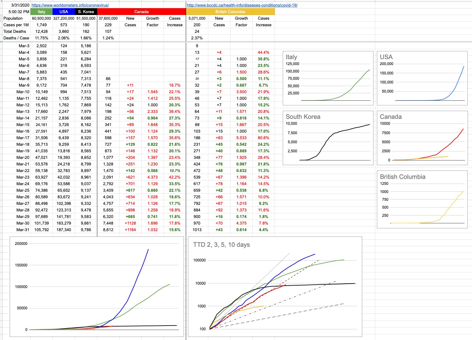
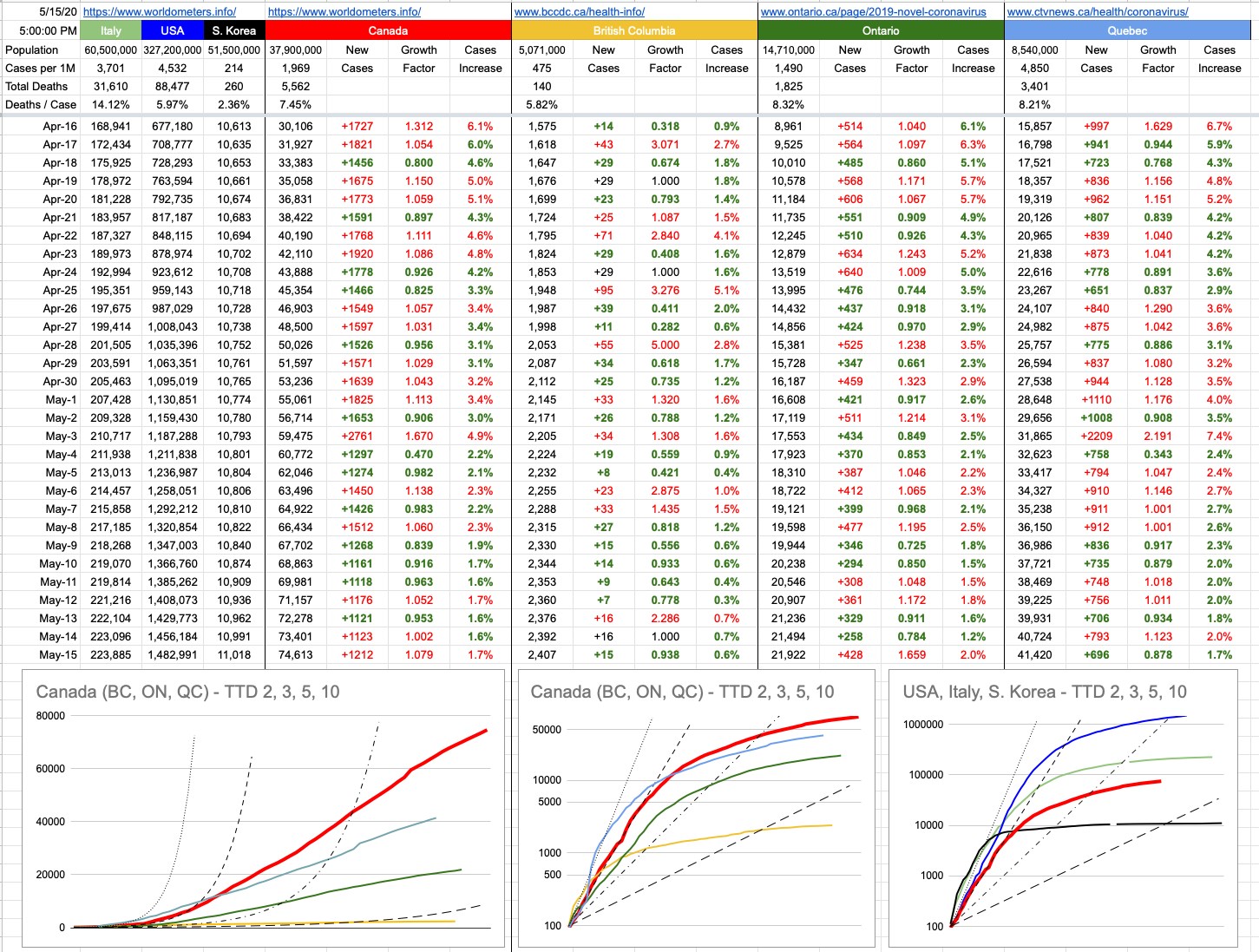
More relevant to all of us are our local numbers, and there are many to look at. We are on track (haha!!) for opening things up soon, and, at least around here, it makes sense. It’s been a while since I’ve talked about “Time To Double”, so let’s look at that a bit. The graphs below don’t do justice entirely to where we’re at, because TTDs when presented in this fashion becomes a “lagging” indicator. Things are better than what those graphs imply, if you’re looking at the TTD lines.

Recall, back in the day… like back in March, which seems like it was 20 years ago… we were looking at some scary TTD numbers. The new-cases numbers were increasing by about 25% day-over-day, a TTD of about 3. Scary exponential growth.

If we take some averages of the last 5 days of confirmed new cases… the TTDs and percentages look like this:

B.C.: 130 (0.53%)
Ontario: 43 (1.63%)
Quebec: 37 (1.89%)

Canada: 44 (1.62%)

These are obviously very-flattened curves, compared to where we were.

I am well aware of the people standing up screaming that those numbers aren’t real. Have a seat, and let’s discuss the obvious. Of course not. There are more, and have been more, cases than we’ve “known” about. We will in due course know how “off” we were… like is the real number 10x that? 100x? 1,000x? I’d love it, if it were 2,000x because that’d mean we’ve all been exposed to this, and if you believe that gives you immunity (and that seems to be the case with coronaviruses in general), we’d be in great shape. That number is way too big, but while I’m here, in an effort to make numbers and guesses and projections more accurate for all of us, I urge you all to visit the bccdc dot ca site and take the survey. You may even get a serological antibody test out of it.

Inaccuracy of those particular numbers aside, there are some concrete ones which are indisputable… hospitalizations, ICU cases, “pressure on the medical infrastructure” and excess deaths… to name a few of the most critical ones. These numbers vary wildly around the world, but they’re the best indicators, along with new cases, to indicate how close jurisdictions are to phasing-in re-openings. At least around here, those numbers look good… good enough that we’re marching ahead to the next phase.

View Original Post and All Comments on Facebook

Day 50 – May 5, 2020

As always, on the heels of Star Wars Day (May the Fourth be with you, if you don’t get it), comes Cinco de Mayo. I guess we’re all getting a little tired of hearing that same old refrain… “It’ll be different this year”. But yeah, indeed it will. As you may recall, around here, the first “celebrated” holiday affected was St. Patrick’s Day… and the decision to pull the plug on pub gatherings was made only a few days, if not hours, before March 17th. My first post of this entire series was on that day, me sitting here in front of the computer with a pint of Guinness, digging into some numbers, trying to figure this out for myself.

Good trivia question… how many countries in North America are called the United States? I obviously wouldn’t be asking this if the answer were obvious… the answer is two, because the official name of the other one is “Estados Unidos Mexicanos” — literally, the United States of Mexico.

Now that you’re back from Googling that, let’s continue…

There are 32 states in Mexico, and most of us haven’t heard of many of them. Looking at this list… the following stand out: Jalisco, Baja California Sur, and Nayarit… because I’ve vacationed there. Chihuahua, Sonora and Sinaloa stand out because they’re continually in the news related to drug cartels and violence (and cute dogs). Mexico City, of course. And Veracruz, but only because my buddy, two-time-Kentucky-Derby-winning-jockey Mario Gutierrez is from there.

The Mexican federal government has their hands full fighting this thing, but they have the added headache of the very powerful and ubiquitous drug cartels, who control many areas, especially near the border. It also doesn’t help that these criminals are stepping-up, handing out care packages to locals who happily accept them and who can use any help they can get. Big-time criminals love this sort of stuff — step up for the little guy, do more for the people than the government is doing, etc. Pablo Escobar was good at it. So was Al Capone. Optics.

There hasn’t been much talk of the border wall these days; remember, the big wall Trump was going to build and which Mexico was going to pay for. I think they may have built some parts, or maybe that was just refurbish/remodel. I don’t know. What I do know is that Mexico hasn’t paid a cent for it. Whatever.

The border-wall, or lack thereof, that worries me a lot more, is the virtual one that exists 30km south of here. For the moment, that border is closed, and that suits me just fine. And if our neighbours to the south could follow along with what’s best for the common good, I wouldn’t be against re-opening it. But, at the moment… well, at the moment, let’s look at a different state that borders Canada.

Recall the governor of Michigan, Gretchen Whitmer… at some point she called-out President Trump, labelling his federal response to the pandemic as “slow” and “mind-boggling”. Trump’s response was to sit back, reflect and admit he was wrong, and quickly move to provide whatever help he could.

Ha ha! Of course not. As expected, he lashed back, made up a name for her on Twitter ("Gretchen ‘Half’ Whitmer” — because, I guess, she only does ‘half’ a job? Or because she's a half-wit?) — and proceeded to insult her. By the way, even by Trump’s infantile-nickname standards, that’s pretty lame. I would’ve expected something like “Grumpy Gretchen”. This was the governor that Trump made a point of not calling, and telling us all about it.

In any case, Governor Whitmer was doing the best she could under exceedingly difficult circumstances. As of yesterday, Michigan was in third place for most deaths in any state, and that’s not a good spot to be in when it’s only New York and New Jersey ahead of you. Going with the best advice she could get, from all of the intelligent people she’s surrounded herself with, by evaluating what’s going on elsewhere, by listening to her medical experts… Governor Whitmer renewed the state emergency order a few days ago, extending it from April 30th to May 28th. This led to loud and crowded protests at the state Capitol building. You know the kind, lots of flags, guns and “MAGA” hats. But this time, add to the mix — nooses, Confederate flags and swastikas. With all due respect (which isn’t much), f#@& these people.

President Trump, upon whom the game “How low can he go?” is based, tweeted his support for the protesters, which in a sense validated and empowered their insanity. A man in Flint, Michigan shot and killed a security guard — who’d simply asked him to put on a mask. Also, in Holly, Michigan, a man wiped his nose on a store clerk who told the man he needed to wear a mask.

Michigan has a population of 10 million, exactly double that of British Columbia. But while we’ve had only 2,232 confirmed cases since day one, they’re over 44,000… a clean 20x… which makes it about 10x more than it would be if people were following orders. And while B.C. is at 121 deaths, Michigan is at 4,179… a staggering 35x. They’re not in good shape, and it’s about to get worse. And, of course, Michigan borders Canada. In fact, given the twisted border situation of Windsor and Detroit, parts of both countries are actually inside of each other. All I can say is I much prefer our Washington neighbours to the south, who I suspect wouldn’t be anywhere near as tolerant of the insanity. The Peace Arch border crossing has engraved on it “May these gates never be closed”. Indeed, those gates can’t literally be closed as they’re not hinged; they’re bolted into the stone. But virtually, the border is closed to all non-essential travel, and until things get sorted out and settled to both sides’ satisfaction, it needs to remain that way. We are doing well here, and we don’t need to mess with that. We apparently have bee-murdering hornets now visiting from Washington State. That’s enough for now.

On that note, around here, our single-digit increase (+8) in known cases is the lowest since March 14th, when things were just starting up, and heading in the wrong direction. Dr. Henry thinks we may be down to zero by the middle of June. We are approaching the end of the beginning, but there’s a ways to go. Moving too quickly can mess this up; things will be gradually eased, but it has to be done right. And if we do it right, and stick to the new normal for a while… we’ll be ok.

Wow, look at that sunshine… time to go get some Vitamin D… and after that, time to go crack open a bottle of Corona and find a slice of lime. Salúd.

View Original Post and All Comments on Facebook

Day 42 – April 27, 2020

Purely for the sake of creating examples, I am going to once again virtually kill a lot of people. Please don’t be sad… this is all made up as I go along.

  • Older lady, sheltering with family. All of them became a little sick, but not sick enough to get tested. Some fevers and coughs. She dies in her sleep, but doesn’t get tested. A few weeks later, the family is tested and they’ve all had it.
    – Young man, smoker, high blood pressure. Has a heart attack and dies. Tested and found to have had the virus.
    – Elderly man, tested positive, was doing ok at home, but breathing is becoming difficult. Gets in the car, speeding to the hospital, blows a red light and gets T-boned by a truck. Killed instantly.
    – Young man who, as a result of the lockdown, lost his business and is now losing his home, history of depression, commits suicide. Tests negative.
    – Same example as above, but tests positive.
    – Middle-aged man has a heart attack, rushed to hospital, but massive delay at ER… and dies while waiting for admission. Tests positive. Or negative. Whatever.

    I can come up with lots of “edge cases”, but perhaps they don’t serve much purpose other than to spark an interesting conversation. Some of these are obvious, some are not, and some, one could argue, should be… but aren’t.

    The question you might think I’m about to pose is… what counts as a COVID-19 death… and yes, that’s part of it… but trying to answer just that question… can be quite problematic.

    At the moment, there is confusion and disagreement with respect to what counts and what doesn’t. There is a certainly a big difference between dying of COVID-19, and dying with it. And there’s a lot of grey area in-between the obvious cases.

    To compound the confusion, different jurisdictions have different ways of counting things… and many of them have changed their method as time has progressed. On April 14th, the state of New York changed what counts as a COVID-19 death, adding 3,700 to their count. More recently, Pennsylvania made adjustments that lowered their number by 200.

    My examples above are only a tiny fraction of the sorts of cases one could argue one way or the other, and my examples are pretty superficial. When it comes to categorizing deaths where there were pre-exisitng conditions, it requires real medical knowledge, and even then… one lung is full of fluid but the other is not, patient was positive but that’s an unusual presentation of the virus, plus this, minus that… it’s up for debate among medical professionals, let alone everyone else who may have a vested interest in that number being higher or lower.

    It’s complicated. And, obviously, necessary to standardize in the long run so everyone can be talking about the same thing. But in the meantime, there’s another number that’s very telling and, to a great extent, indisputable.

    If you want to shut up the “it’s just a seasonal flu” crowd, and the “the death rate is like 0.04% because everyone already has it” crowd… look no further than excess deaths.

    Excess deaths is exactly what is sounds like… if in a certain place, on average, N people die in the month of March, and historically that’s held quite accurately as X% of the population, then you have a pretty good argument for COVID-19 deaths when that number is N+2,000. Even if the official tally says only 1,500 virus deaths, you know it’s been understated by up to 500… which would indicate undercounting by 33%

    You can then set aside the differences between states and countries as to what counts and what doesn’t, because after you factor out the obvious ones such as accidents, you have a bunch of deaths that are generally unaccounted for, with no category. There’s a good chance that this virus is their category.

    This has been going on long enough that we can actually start looking at those numbers, to see if they reveal anything of value.

    Note that there are times when averages are worth talking about… and there are times when they are not. Averaging the ages of passengers on a school bus full of kindergarten kids and their grandparents… tells us little. The average of 20 5-year-olds and 20 people aged 68 to 82… is about 40. And nobody on that bus is anywhere near that age. Two averages tell us a lot more… like one average is 5, and the other is 75.

    Keeping that in mind… is there any consistency with respect to excess deaths?

    Europe is a good place to look, with its diversity of population and experience during this pandemic. The average excess death percentage across 13 countries is 49%… which means for every two documented COVID-19 deaths, there was an additional one that flew under the radar.

    As one might expect, the hardest hit places were Italy (90%) and Spain (51%). Those are two places where things got out of control quickly… and also where there is already enough data to make sweeping generalizations. If you look at graphs of what this looks like, The Financial Times, at ft.com, has an article titled “Global coronavirus death toll could be 60% higher than reported” with lots of little graphs, per country, to look at.

    Note that this still isn’t apples to apples, because Spain and Italy were first, and are much further along their pandemic trajectory than others. In comparison, you might be tempted to look at other countries and think it doesn’t look so bad, but this is something to revisit in the future, when more than one month of data is available. Those graphs, per country, all show a series of flat, grey lines (previous years) and then the red 2020 line… which goes along quietly on top of the others and then suddenly spikes, sharply and quite alarmingly in most cases. What’s interesting to see is that these spikes are like ocean waves… and there’s no way to tell if that wave is crashing, or whether it’s the first part of the wall of a tsunami. Ideally, it spikes right back down again… and Spain and Italy may well be doing that. The others; the jury is still out. The England/Wales number is “only” 37%, but that graph looks ready to continue to rise, and/or at least continue to fill a long red section. As do many others.

    And when you drill down to certain, known areas of concern… New York City — forget the official stats… they have a 300% excess death-rate to look at. London, 96%. Paris, 122%. Stockholm, 75%. And if you look at Northern Italy, specifically the hard-hit Bergamo province… 464%.

    He are some raw and indisputable numbers of how it looks when things don’t get clamped down. Lots more people die, directly or indirectly, as a result of this virus.

These places seems distant and irrelevant to some of us here, lucky enough to live in a place with 39 new cases yesterday and only 11 today. And that’s a result of doing things right. It’s not just luck.

View Original Post and All Comments on Facebook

Day 39 – April 24, 2020

Yesterday, I talked about the dinosaur apocalypse… how they were all wiped out. But, to reiterate, the only ones that were fully wiped out were the ones on the ground. As hard as it is to believe, and I know some will take exception to this… but… birds… are not descendants of dinosaurs. They are dinosaurs… the ones that survived that cataclysmic event 65… sorry, 66 million years go.

That cataclysmic event was so… umm, cataclysmic… that it wiped out 75% of all species on earth. That was fortunate for those who survived, because it gave them the evolutionary advantage to thrive, among them… mammals.

It’s a long line of evolution between those mammals and the first hominoids… but it does beg an interesting question; has the human race ever been close to extinction? Terrestrial dinosaurs were around for close to 200 million years. Humans have only been around… well, depends how you look at it. With broad brush strokes, the human animal… maybe 300,000 years… but we only began to exhibit what you might call “modern behaviour” around 100,000 years ago.

What would’ve happened if a pandemic-capable virus had shown up? Not much, because there was next to no overlap of communities distanced by geography. It makes one wonder, how often have there been these sorts of viruses over the centuries? Probably lots. But it was localized, there was no treatment, there was no social distancing… all that happened was a big wave of very sick people dying, and eventually through herd immunity and/or lots of death, the virus made its way through everyone it could, and then disappeared from existence.

But the human race actually did come close to extinction, and it wasn’t that long ago, geologically speaking. Well, this is one theory. It’s interesting, as usual, to research things on the Internet because you can always tell where the conformation bias lies. You can tell what people want to believe, and how they conform their evidence to support their side.

Around 75.000 years ago, there was a massive volcanic eruption — one of the biggest ever. The Toba Supereruption (Lake Toba, Sumatra, Indonesia) erupted and ejected some 2,800 cubic kilometres of magma. That is a staggeringly huge cube of hot, melted rock… and it left behind something the same size as the crater that took out the dinosaurs… an enormous 100 x 30 km caldera complex. Once again, it messed with the environment very significantly… the six billion tons of sulphur dioxide that were ejected into the atmosphere caused a global cooling of up to 15 degrees all around the planet for at least a few years, and it was many decades before things returned to normal. This lowered the tree line and snow line by about 10,000 feet… and for humans who were used to a dry, temperate climate, years of perpetual snow did not sit well.

There is a genetic bottleneck at the time when looking back at humans, meaning it seems we can all trace our DNA back to a small group (like a few thousand humans) who made it through that. The rest were wiped out. And to some extent, if that’s what happened, you have to assume we’ve all evolved from a pretty tough group of humans. This was survival of the fittest imposed in the harshest of ways.

This is one theory, and it’s very interesting. There is another group of scientists who claim that’s hogwash, and that the evidence doesn’t necessarily imply any of that.

Whatever the case, all of that I learned yesterday while digging into dinosaurs… you know how the internet can be… one moment you’re reading about what you were researching, like dinosaurs and their extinction… and 40 minutes later you’re reading about mentally ill monarchs throughout human history.

That’s a good little segue onto a topic I really don’t want to touch here. I had a whole thing written out, and indeed, I could write a book on my thoughts with respect to American politics of the day, but this is a scientific and statistical endeavour, ostensibly aimed at keeping track where we are with respect to this pandemic. On that note, it’s not irrelevant to point out, as I have earlier, the shortcomings I see when it comes to leadership pulling in different directions, etc etc. But I just deleted many paragraphs that delve into far more detail, and will leave it at that.

OK, one paragraph. I worry greatly for the great country of the United States of America. Every single day, thanks to the actions or words of just one man, the chasm that separates two groups (big broad brushstrokes here: Republicans and Democrats) — gets a little bigger. It started on day 1, lying about the inauguration crowd size. “Who really cares” is really what should have been the answer, but he chose to lie about it, then double down on his lies, then make others lie for him… it was bewildering, to be honest. What the hell is going on? There was incontrovertible evidence… pictures and witnesses and everyone who was there… but no. It ended up with “alternative facts” trying to be jammed down our throats. All of this on day 1 of his presidency. And since that day, whenever he says or does something that is completely unpresidential, both sides rise to the challenge. And while the argument rages on about who’s right and who’s wrong, the country slides a little bit more downhill. This is not to bash on Republicans and Democrats… there was a time when both those parties worked in harmony for the greater good of the country, especially in times of crisis. I really wonder how repairable this is now. Long after Trump is gone, the degree of bipartisanship needed to successfully guide a country — may not be achieved for many, many years. And I’m not interested in the bullshit arguments of what a great job he’s presently doing. He’s not. I don’t use vague handwaving and gut feel to come to my conclusions, I use hard facts. As you may recall, this entire project of charts and graphs and light commentary started with a simple exercise of trying to track Canada’s response to this crisis as measured by comparing the U.S. and how they were doing. And comparing them to Italy, who was ahead of them. The short answer now is: Awful. Brutal. Look at the numbers, look at the graphs. This isn’t fake news, this isn’t opinion. These are their numbers. These are confused people. These are hospitals that can’t keep up. These are states and leaders with mixed messages. These are deaths. These are the preventable disastrous blue line and its associated numbers, towering over the green, red and black ones below it. This is failed leadership, from the very top.

Sorry for the long paragraph… but I did say, just one paragraph. But, some numbers… Canada, today, flat or better growth all across the country. U.S…. more deaths today than the number of new cases in Canada. Also U.S., more deaths today than the entire number of known cases seen in B.C., active or resolved, since the beginning of this pandemic. And finally, U.S., more new cases today than all of what Canada has seen, combined, since day one. By the end of the weekend, the U.S. will have seen its one millionth case. Canada will be below 50,000. That same proportion maps to deaths. And some quick math for you… no, the population of the U.S. is not 20 times that of Canada. Not even 10. As President Trump likes to sign at the end of many of his Tweets: Sad.

View Original Post and All Comments on Facebook

Day 34 – April 19, 2020

There’s this old joke where a mathematician, a physicist and a statistician go hunting. They’re crawling around for a while, but suddenly see a deer, way off in the distance. “I got this.”, says the mathematician, and he carefully takes aim and pulls the trigger… but misses about 5 feet to the left. The physicist says, “Not bad… but I got it”. He aims his rifle and fires…and misses, 5 feet to the right. The statistician jumps up excitedly… “We got him!”

This game of analyzing numbers can get very convoluted, because there are always different ways of looking at things, and according to something I briefly mentioned yesterday (confirmation bias), we’re often looking to find and interpret data to fit what we believe… or want to believe.

There’s a big part of me that wants to believe this virus is far more prevalent than has been reported. The implications of that pretty straightforward. At the moment, in Canada, we have around 35,000 confirmed cases. We all know the real number is higher than that, but how much higher, and what does it matter? If the number were 100x, we’d be approaching 10% of the population. If it were 1,000x, we’d be way past the point of herd immunity… the implication would be that we’ve all had it and can pretty much get back to normal, just being extra careful to isolate those who are still at risk, at least until they get it… in whatever form it shows up… knowing full-well the medical system can handle it. We will, in the near future, know exactly what number to attach to that x. Here in B.C., somewhere between 5 and 10 is my guess… which, combined with our effective efforts at flattening the curve, imply we can start along the path of getting back to normal… and the initial easing of restrictions, tentatively scheduled for mid-May, is step one.

There’s a study coming out of Stanford that implies that number may be between 50 and 85. I am suspicious of that number for a few reasons, but we will let the experts sort it out. The sample size and who comprised the test group and a few other things… leads me to think there are a lot of asterisks next to a lot of the findings. I haven’t read the report, but as per above, I hope it’s even a little bit true; the implication that this has been around longer and wider than we think.

That being said, there is no version of reality where this is just like any other seasonal flu. A “bad flu season”, and we’ve had many, does not overrun the medical system like this one has. There is no version of this where “just let it run its course” would make sense. There is a lot of screaming from some people about how we’re destroying our economy and people’s livelihoods for nothing. Well, there will be plenty to learn from all over the world, since there are (unfortunately) jurisdictions that have decided to follow different, less strict routes… some through design (U.K.), some through incompetence (U.S.), and some through sticking their heads in the sand (Sweden). There is a technical/scientific term for when one suddenly realizes the present course of action may not be ideal, and that a drastic course-correction may need to be implanted. It’s called the “Oh… shit” moment.

Two of those jurisdictions have already had their moment. The third is well on its way, and it requires a somewhat different way of thinking about things.

Let’s begin with a bad example of trying to compare apples to apples. What country has the highest confirmed infection rate? Well, it’s the Vatican City… they have a population of 800, and have recorded 8 infections. But 8 out of 800 is the same as 1 out of 100. Which is the same as 10,000 out of a million… which is very, very, high. The U.S. comparative number is 2,300. Canada’s is 922. In fact, given the demographic breakdown of the Vatican population (I’m assuming a disproportionate number of older men)… and the fact that it’s surrounded entirely by Rome, the largest city in Italy (whose comparable number is 3,000), that’s pretty good. To add to the list of interesting but useless numbers, the Vatican has 2.27 Popes per square km.

Part of the challenge of analyzing numbers is being sure you’re comparing apples to apples, and the more I’ve been at this, the more I realize it’s not even apples to oranges… more like apples to bicycles.

Sweden, with a population of 10.2 million, has 14,385 known cases… which equals 879 cases per million… pretty close to Canada. So far so good. Their number of 1,540 confirmed deaths isn’t so great… more than double the U.S, and approaching Italy numbers as a percentage of total population. But not an outlier with respect to other countries. Where things differentiate greatly is the “Resolved” column, and that one is pretty-much apples to apples around the world. No matter how widespread or deficient the testing strategy in any particular jurisdiction, there is a measurable number of test-positive cases, and those cases will resolve: recovered or deceased. This doesn’t have anything to do with assumed cases or Stanford studies. It’s far simpler… at some point, you were tested… and you either recovered or you died. These are the survival rates of identified cases:

Canada: 88.4% (B.C. 92.4%)
United States: 63.6%
South Korea: 97.2%
Spain: 78.4%
Sweden: 26.7%

So what exactly is going on in Sweden? If you look at the distribution of test-positive cases, it’s a pretty standard bell curve. If you look at the distribution of deaths, it’s heavily weighted to older people…. 89% of those deaths are people aged 70 or over. That’s comparable to Canada as well. I think the vast difference may be that a lot of these cases aren’t being identified until they’ve passed away. I’m not sure these cases are entering the system till “after”, and it goes straight into the two stats: positive test plus death. Their medical system is not overwhelmed. It’s a first-world country when it comes to treatment, and they have capacity. So the implication is that the virus is running rampant through the elderly population… and given their strategy, no masks nor gloves nor social distancing (unless you have symptoms) and keeping everything open… this will eventually reach everyone over a certain age. That’s roughly 20% of Sweden’s population, and with a roughly 10% mortality rate for that demographic, that’s more than 200,000 people. That is their trade-off for keeping the economy open.

In Canada, 4 million people are aged 70 or over. So if we did the same here, we’d be looking at roughly 400,000 deaths in that age group alone.

Those are the worst-case scenarios, mitigated by potential treatments, vaccines and changes in policy… but here’s at least one version of an answer to that rhetorical question that’s often getting asked: “What is the trade-off for shutting down our economy?” The answer is… many, many lives.

View Original Post and All Comments on Facebook

Day 30 – April 15, 2020

The textbook definition of the word “optics” has to to do with light, and its interaction with the physical world. The most familiar adaptations we’re familiar with have to do with light interacting with our own eyes… optician, optometrist, ophthalmologist.

If you’re a professional photographer, this extends to different lenses and fields of vision and lighting and focal lengths and so on.

When it comes to business or politics, “the optics” refers to how it looks… to the general public. “What are the optics?” is the buzzword-question asked of advisors and consultants and marketers and branding experts and spokespeople and press secretaries — by the people behind the scenes who’ll care about the answer. How will the public take it?

Over this last long weekend, Prime Minister Justin Trudeau decided to join his family, who’ve been living in the Harrington Lake cottage for the last few weeks, for Easter. The cottage is in Gatineau Park, which is in Quebec.

That visit violated the social distancing orders that the federal government and every provincial government has imposed on its residents — the same ones Trudeau himself repeats every time he’s at the podium. That visit also violated the order with respect to crossing the provincial border which at the moment is supposed to be open only to essential travel.

And just to shove it a bit more in all of our collective faces — us, most of whom who stayed home all weekend, many of us who have cabins and cottages and places to where we’d love to have gone to get away from it all… and if not, especially in this beautiful weather, just pack up the SUV and go camping somewhere — he posted a selfie of himself and his family.

The picture shows a beautiful, smiling family of five, clear blue skies with a few light, scattered clouds in the background. Everyone dressed appropriately for the crisp, fresh air. A few wispy trees. The lake itself in the distant background. From a photographical optics point-of-view, excellent. From a political optics point-of-view, awful. Just awful.

Forced to explain himself, the PM gave a somewhat meandering and deflective comment. Within his statement was the sentence, “We continue to follow all the instructions of the authorities.” You’re supposed to be the top of that authority, Mr. PM.

Meanwhile, on the other side of the country, not to be outdone, Conservative leader Andrew Scheer stepped onto a government jet in Regina with his entire family, completely destroying any semblance of social distancing a 9-seater plane may have been able to offer its present two occupants. Why would his family, who one would think should be isolating at home in Regina, need to be heading to Ottawa. In a normal world, that last sentence would have a question mark after it, but these rhetorical questions don’t need them because the answers are self-evident.

We seem to have been dealt a fortunate hand here in B.C. — our provincial leaders convey a calm, consistent message with logic and transparency. They walk the walk, not just talk it. The plan is collective; you hear the word “we” a lot, and that “we” includes them. One wonders what that might look like at a national level. Like, how would it look if there were an entire country being guided by the calm, clear plan and intelligent reassurance we hear almost daily from Dr. Henry? What would it look like if B.C. were its own country and had control of its borders and could independently navigate this entire ordeal?

That particular rhetorical question actually has an answer: New Zealand… which coincidentally has a very similar population of around 5 million people. But the similarities don’t end there.

Their Prime Minister, Jacinda Ardern, has a lot in common with our own Dr. Henry. She stands up in front of her people, she speaks calmly and intelligently and pulls no punches when expressing the seriousness of the situation… but at the same time, is reassuring and inclusive and transparent. She is very much one of them, and she knows how to talk to them, and they listen.

On March 14th, when there were only 8 confirmed cases in the entire country of New Zealand (B.C. was at 73, Canada at 252), PM Ardern clamped down hard and implemented all sorts of measures that have now become familiar to all of us; 14-day isolation upon returning from out of the country, canceling cruise ships, cancelling big events and festivals. She went on TV and said a lot of things, many of which will sound familiar… “We will get through this together”. “Be strong”. “Be kind”.

Eight cases might sound early, but the results have been better than anywhere else on the planet. She saw what was happening around the world, she realized that time was of the essence and that even the slightest variation of the initial conditions (see yesterday’s post) can make a big difference. If she erred, it was to the side of caution, which these days might be the only right way to be wrong.

One of the sound bites of that TV address was her plea: “We must go hard and we must go early”. It has been said that this is the same sort of rallying cry that the coach of the New Zealand All Blacks might give his players before a game. My personal experience playing a rugby team from NZ would agree. They proceeded to go hard and go early and destroy us. Great bunch — this was in high school, so there were no after-match drinks, just handshakes, but I would’ve enjoyed a pint with those guys. Their game was disciplined, cohesive and well-executed. It was all business, from start to finish.… much like New Zealand’s response has been so far. And that’s why they’re winning; they can all relate, and there is tremendous trust in their leadership and the plan. It looks and sounds good, and it’s working. Good Optics.

Justin… Andrew… come on guys, you can do better, and the country deserves better. We need better. You’re both “one of us” too. Lead by example. Don’t just tell us what to do; do it yourself as well. Lead by example, because mixed signals and a “the rules don’t apply to us” attitude — Bad Optics.

View Original Post and All Comments on Facebook

Day 29 – April 14, 2020

In simple terms, there are three initial conditions to consider if you’re going to fire a cannon: the weight of the cannonball, how much gunpowder you load into the cannon, and the angle of the cannon when you fire it.

If you’re trying to figure out what effect changing those variables can have, the right way to do it is to fix two of them and then see what happens as you vary the third.

For example, set the cannon at a 30-degree angle, and use the same weight of cannonball for 5 shots. Pack each of those 5 shots with increasing amounts of gunpowder… like 10, 20, 30 pounds and so on.

After you’ve fired those five cannonballs, measure the different distances and graph them. And draw a line through those 5 points… and extend it, beyond the last one, following the shape of that line. It might be perfectly straight. It might curve a bit. This is called extrapolation, and lets you make a pretty good guess as to what would happen if you had kept adding more gunpowder.

Now, do the same… this time, use the same amount of gunpowder, but use different weights of cannonballs. Graph and extrapolate that too.

Finally, pick one of those cannonball weights and a fixed amount of gunpowder, and fire them all, changing the cannon’s angle by 5 degrees each time. Graph and extrapolate.

Given those three graphs and their extrapolated lines, you now have a pretty good idea of how to fire this cannon, depending on what you desire. There may be many ways of hitting a target 500 yards away, but one uses more gunpowder. Or maybe you want to hit it with a bigger cannonball. Maybe there are trees in the way, so you’ll need a steeper angle.

One thing that’s certain; the only control you have with this cannonball is what you set with these initial conditions. Once you light that fuse and the cannoball blasts its way out of there, there is nothing you can do about its trajectory. Hopefully you got it right.

It occurs to me that a more modern and relevant example would be golf. When you’re trying to hit a golfball into a hole 150 yards away, there are many variables to consider, and usually, too many for most people, all at once. Pick the right club, but after that… the wind, your tight grip (but not too tight), feet shoulder-width apart, bend your knees, lean forward, keep your waist straight, look at the ball… etc etc. There are many more, and very few people are able to maintain all of those, all at once. And one initial condition out of place affects the whole thing. And again, like the cannonball, once you hit the ball, all you can do is watch.

When you look at the graphs in this picture, it’s not hard to visualize where these lines might be going, given the trajectories shown. If you look at the TTD chart for the world, the one on the far right, you can see the red Canada line in between the black South Korea line and the green Italy line. For a long time, we were hearing thing about which trajectory Canada might be following, using those two countries as examples… ideally, South Korea… but, worryingly, looking like Italy.

Ideally, our red line would’ve bent harder and right, sooner. It didn’t, but it also didn’t follow Italy, though the shape is the same, and using extrapolation, all things being equal, we can tell where we might wind up with respect to cases, if nothing changes.

Except all things are not equal. Unlike cannonballs and golfballs, the big difference here is that we can course-correct, and we have. Our red line and the American blue line were on top of each other for a while… until around March 26th, where things diverged rapidly. Implementing changes makes a difference, and the timing of it is key. A few days sooner or later makes a big difference.

It’s important to note that there were many initial conditions, both here and around the world, that affected things greatly. A big crowd at a soccer game. A large church gathering. Staggered Spring Break dates. The Canucks were away for almost two weeks after Feb 22nd. An endless list of endless jurisdictions where at the right place/right time, some situation that may have brought together a lot of people from lots of different places — did or didn’t happen, for whatever reason.

We will be shown some modelling later this week, and some “what if” scenarios. The biggest “what if” around has to do with properly implementing the measures that have been imposed in many places (including here), and the effects they’ve had. There is some guesswork and some assumptions, but they’re intelligent guesses based on what’s been experienced elsewhere. Extrapolated graphs are part of it. And every indication is that what we’re doing has made — and continues to make — a big difference.

View Original Post and All Comments on Facebook

Day 24 – April 9, 2020

Oh, Canada… our home and native land is a lot more relevant to the majority of people reading this, so I’ve made some changes. You will notice that the original graph that started this little daily update is gone. It’s served its purpose, which originally was to map an apples-to-apples comparison of Italy, the U.S. and Canada — with South Korea thrown in for reference — if you were to superimpose their trajectories from a comparable starting point. When that started, Italy was 10 days ahead of the U.S. and the U.S. was 10 days ahead of Canada. On the graph, all of those lines were on top of each other, and it was going to be interesting to watch what happens as time goes on.

To summarize what has happened since… and you can look at yesterday’s final version of that graph to see what I mean (or go back even further and see when things really started to diverge)… The U.S. was actually doing better than Italy for a while, until all hell broke loose… then they burst through that green line and have never looked back. Italy, while still in the midst of their crisis, has definitely seen its curve flattening. Canada, for a while worryingly tracking the U.S., “fell off the bottom” of that blue curve and has comparatively been doing a lot better. The B.C. line, on this scale, is indistinguishable from the X-axis. Indeed, it’s the scale of this graph (linear Y-axis) that has rendered it useless. The unfortunate blue-line numbers will just keep squashing the other lines down, so we retire this graph with full honours, though I will still track the data and update the TTD logarithmic graph of Canada vs. The World.

But there are two new graphs… one, on the bottom left, is exactly what I described above, but just for Canada… with B.C., Ontario and Quebec. You will notice with some degree of curiosity that the Quebec line is above the Canada line… how can that be? Isn’t Quebec still part of Canada? Let’s not have that particular discussion, right here, right now. Yes, of course they are, so what’s the deal?

Nos amis from la belle province, with their usual panache, were simply late to the party. Given that this graph aims to compare apples to apples, its starting point is the same for everyone. Quebec recorded its 100th case March 18th or 19th. On that day, both B.C.and Ontario were around 250 each. Canada’s total was around 800.

Forgetting when it happened, but rather how it happened, Quebec’s numbers were not great for a while; they quickly accelerated at a frightening rate. They went from 100 to 1,000 cases in 5 days… a pace that exceeds Canada’s overall trajectory. The good news for our frères and sœurs is that things have recently looked a lot better. In fact, while numbers keep growing, they are growing more slowly. The “Cases Increase” percentage columns all tell that same story. Social/physical distancing… you know.

Where are the Prairies, the Maritimes, the Territories in all of this…? Listen, you don’t want to be on my charts… I aim to chart the big, significant numbers. Hope you never get so relevant that you need your own data column and squiggly line… anyway, there are only so many colours.

Special shoutout to Nunavut… with respect to this pandemic, they are having none of it. Ha Ha!! (Sorry). But indeed, they’re the only province or territory with zero cases. How it that possible? It’s very simple… the population density of our northern compatriots is 0.02 people per square km. In other words, everyone up there gets their own 50 sq. kms. In other words, go up there and draw a square that’s 7km per side. It’s all yours. It’s also really cold. All of that combined equals automatically-imposed social/physical distancing. And check it out… zero infections. Case closed.

View Original Post and All Comments on Facebook

Day 23 – April 8, 2020

Back in 2007, a friend approached me. He’d started a company some years earlier, and it had reached a turning point. We talked about what it needed to take it to the next level, and I saw enough potential in it to get involved. He was the CEO, he had a vision, and I shared it. OK, let’s do this. As part of it, I also brought in one of my closest friends, and together we built it from a handful of people to an industry leader. In reality, those two built it with their day-to-day hard work. I just threw in my two bits when needed. Early last year, we sold it to a much larger company. A very nice success story.

Yesterday, I had a Zoom call with those two. One of them is the former CEO. The other is the former president, but still runs what used to be our company as a subdivision.

And it wasn’t a great call… just an update to let us know that our acquirer, themselves now facing top-line revenues that were 15% of original projections, had to let a lot of people go, including many of the key people who’d help build our success story. It knocked our piece right back to 2007. The worst part of it was hearing the names… these great, talented people who’d been such an integral part of building this thing… all out of a job.

Also yesterday, I had a very nice chat with a reporter who covers horse racing. She wrote a very nice article which you can see directly below this post. As much as it was a discussion about me and these posts, it also got into a much larger discussion with respect to the horse racing industry and the people it employs… including her. A sports reporter without any sports to write about… now what.

Like so many businesses and industries and people these days, very few have worst-case scenarios designed to deal with zero revenue. A pub might have a great month because the weather was good and the patio was open and jammed with people enjoying the sunshine. Or what could have been a great April and May were not, because the Canucks missed the playoffs. The guys in the offices have lots of fancy spreadsheets where they plug in numbers and run lots of different “What If” scenarios. But none of them ever plug in zero at the top, because zero at the top means you don’t have a business. Unless you’re Apple, and sitting on hundreds of billions of dollars in cash, you’re presently in completely uncharted territory.

Having had that discussion about horses yesterday, I woke up this morning really missing it. This beautiful sunny morning, exactly the sort of day where in that parallel universe — the one where the Canucks clinched a playoff spot a few days ago and are preparing for round 1 — I’d be heading off to the backstretch at Hastings Park, where I’d park myself at the gap, the rising sun behind me to the East, and watch horses, some of them mine. The smell of the barns, the hay, the horses, the mud. The sound of distant hoofbeats getting louder as the horses approach, and then fade away as they round the turn. The sight of these beautiful animals in full flight, sun glistening and steam rising off their bodies. Words don’t do it justice… but if you’ve never experienced it, that might give you some idea.

And then there’s the people, of course. I miss that crowd… the backstretch of any racetrack is its own society, and for lack of a better way of describing it, a “flat” one. Whether you’re the wealthy owner writing cheques or whether you’re the hard-working groom who’s up at 5am mucking stalls, everyone is there for the same reason, that same passion. Anyone can — and does — talk to everyone else, at the same level. An eclectic collection of peers. But there is also a big difference… for me, this is just a hobby. For them, it’s their livelihood, and in some cases, their home. There is uncertainty at every level.

Those of you who think you’re considered to be nothing more than expendable little cogs in a big machine… I assure you, you’re not. Whether you were writing software or serving beers or mucking stalls… and now, for the moment, are not… there is someone, somewhere… in a cramped little office, after a sleepless night, stressed out looking at a scary-looking spreadsheet. That spreadsheet these days has a lot of red numbers. And that guy feels bad. Really bad. Not because he’s not rolling in the cash, but because he knows you have rent to pay and mouths to feed. He wishes he could do more for you, and in many cases, he does. He wants that light at the end of the tunnel as badly as you. He wants you back at work. He wants to have work to give you.

I think if I ever had to go to prison, and were given a choice…. one option is a 10-year sentence. The other, unknown: you might get out tomorrow. Or, you might never get out. Every day, the same thing. Maybe you’re going home today. Maybe you’re not.

Given what I’m experiencing today… indeed, what we’re all experiencing… I think I might go for the 10 years. That’s a dreadfully long time to be locked away, but at least you can wrap your head around it. Set goals, set expectations, figure out how you’re going to fill that time.

I think what a lot of us are feeling these days is the despair that comes along with the uncertainty. Tell us when we can get back to normal goddammit… just tell us. I get it, and I feel it too. I don’t have the answers either, but one of these days I’ll give my version of what I think that finish line looks like… because there is one… the when and how. It’s on the horizon, but nobody is quite sure how distant… yet.

For now, we’re here today, so let’s look at some numbers…

It wasn’t a great day out East, as far as numbers go… but it’s actually not as bad as the first impression might imply. Ontario saw an increase of 550 confirmed cases, which is a jump of 11.6% from the previous day… but the average increase over the last three days there is only 9.3%… and the 3 days before that were 13.1%. And the three days before that were 17.9%. While I’m at it, let’s do the same for Quebec… their 3-day average daily increase including today is 7.9%. Three days previous, 13.2%. And the three days before that, 17.3%. As far as trends go, this is exactly what you want to see. A one-day spike doesn’t necessarily imply a sudden, drastic turn of events. Indeed, here in B.C. we saw 45 new cases… which is the highest one-day increase in 5 days. But then again, it’s only an increase of confirmed cases of 3.5% over yesterday.

Everyone — just listen to your respective chief medical officers. And if you don’t like what yours is saying, listen to ours — she’s awesome, and she’s right. We’re doing it. It’s working. It’s not magic; it’s science. But we’re not there yet. Stay at home, physically isolate, and do your part… we’re getting there.

View Original Post and All Comments on Facebook

Day 15 – March 31, 2020

You know that feeling you used to get back in school, when the teacher was handing back tests? The anticipation/dread… moments away from finding out how you did. Maybe you should’ve studied a bit more. Maybe you knew the material, but dammit… you froze, and blew it. Maybe you did ok, but almost certainly you made some stupid mistake.

That 5-second rush of emotion as she calls your name or just drops the marked test onto your desk… just before you flip it over to reveal your grade… that’s the feeling I get every single day when Dr. Bonnie Henry steps up to the mic to begin her update.

I find myself rooting for what I know would be good numbers. I know my charts and I know the math. I know exactly what number indicates the tipping point between this being a green day or a red day… and I find myself thinking the same thing I’d be cheering if I’d just bet zero on a roulette wheel… come on green. Come on.

Today was most certainly a green day, but, as usual, we’re still in this grey zone. Dr. Henry, intelligently, never leans past cautious optimism, and keeps talking about how “we’re two to fours weeks away from knowing”. and “this is a critical juncture”.

There are two parts to that.

Keeping in mind that we’ve been locked-down longer than a week, and that the incubation period is at most 14 days, we’re less than a week away from knowing what that particular impact has looked like. All indications with respect to that are optimistic. There’s no doubt our numbers in this province are trending favourably. For now.

BUT… there are people who will have gotten sick after that cut-off. And the people they’ve infected. And people who’ve arrived since the cut-off, and the people they’ve infected. And the people who are simply not following physical-distancing guidelines, etc. It takes a while for all of that to work its way through.

Along with that comes a serious reality check which is now being brought to light… that if this whole lock-down thing is the right way to do things (and it certainly is), we need to be prepared to do it for quite a while. At least in B.C., there’s zero chance of any of these standing orders being modified before the end of April, but it’s likely to be a lot longer.

Looking at the rest of Canada… there are some possibly-concerning numbers coming out of Quebec, but what’s interesting is that overall, the country’s numbers are doing reasonably well. I’m not close enough to what’s going on in Ontario and Quebec to say anything intelligent about it, other than to point out that Ontario has twice as many cases as B.C.. and Quebec has twice as many as that. Those combined ON/QC numbers are going to strongly influence the national numbers. Kind of like a federal election. Out east, they’re on their own “lock-down period vs. incubation period” countdown, so let’s wait till they’re clear of that before we start making assumptions. There’s green in that column too.

View Original Post and All Comments on Facebook

Go to Top