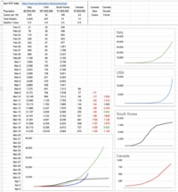
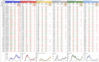
Day 7 – March 23, 2020
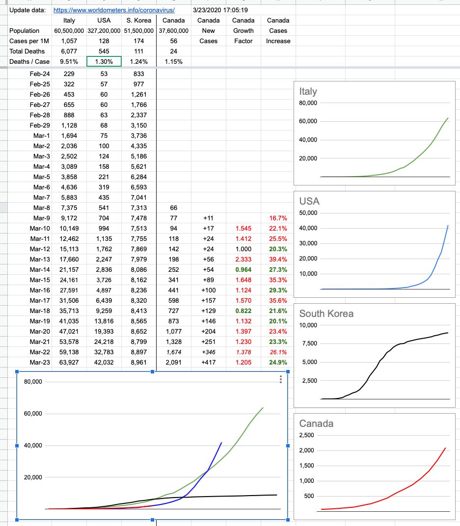
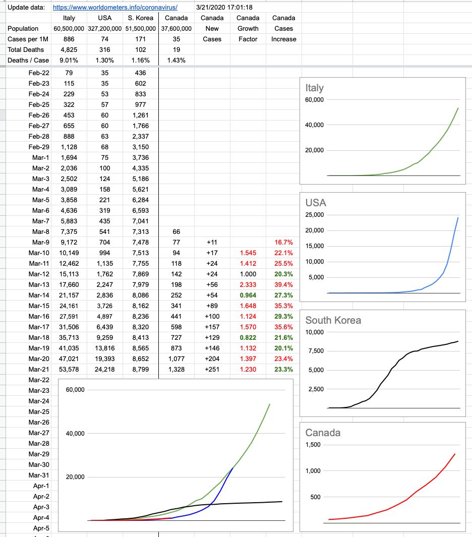
The lack of data over the weekend left a bit of a gap… which I filled in with some guesswork. I know where we were on Saturday, and I know where we are now. How we got here looks to be pretty consistent, but the next few days are more important than the last few. We are tracking very closely to the US, trailing by 10 days… just before things started getting really out of hand down there.
It’s important to note that I’m tracking new cases — not active cases. It was good news to hear that 100 cases in BC considered active have been resolved to “cured”. More than 300 in Canada overall.
As time goes on, we can look forward to that number of resolved cases growing, but note that its growth doesn’t affect tracking new cases. Those will always go up. In fact, at some point, it’s (hopefully) likely we will have “negative” days — where there are less new cases than resolved cases… but the idea of these graphs is to simply track the spread (and control) of new cases. What we do with them is a whole other question, and I’ll be happy to offer my opinion on that as time goes on. So far, comparing it to what’s going on elsewhere in the world, it’s pretty good. And will gradually look a lot better if you all just #stayhome!!
View Original Post and All Comments on Facebook
Day 6 – March 22, 2020
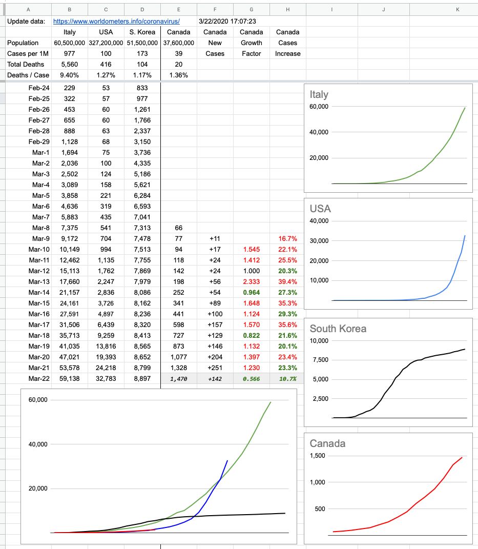
I don't like posting incomplete data, so stick a huge asterisk next to this… because there was no BC update today, so the Canada number is incomplete. Nevertheless, the other numbers are accurate, so here it is… and with tomorrow's update I will back-fill what's missing from today's and we'll see where we're at.
Hope you all got out for a bit of outside social distancing! Because most of the rest of the week is miserable rain, and for once — Vancouver rain — if that's going to stop people from clustering outside on the White Rock pier or the basketball courts at Kits beach… good.
View Original Post and All Comments on Facebook
Day 5 – March 21, 2020
To put it in very Canadian terms, what you want to see on the graph is for it to not "hockey stick" up to the right. So far… we're good. I keep saying the same thing, but seeing numbers grow isn't bad; it's expected. And linear growth flattening out is the best-case scenario. Exponential growth is what's bad, and as numbers grow, we'll have a better sense. The next several days will tell a lot.
In the meantime, I hope everyone had a really nice day of social-distancing outside in the sun… which means hang out outside, alone or with the people closest to you, ie the people you live with. And stay away from everybody else!
View Original Post and All Comments on Facebook
Day 4 – March 20, 2020
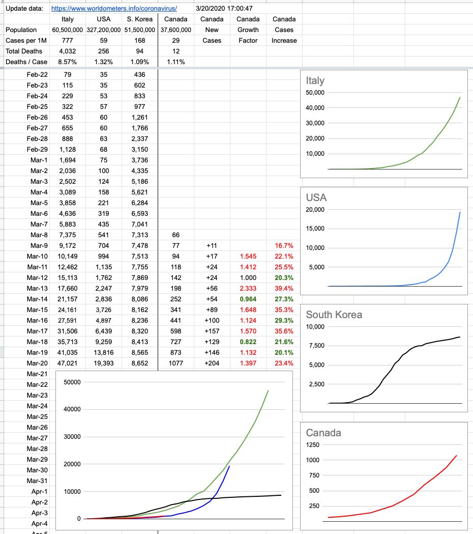
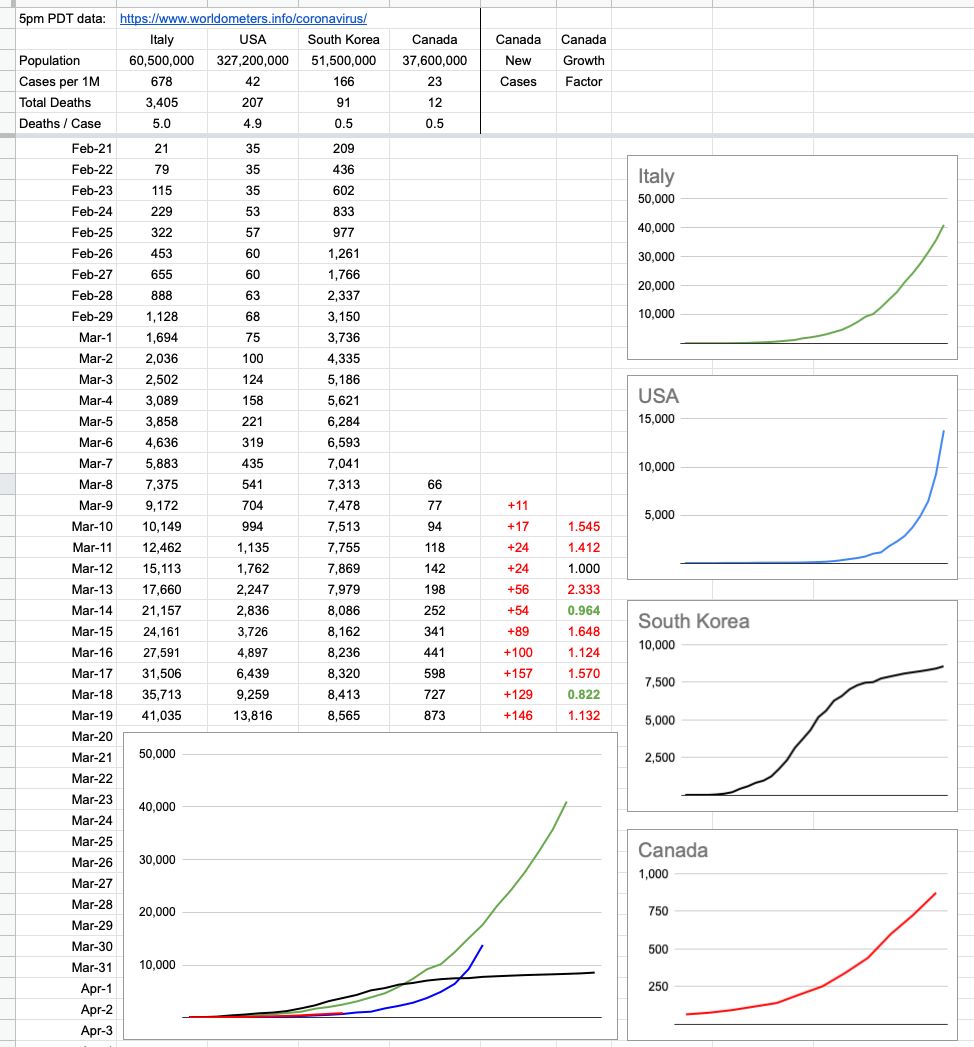
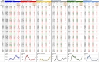
We’re still at relatively low numbers, tracking pretty closely to where the US was 10 days ago. It’s a continual rolling 10-day window to see how effective our efforts have been. It’d be really nice to see that red line detach from the blue one and continue straight across with no upswing and it’d also be very nice for our neighbours to the South to see their line flattening out.
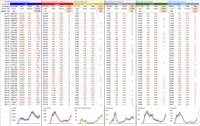
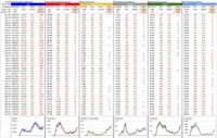
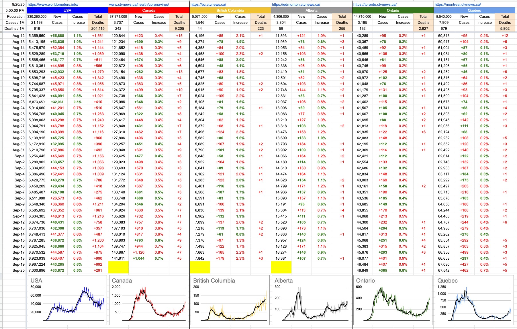
The colour coding on the rightmost two columns of numbers signifies change from the previous day. The growth factor is a comparison between today’s new cases vs. yesterday’s. The column to its right is the percentage increase of cases nationwide. Green is good, because it implies a smaller increase than the previous day. A streak of green days in a row would be very nice to see.
Needless to say, especially this early in the game, these numbers are very susceptible to how many tests are being administered and who’s being tested. As time goes on and numbers get bigger and the data is more generalized, it’ll all mean more and be clearer. The localized clusters we’ve witnessed (especially in B.C.) are not indicative of the entire country. If we based our assumptions entirely on what’s unfortunately happened at the Lynn Valley Care Center, we’d be appropriately far more worried.
Shoutout out to Dr. Bonnie Henry and Adrian Dix, whose 3pm updates are not just informative but also reassuring. And to the sign-language guy… if we are all as passionate in treating this as seriously as that guy is with the way he conveys the message, there’s no doubt we’ll be ok.
View Original Post and All Comments on Facebook
Day 3 – March 19, 2020
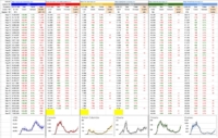
I added a couple of rows and columns of interest. Mark Twain said something like "Lies, Damned Lies, Statistics". Indeed, there are many ways to paint different pictures with the same colours. This simple chart has grown in complexity and I've received a lot of comments and some criticism from people.
To be clear, and I'm not a statistician… I was curious how Canada's response, at this critical time, looks compared to three other cases… Awful, Bad, Bad-then-good. It's still early to tell, and I have my opinion… but pictures are worth more than words, so here you go.
View Original Post and All Comments on Facebook
Day 2 – March 18, 2020
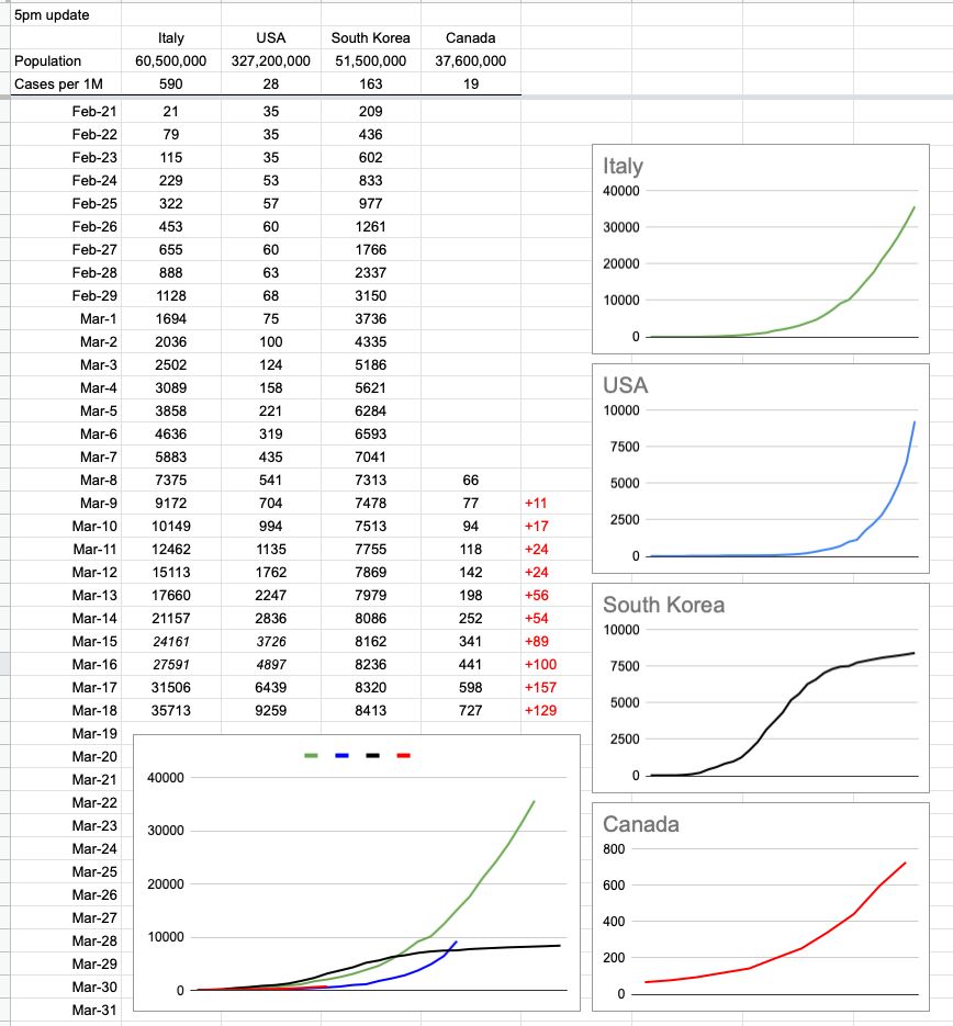
Follow-up to yesterday’s post… and I will try to update this daily, around 5pm. To make it consistent, I’ve normalized the numbers for that. The data comes from https://www.worldometers.info/coronavirus/
The individual Canada chart looks a little curvier than it did yesterday, but that’s only because I added a bit of earlier data and while the trend was indeed increasing, the historical numbers are small. Check the y-axis, not just the pattern.
Also, while yesterday saw an increase of 157 cases nationally, that number was lower (129) today, according to this source of data. And that’s what it’s all about… slowing the growth, because it will grow for the foreseeable future. The question is how fast.
I’ve also added South Korea as an example of how it looks when you do things right; that is the trend everybody wants to see. Still growing, but way slower than before.
View Original Post and All Comments on Facebook
Day 1 – March 17, 2020
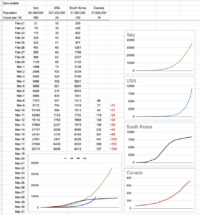
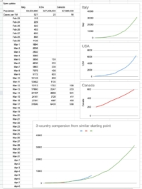
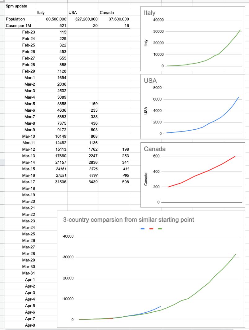
There’s a table going around showing what’s happened in Italy and the US so far. Here it is, with Canada added in… and a couple of rows of extrapolated data. I added the graphs, and what they show is simple — it’s up to us, ie Canada, to do everything we can with respect to flattening the curve. It’s not too late, because it’s still a straight line… but there’s zero wiggle room. In a perfect world, that red line stays straight, stays well-below those exponentially-growing green and blue lines, and eventually flattens out and goes down to zero. We, today, are where the US was a week ago and Italy was 2.5 weeks ago. And neither of those are trends we want to follow. Listen and follow what we’re being told. They are strict guidelines for a reason; they work.
View Original Post and All Comments on Facebook
Share...
September 24, 2020
When I was around 13, my mom’s cousin came to visit – from way far away; he and his family live in an industrial town in Slovakia. It was just him that came to visit, and he spent a week with us. I recall he arrived on Saturday morning, and we spent the weekend taking him around town, hitting a bunch of tourist sites. The beauty of Vancouver made a big impact on him; it was all very different from his typical surroundings.
On Monday morning, we all had breakfast together, and then it was time to go… my sister and I to school, my parents to work. They offered to take him downtown or drop him somewhere to look around, but no… he just wanted to chill at home. No worries. When we all left, he was sitting outside, on the deck, overlooking the backyard… with a cup of coffee and a cigarette in his hand.
Fast forward about 10 hours… I got home before anyone, and there he was, still sitting on the deck… the cup of coffee had transformed into a beer, and the ashtray was now overflowing with cigarette butts.
“Have you been sitting here all day?”
“Absolutely.”
OK… whatever melts your butter, I guess… but at the time, I do remember thinking how insanely boring that must have been. I thought about everything I’d done that day (a lot) and compared it with what he’d done (nothing).
The next day, it was the same thing… a full-on 10-hour chill. A few cups of coffee, a few beers, a pack of smokes… and call it a day. And that was pretty much it for the rest of the week. Every single day, all he did was sit outside and stare into the garden.
The world’s most boring man, I thought, at the time.
I told him, at one point,
“I really can’t understand how you can just sit here all day.”
“One day, you will.”
Over the years, every time I think about it, I have a more profound appreciation for it. This guy flew 8,000km to disconnect from his day-to-day reality, and he did it right. Back home, he was a hard worker with tons of responsibility and stress. And here, well before the era of perpetual connectedness, he’d found his oasis and he milked it … [Continue Reading]
September 23, 2020
I spent a wonderful, relaxing day yesterday (once again, thank you for all the good wishes) – soaking in the good weather, and feeling deeply appreciative of many things. Certainly, a big part of that is having the privilege to ride out this pandemic here in Canada. The colossal difference that thin line running along the 49th parallel makes; it has never been more evident.
I am, in all sincerity, hoping The United States of America can hold it together. So much has already been written about the GOP’s hypocrisy with respect to the Supreme Court; how they’ve done a clean (actually, couldn’t be dirtier) 180 with respect to filling a vacancy during an election year. They denied Obama the opportunity in 2016, but they will jam down everyone’s throat their candidate in a matter of months. And all of it, both 4 years ago and today, beautifully described and justified in a gleaming, shiny steaming coat of bullshit.
It doesn’t matter whether you’re a card-carrying Marxist or a fanatic right-wing fascist. Most people are neither, and find themselves in the moderate in-between. But all of you should be horrified at how your country, you know – the one with life, LIBERTY and the pursuit of happiness – is being ripped away from you… a process that started years ago but really caught its footing in the last four. It began to quickly accelerate right around the time the president figured out he could just make it all up as he goes along, jam “truth” down people’s throats, and make them swallow it, either by persistently sticking to it, or by just ignoring the backlash and moving on to the next thing… all the while being cheered by his adoring crowd.
Accountability is at an all-time low, scraping along the bottom of credibility. If anyone is deserving of a dying wish – after all she did, to benefit the greater good – it was Ruth Bader Ginsburg. And her dying wish was to not be replaced before the next election. It’s more than unfortunate that she won’t be granted that. On the flipside, voter registration surged after her passing. Perhaps enough people are realizing that unless they do something, it’ll get done to them… and it won’t be pretty. But to flip it … [Continue Reading]
September 22, 2020
Thank you all for the kind birthday wishes; certainly a most memorable one. Not being much of a party animal, I have very little memory of my last 5 birthdays… but this one will certainly never be forgotten. I hope by next birthday we’ll all be back to a much more mundane and forgettable – ie familiar ie normal —sort of party schedule, whatever that means for you. ????
But for now, I’ve spent the day enjoying some free time, playing hooky from everything… and it’s been great… and I’m about to continue to do so.
See you tomorrow.????????
View Original Post and All Comments on Facebook
September 21, 2020
Dr. Henry’s “back to school” ad rubbed a lot of people the wrong way, and I was one of them. It painted a completely unrealistic picture of what classrooms would look like. As any student or teacher or parent (of either of those) will tell you, most classrooms have more than 6 kids and most classrooms don’t have a sink for convenient and frequent handwashing. The explanation given was that it was simply a setting for Dr. Henry to be explaining things to a group of kids; it didn’t necessarily represent the norm. They could’ve shot that ad outside or in a gym or in a playground or wherever, but they chose to talk about classrooms… in a classroom – but a classroom that doesn’t actually look like what classrooms will look like. Hmm.
When I was in school, the most frequent thing from teachers was “Settle down” or “Be quiet”. Until recently, it was “Get off your phone”. These days, all of that has been replaced with “Put on your mask”.
Seeing some of the pictures my kids are sending from school (both are in high school), it seems one thing hasn’t changed; a lot of kids aren’t great listeners and will do whatever they want.
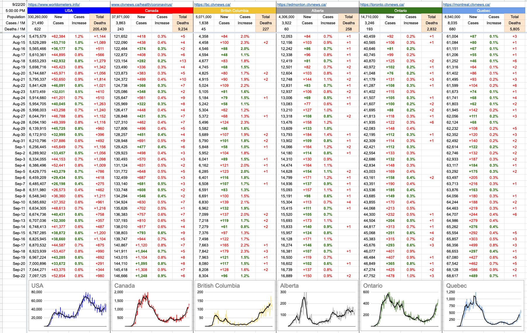
In another sort of horse race that nobody wants to win, the province of Alberta has recorded more than 100 school outbreaks, and they’re growing quickly. B.C. is presently at around 20. For comparison, as of a few days ago, Ontario had seen around 90 school outbreaks… and Quebec, around 270.
Interestingly, a few minutes after I signed and submitted some forms promising to keep an eye out for symptoms in the kids before sending them off to school, the B.C. Ministry of Health removed more than half the symptoms, among them sore throat and runny/stuffy nose. To be clear, the directive is this: IF you are a kid and IF you have only that symptom… sore throat and/or runny/stuffy nose – chances are, you’re ok.
I get it, and I don’t get it. It’s a tough situation. As anyone who has kids (or has ever been a kid) knows, every single kid at some point between now and March will have a sore throat and/or runny/stuffy nose. All of them. And, for the vast majority of them, … [Continue Reading]
September 20, 2020
The air has finally cleared… unlike my schedule… so just a brief note before tomorrow’s numbers come out, because I am going to enjoy the usually-taken-for-granted crisp, fresh air.
The AQI at the moment is 18, which is exactly what it was before the fires, and about as good as it gets. For a week, it was fluctuating between 150 and 225, which is labelled Unhealthy at best, Very Unhealthy at worst. And to be clear, this only means our problem has gone away (for the moment) … the AQI is 450 in some parts of California. Anything above 300 is labelled Hazardous, as in don’t breathe the air outside or you’ll likely get sick.
Not like there isn’t enough to occupy your time on the internet… but waqi.info is an interesting site. A world map of AQIs, and you can hover and zoom around easily. At a glance, you’ll quickly notice (as I have over the last week) that many places around the world are perpetually stuck with bad air. Parts of Brazil, India… and, of course, China.
It's good site to check out next time it’s pouring rain and you’re stuck at home… for two reasons. One to see that it could be a lot worse, and two to remind us how fortunate we are to live in a part of the world where the air scrubs itself. I wish my schedule could do the same.
View Original Post and All Comments on Facebook


